
Today, human live with screens, and most likely, with multi-screens. There are PCs, smartphone, tablets, TVs, smartwatches and more. People use them for different occasions or use them together. As a designer, I heard about terms like “mobile-first” and “responsive” a lot and have actually designed products across different platforms, while I found there is still a gap and struggle of designing for multi-screens.
Therefore, I spent some time diving into the topic to find out what makes for a good multiscreen experience and what are the things to be considered when designing for multi-screens. There are two books I found extremely helpful about this topic.
Leverage the advantages of the devices
Devices have their own pros and cons. They are different in display size, proximity, the location being used, use mode, viewing mode, interaction model, attention pattern, device sharing, and the built-in features and sensors. They exist because there is no one can entirely replace another.
The major devices being used include PCs, smartphones, tablets, and TVs. Smartphone is becoming the major device people rely on, instead of the traditional PCs. Therefore, in the future, there may be more and more products starting from mobile.
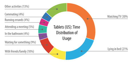
Tablets and TVs seems are not as popular as PCs and smartphones, however, they have their unique spaces that others can’t replace. When it comes to reading, tablets beat smartphone. When it comes to gaming, TVs beat all other screens. Another surprising fact is TVs and tablets actually make a good combination. The research mentioned by the book Designing Multi-Device Experiences shows that “70% of tablet owners used their tablets while watching TV” which constituted 30% (the largest share) of their total time with the tablet.
Consistent, Continuous and Complementary
Most of the apps are trying to provide the consistent experience when it comes to multiscreen design, while “Consistent” is not the only approach.
There is a 3Cs Framework could be applied to multiscreen design:
- Consistent: provide the same basic experience
- Continuous: the experience is passed on from one device to another
- Complementary: devices complement one another to create a new experience
The framework could be used independently or together. “Consistent” is easy to understand, which is to provide very similar experience across different platform while optimizing for the screen size and interaction model.
“Continuous” fits for the tasks which can’t be completed in a short time, so users may need to use more than one device to complete their goals. There are two kinds of flow could use “Continuous” approach:
- Single activity flow (such as reading a book, watching a movie and writing a long document)
- Sequenced activities flow (such as, from learning how to cook to actually cooking, from reserving restaurants to eating, from buying concert tickets to watching the show)
“Complementary” approach refers to using different devices together to complete a single goal. It is currently most common in gaming and TV shows. For example, using iPhone/iPad as a controller for the game displayed on TV, or use iPhone to provide additional information of the TV shows users watch.
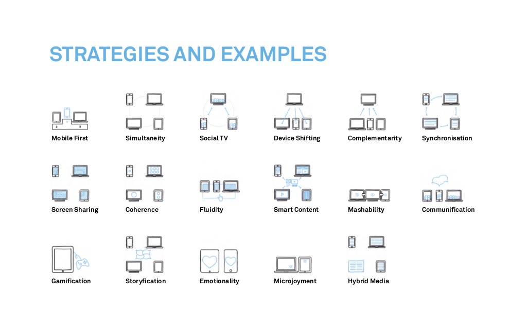
The book Multiscreen UX Design provides more strategies and examples of the relationships of the devices, while most of them can still be adapted to the 3Cs Framework.
Always consider users and the context of use
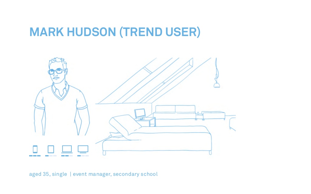
Users are always the center of UX design. For multiscreen design, both users and the context of use are very important. Unlike desktops, which we know users are mostly sitting with good internet connection, other devices turn to have more limitations or distractions.
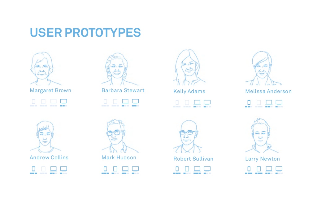
The book Multiscreen UX Design provides great examples of how to build “user prototype” to map out the usage of different devices and the context.
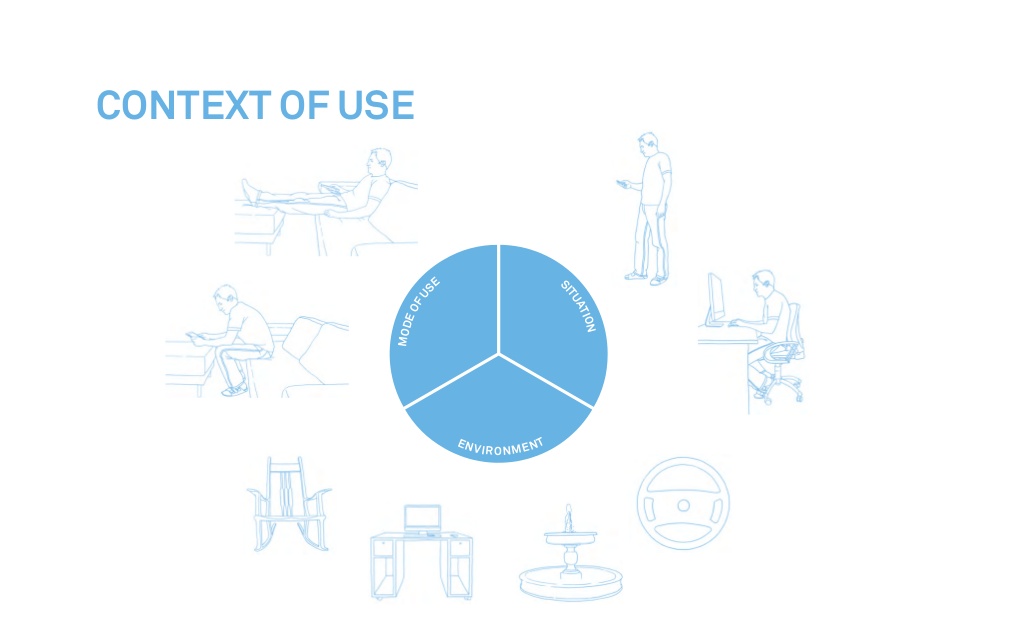
Asking a 5W1H (who, what, when, where, why and how) before designing will be helpful to design for user needs:
- Who are we designing for?
- What are the user needs?
- When will users be using the product?
- Where will user be using the product?
- Why users use the product (at the time they use)?
- How will users use the product?
After we have a good understanding of users and the context of use, then we can define the different strategies for different devices and how they will be working together as a whole to serve users.
Also, don’t forget to educate users on how to enjoy the best experience. Some approaches we talked about before may not be as intuitive as the “Consistent” experience but will work really well once users know how to use. Therefore, remember to integrate the guidance in the user flow to help users become pros of the product.
Conclusion
It is obviously not enough to just design for desktop, which most companies already know, and it will be not enough to just design for both desktop and mobile soon – the potential of tablets, TVs, and smartwatches has not yet been reached. In the future, the display in a car may also be more connected with our other devices.
This article provides the basic principles of how to start designing for multi-screens, while different products have its unique user journey needs to be considered. It always has no harm to start with understanding users. Map out the user journey, consider the limitations of each step and then leverage the advantages of devices to provide the integrated experience for users.