Choosing a good color scheme that follows best practices in design theory is a very important factor when creating a digital interface. It’s also important to design in ways that allow as many people as possible to access a product by taking into account the differing ways in which people perceive color.
What is color blindness?
Color blindness, also known as color vision deficiency, is a limited ability to see certain colors, all colors, or a differing perception of color from the way it is perceived by most people. The condition is significantly more common in men, with “as many as 8 percent of men and 0.5 percent of women with Northern European ancestry have the common form of red-green color blindness” (Facts About Color Blindness, 2015).
There are three main types of color blindness, according to the National Eye Institute, with various specific types of conditions associated with each:
-
- Red-green color blindness is the most common type, where those with the condition either have no ability to see red and green or their ability to see red and green is significantly less than that of the general population.
- Blue-yellow color blindness isn’t totally uncommon, but not as common as red-green color blindness.
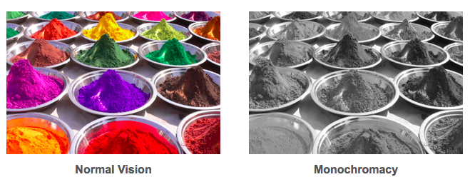
- Complete color blindness is the rarest and most severe, where those affected perceive very little to no color in their vision.
Find out more by checking out NEI’s fact sheet on color blindness.
Designing for color vision deficiency
Designing for color blindness is difficult because there is no standard, color vision deficiency-friendly template in which to base interfaces off of. This becomes especially the case with the ever-increasing variety of monitors, displays, and devices that an interface can be viewed on. So how do designers design for people with color blindness? Luckily, designers do not need to establish themselves as authorities on color blindness in order to make interfaces more accessible (Facts About Color Blindness, 2015).
One way to make sure that an interface is more accessible for users with color blindness is to make sure it can be viewed in monochrome (black and white) – even if the user can’t see some colors or any color at all, they’re likely still able to differentiate between hues of black, grey, and white (Sula, 2018). It’s also important to keep in mind that colors, in general, should be used sparingly. According to usability.gov, using contrasting colors is best practice, as well as enhancing links or other interactive elements by underlining them or otherwise creating a signifier that doesn’t require color in order to recognize it (Liu, 2010). This helps users with color blindness be able to navigate an interface without having to rely on colors to guide them.
To simulate what different color schemes look like for people with different types of color blindness – or if you want to find an accessible color scheme! – check out Paletton’s Color Scheme Designer. You can also test your own ability to differentiate between hues of color using X-Rite’s hue test. The X-Rite test can be informative, but you shouldn’t use it as a way to self-diagnose color blindness.
While it’s impossible to design an interface for every single type of user that may interact with it, taking the steps to make sure that people with color blindness can have the same experience with a product as everyone else is an important part of accessible design.
Works Cited:
- Facts About Color Blindness [Fact sheet]. (2015, February). Retrieved October 10, 2018, from National Eye Institute website: https://nei.nih.gov/health/color_blindness/facts_about
- Sula, C. (Presenter). (2018, September 12). Visual perception, color, and interaction. Lecture presented at Pratt Institute School of Information, New York, NY.
- Liu, J. (2010, February 1). Color Blindness & Web Design. Retrieved October 12, 2018, from usability.gov website: https://www.usability.gov/get-involved/blog/2010/02/color-blindness.html
- Paletton’s Color Scheme Designer. (n.d.). Retrieved October 12, 2018, from Paletton’s Color Scheme Designer website: http://paletton.com/#uid=1000u0kllllaFw0g0qFqFg0w0aF
- The X-Rite Color Challenge and Hue Test. (n.d.). Retrieved October 12, 2018, from The X-Rite Color Challenge and Hue Test website: https://www.xrite.com/hue-test?pageid=77&lang=en
- [Protanopia]. (n.d.). Retrieved from http://www.colourblindawareness.org/colour-blindness/causes-of-colour-blindness/
- [Tritanopia]. (n.d.). Retrieved from http://www.colourblindawareness.org/colour-blindness/
- [Monochromacy]. (n.d.). Retrieved from http://www.colourblindawareness.org/colour-blindness/types-of-colour-blindness/