Introduction: This post is about how to use information visualization to delivery our findings to the clients when the quantitative research involves complex or significant amount of data.
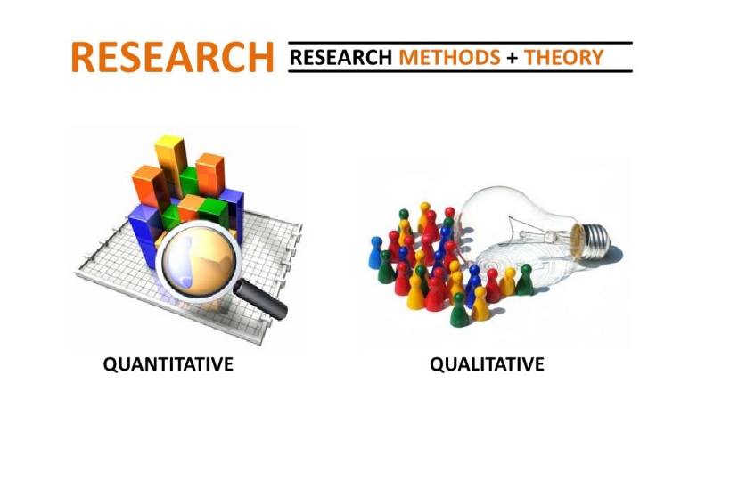
Quantitative research methods such as A/B Testing and data are widely used in usability research to better understand the audience and compare different prototypes for improvements. Other than quantitative research methods, researcher also use qualitative research methods, such as interview, focus group studies or observation. Qualitative research methods and quantitative research methods support each other in a lot of situations. Qualitative research methods are often used to help us figure out why and how for future solutions while quantitative research methods are used to help us prioritize tasks and make comparisons on existing products or prototypes.Both methods help UX researchers or designers to have the complete picture of the design. As UX Experts, it is our job to synthesizing the data sets received from quantitative research results and present our insights to our clients in a understandable and easy way. Information visualization can be very helpful in the delivery process.
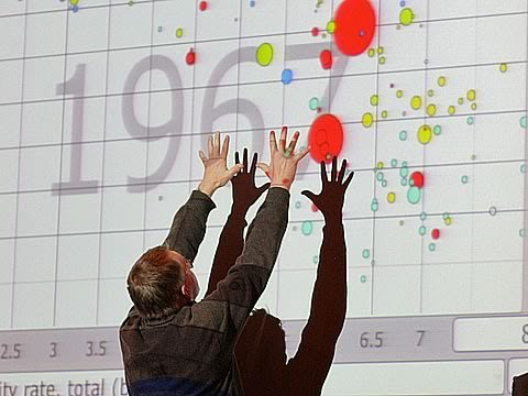
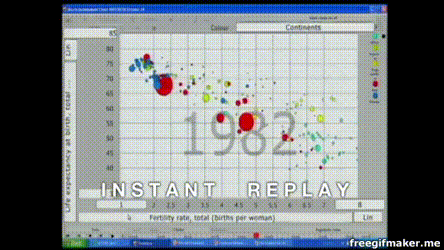
One of the best information visualization example is from the Ted Talk given by Professor Hans Rosling “the best stats you’ve ever seen”. In this Ted talk, Hans used an interactive and animated data visualization model, and vividly pictured the relationships between child mortality and GDP through the enormous amount of data over the last 40 years. He was very clear and persuasive to a wide range of audience without professional backgrounds in global health, because he made these complex data into moving graphics in a easy and visually pleasing way.
Some highlights to help us better deliver data sets from quantitative research results to our users/audience/clients are: 1. Use interactive or animated model to keep the audience engaged. 2. Use bright color with great contrast (difference) when creating infographics. Red and green would be a bad example to use together in one data model. 2. Use real objects, such as image of the person or products, to make the information(numbers) more relatable. 3. Use metaphor to help the clients better understand data from an unfamiliar topic. 4. Provide complete background or context of the data sets.
It is important to remember that the purpose of presenting the data results should be educational and make your audience feel empowered. As UX designer, our statistics from quantitative research should be straightforward and simple to the clients. We only use data when necessary to make our recommendations or findings more persuasive. We don’t want to confuse the clients.
A few examples that well applied the rules above are The Daily Routines of Famous Creative People, infographics created by designer Marion Luttenberger, The Internet Map and Universcale by Nikon.
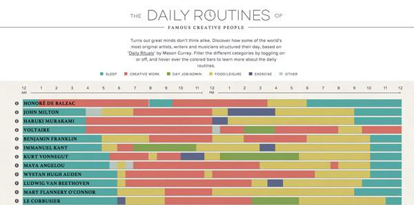
In The Daily Routines of Famous Creative People, they made the data sets very interactive by adding unique details such as “have breakfast with wife”, “drink coffee with at least 10 coffee beans”. The information is easy to read at first sight. They used animated model to encourage users to explore on their own.
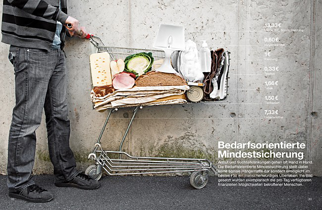
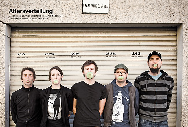
In the infographics created by designer Marion Luttenberger, Marion applied his lens as a photographer and graphic designer by combining real images with the data sets. When we are presenting sensitive topics such as drug abuse or the homeless, this method can greatly emphasize with the audience.
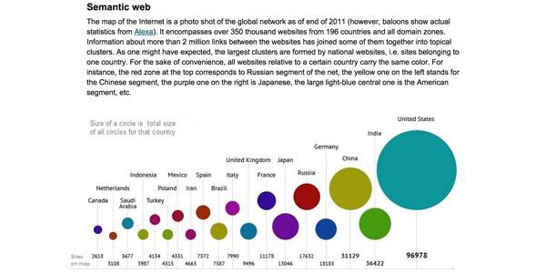
In the Internet Map, the designer shows the complicated idea of linked data and the large amount of information of linked data behind different countries through a galaxy map.
At the end, when we use quantitative research methods, we need attention to details, curiosity (that’s when qualitative research methods may come into place too), and tolerance of failures.