Quantitative usability methods, relying on computer data collection and statistical analysis, are relatively objective because the presence of the research is always the number and quantitative data. The quantitative data is one of the most important elements of usability testing. Quantitative data provides information that can be counted to answer such questions as “How many?”, “What were the outcomes?”, and “How much did it cost?”. So how can we analyze a series of quantitative data? For example, a web page has 3 thousand visitors traffic every minute. That means nothing. How can the usability experts evaluate their hypothesis and recommendations? The comparison, in this case, is the key issue.
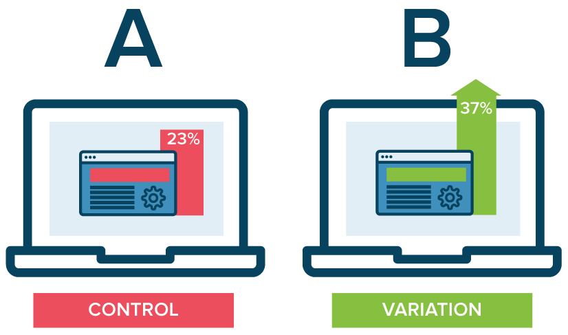
There are some design methods based on the quantitative data in the real world’s design process, such as the Eye-tracking technology, Satisfaction survey, and A/B testing. The most convenient and low-budget method is A/B testing. This method is the most frequent method implied during my previous job because it is easy to observe the testing result and evaluate the design work’s efforts. The principle of this method is to define the variable element and compare with the pre and post edition. The researchers just need to observe the traffic of the pages or interfaces. For example, You compare two web pages by showing the two variants (let’s call them A and B) to similar visitors at the same time. The one that gives a better conversion rate, wins. By testing many times, the evaluators can figure out which elements of the interface influence the traffic and which iterating directions perform better and prove or refute their hypothesis.
Case Study
Here are the case studies in the real world. The first case is about a German company that offers various software training courses, MedienReich ComputerTrainings. The UX experts’ hypothesis is that replacing ‘course categories’ with ‘best selling courses’ on the homepage will boost engagement.
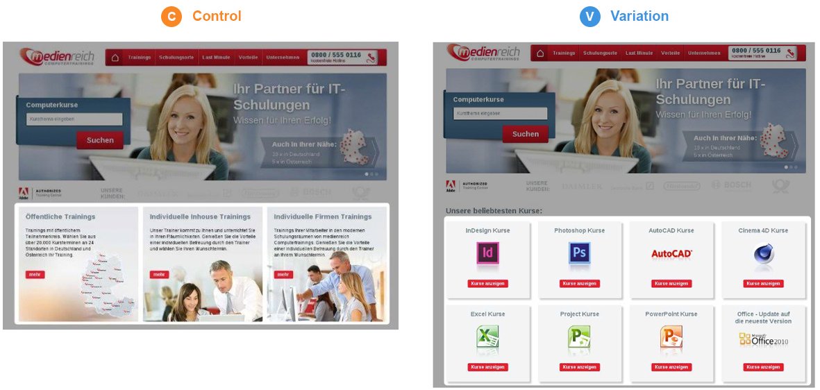
The “Control” one (A) is the original page, offering visitors the traditional information in the home page. On the other hand, the “Variation” page (B) shows the most popular courses on the homepage.
The result proves the experts’ hypothesis. The engagement on the homepage increased by a robust 40.87% at a confidence level of 99.9%. The year-on-year value of the homepage also increased by 106.42%. The variation won because it served visitors with the right information at the right place. showing the popular courses on the homepage can give some visitors, who are not sure what courses they want to learn, chances to directly access the best-selling courses. So this information will enhance the engagement of these kinds of visitors.
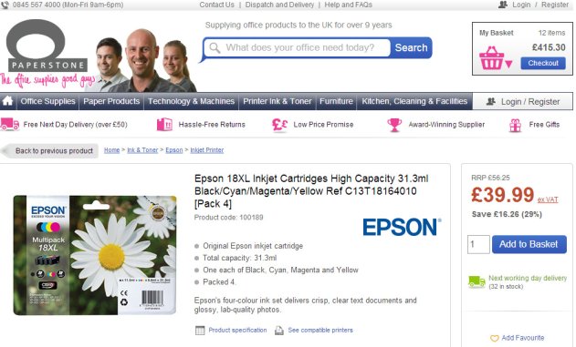
The second case is about Price information page of Paperstone, which is a UK based eCommerce website that deals in office supplies. The Usability experts thought that displaying competitors’ higher prices on product pages will increase clicks on ‘Add To Basket’ and overall website conversion rate.
This test is special because it has 2 variation versions.
In this case, Variation 1 couldn’t perform better than the original page. This happened probably because the competitors-prices module didn’t have a differentiating presence on the page. The module was a plain text version and might have become a victim of banner blindness (Banner blindness is a phenomenon in web usability where visitors to a website consciously or unconsciously ignore banner-like information, which can also be called ad blindness or banner noise).
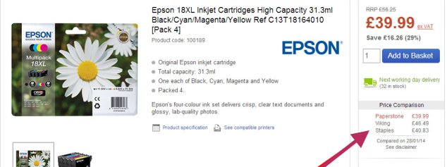
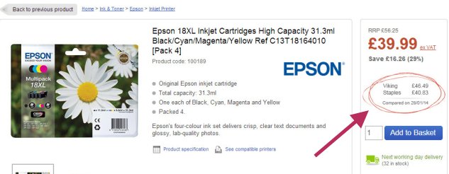
The second variation worked much better and won over the control. The competitors-prices module was more prominent — Paperstone’s price was also highlighted against the competitors’ prices, and a header text was added. The module was also repositioned below the ‘Add to Cart’ button in a bid to clear up the CTA’s surrounding space. This case provides some necessary questions in the similar design process:
- Would displaying competitors’ prices drive potential customers to your competitors, if the saving is only small? Or if visitors were not previously aware that the competitors sold the product?
- Would you appear more expensive on product pages that do not have the competitor price module?
- Would adding the competitor price module to your product detail pages create poor UX which distracts and puts off your users?
In the nutshell, A/B testing will effectively help the UX designer to evaluate their features and evaluate the usability in a cheap and objective way. However, A/B testing still has its limitation, such as the testing target or element of the A/B testing is single and the test result must require statistical data; A/B testing can only test the immediate user’s operation; A/B testing cannot provide the details of user’s behavior. There is no most perfect way for the UX field but there is the most suitable one. Usability evaluation method should be used in the right contexts and the right scenarios.
Reference:
Nitin Deshdeep, “10 Kickass A/B Testing Case Studies From Our Archive”, https://vwo.com/blog/10-kickass-ab-testing-case-studies/
Jan Panero Benway David M, “Banner Blindness: Web Searchers Often Miss ‘Obvious” Links’ ”, Lane Rice University Houston, Texas