Word clouds — a form of “tag clouds” — are visual representations of the prominent word choices in a selected text. The relative importance of a term is indicated by the weight of the font: the more often it appeared in the original source, the larger the word appears in the graphic “cloud.” This “Web 2.0” graphic novelty was created by Flickr co-founder Stewart Butterfield in 2004, and used widely on sites such as Flickr, Del.icio.us and Technorati.
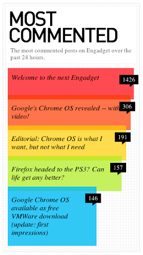
Over time, this visual trick lost its popularity and has come to be discounted by user experience designers. Jakob Nielsen, generally considered a leader in the field, says “Tag clouds are overused. While looking pretty, they use screen space inefficiently, and many users don’t know how to use them” (Nielsen). Most online UX chatter is biased against their use, with a preference for other more readable infographic design concepts like this one:
 While the concept may not be right for web design, I would argue that word clouds can provide a very useful tool in presenting content-oriented concepts to clients and stakeholders, if created properly. I built a successful word cloud during my content strategy work for the Pratt Institute Libraries re-design project, which was used in presenting our branding and user research back to our stakeholders. I followed four simple steps to create an effective word cloud infographic.
1. Prep the Data
We conducted interviews with several key stakeholders from the Pratt Institute Libraries in order to gather crucial information about their goals for our re-design project. After collecting the detailed script notes from the interview note-takers, I created a single document to use as my source text.
In order to prepare the text for the word cloud exercise, I removed all duplicate, repetitive and unnecessary content: the stakeholder’s names, the text of the interview questions, and terms such as “Pratt” and “Library,” which did not need to be represented in my graphic. I also removed all formatting from the document, such as bullets, heads and color, until it was straight text.
2. Find a Tool, and Load the Text
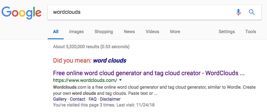
Next, I Googled “word clouds.” There are many, many free online tools for this purpose (see the link to a recommended list at the end of this article): my search yielded over five million results, and I simply used the first selection.

I then pasted my lengthy text into the box provided in the online tool, chose a shape and a color scheme, and voila:
But this was overwhelming: too many teeny tiny words! And who cared about useless words like “can,” “make,” “get, “will,” “want” — and that oh-so-descriptive term — “things”?
3. Curate the Word List
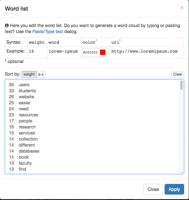
The way to fix the noise in your wordy word cloud is to curate the word list, available in a menu option. Comb through this list carefully, and you will find many needless words (such as I listed above) that detract from the effectiveness of your word cloud. You can remove them without diluting its meaning.
Also note that the tool does not combine variant spellings of the same term. For example, all of these were considered — and counted — separately and had to be combined manually by me: “Student,” “student,” and “students.” I also chose to make everything lower-case.
As you can see from my curated word list below, the most frequently used terms in our stakeholder interviews were highly appropriate to the mission of the Pratt Institute Libraries: users, students, website, easier, need, resources, people, research, and services.
4. Design
The final step in creating a persuasive word cloud is to make good design choices. This involves using the tool as effectively as possible in addition to having a sense of what makes good user design.
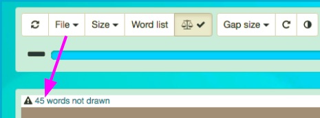
First, you need to check that all of your words have been drawn into your word cloud. In this tool, there is a slider that allows you to ensure that all are included.
In this instance, 45 words were missing — including (when I checked my visual) the very important word “students”! Words appeared to be eliminated randomly rather than by level of usage, so it’s crucial to check.
Next, choose a shape for your cloud. The research says that users merely scan word clouds and do not read them closely; they also focus primarily on the terms in the center of the cloud. Therefore a non-shape like this one with a white background, below, can be too visually busy with words floating in space. The resulting cognitive overload will not allow viewers to easily take in the key terms that you want them to see.
In the end, I chose a circle, and a black background to focus the viewer, and after a few tweaks of the slider, every word fell into place — with the super-important “students” smack in the center.
In Conclusion…
A simple and dramatic word cloud is an effective way to do “show and tell” for stakeholders or clients about the language that surfaces in our UX research. It can reflect their mission in their own words, as in my example, or it could surface the challenges that come up in user interviews. It could be implemented during a “brand tone and voice” analysis of web site content as a way to compare the stakeholders’ stated branding to the terminology actually used in their site content. It can be a persuasive argument when needed.
Just know that your best audience is probably not hard-core UX designers, who have shown a bias against word clouds as “over-used” and rightly know that they’re not the best option for web design. Word clouds can work well to provide an impression in a presentation, but probably not to live permanently on a site. However, if you can create one that communicates effectively, it can help you tell a good story.
= = =
Nine Excellent (yet free) Online Word Cloud Generators
http://www.smashingapps.com/2011/12/15/nine-excellent-yet-free-online-word-cloud-generators.html
Sources:
Lohmann, Steffen et al, “Comparison of Tag CLoud Layouts: Task-Related Performance and Visual Exploration,” https://www.uni-due.de/~s400268/Lohmann09-interact.pdf. Appeared in T. Gross et al (eds): INTERACT 2009, Part I, LNCS 5726, pp. 392-404, 2009.
Nielsen, Jakob, “Tag Cloud Examples,” March 24, 2009: https://www.nngroup.com/articles/tag-cloud-examples/
“Most Commented” infographic: https://i.stack.imgur.com/H8fTE.png


