The Project
Our task was to redesign of the Arts for All official website to make it more attractive, more functional, and more appropriate for a modern arts education nonprofit.
The Problem
AFA’s current website is unpleasant to use because it is ugly to look at and it is difficult to discern the site’s architecture and where you are located within it.
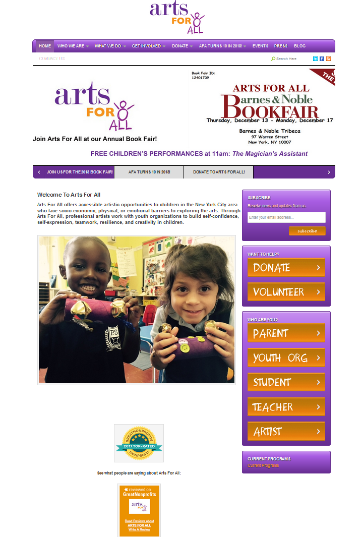
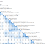
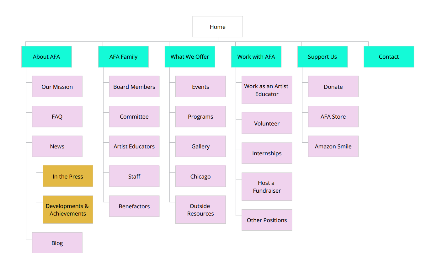
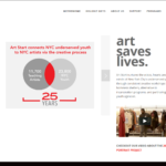
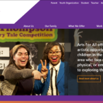
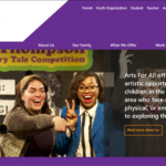
In the homepage above, note the use of color and gradients, which make the page visually loud, as well as the cramped design and overabundance of links, which make it difficult to know where you want to go.
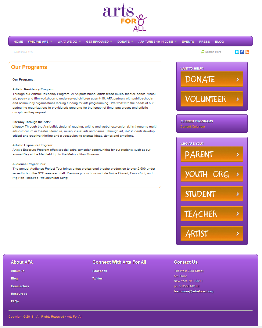
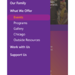
In this image, note how you are given no indication of where you are in the site architecture at a glance. You must first open one of the drop-down navigation menus to see if you are on one of the pages in that category.
My Role
All four members of the group conducted user testing and contributed to the prototype design at each stage, from paper prototype, to wireframe, to the final digital prototype. As editor, I was also responsible for identifying and correcting spelling errors, clumsy or unclear wording, and grammar mistakes in all of our deliverables.
User Research
Our first step in improving the AFA website was to conduct user research using interviews, observations, and questionnaires to ascertain what site design elements are most important to users.
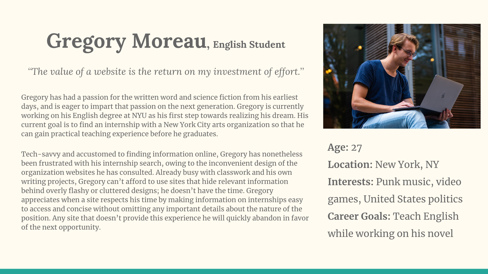
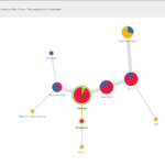
The persona above was constructed by me using information gained from observations and interviews of college students using arts organization websites to seek employment.
The main insights I gleaned from this process were:
- Employment information is top priority; it should be comprehensive and focus on concrete details (pay, location, hours, etc.) rather than attempts to “sell” the position.
- Information, especially employment information, should be available with minimal searching and no interruptions.
- Users favored a simple and functional design over a flashy, image-heavy design that was hard to navigate.
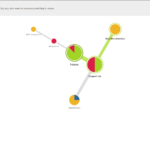
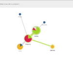
Site Architecture
Our next step was to conduct a card sort and tree test to help us in structuring the new site’s content.
Card Sort
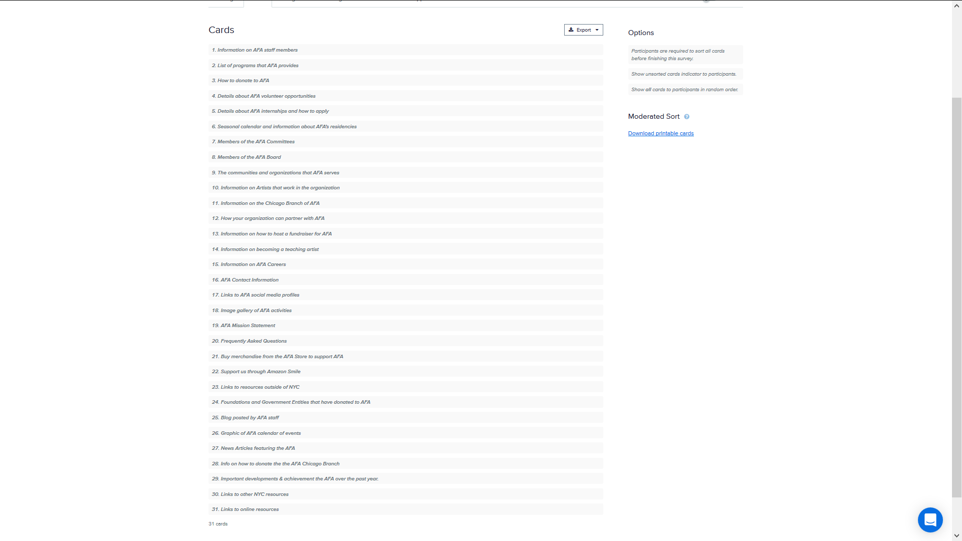
Our list of 31 cards was compiled from existing site pages and new pages based on our user research results.
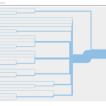
Our card sort results (above) helped us decide how to separate pages into categories (e.x. all employment, volunteer, and internship information in one top level category, making it easy to locate).
This is our initial site architecture, informed by the card sort results and by a desire to avoid the clutter and option overload of the current homepage. We hoped to minimize complexity by reducing the overall page count and the number of top-level categories.
Tree Test
Our initial architecture was used to design the five tasks that made up our tree test, seen alongside their results below.
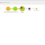
Our tree test results indicated that while our design was easy to navigate, we had issues with categorization and naming. Participants stated they had no trouble working their way through the tree but still produced many failed tests.
- Failures in Task 1 convinced us to move the “Blog” to the “About AFA” section since participants frequently looked there in the task.
- The results of Task 2 led us to categorize “Benefactors” under “AFA Family” rather than “Support Us” so people didn’t visit “Benefactors” trying to donate.
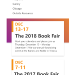
- The confusion around “Calendar”, “Events”, and “Classes” evident from Task 3 led us to combine the three pages into one “Events” page.
- Task 5’s results demonstrated that participants were confused by the term “Teaching Artists”, mistaking it for a goal of the org rather than a position, leading us to relabel the term “Artist Educators”.
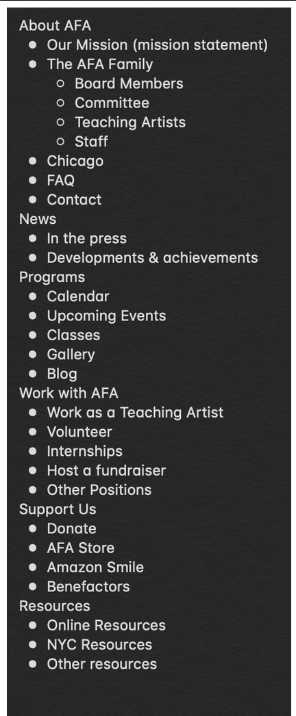
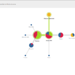
Site Map
We refined our site architecture into the site map below based on our tree test results.
We further refined this design later on based on feedback, removing AFA from all category and page names (to reduce redundancy), combining the news subcategories into one News page to reduce complexity, and eliminating the contact top level category in favor of putting the contact info in the footer of every page.
Competitive Analysis
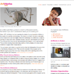
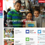
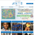
To ascertain the strengths and weaknesses of AFA’s competitor sites, we looked at the official sites of ArtWorks NYC, The Center for Arts Education, Free Arts NYC, and Art Start (homepages below).
We evaluated these competitor sites using six dimensions: Homepage, Links and Labels, Content, Images, Organization, and Accessibility.
Based on our analysis, our design priorities going forward were to focus on creating a site that was simple and accessible while retaining an attractive appearance. To this end we retained our simple site map and designed pages such that they were not cluttered with too many links and images. Our intent was to use links that stood out without being garish, text that was attractive and readable, and images that accurately represented Arts for All (not stock photos), while striving to meet accessibility standards. We also resolved to pay particular attention to the homepage, to make a good first impression on the user.
Prototype Development
Prototype development occurred in three stages: initial paper sketches, wireframes used in testing, and a final digital prototype.
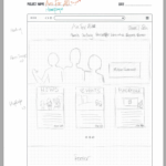
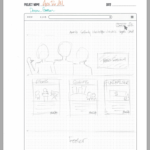
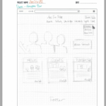
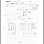
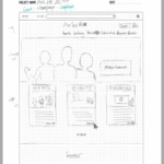
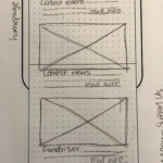
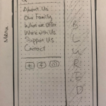
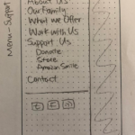
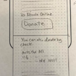
Paper Prototypes
Our initial paper sketches can be seen below:
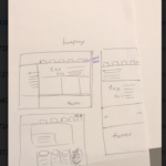
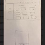
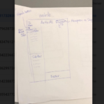
Most of the design elements seen here were retained in the final design, in particular the top of page navigation bar and the secondary side navigation seen in the desktop sketches, and the expanding menu seen in the mobile sketch. The most major change to these designs was cutting down on the borders seen in the homepage sketch to give the page a less claustrophobic feeling.
Task Development
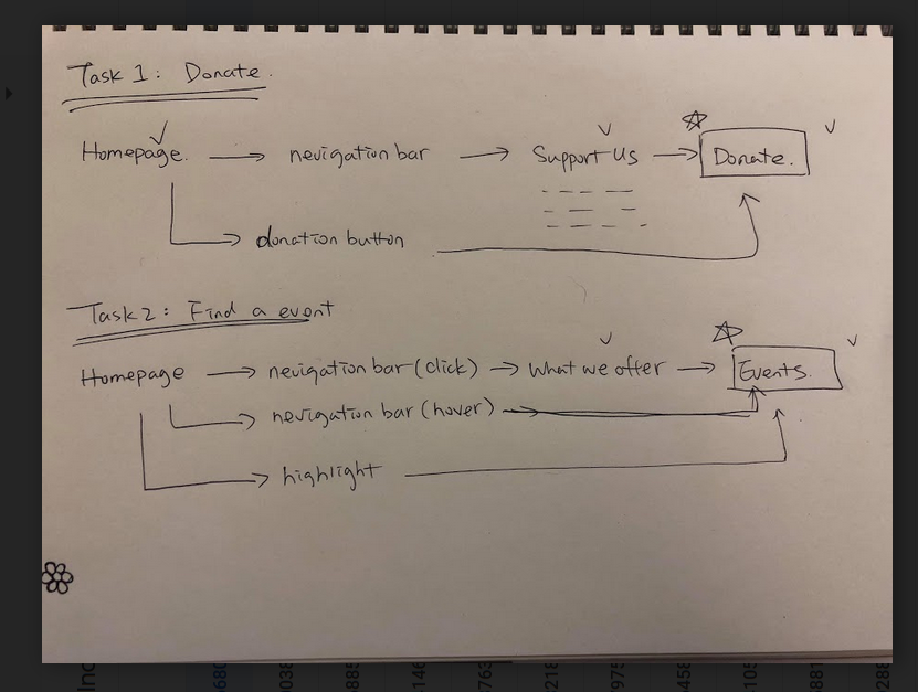
We developed these tasks for use in wireframe testing. We chose these tasks based on the importance of donations to non-profits like AFA, and the heavy emphasis placed on events in AFA’s current site design.
Wireframes
We uploaded more sophisticated paper designs to the marvel app to produce wireframes suitable for prototype evaluation, seen below. Two members of the group delivered one task on mobile and the other on desktop, while the other two did the opposite. I delivered the donation task on the mobile prototype and the event location task on the desktop prototype.
Response to our prototypes from participants was universally positive. My participants in particular noted the effectiveness of our prominent donate button placements and the convenience of the sidebar navigation menus on desktop, leading me to push for their continued inclusion in the final design. My participants also reported happiness with the lack of top-level category pages, as they felt their inclusion was unnecessary. This was good to hear; as it justified our sustained effort to reduce site architecture complexity by cutting unnecessary pages.
Final Prototype and Feedback
Our final digital prototypes are available at the links below:
Style Guide
Below is the style guide we used in the creation of our final prototype pages.
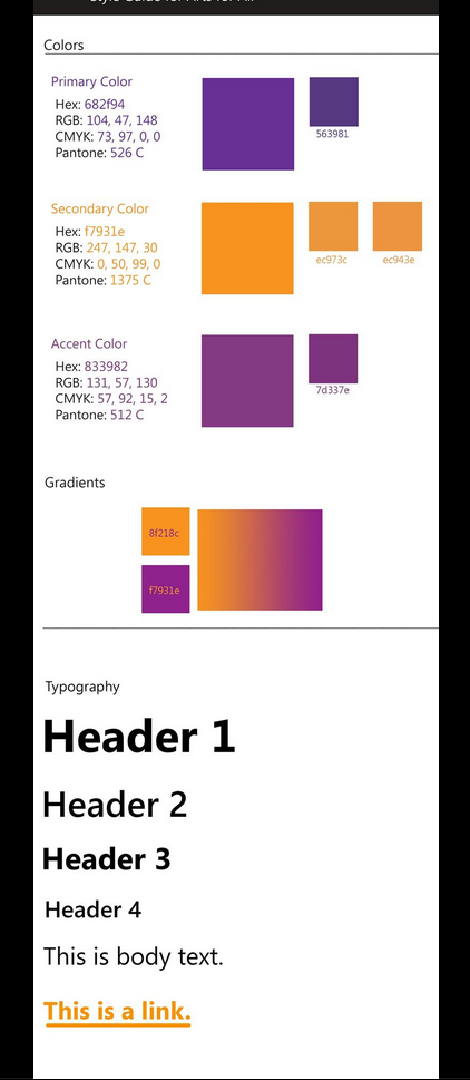
The goal was to use stylistic elements present in the existing site in a more effective way. To this end, we used one of the fonts on the live site (eliminating the somewhat silly looking handwriting font) and the live site’s color scheme. We focused on creating a “sunset” look with the orange and purples, to avoid the color clash evident in the current design.
Desktop
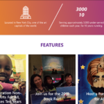
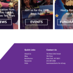
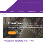
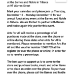
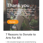
Note the design of the homepage compared to the original, which leaves more space between elements to reduce feelings of clutter and includes helpful “quick links” to useful pages within top level categories. In the “7 Reasons to Donate” page, note that your position in the site is always clear, as the top level category your current page is in is displayed in orange in the top navigation bar, while your current page is displayed in orange in the sidebar menu.
Mobile

Mobile specific design elements designed to reduce clutter include changing the navigation bar to an expanding menu (to keep the links from feeling cramped running across the screen) and blurring the rest of the page while the expanding menu is open (so it is easier to focus on the menu’s contents. I was particularly happy at the inclusion of a secondary expanding menu on pages other than the home page. This menu indicates position in the site in the same way as the desktop prototype’s sidebar menu, a feature that my research showed was very popular.
Conclusion
The response to our digital prototype from evaluators was generally positive. In particular, we were commended for our modern, attractive visual design and our image choices, which gave the page a fun and inviting atmosphere. Furthermore, we were able to avoid issues of editing and proofreading that were noted to plague website prototypes. The main criticisms of our design revolved around its readability. Some orange text was not always visible against images, our homepage quick links were not readily identifiable as buttons, and text on the mobile site was judged to be a bit too small. Our evaluators also advised us to consider the depth of a site’s content before designing for it, as some of our design elements were created to support much more content than AFA actually has to display. These criticisms aside, our design was ultimately well-regarded and considered a substantial improvement on the existing AFA website.