Introduction
The Metropolitan Transportation Authority’s (MTA) Interactive On the Go Kiosks were first introduced in 2015 and over the years they have provided New Yorker’s and tourist with a one-stop station for navigating their way in, out, and around the city. You can conveniently find directions from your current station to the Empire State building, get real time information on arrival time of the next train or service status information that may affect your travel.
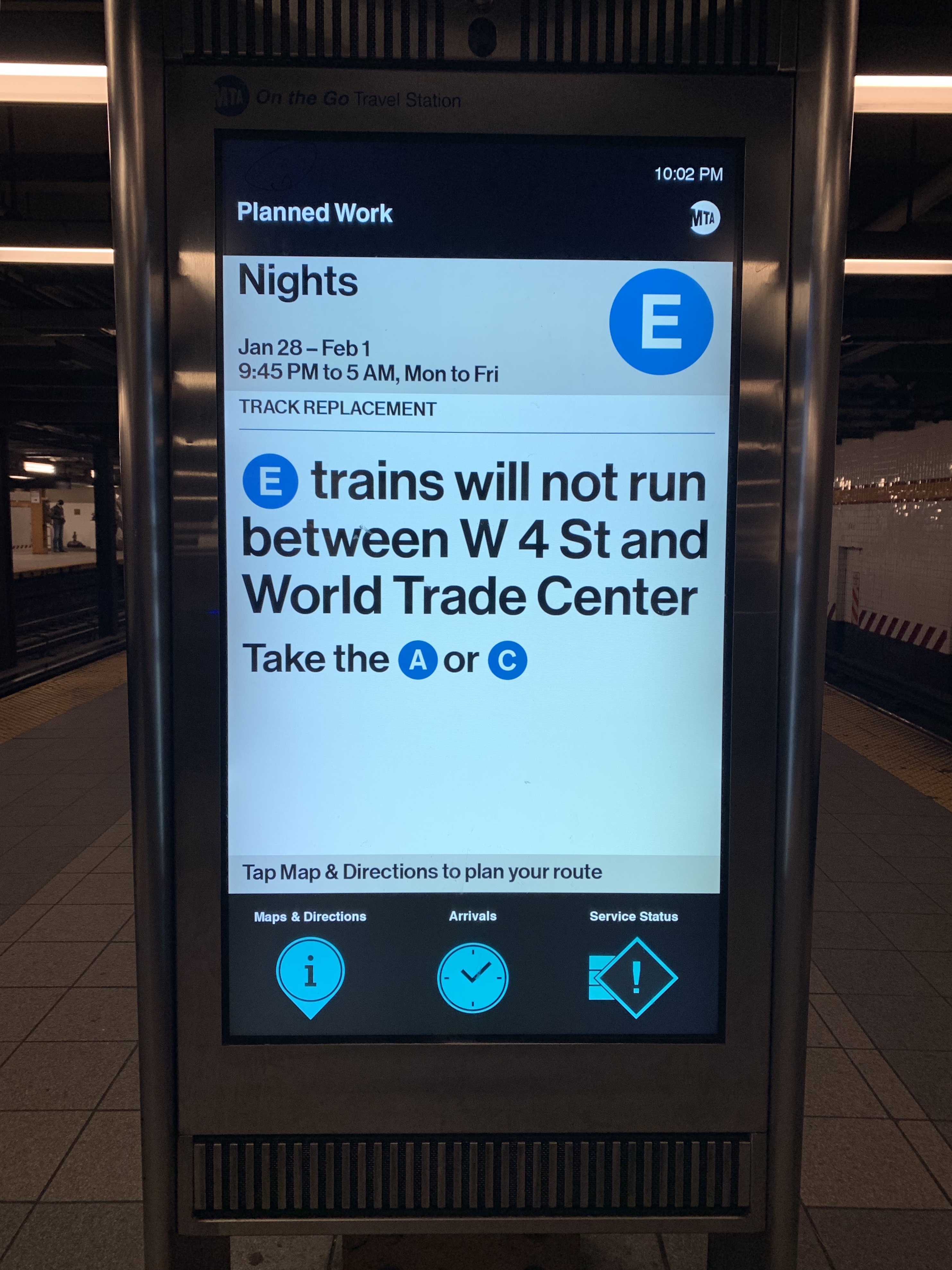
Figure 1 – Picture of the MTA On the Go Kiosk I used to do the design critique. It is located in the 14th Street Station (A/C/E and L trains) near Pratt Manhattan Campus.
Design Critique
To begin, the On the Go kiosks provide good clues of discoverability on the possible information a user can find with this device. Not only the physical placement, typically in the center of platform, but also the physical nature of it. It is a solid metal structure with a large illuminating screen. It affords interaction from passersby. An interesting advertisement may catch a potential user eye as they walks by or approaches the kiosk but as they scan the display they notice three large blue labeled icons in a black box. The placement, layout, and format of these buttons resemble the apps you would find on your smartphone and therefore there is a perceived affordance of interaction by pushing (tapping the screen). With this examination of the kiosk, the Gulf of Execution and Gulf of Evaluation become clear on how to operate and interact with it’s digital interface.
Figure 2 below illustrates that these icons are always visible, even when an advertisement is running. The designers purposely did this to avoid confusing the user into thinking it was just another one of the many digital advertising billboards in New York’s subway.
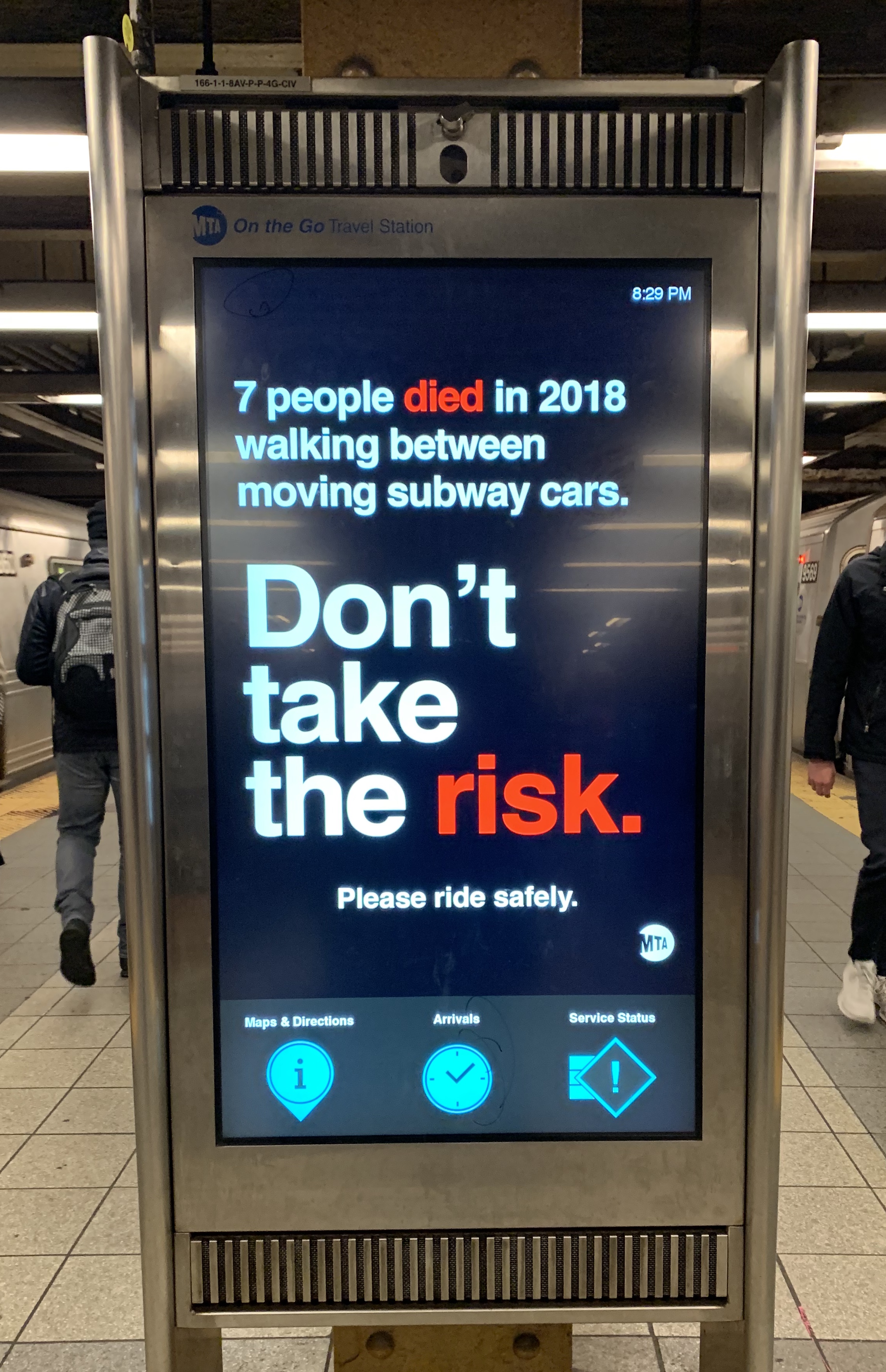
Figure 2 – Example of an ad by MTA promoting safety and caution when moving between subway cars. As you can see the three buttons for “Mapping & Directions”, “Arrivals”, and “Service Status” are displayed even when an advertisement is running.
Furthermore these three large blue icons or buttons, labeled (in English) as “Mappings & Directions”, “Arrivals”, and “Service Status”, act as signifiers telling the user what information can be retrieve by interacting with the screen. The images for each button is unique and distinctive: a map pin with an “i”, a clock, and a diamond caution sign with an “!”. It’s no coincidence these images are similar to other buttons or apps used in other applications such as Google’s Patented Maps Pin icon or the use of a Modern Traffic diamond caution sign. The use of a similar images which users are already familiar with help them bridge the Gulf of Execution and Evaluation to the their mental models.
In Don Norman’s book, The Design of Everyday things, he mentions that “Designers need to ensure that controls and displays for different purposes are significantly different from one another”. This same principal has been applied here and the use these “always on display” distinctly labeled buttons support visibility and mappings between the intended actions and actual operations or information in which they will retrieve.
Q: Wondering how long it will take for the next C train or bus to get to the current station?
A: Select the “Arrivals” button to show how many minutes it’s away as seen in Figure 3.
Q: Want to take a detour to see the 9/11 memorial?
A: You can plot your route by pressing the “Maps & Directions” button as seen in Figure 4.
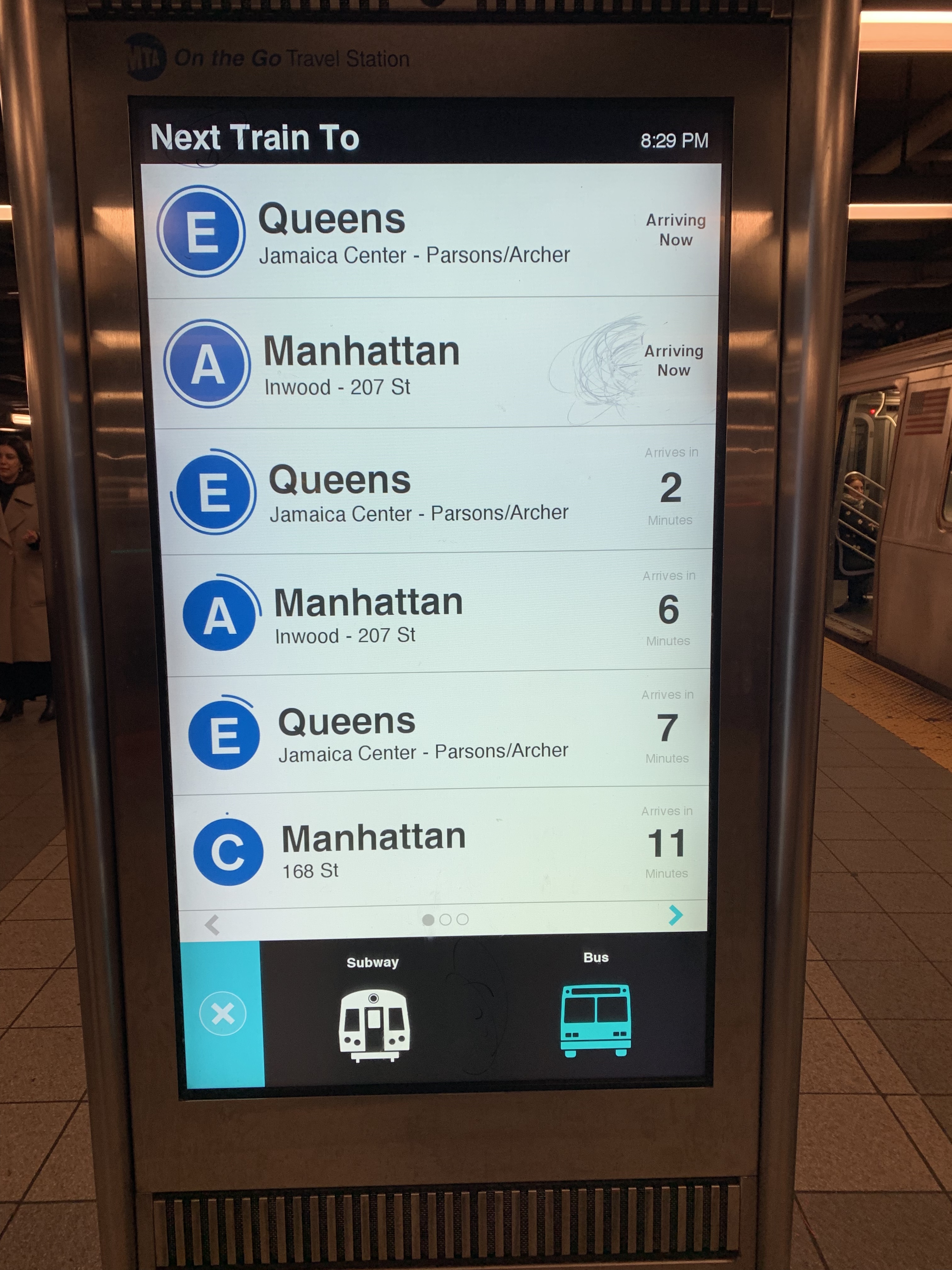
Figure 3 – After pressing the “Arrivals” Button, the next will screen shows the approximate arrival times the next trains to your current station. You also have the option of finding bus arrival times near your current station as well by pressing the bus button/icon.
As far as I could tell the kiosk doesn’t emanate sound despite having what appears to resemble speaker grills at the top and bottom of the display. However it does provide perceptible immediate feedback by quickly transitioning (in less than a second) to a different screen after pressing any button. For example in Figure 4A, after pressing the “Maps & Directions” button the screen transitions to a zoomed out map of your location/station and with directional pad for navigation. In addition to the signifying directional pad, there are clear instructions (‘Tap Any Station’) to further inform the user the map is interactive.
A.
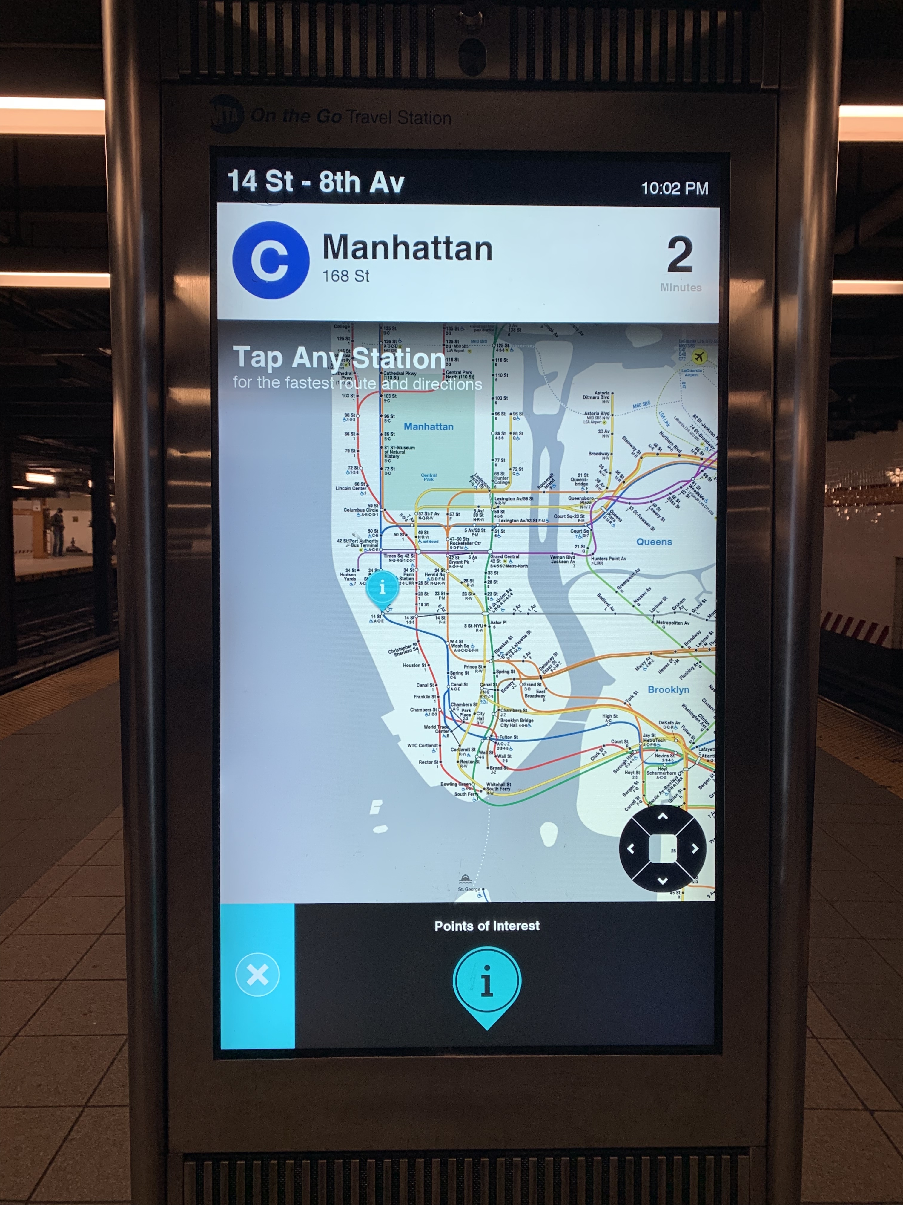
B.
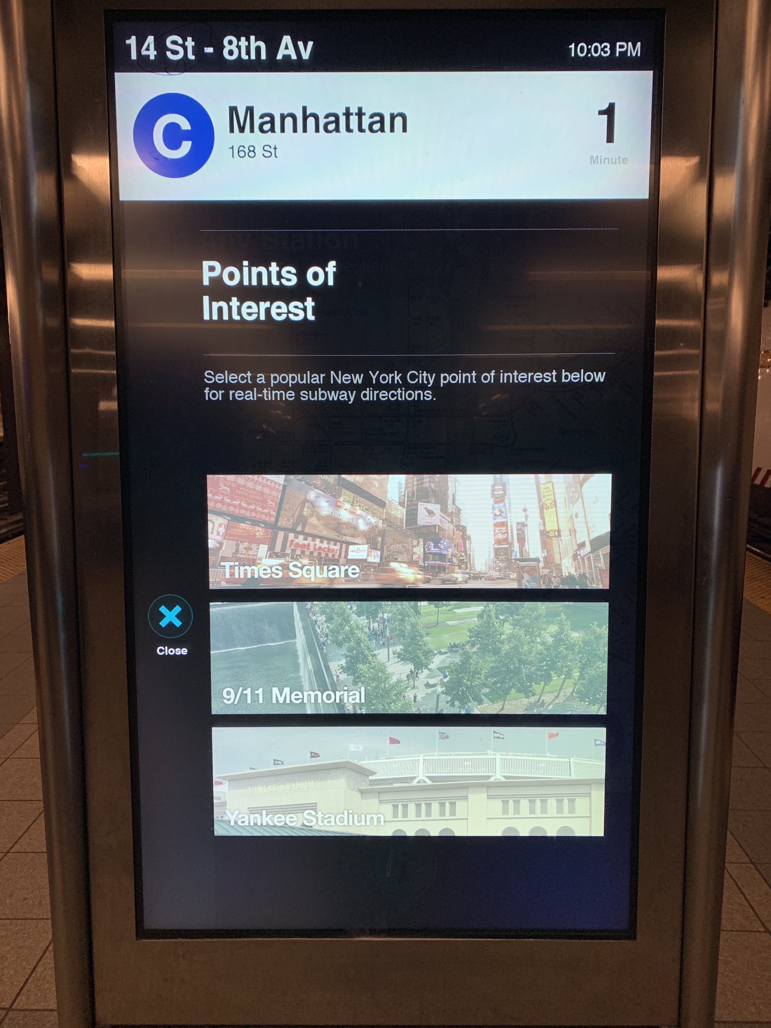
C.
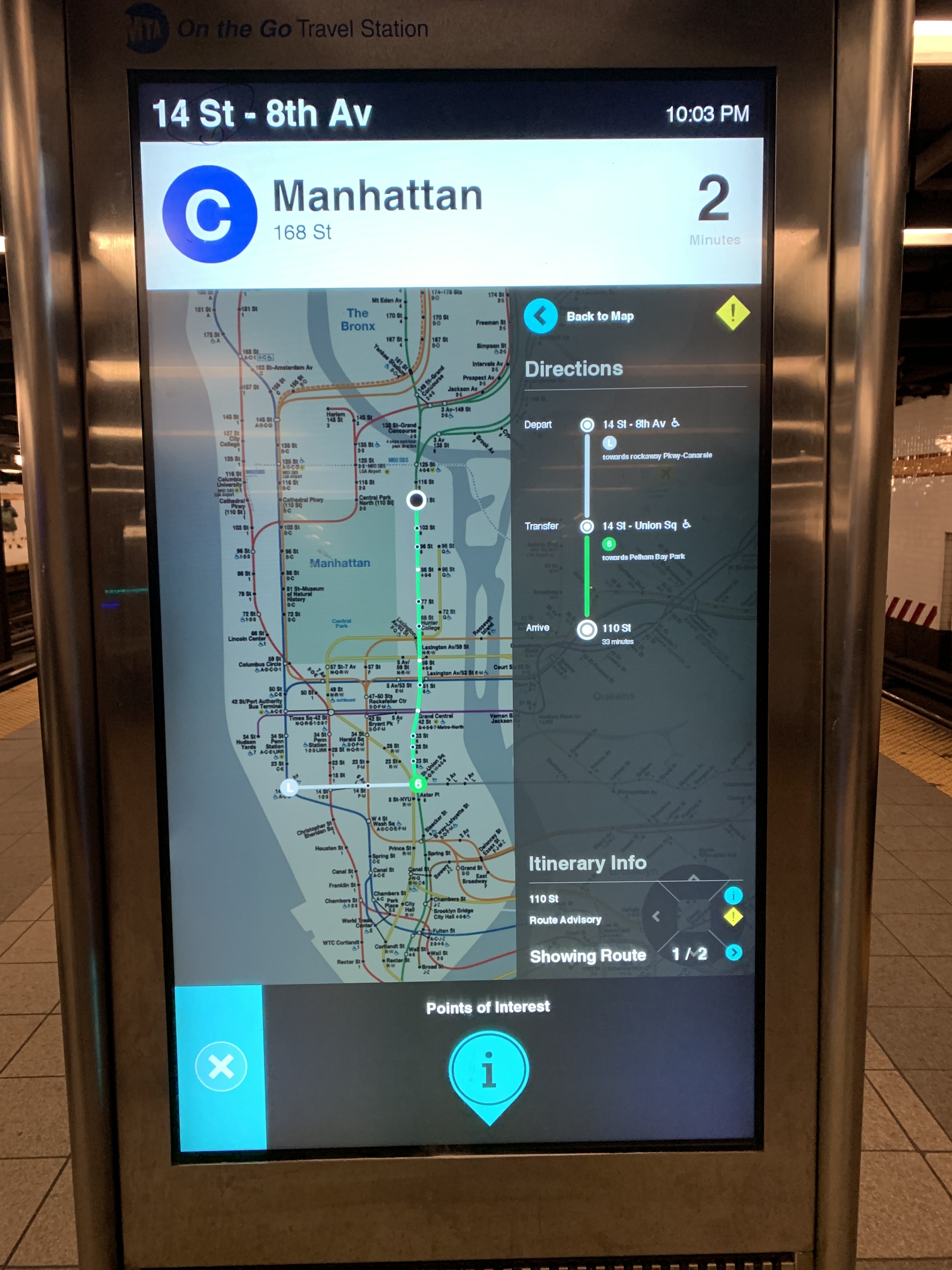
Figure 4 – In picture A, at the bottom of the “Maps & Directions” screen you will find an “Points of Interest” option. This button brings up curated list of various NYC landmarks such as Times Square, 9/11 Memorial, or Yankees Stadium. In picture B. you can select one of these landmarks to bring up information and have an option to get directions on how to get there as seen in picture C. Notice each one of these windows have a circled X, which allows the user to go back to the previous screen.
As seen in Figure 4, you will find a new signifier, a circled X button. This button allow a user to exit the current screen and go back to a previous one. The convention, a type of constraint, of using an X button to close/exit is common practice in variety of applications we use today and this method is consistently used throughout the interface.
The repeated use of the same button icons and functions (map pins for directions, clocks for schedules, or circled X’s to close/exit) with their dominate blue color drives consistency throughout the interface and not only affords but signifies what is interactive and what is not.
Recommendation
A potential option for users is to provide the option to change the language used in throughout the application’s labels, directions, and navigation. While the icons themselves are similar to other icons used in other applications (ex. Google Patented maps pin icon) they may be initially misunderstood and misused as they could mean different things (mapping/constraint) depending on the cultures. When discussing culture and design in the DOET, Don Norman mentions “What is natural depends upon the point of view, the choice of metaphor, and therefore, the culture”.
A perfect example of culture effecting natural mappings and a cultural constraint is the actions of the Playstation controller buttons. In the Japanese culture X means NO/Cancel and O means Yes/Confirm and the button’s reflect that, in western cultures this layout is reversed. Having the option to change the language from the default language of English to something else could improve discoverability and understanding of the interface.
Summary
Overall the MTA’s on the Go Kiosks is well thought out and its use of affordances, signifiers, immediate feedback, and mappings presents a strong example of a user-centered design product. It is easy to use and understand and has a simple design that enables discoverability to a variety of information that will help people navigate their way through the busy streets of New York City. All these things put together provide a great conceptual model on how it works and what information is retrievable.