
Introduction: Beauty Plus is a camera application produced by Meitu, Inc. This application allows people to adjust their photos in a fast and easy way. Users can change the tone, contrast, filter of their photo. They can even beautify their photos by covering their acne, black circle, changing their body size — become taller or slimmer, modifying their facial features — magnify the eyes or take the weight off the face, and so forth.

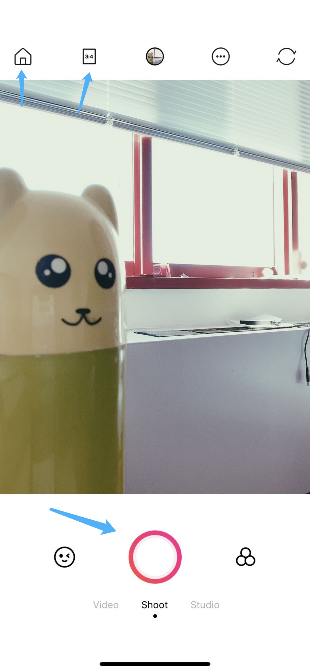 Figure1 Figure2
First of all, the discoverability of the application is very strong and obvious. There is a big camera image button at the bottom of the home page(Figure1). It shows me that this is a camera application and I can take photos with it. After I press the camera icon, the window shows up(Figure2). The big circle under the viewing frame is visible and the function of the circle is demonstrated clearly under it. Besides, the circle is also a good signifier which provides clear meaning that I can press or touch it to take photos. What is more, the small house icon on the upper-left side is also a good signifier which shows that I can return to the home page if I press it. The icon next to the house icon shows a good constraint that I can only adjust the frame size of the photo through this button. When I press this icon, the viewing frame changes accordingly, which gives me good feedback. Last but not least, I can press the different words under the circle to change the function at the bottom of the screen, which brings a good mapping. When I press the left word, the mode change to video recording and when I press the right word, the mode change to photo shooting.
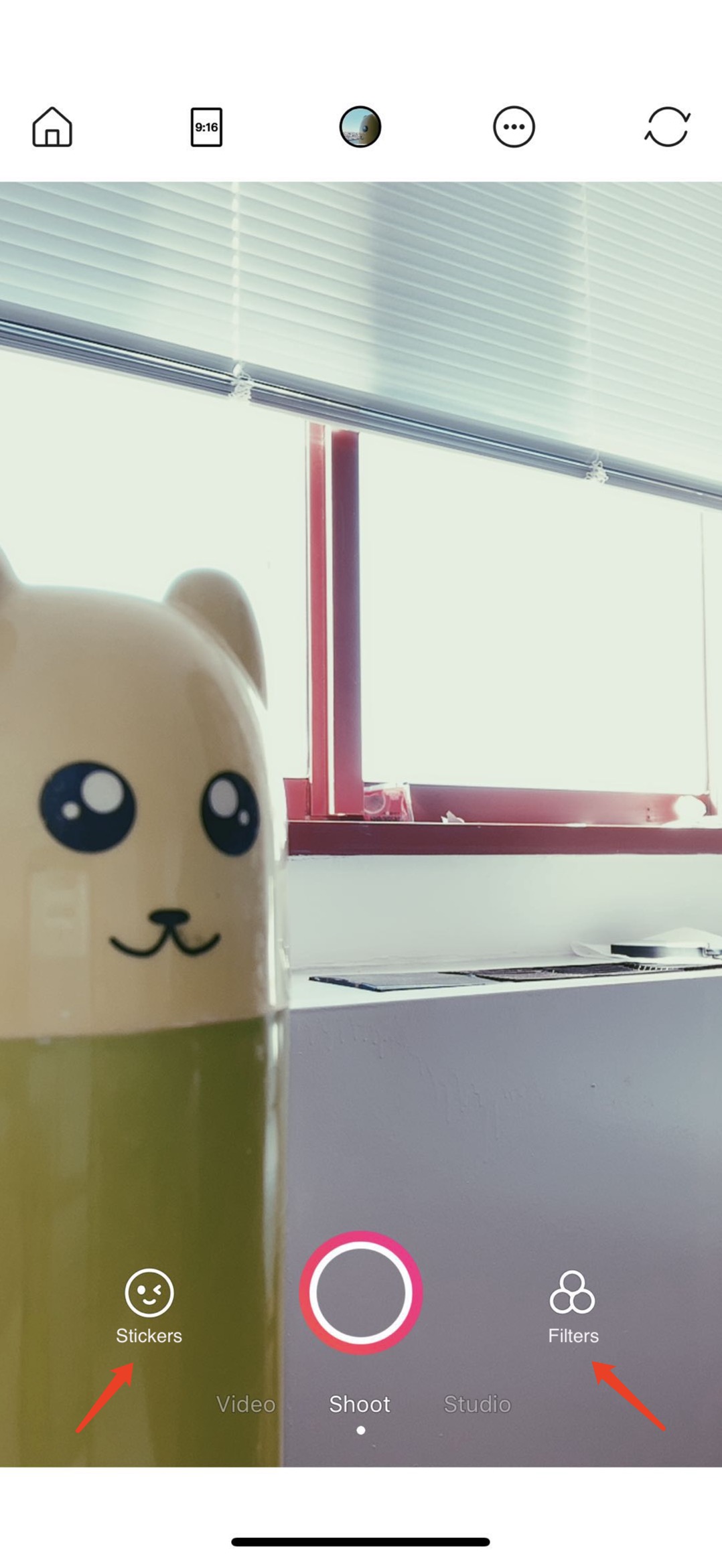
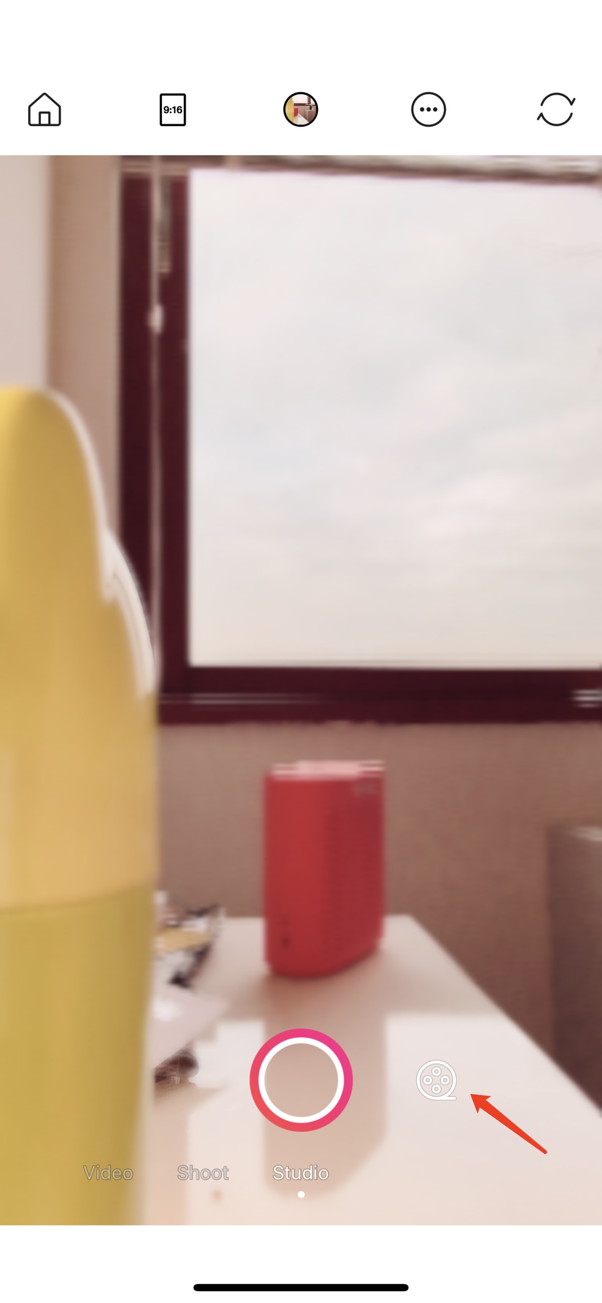 Figure3 Figure4

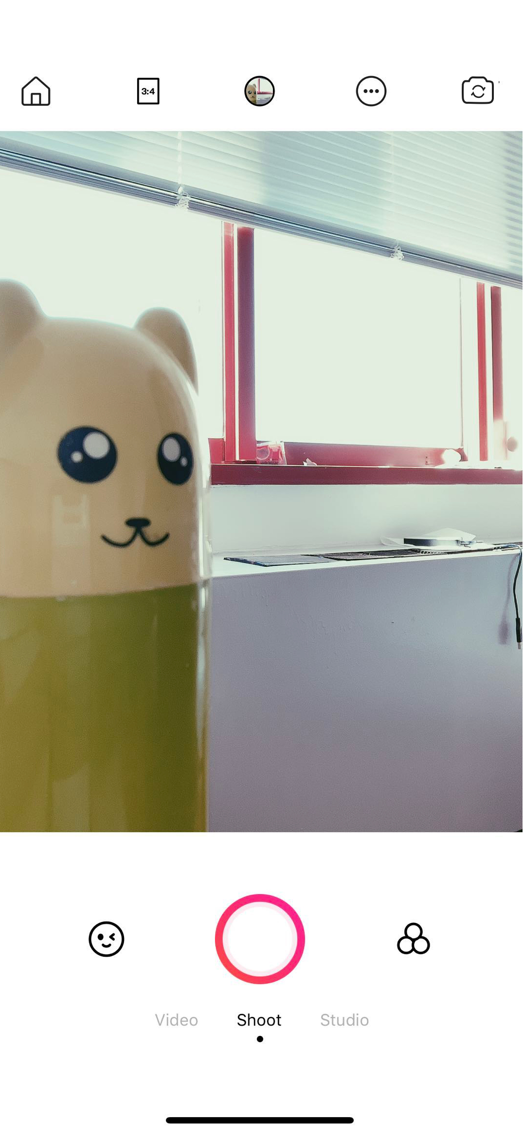
Figure5 Figure6
Overall, the design of this App is good and user-friendly. However, there are several bad designs in the application. First, there is no description or explanation word under the icon on both sides of the photo shooting button(Figure2). I cannot figure out the function of the two icons intuitively. Actually, the icon on the left allows me to add stickers or cartoon images to the photos and the icon on the right allows me to change the filters. This design is a bad signifier, which cannot offer me a clear guide or tell me what operation I can take after I press the icon. To improve it, the designer just needs to put the function names under the icons, for example, “Stickers” under the left one and “Filters” on the right one(Figure3). Second, the film icon is a bad design(Figure4). In our conceptual model, the general meaning of a film icon means the users can record a video by pressing it. However, in this application, by pressing the film icon, I will take a photo and add the film filter to the photo instead of making a film. What is more, the studio function is a minor function. It only allows me to change six filters. To improve the function and connect the action better with its result, the designer can move the studio function under the shoot function as the secondary selection, which allows me to I add filters to photos and make the photos look like the frames of the film. Third, the icon on the upper-right corner is a bad signifier. It looks like after I press the icon, the application will try to update or sync data(Figure5). But in fact, the function of the icon is to switch between the front and the back camera. To improve it, the designer can embed the original icon into a camera icon to make the function more recognizable(Figure6).
Generally speaking, this App is not the same as the conventional camera. It contains technology and algorithm which can help the users to adjust their photos in an easy and convenient way. For example, a user wants to post a photo on her social media App(Goal). She takes a photo and comes up with the idea “I want to make my photo looks better(Plan). My eyes can be bigger and I will brighten my tone of the face”(Specify). Then she opens the App finds the function and adjusts the size of her eyes and the tone of her face(Perform). She sees the result and she is not satisfied with it(Feedback from the screen). She makes her background color darker, which makes her figure stand out better(Compare with the previous result). Then, she posts the photo happily. These are the stages that Don Norman mentioned in his book and I think they clearly point out a user’s experience when she/he interacts with the world.