Introduction
GrubHub is a service that allows people to place food orders for pickup or delivery to local restaurants, either online or through their phones. It boasts a huge selection of local restaurants as well as fast food chains for their customers to choose from.
Critique 1
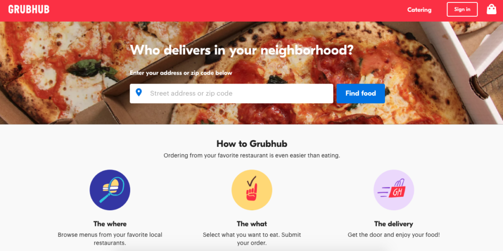
When first entered, the website greets you with this page (Fig.1). It is a good example of Human Centered Design. It first starts off by asking the user, “Who delivers in your neighborhood?” as opposed to a more calculated, computerized question like “Where are you located?” The action of choosing your location is centered on the page and is one of the only things that you are able to do, making it simple to understand the next step that needs to be taken, Normans design principle of Visibility is present here. Along with the location finder, the user is presented with infographics that state exactly what the user is expected to do. along with making the page more appealing it makes concrete the end goal of using this service. Enter your desired location and hit the “Find food” button and you are off to the next page.
Critique 2
Once the user has entered their address or zip code they are sent to a page that is overrun with options for food and deals, and different ways to filter the content (fig. 2). It is a marked difference from how the user first entered the site. the minimalistic view that graced the landing page is now gone and the abundance of options is placed in its stead. While the feedback that is received when a filter is clicked is fine, the gulfs of execution and evaluation are not hard to discern, I feel that a more guided experience would be helpful in the first stages of using the site.
Recommendation
If, instead the site took you through all the filter steps (price, rating, distance, etc.) one at a time the end result of all the options being displayed at once wouldn’t be so jarring, as the user has had a chance to look at each piece individually first. Some constraint would make the experience feel more like gradually entering the pool, than being thrown into the deep end.
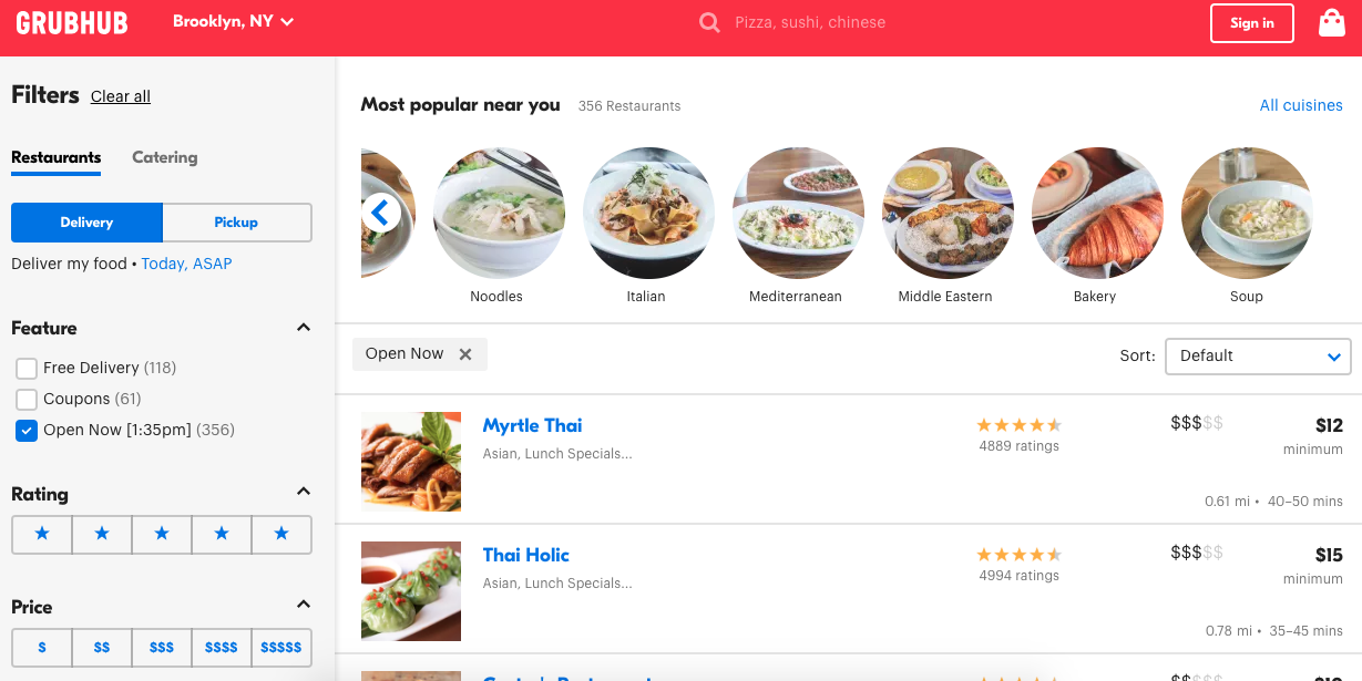
Fig. 2
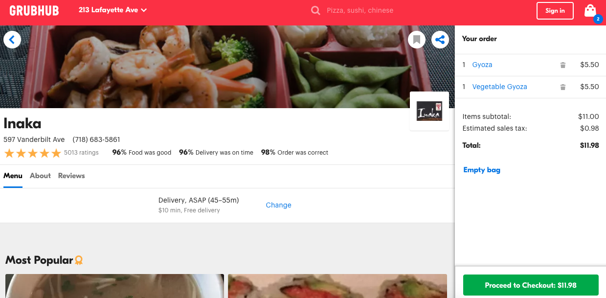
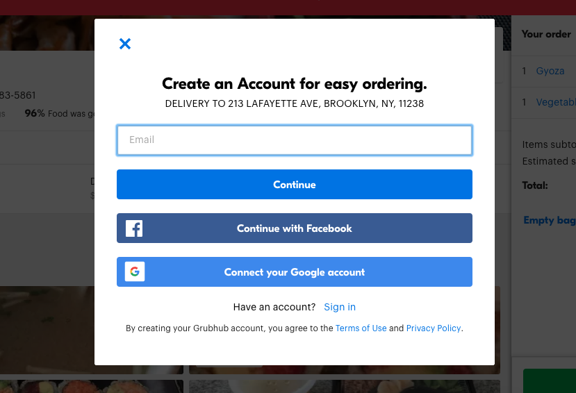
Critique 3
When you have chosen the restaurant and your food options there is a handy sidebar to the right of the screen that, in real time, adds the items to your checkout bag and updates the total amount you are spending (Fig. 3). As you reach the end of choosing your meal only now is the idea of signing up for the service presented to you (Fig. 4). The user is given a variety of options in order to finish the process of ordering. It is a streamlined process that is made simple by the use of photos and well proportioned text, as well as grid-like sections that make sure everything has a place and everything is in that place.