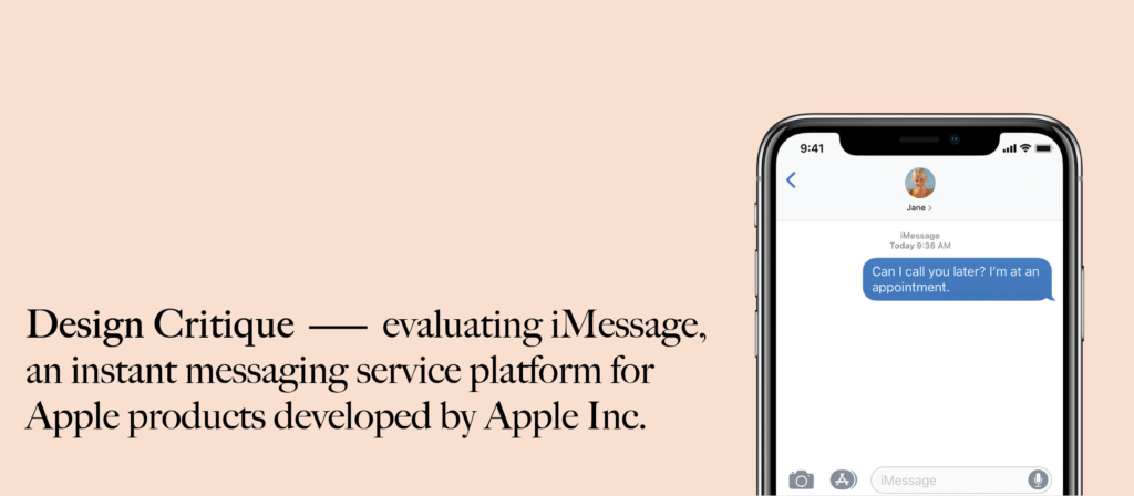
Introduction
In this design critique assignment, I will apply concepts discussed by Don Norman in The Design of Everyday Things to evaluate 4 attributes of iMessage, an instant messaging service platform designed by Apple in 2011, which allows a user to send message, attachment, contact information and money transaction. In general, the application itself has a simple and understandable interface in terms of basic task like sending a message, media, and etc. Below are 4 critiques that I would like to emphasize:
1.Hypertext on incoming message (Positive Experience)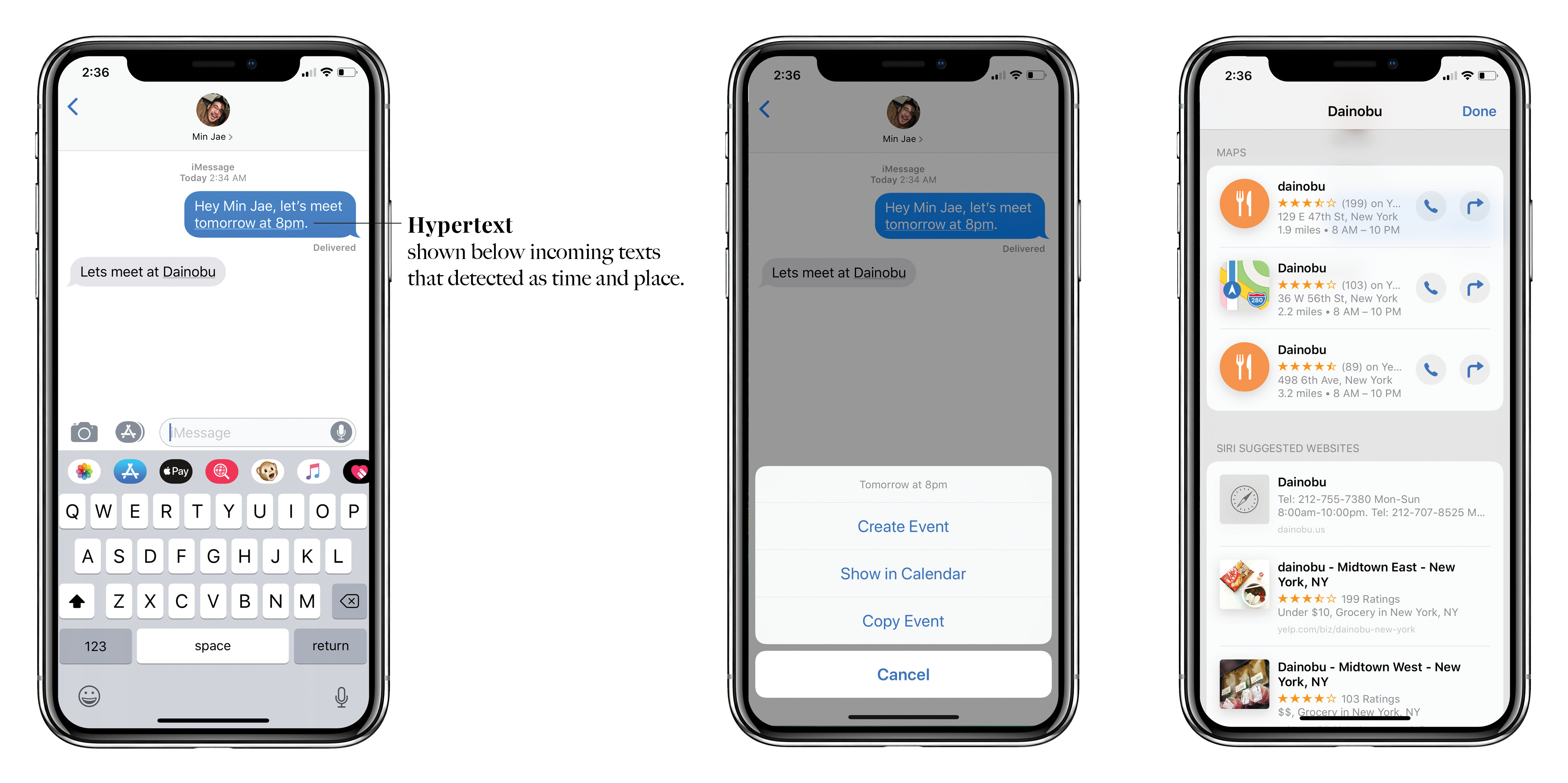
Firstly, I want to discuss the new iMessage feature on Apple’s IOS 8 which converts specific incoming messages into hypertext. Incoming texts like names of a landmark, restaurant, time, artist and etc. are seamlessly converted into clickable hypertext that connects user to other Apple application like Siri, Apple Maps, Calendar and etc. In my opinion, this feature has:
- Great feedback by giving underlined dots under the text that creates discoverability for users to know that it is a clickable hypertext.
- This feature provides knowledge in the world because it reminds users to set upcoming events in the calendar as a reminder.
- Since this feature is quite new, it has an obstacle which disables hypertext feature with venues that aren’t well-known and time will also not be converted into hypertext if it isn’t supported with a specific hour (if the user types tomorrow instead of tomorrow at 8 pm, tomorrow won’t be converted as hypertext). This is one of the examples of logical constraint discussed by Don Norman.
2.Imessage ID (Negative Experience)
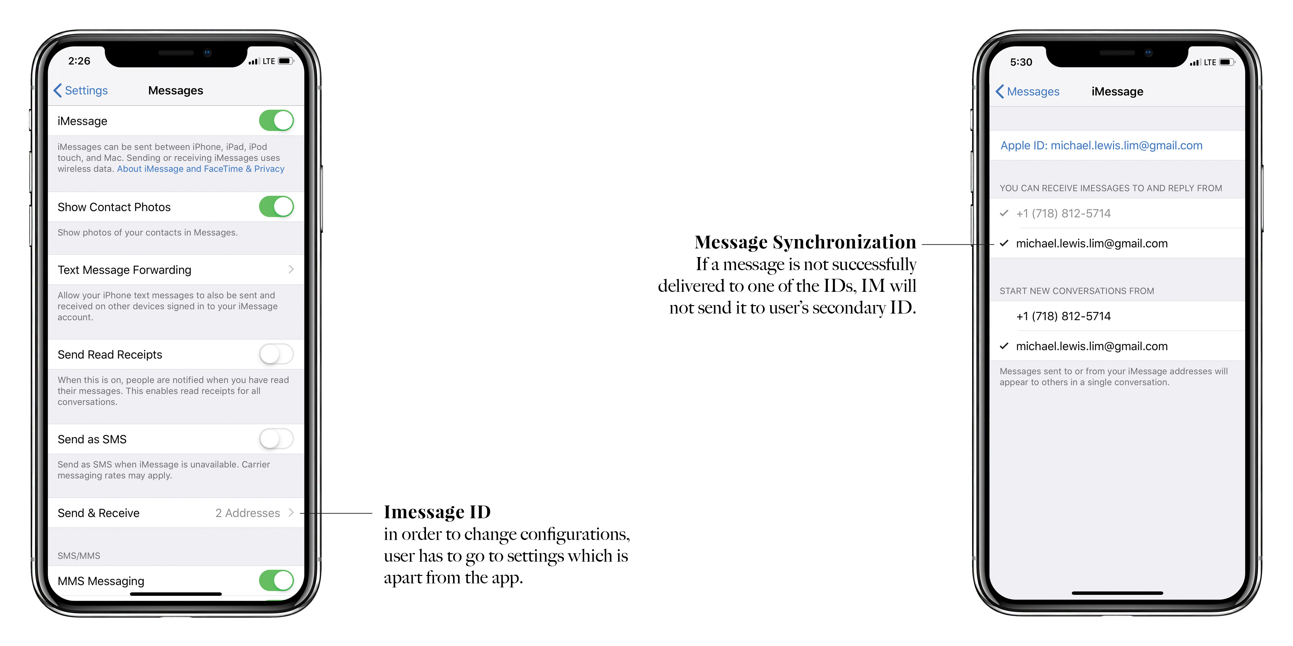
Secondly, Imessage ID can be based either on user’s phone number or Apple ID or both. This might look very convenient at first, but for someone who travels frequently, this is one of the worst iMessage UX flaws.
- The cultural constraint in the U.S encouraged users to use iMessage as their primary social networking service since the majority of people in the U.S. are using iMessage. Also, the majority of people would exchange contacts through phone number instead of Apple ID/email.
- Continuing the evaluation above, when users travel abroad, they usually change their SIM card and hence disabling users to receive messages that are sent to their U.S. number. This happened because iMessage separates messages that are sent to user’s email and phone number, although user set both email and phone number as his/her iMessage ID.
- It has bad signifiers because users have to go to settings which located apart from the application to configure all the ID settings.
I believe that if Imessage could synchronize messages that are sent to both user’s phone number and email, it will create a better experience for the users.
3.Sending Attachments (Negative Experience)
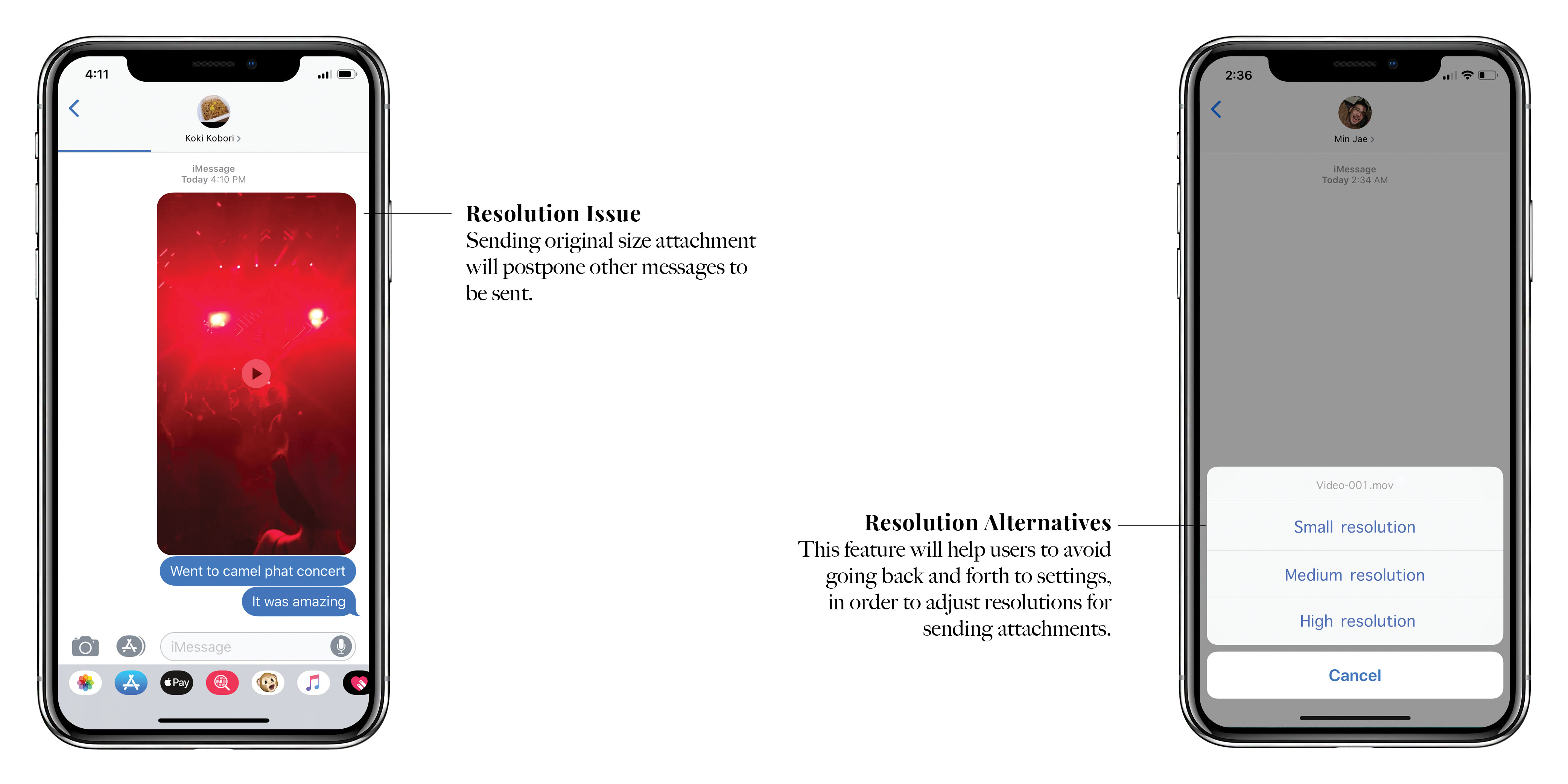
Thirdly, sending attachments in Imessage takes longer time because the default setting of the app was set to its highest resolution.
- It has bad discoverability for users because have to go to settings to set “low-quality image mode” to send media faster with lower resolutions.
- Unlike Imessage, Whatsapp has better signifier, it offers user different resolutions when sending attachments.
- Imessage prioritizes message/media that is sent prior. In other words, messages that are sent after, will not be delivered unless the media is successfully uploaded.
4.Time notification (Negative Experience)
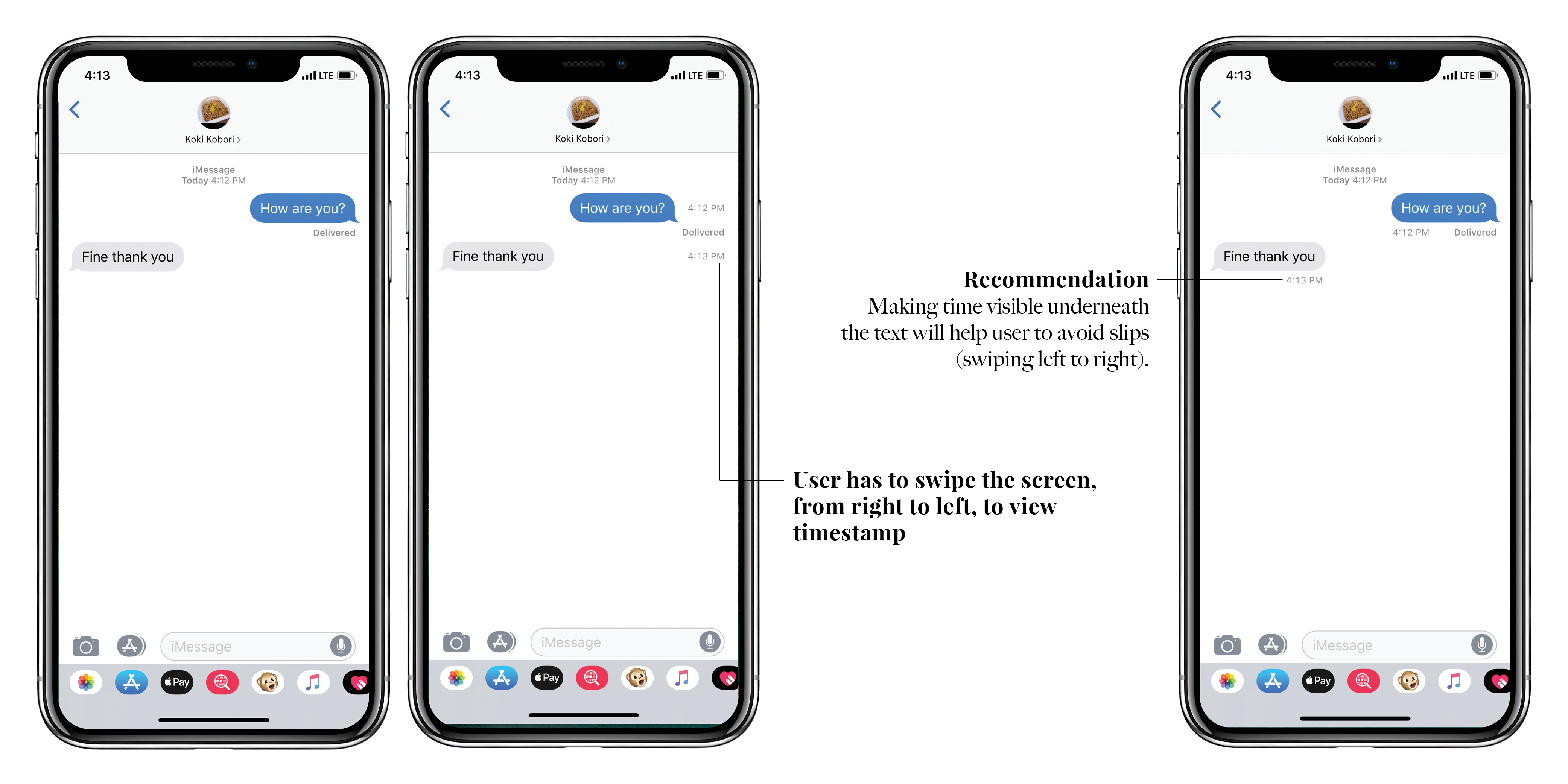 Last but not least, time of messages being sent and received is not visible unless user swiped right to left, from the right side of the screen.
- Imessage has bad discoverability because the timestamp is not visible, unlike Whatsapp and Line.
- However, iMessage provides a decent mapping element (third-based mapping), because once the user is confused, he/she will notice that the only way to show the time is to swipe the screen, right to left. (Swiping right to left is a familiar method to go back to the previous page for regular Apple users).
- According to Don Norman, novices are more likely to make mistakes than slips, whereas experts (regular Apple users) are more likely to make slips than mistakes. In this case, a few people that I observed, admit that they subconsciously swiped the opposite way to check the timestamp which caused them to exit the chat room instead.
- It is not an effective conceptual model because the designer of the interface assumes that the majority of users would understand based on their mental model.
In my opinion, Imessage should minimize task to be done by putting time underneath every messages that are sent and received.
Recommendation
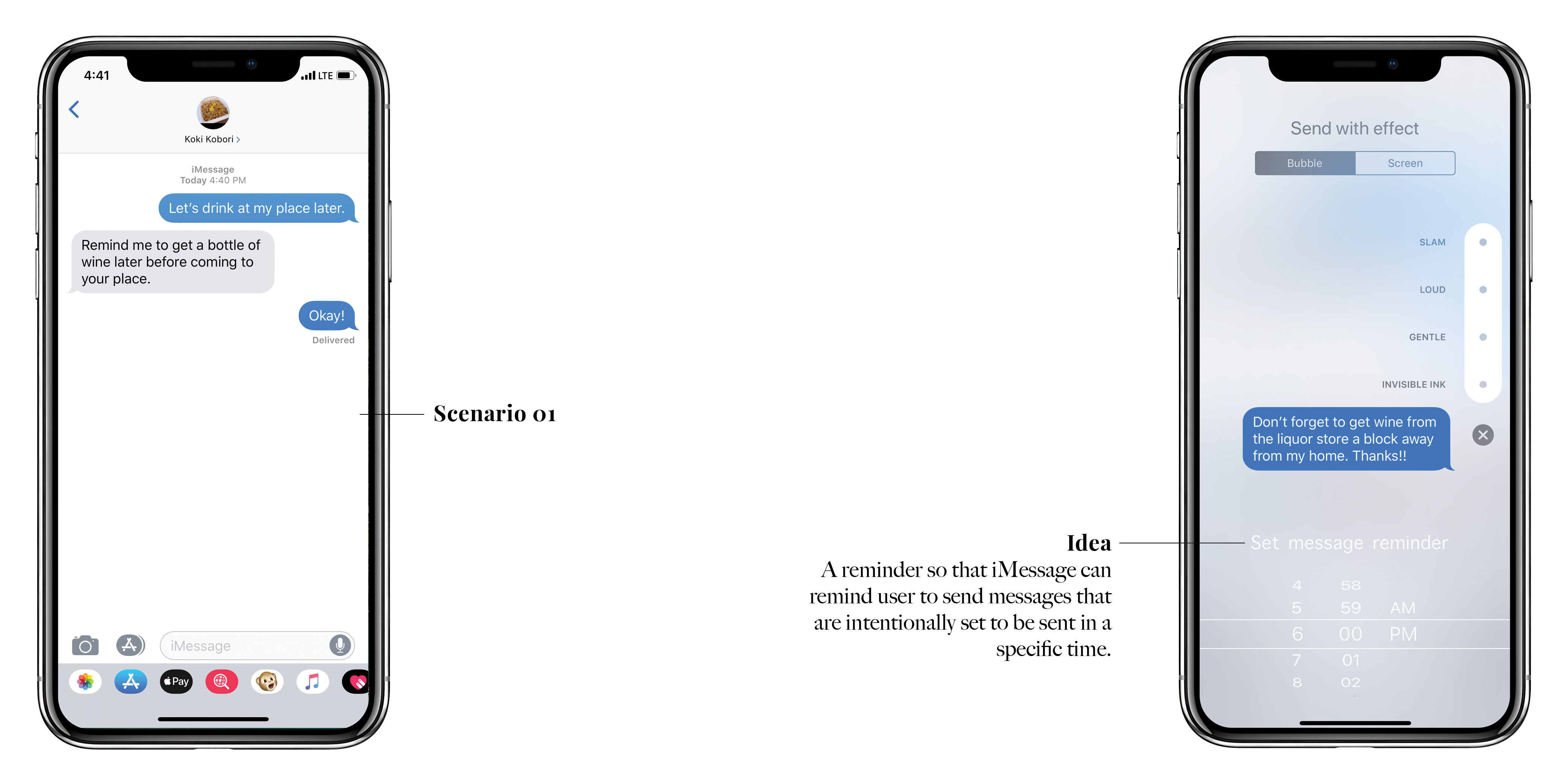 I would also like to finish this design critique by recommending an incremental idea for iMessage. I called it “reminder auto-send message”, the feature reminds users to send a message at a specific time chosen by the users. Not only it helps people to deal with their memory-based slip and interruption, this feature also supports feedforward theory by combining both knowledge in the world and knowledge in the head in order to complete a task.
Picture reference : https://support.apple.com/en-ca/HT207006