
Instagram is a popular application that is almost a decade old and whose mission has been letting people capture moments and instantly share them with the world. Over time, it has evolved as a platform that also helps people network, connect with friends, and find inspiration. It has a very streamlined and minimalist layout that puts more focus on the content.
Initial login

Figure 1
The application follows a very standard format in terms of the login process. It makes use of the concept of knowledge in the world, which lets the users log into the application effortlessly. The ‘login’ button (Figure 1) acts as a signifier and informs that the application affords logging in.
 Figure 2
On the usability front, the application provides several user prompts that help the new user navigate through the application (Figure 2). It also educates the user when a new feature is rolled out, helping them create the perfect system image.
Exploring new content
Once logged in, the user can scroll through the timeline to see the pictures posted by their friends. The home page has several key signifiers, giving the user easy clues to follow on how to proceed to successfully any task.
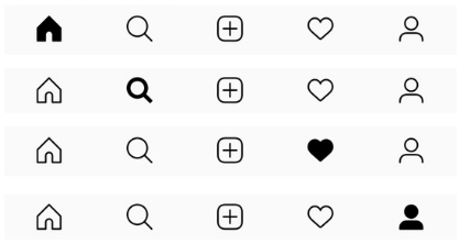
Figure 3
The bottom navigation bar uses natural mapping. It is in connection with the interface controls and gives a clear idea of what happens when the tabs are used (Figure 3), hence also employing knowledge in the world. The feedback mechanism of the bar tells the users what part of the application they’re exploring, by highlighting the corresponding icon on the bar.
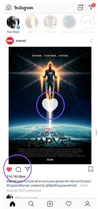
Figure 4
A post affords liking, commenting on and sharing. The icons below it act as signifiers informing where to tap. One can like a post even by double tapping on the image. But it lacks a signifier which would tell the user to do so. However, double tapping gives an instant visual feedback by highlighting the heart icon below the image and with a heart pop up (Figure 4).

Figure 5
If a post has multiple images (Figure 5), it has a count at the top right corner, informing the users that there are more images they can look through. Such posts also have a carousel design that lets you go back and forth in the order of images. The dots below the posts and the numbering on their top right corner give feedback as to where the user is in the stack of images. They also act as signifiers telling the user which direction to swipe in to view the entire thread of pictures.
Viewing Stories
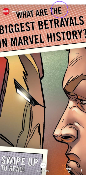 Figure 6
The story section of the application is easily discoverable. It follows a good conceptual model. You come across the concept of natural mapping when viewing someone’s story. You can tap on the left or right corners of the screen depending on how you want to move through the timeline showcased at the top of the screen. Here, logical constraints are also applied in terms of the duration that you can view each part of the story for (Figure 6).
Adding a new story
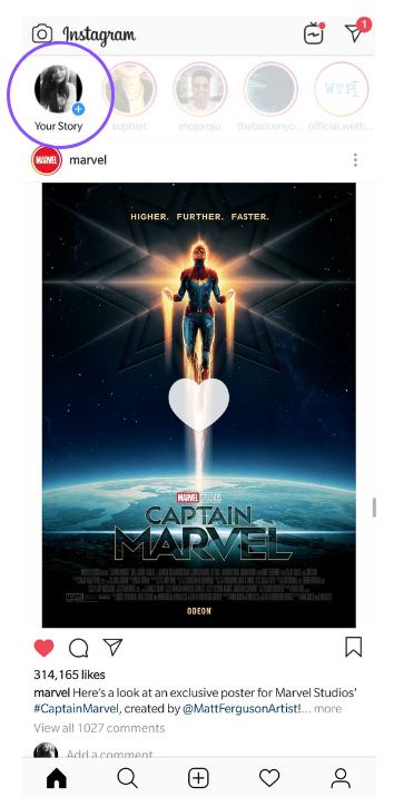
Figure 7
The function of adding a new story to the timeline is made discoverable. The picture bubble with the blue ‘add’ icon (Figure 7) tells you that it affords adding a story, wherein the icon itself acts as a signifier. However, when the user tries to upload a second story, a Gulf of Execution arises and the user makes an action based slip. The second story in the thread cannot be uploaded by following the same steps, causing the user to become frustrated at the visceral layer of processing, also causing learned helplessness. This results in a disconnect between the conceptual model and the system image.
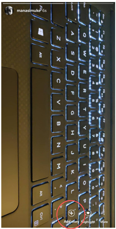
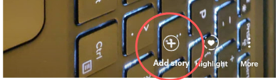
Figure 8
This gulf can be bridged by either placing some signifiers on the home screen or by adding an extra button on the story screen. (Figure 8 – Mock up).
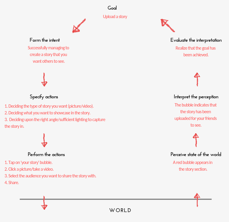
Don Norman’s seven stages of action are followed while using the application. Let’s take the example of uploading a story on your timeline.
Conclusion
Instagram is now used immensely for a variety of purposes, but it has room for improvement on the usability front in some areas. However, once you start playing around with its functions, it is easy to understand and navigate through.