Introduction:
Lyft is a transportation company that provides users with online ride-hailing services through a mobile application. The application matches on-demand riders with drivers and also allows payments through the app. Lyft operates in approximately 300 U.S. cities and provides over 1 million riders per day.
Critique 1: Home Screen
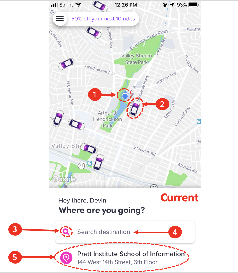
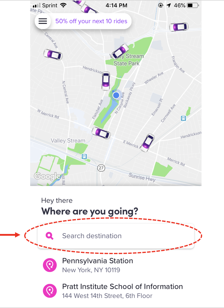
When opening the Lyft app, you are immediately brought to the home screen. This screen is a virtual map which shows nearby drivers in real-time as car icons. This home screen is a compelling conceptual model of how this application works. This is because the car icons moving in real-time, coupled with the clarity of the map represent the idea of how one may perceive traveling in a vehicle.
The home screen is well designed due to good discoverability, mapping, and signifiers. The overall mapping of attributes on the home screen allows for easy discoverability in regard to:
- Your current location signified by a blue dot with a white outline and a triangle pointing in the direction you are facing. I’m aware that the triangle that points out in the direction that I’m facing due toknowledge in the head. I’ve learned from other GPS apps that it is meant to face in the direction that I am facing.
- The location of nearby drivers which are signified by car icons.
- The magnifying glass which signifies that you may use this bar to search. This also follows the principal of knowledge in the world in that one associates a magnifying glass with searching.
- The label “Search destination” is another signifier indicating where the search should take place. Additionally, it allows affords searching for intended destinations.
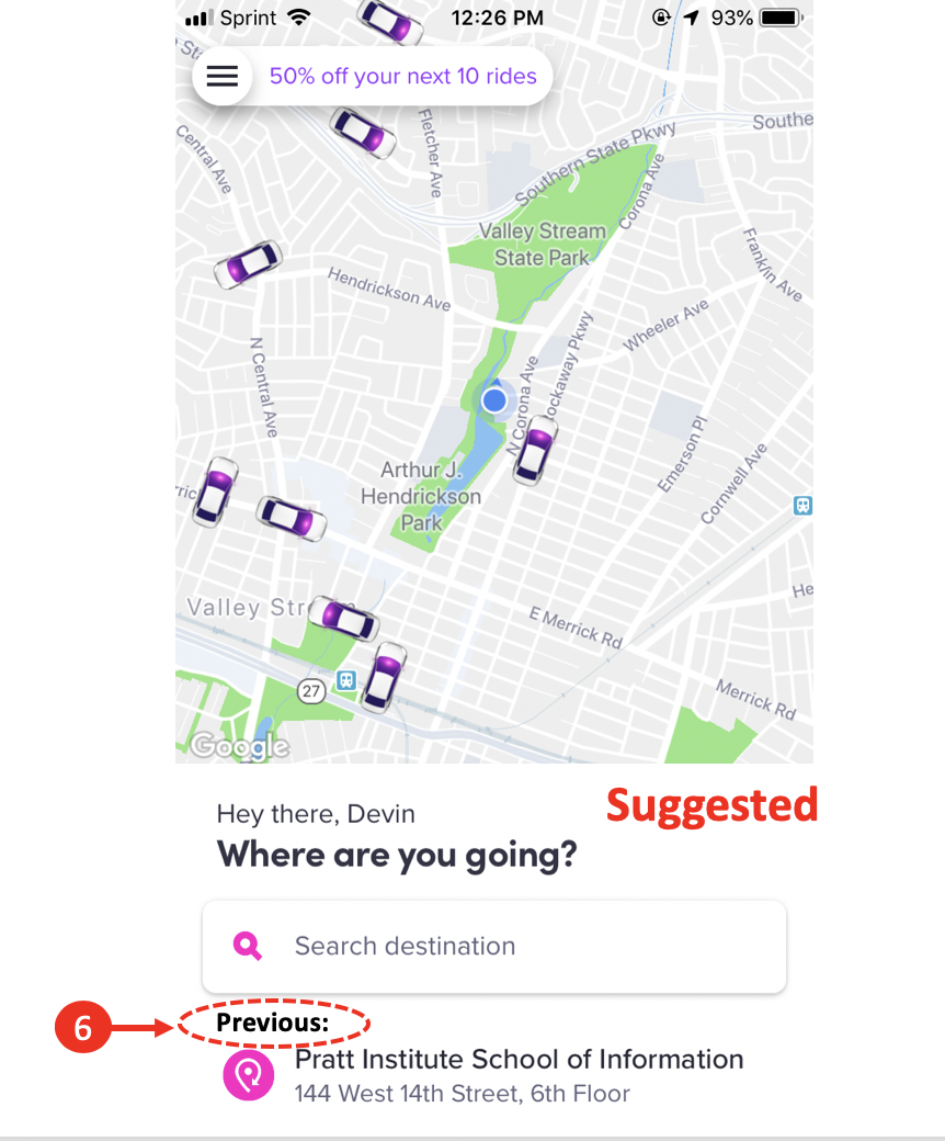
- Displaying a previous destination with an icon.
Overall, the signifiers, mapping, and discoverability are well designed. However, when displaying a previous location, there is no clear signifier informing the user that this has been a previous destination. The current icon being used as a signifier may not be effective since it requires knowledge in the head, acquired through repetitive usage of the application to learn that these have been previous destinations.
Solution:
A suggested solution for this would be to include an additional signifier, a label that says “Previous,” therefore users know that this location was a previous destination.
Critique 2: Hamburger Menu
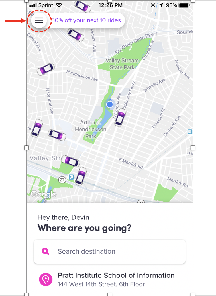
The home screen is designed for users to request cars to travel to intended destinations but there are several other options available as well. Some of these options are things such as ride history or access to payment information. Due the physical constraints of a small screen, the hamburger menu was implemented with clear feedforward intent as a secondary navigation to get to the other options. The mapping of the hamburger menu in the upper left-hand corner makes its easily discoverable. Additionally, it’s further discoverable by the appropriate icon as a signifier as well as being grounded in a white circle, increasing visibility and affording other options.
Moreover, the hamburger menu further offers immediate feedback as all options are shown once tapped on. The hamburger menu has physical constraints in that it cannot be pulled out any further than it currently does. It also does not allow for scrolling further than the options listed, and if one does then they will be automatically scrolled back to the list of options. This automatic scroll back could be interpreted as immediate feedback.
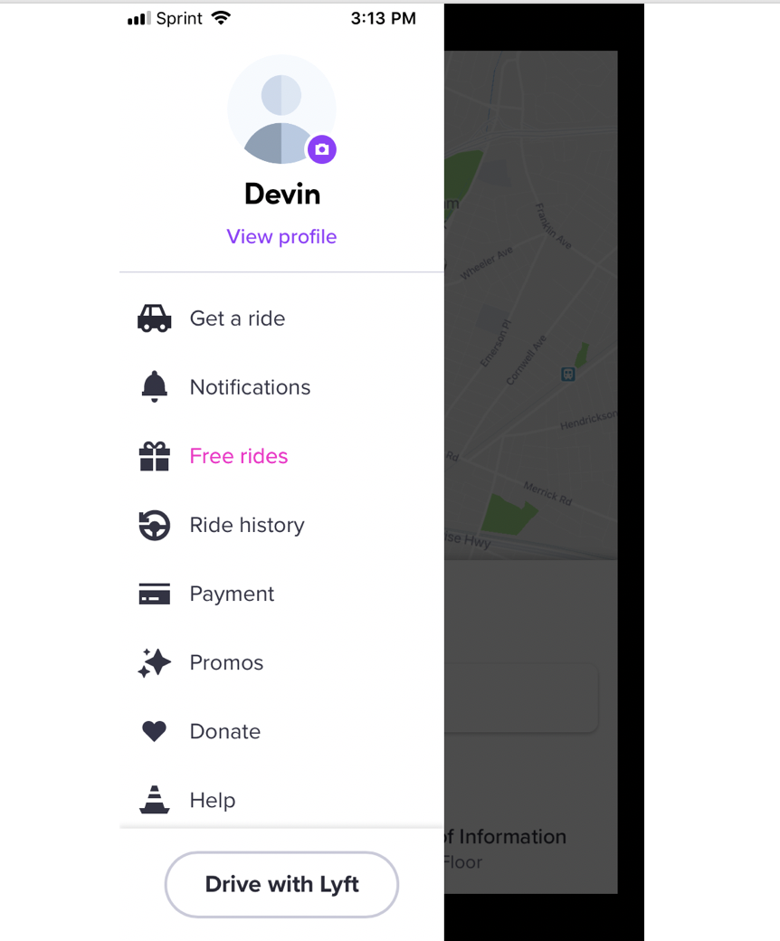
However, there is one design flaw that comes to mind when I use the hamburger menu. After clicking into on the options, I was no too sure how return the previous screen. The signifier that is currently used three dots in the upper left-hand corner. I feel that this could pose a problem for users that do not have knowledge in the head, due to previous experience with the app.
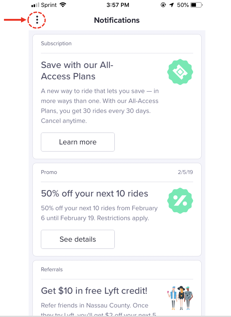
Solution:
Replace the three-dot signifier with a back arrow instead. A back-arrow signifier uses intuitive feedforwarding for users to return to the previous page.
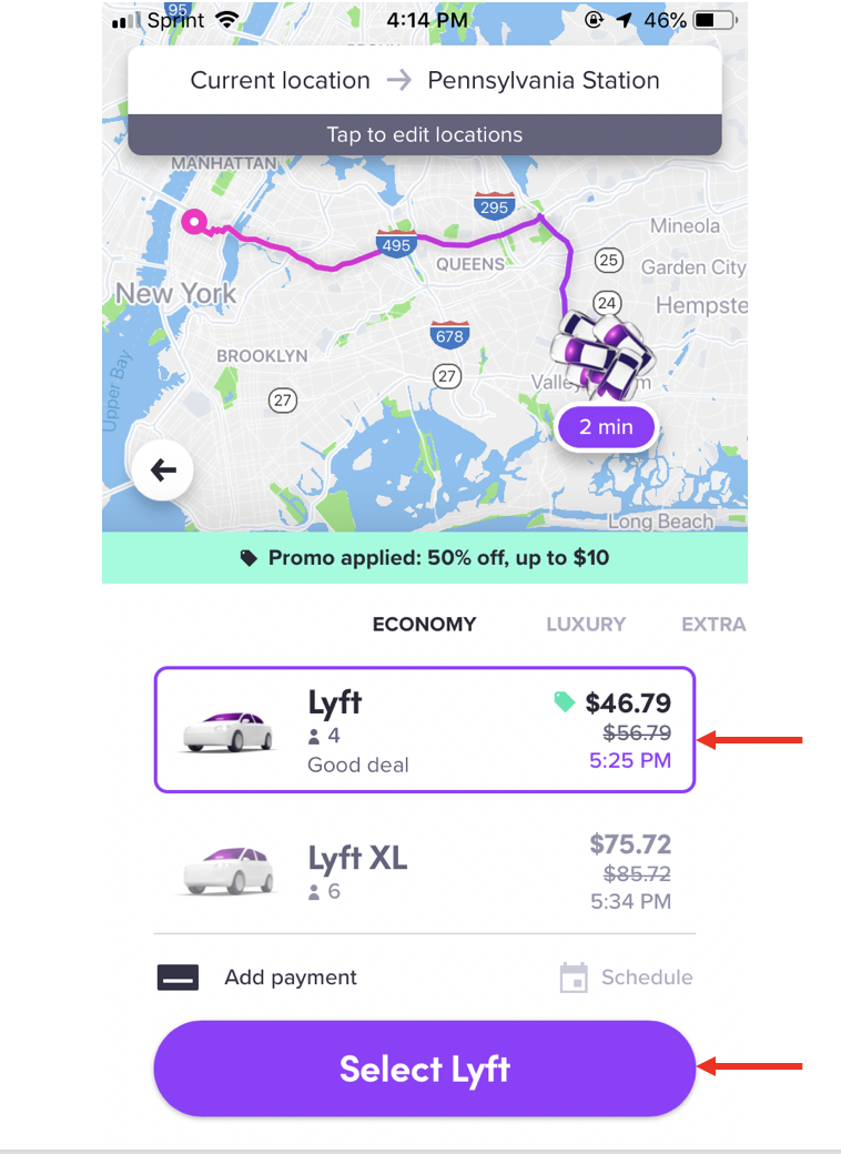
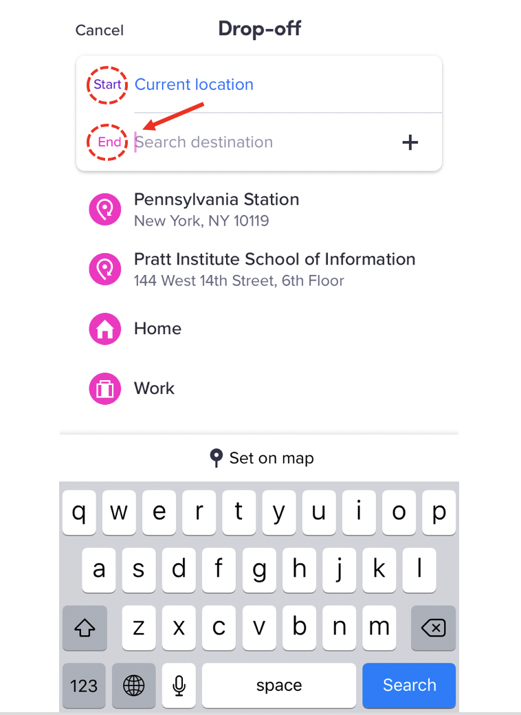
Critique 3: Ordering a Lyft
There are clear signifiers with immediate feedback informing the user that they are making the appropriate steps to order.
After clicking “Search destination” you are able to type your destination in. Clear mapping of labels such as “start” and “end” in the both text boxes act as signifiers, affording the user to input their destination. Additionally, there is a pink bar in the text box that further acts a signifier. Once you input your destination, you receive immediate feedback, in the form of a screen that maps the route to your destination.
You’re then prompted with appropriate signifiers to choose whichever type of Lyft you’d prefer. Finally, once you’ve tapped the “Select Lyft,” you once again receive immediate feedback informing you that the app is searching for a driver to accept then you will be pick up.