
Introduction
My Disney Experience is both a web app and mobile app for navigating and planning your visit to Disney. Having Disney Annual Passes, everyone in my family uses this app constantly. Before this app, we had to make reservations by phone, or in person, and schedule fast passes at a kiosk upon arriving at the park. Although we knew the parks well, we would occasionally need a map to navigate. This app was a game changer for us and really enhanced our trips to Disney.
For my critique, I chose to focus on the web app due to the fact that the mobile app works best when on location.
Dashboard
Using the mydisneyexperience.com URL will take you to the My Disney Experience (“MDE”) landing page within the Disney World site. This page also corresponds to (1) “My Plans” from the MDE dropdown menu and works as a dashboard. It provides a quick overview of all your current plans and possible actions.
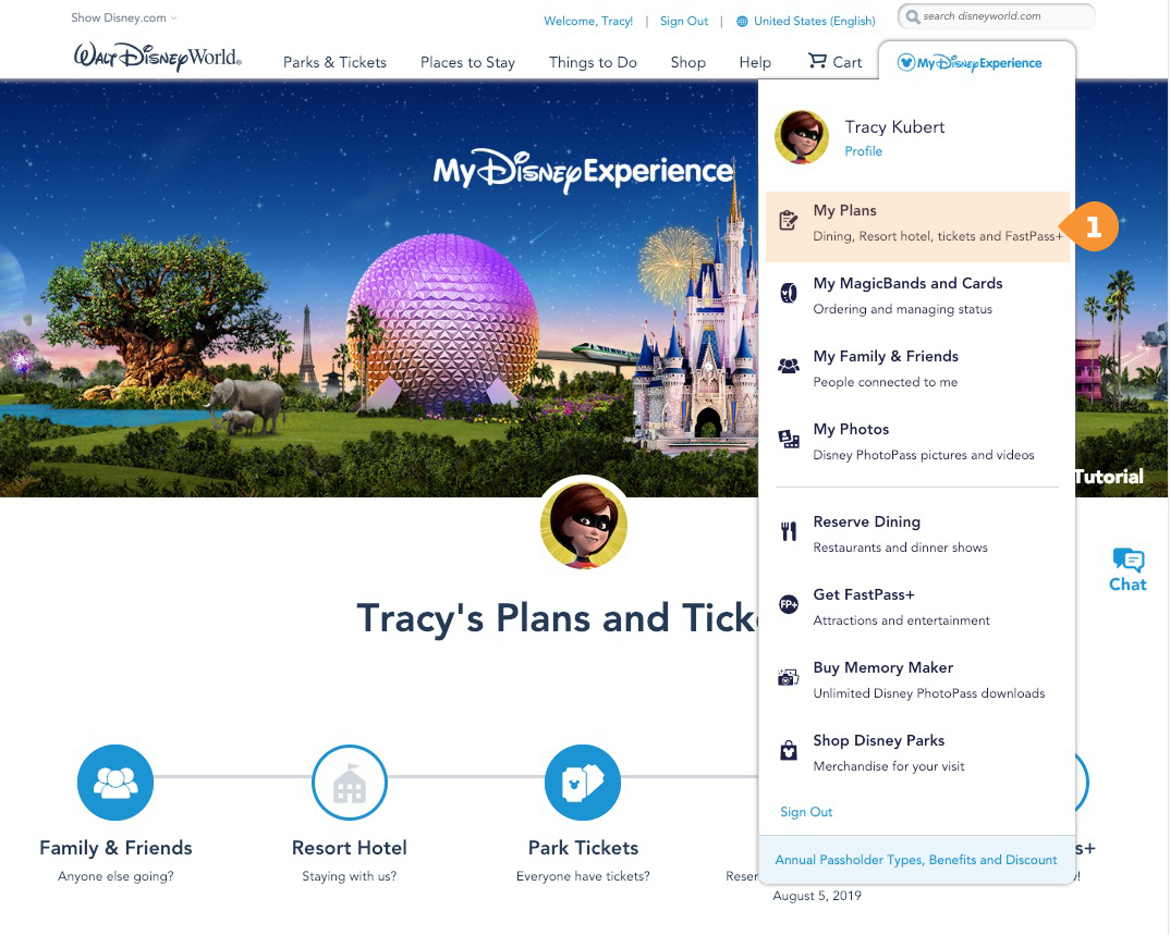
The app, in general, does a great job of providing feedforward through good discoverability that allows a user to easily identify possible actions. Using clear signifiers, the user is first presented (2) with five buttons that utilize both visuals, title and short descriptions to communicate. The visuals leverage common images or knowledge in your head, so the function of each button is easily understood.
Another level of information is communicated through whether the button icon is grey or blue. The darker color means you have made plans in this area. Not as obvious as the button signifier, but something the user quickly picks up on. Upon mouse rollover, users are presented with buttons for possible actions. Once again, providing signifiers.
Good: Easy discoverability of possible actions (creating groups, getting tickets, making reservations and fast passes) that along with signifiers (buttons/icons) provide the feedforward to bridge the Gulf of Execution.
Navigation
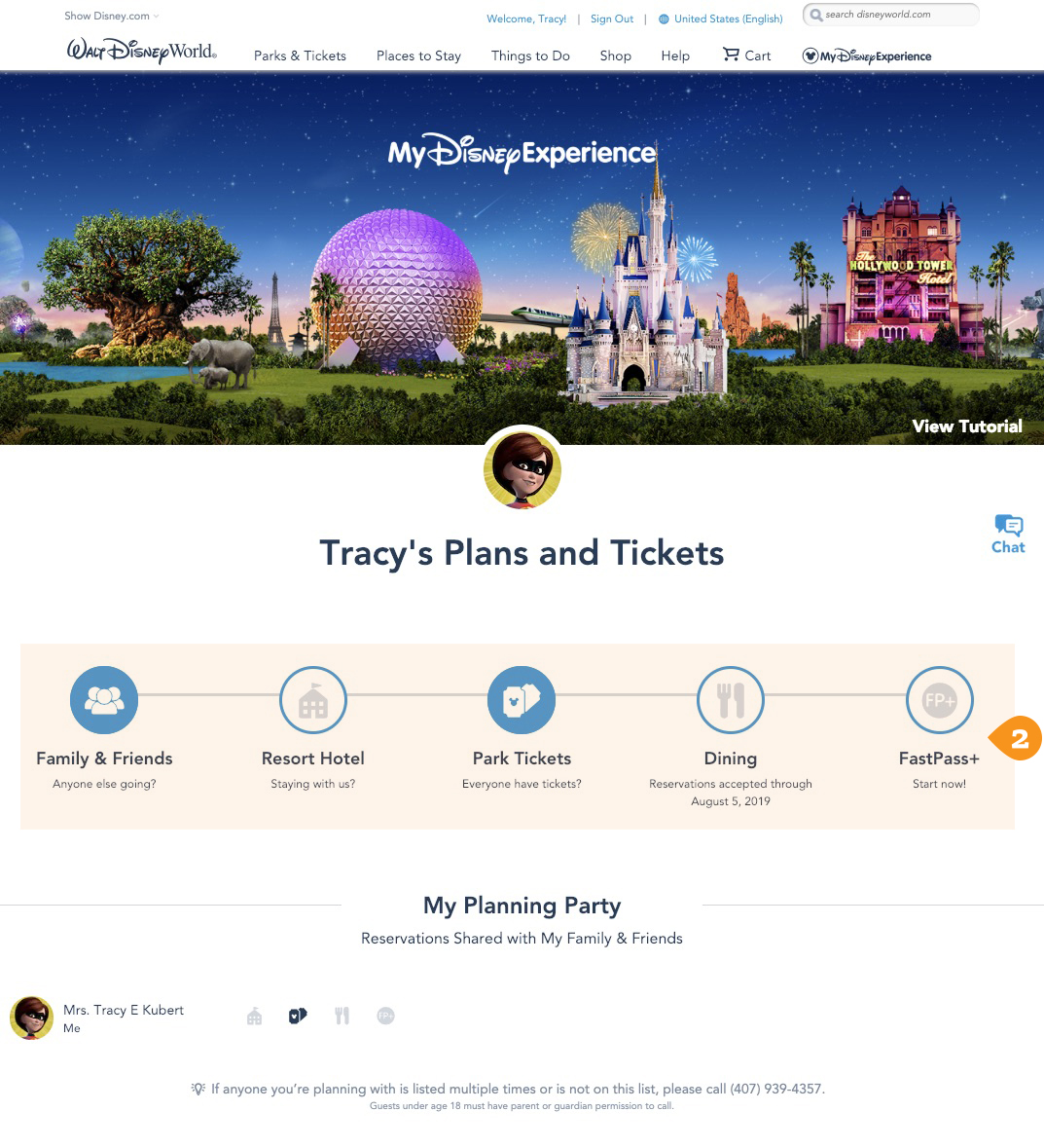
There are several “My” themed links available through the My Disney Experience dropdown menu. The conceptual model for the user would expect that if a user chooses these links, they are navigating within this section. The varying navigations on these pages do not follow expectations and can be confusing.
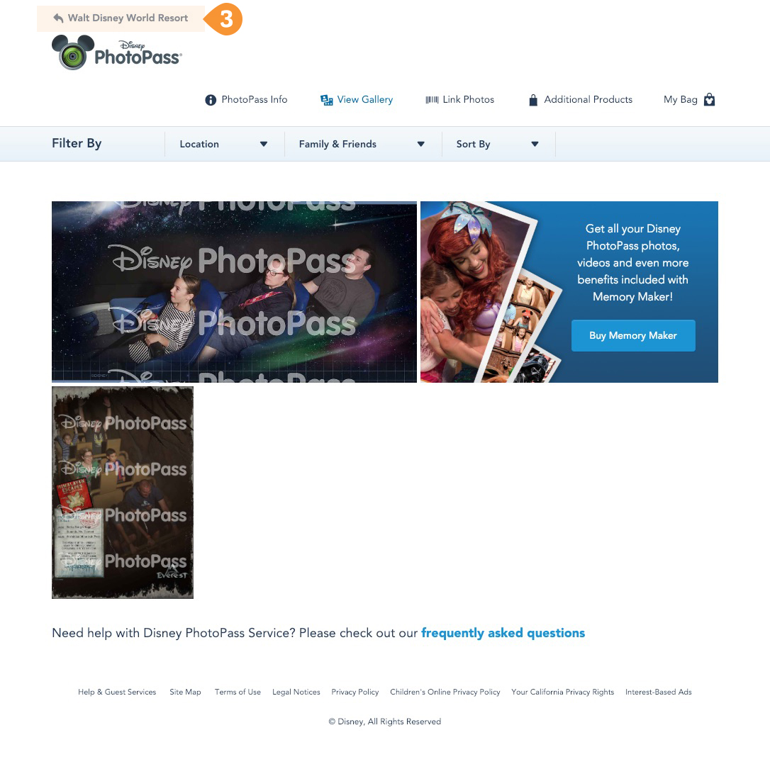
On the “My Photos” page, (3) the link at the top takes the user out to the Disney World landing page instead of back to My Disney Experience.
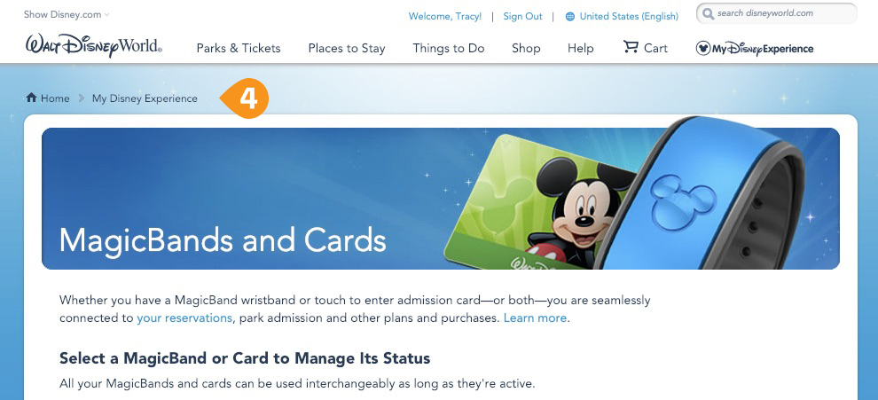
My MagicBands & Cards page (4) makes a clear relationship between the page and MDE.
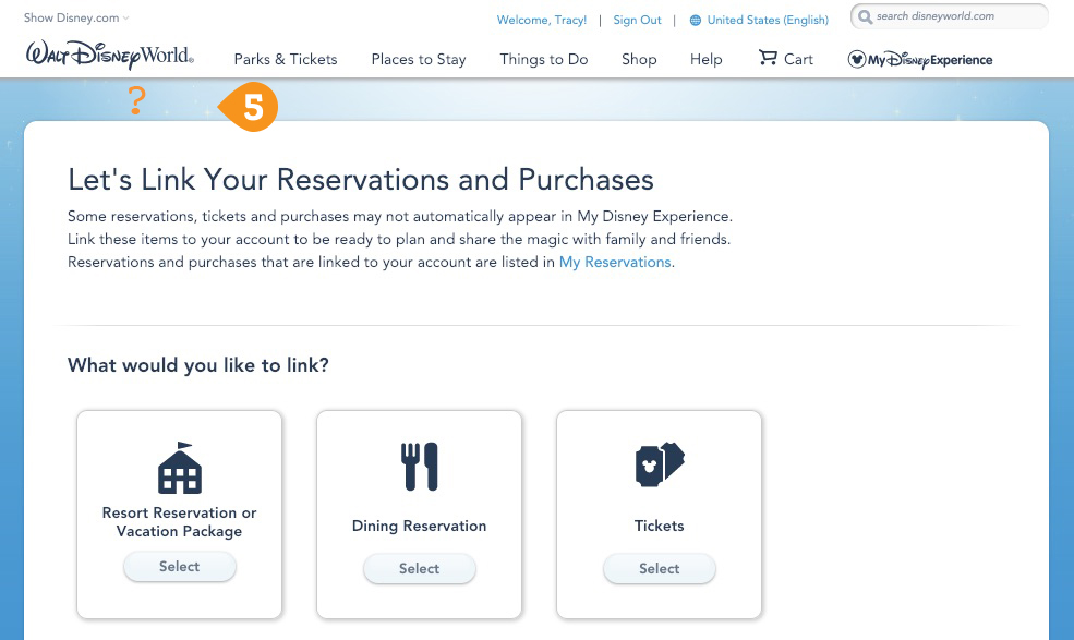
And the page with a where you link current reservations to your MDE (5) has no such mapping.
Poor: Navigation is not consistent and in some cases does not match the conceptual model. The mapping in the navigation between Disney World content and what is specific to MDE could be more clear.
Possible Solution: Mapping could be helped by adding an element to the main navigation that delineates or separates MDE from the rest of the navigation items. Also, a consistent breadcrumb on “my” pages would help with the conceptual model. See solution below.
Current:

Suggested:

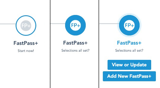
FastPass+
The most used function of the My Disney Experience is the FastPass+. If you have ever been to the park, this is a logo and term that you will certainly remember.
This functionality of the app provides constant visual updates as feedback that allows a user to quickly detect if there has been an error, or slip, and make a correction.
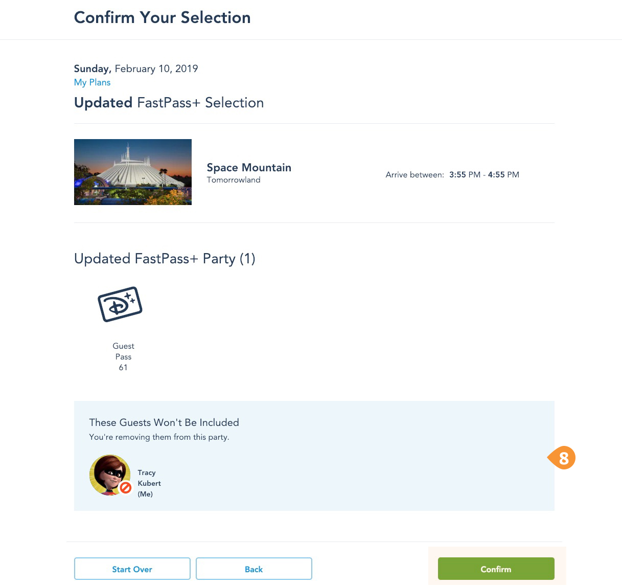
The above image which combines the before and after screens while adding another guest to a FastPass+ reservation (the goal) is a good example of the Seven Stages of Action. The left side clearly shows the stages of execution (plan, specify, perform) and the right the evaluation stages (perceive, interpret and compare).
The screenshot below for choosing your date makes good use of a commonly known conceptual model.
![]()
The list of available FastPass+ times for attractions is mapped in a way that most people will understand with (6) the earlier choices on the left. There are also (7) clear messages explaining why some choices are not available which is appreciated feedback.
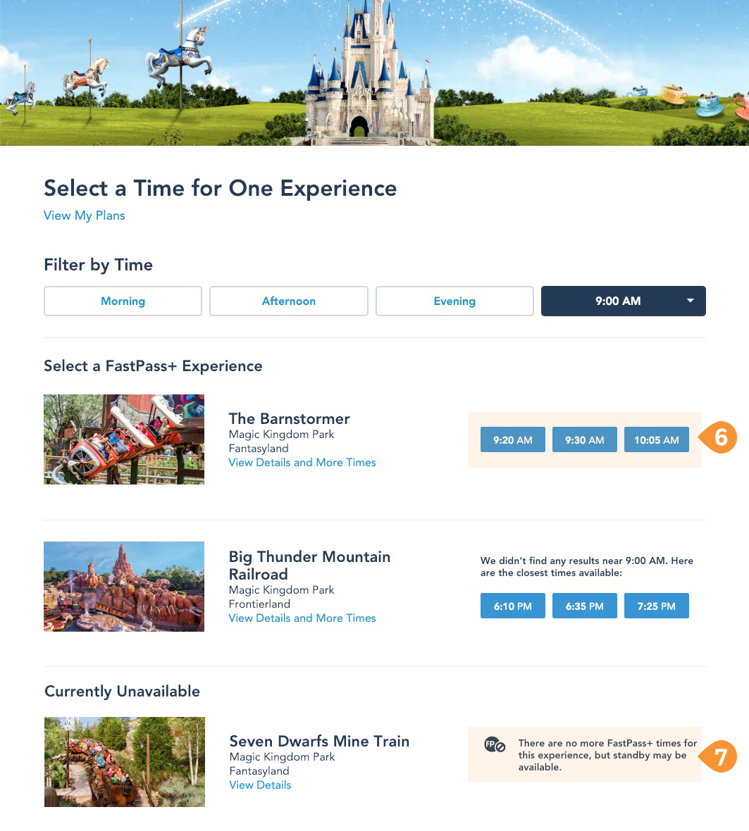
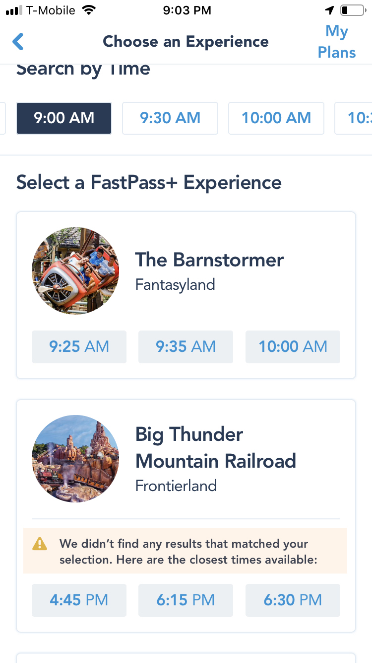
Although… I like the hazard signifier from the mobile app for these messages better 🙂
The use of constraints is used to prevent slips, such as a Loss-of-Activation, by greying out buttons or not displaying the next action until all selections are made. There are also (8) several cues for consequences of actions in case of other slips, such as Capture Error during a series of selections.
The constant feedback loops work to ensure there is no Gulf of Evaluation and the user is clear on the results of there actions.
Conclusion: The app makes good use of many of Norman’s design principles to deliver an enjoyable and empowering user experience that we find fun to use.