 Source: https://itunes.apple.com/us/app/mymta/id1297605670?mt=8
Introduction
The MYmta iPhone app is a travel app designed to provide relevant information related to New York City’s many public transit options: subways, buses, LIRR and Metro-North rail services, and the Access-A-Ride program. The app allows for real-time scheduling and service changes, as well as personalized settings and trip planning, and station accessibility information.
Critique
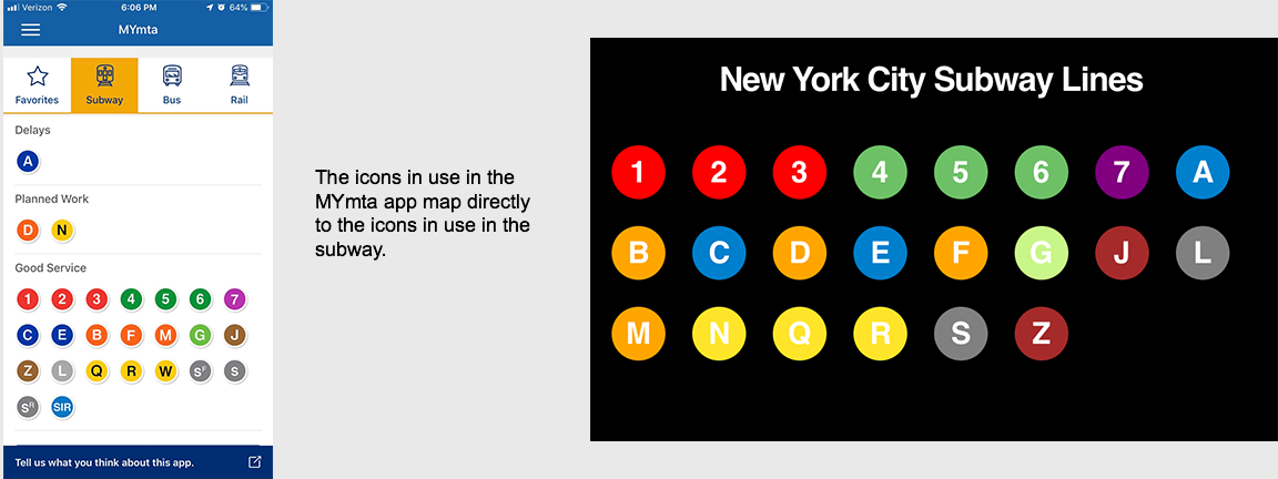
1. Mapping of Subway line icons (good design)
In the “Subway” service section of the app, there are subway line icons that can be tapped to see more details about the line: delay information, planned work details, and station stops where a user can further tap in to see real-time subway schedules.
Why this feature works well:
- There is good natural mapping since users can tap directly on the icon to see more details about the subway line as a whole, and then further into see station level information. The experience is intuitive because the hierarchy matches the experience of navigating the subway in real life and a mapped view.
- The shape (circle), colors, and typography of the subway line icons also also match what is in use in the actual subway so the app picks up on the mental model that already exist in subway riders minds.
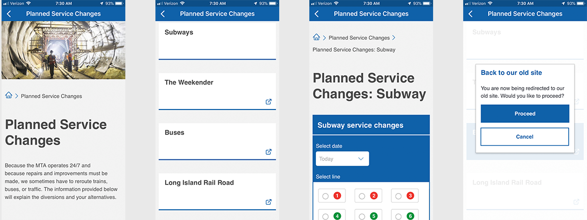
2. Planned Service changes (minor improvement)
At the bottom of the main screen a user can enter a space to search for service changes to their subway line. However, there is a lack of signifiers to show what to do. There is simply a block for each service and it seems like there is not information available. However, tapping on the space does open a search panel. I would recommend adding a label or icon like in the other screens to show there is content in the space.
3. Consistent affordances related to icons (minor improvement)
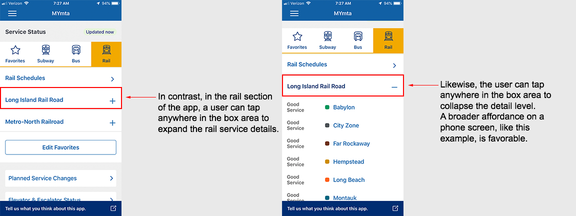
In the My Stations & Stops section under the Favorites menu, there is a list of subway stops that an individual user has selected as ones that are used with greater frequency, so they are able to quickly get real-time train schedules. The ability for a user to personalize their experience in a larger display of information is very useful. In this section, since multiple train lines may stop at a given station, the user must expand/open the item using a + icon to get to the real-time data.
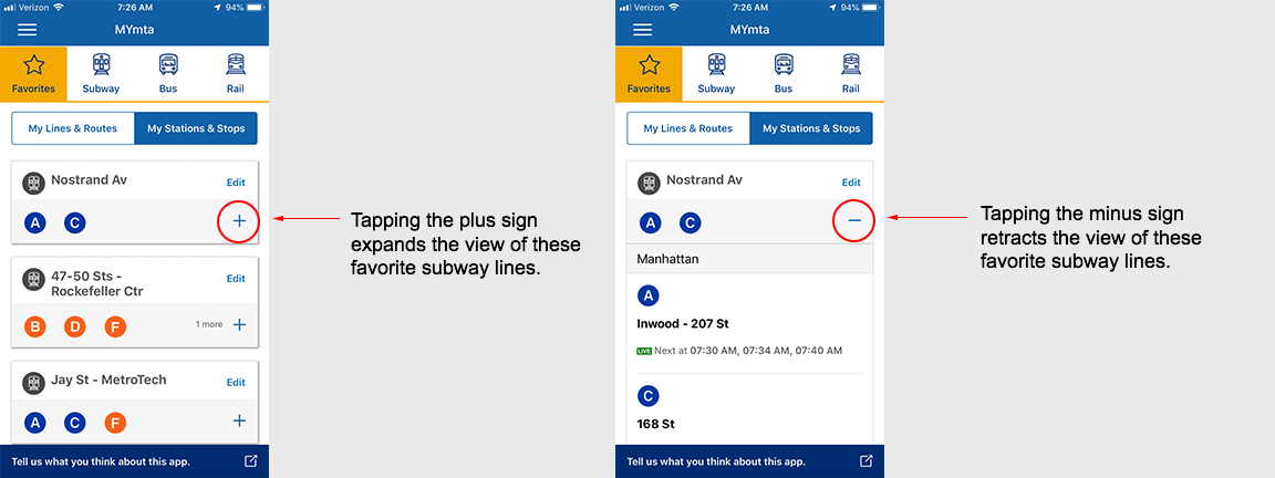
Recommendation for improvement:
- In other sections of the app where the + icon is present, clicking on the entire row will expend the view; however, in the Favorites, section, users must tap directly on the + to expand. Therefore, consideration should be given to standardizing the experience and increasing the affordance to match that of the rail section. This change should enable users have a greater rate of successfully expanding the menu on the first try instead of making errors/slips because icon is not the first item seen or because other parts of the app offer a different level of affordance.