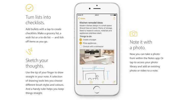
The iOS built-in Notes app empowers users’ note taking capability by providing seamless synchronization feature, supporting multimedia input/insert, and even integrating the sketch feature to simulate the analog note-taking experience. This article would critique the Notes App based on some usability factors mentioned by Don Norman’s book- The Design of Everyday Things.
1.Sketch directly in Notes
The icon follows most of the convention to indicate possible “drawing” behavior in this app, it’s easy to understand and the discoverability is good when it displays with other major action items on top of the keyboard. Once when users tap it, the drawing settings provide the signifier of refining the drawing needs, it showcases the options of brushes, colors, and even a selection tool. However, the mappings and feedback would have some room for improvement. Users might have learned the icon from built-in photo app and screenshot app that it can “mark” on top of photos, so they might assume they can sketch or highlight on top of the text paragraphs, but it can not. This inconsistency might mess up the knowledge in users’ head and creates confusion. Also, the UX inconsistency might bring users attention from the behavioral level to reflective level, since they’ve learned the skills to use the feature in other apps, but have to make a conscious decision when manipulating the same feature in Notes app.
Solution
To modify the icon of the sketch feature in Notes app, but keep some convention visual element to afford the “drawing/sketching” behavior, so the users would be able to tell the action is not mark in order to avoid the Description-Similarity slip. Also, Make the “unsketchable” area grey out when users tap the sketch icon to provide a visual indication of constraint, to simplify and restrict the drawing area even when users don’t draw anything yet.
2. Edit the sketch/note
The “create new note” feature is pretty findable on the dashboard view since that’s the typical knowledge in the head for iOS users-action items located on the toolbar. Once users tap the create new note icon, the keypad with a bunch of major note taking action items slides up as the signifier/feedback of what Notes app can do, this also maps the correct result after tapping create a note icon. However, the mapping goes wrong when users want to edit the note. When users first time create the note, also means the note is being edited, there is a “done” button as the signifier for “done editing” behavior. But there is no “edit” button for “edit” behavior, and because of the knowledge in mind taught users that the “edit” icon looks really similar to “create a note” icon, so they might tap on that, then the result of the action is terrifying – bring users to a brand new page without any description, so users might think the work they’ve done might be gone.
Solution
In this case, to correct the mappings, I’ll suggest a lock-in action like a popup displays “Do you want to save this note and create a new note?”, so the users don’t suffer from the imprecise knowledge in mind and are guided by the precise knowledge in the world. Or provide a “back” or “undo” action item on top of the new note screen to deal with the slip.
3.Add a checklist to the note
The icon here doesn’t follow the convention of the checkbox in a checklist, instead of a square with a check mark, Apple decides to unify this icon with others in the row-a circle with a check mark. Its discoverability is good since all main action lines up on top of keypad together. The mapping makes sense with good visual feedback: after users tap it, an empty checkbox with await text input, but the signifiers of how users can interact with it are not clear enough (like can users check the checkbox when in edit mode?) The “add a checklist” behavior might apply the logical constraint for the interaction, so when users don’t type anything after the checkbox, and tap return on keypad, it deletes the empty checkbox. Because it makes no sense to create a checklist that lists nothing. But in the meantime, users might also think the mapping is wrong since they just tap return key and it doesn’t behave “correctly”.
Solution
When users tap to create a checklist, it should not only display an empty checkbox, but also a placeholder string as the signifier to indicate how to use this feature correctly. Also, even users don’t type anything then tap return, it should still behave as return behavior to unify the experience.


