Introduction
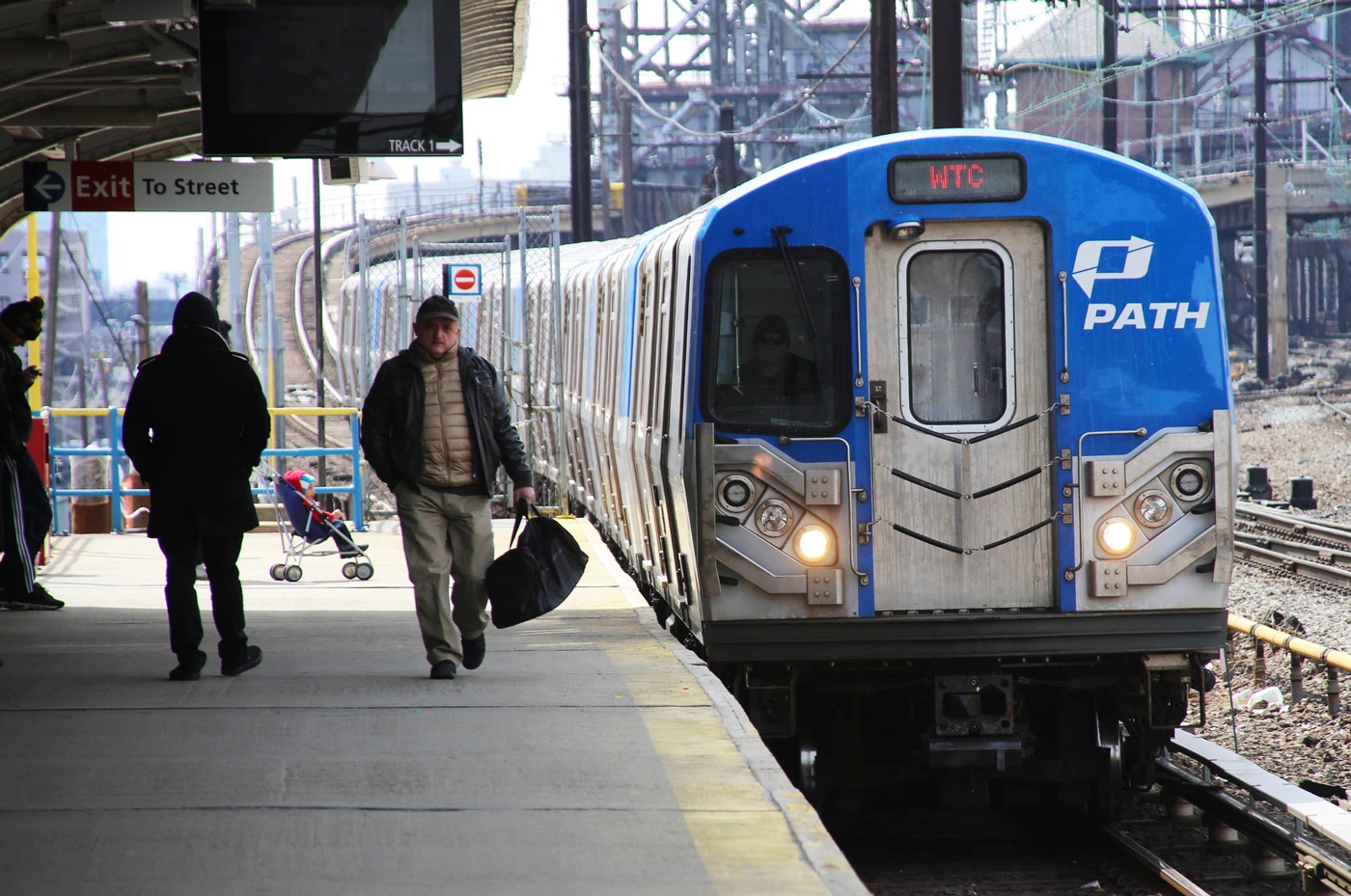
The path vending machines are used to add value or time to a MetroCard or SmartLink by walking users through steps. Users need to interact with a touch screen and multiple parts to get to their goals. We can easily find one on a path train station.
Critique 1: Different colors are used to distinguish between different functional areas
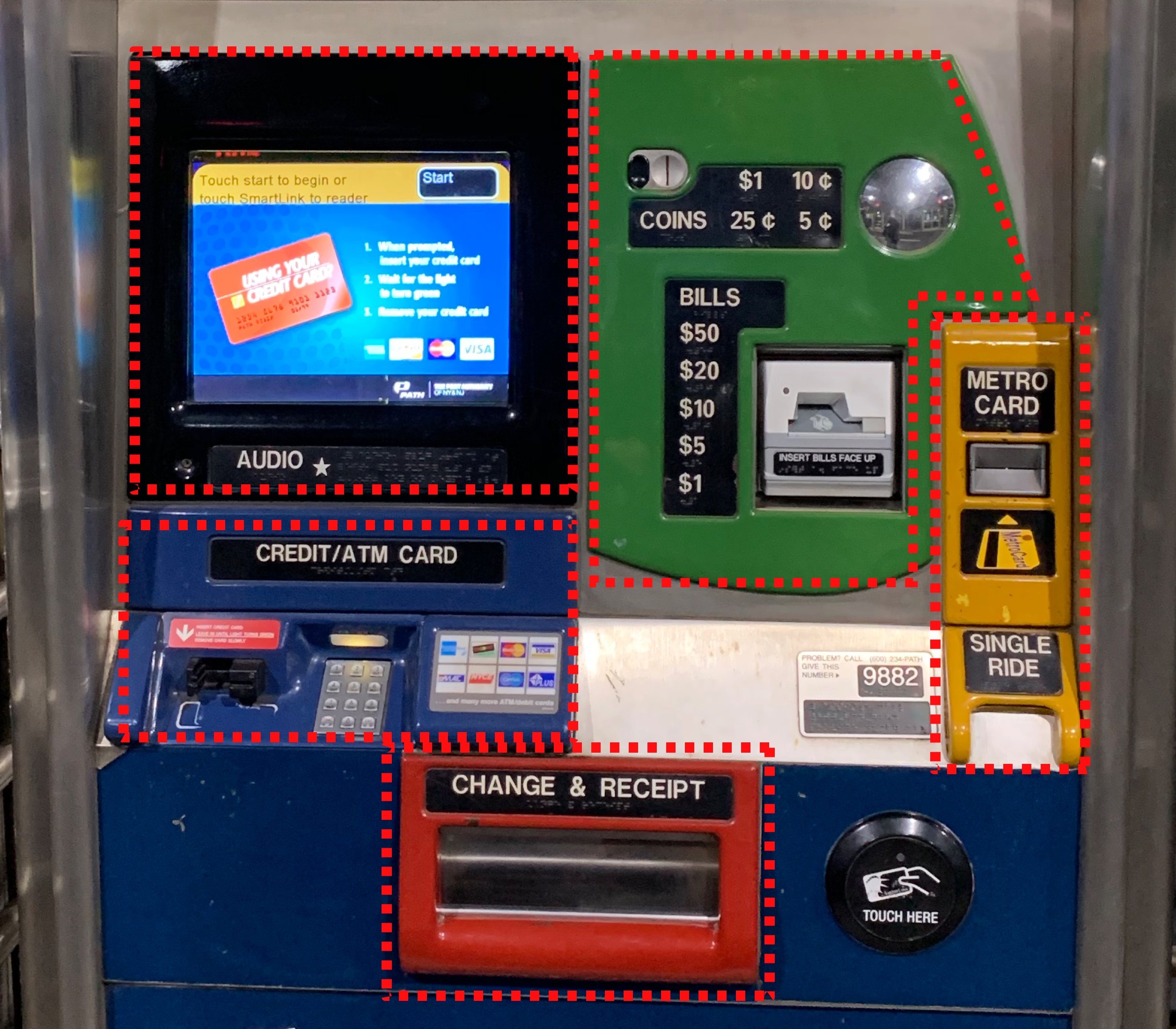
Before using the machine, users can find different areas separated by colors. The touch screen is placed in the black area, cash will be inserted in the green area, MetroCards go into the yellow area, ATM/credit card should be inserted in the blue area, and receipts or changes will be received from the red area. Colors are helpful to distinguish different functions from a visual aspect, users can easily discover which area to interact with during processing.
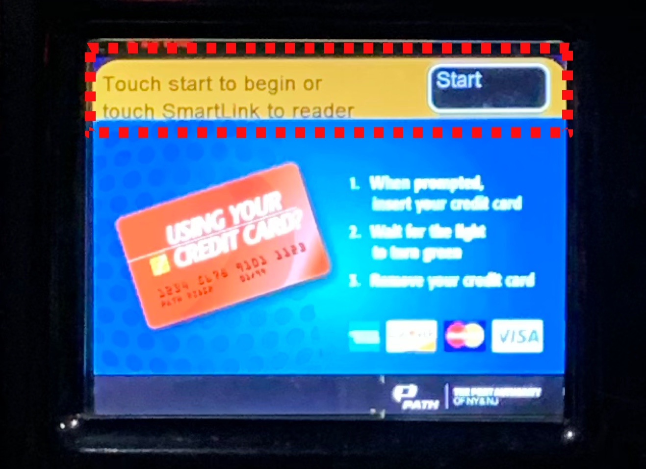
Critique 2: The start button on the screen is big enough to be discovered
When users first interact with the machine, a start button on the upper right is easy to be discovered on the screen. A signifier above the bright color bar saying “Touch start to begin” is visually clear enough and also indicate to tap the button. What’s more, touching a button on the screen is also in line with the users conceptual model. They will not get confused on how to use the touch screen during the next steps.
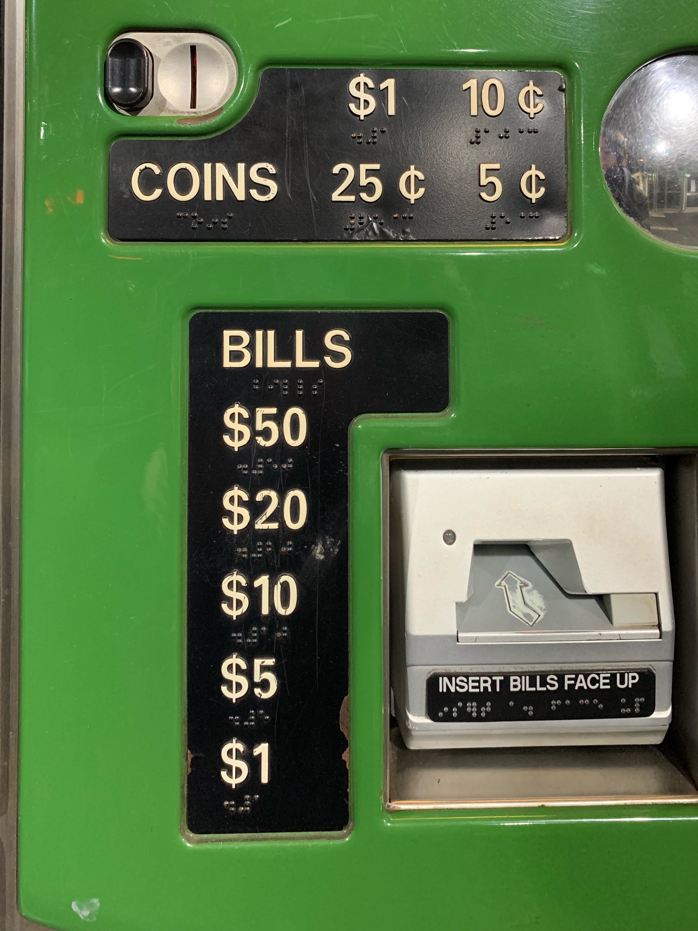
Critique 3: Using physical constraints, signifiers, and feedback when paying a bill
If users want to add value to their cards by cash, they will not be upset when inserting coins or paper bills, because there are physical constraints for different entrances- coins can only be inserted to the upper left entrance, and paper bills to the lower right one. There are also signifiers displayed to tell what the entrance for and the what values are accepted, which is clear enough and easy to understand. After inserting a paper bill, the light is on for a while to give users feedback, that a paper bill is inserted successfully.
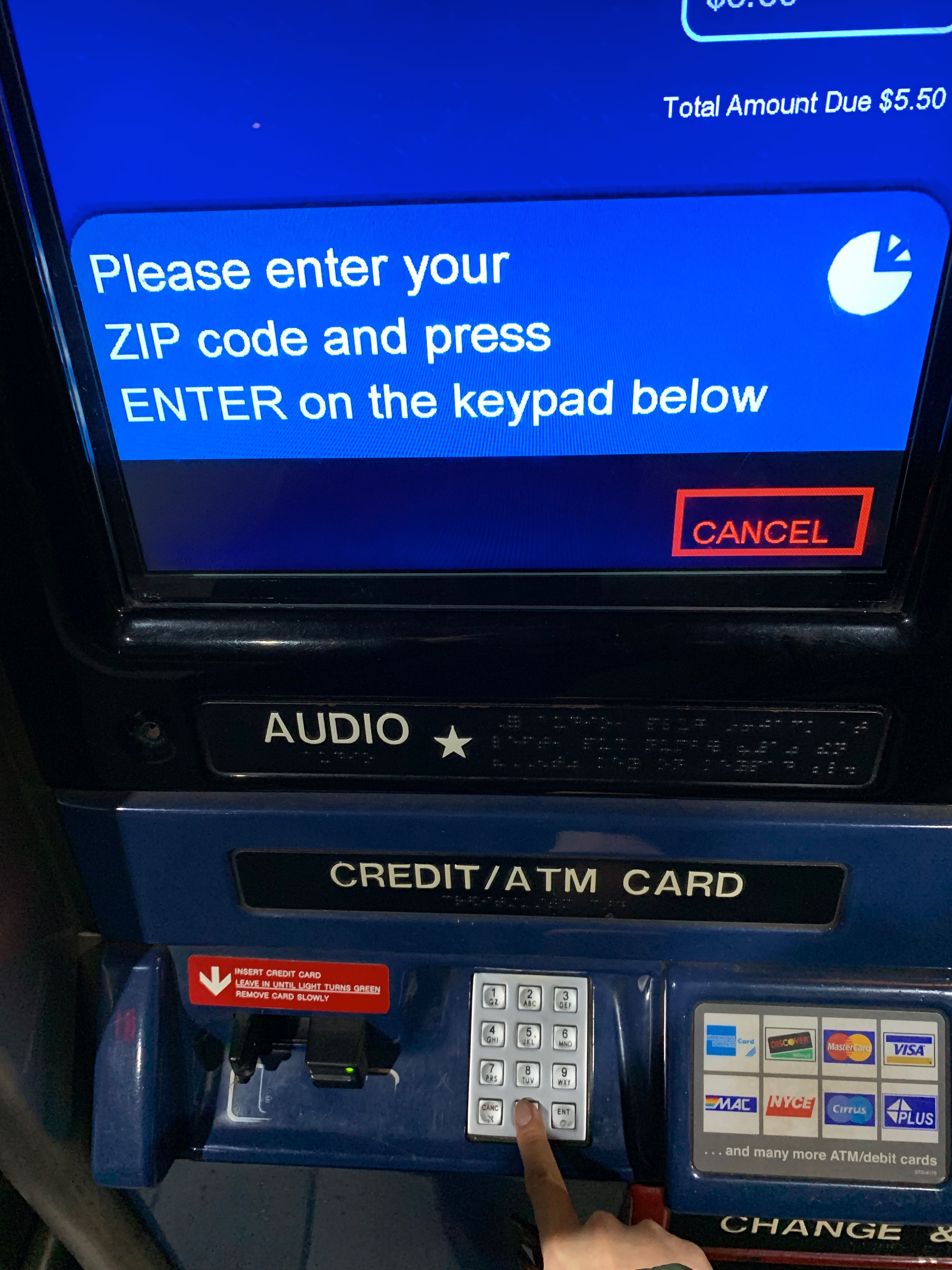
Critique 4: No mappings or feedbacks when typing a zip code
If users want to pay by card, they will be asked to dip their card and type the zip code to finish the process. However, there are no feedbacks when typing on the keypad, therefore users would be confused if they have tapped a key or not. There are also no mappings between the keypad and the screen, sometimes users may forget how many digits they have tapped. I suggest that there should be a sound or vibration after each typing, to give users feedback. Also, there is a need to display on the screen, so that users can map between their actions and the result.
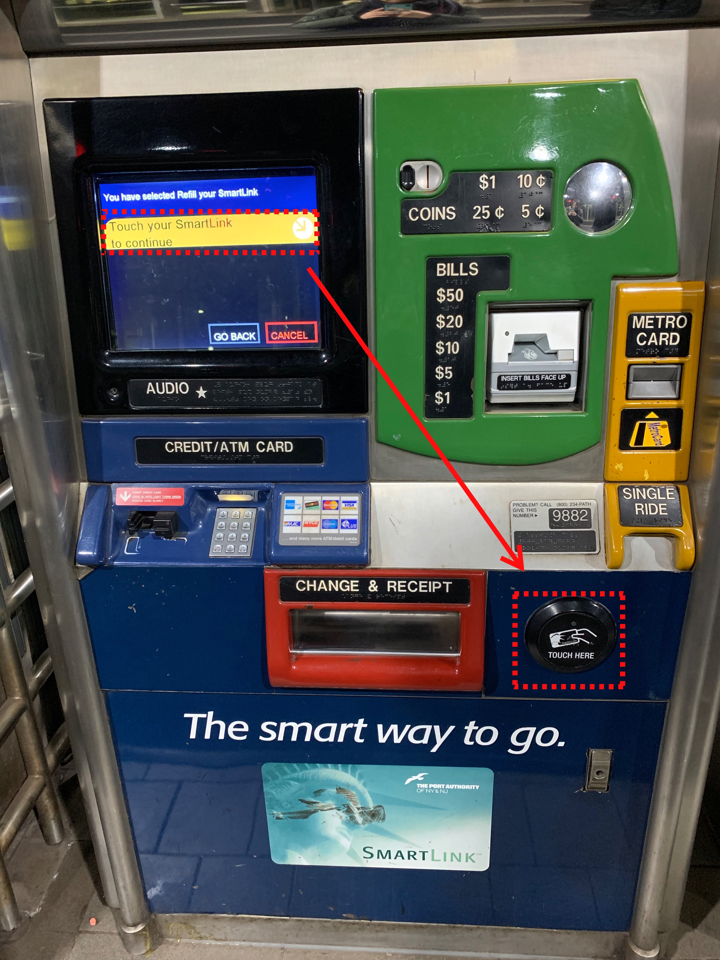
Critique 5: It is hard to discover the touch area for the SmartLink
When adding time or value to a SmartLink, there is a signifier on the screen saying that to “touch the SmartLink to continue”, and an arrow is pointing to the lower right corner. But due to the long distance between the screen and the touch area, it is really hard for users to discover it. I would suggest placing the touching area closer to the screen so that it will be easier to discover.