Introduction
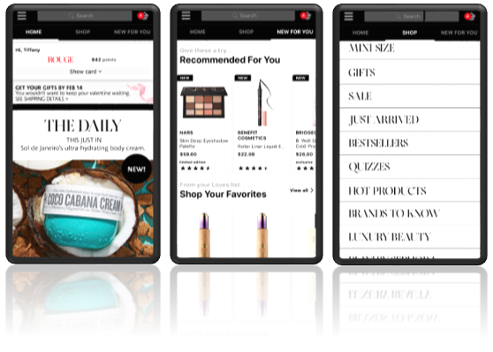
Sephora is a multinational online and in-store makeup, skincare, fragrance, and beauty services, retailer. Upon opening the Sephora mobile application, a user is presented with options to either view latest skincare and beauty deals, to begin shopping or exploring products, to receive product recommendations, to search for specific products, or to navigate for additional features.
Summary
This evaluation specifically reviews Sephora’s navigational design, or user experience, as the user interface design is simple and sufficient.
Good Design: Good Signifiers and Cues
Sephora’s mobile app contains just the right number of signifiers for how an action should be taken without overwhelming users. There are additional signifiers for in-app notifications and confirmations such as items added to the shopping cart:
Much of the user’s interaction is as simple as a “tap” or “swipe”, with excellent spatial cues for controls directly mounted on the items they are designated to manipulate. However, “tap” and “swipe” do not possess explicit affordances other than the mobile phone’s touch screen interface. In contrast, additional signifiers, but with explicit affordances, include the “drop down”, “roll-up”, or “menu” icons.
Within the main “Shop” view, a user relies on perceivable cues to scroll through the below list layout and tap to select a product category—all in the absence of a scroll bar and font suggesting the presence of a hyperlink.
Bad Design: Poor Discoverability
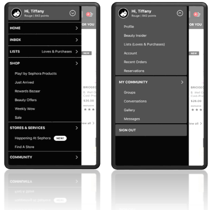
Due to poor mapping within the Sephora’s mobile app, a user has difficulty deciding between which version of “Home” or “Shop” will take you to the preferred view or results. Similarly, “New for You” items, which are recommended new product arrivals, are also available via “Inbox”. These numerous or misguided pathways lead to plenty of user slips.
The user’s intention or goal is simple: to begin shopping or to see the main view. The plan to get there is fraught with poor and duplicate pathways—an onus on the designer and not the user.
Recommendations: Build the User’s Experience from the User’s Activities
Sephora UX/UI researchers and designers should consider applying the human-centered design (HCD) process to acknowledge and articulate the problem. Additionally, they should employ design thinking tools, such as the double-diamond diverge-converge model, to prototype and reiterate designs based on that initial problem and user feedback.
More specifically, and following Norman’s concept of design thinking, I would suggest Sephora UX/UI researchers and designers incorporate the following in their next design iteration/mobile app update:
- Observe actions: Sephora design researchers should observe the user’s actions in real-time to identify which user actions are associated with specific goals. They’ll gain a better sense of how to simplify mapping so that a specific action is enabled through a clear pathway to an expected end goal.
- Ideate redesigns: Sephora designers should ideate on possible designs to improve mapping. Specifically, I would suggest they start with working to consolidate the main and menu views by:
- Remove “Home” and “Inbox” categories from the main menu and consolidate into main view equivalent “Home” and “New for You”.
- Remove “drop-down” icon from the menu next to sign-in details as subcategories, “My Community”, and the “sign-out” option are also available from the main menu.
- However, keep the welcome bar at the top of the main menu displaying a user’s profile picture, name, Sephora points, and status.
- Prototype versions: Sephora designers should work alongside the design researchers to attribute a design experience that matches the user actions and scenarios. Additionally, the removal of features and signifiers should either be replaced or redirected accordingly. It doesn’t hurt to also add a redesign of those areas to accommodate new space.
- Test prototypes: Sephora designers should work alongside the design researchers to test the prototype as the right problem might have been identified but the wrong solution attributed. This might include running tests before and after prototype to compare key performance indicators such as the length of time it took for a user to complete a specific or set of actions within the app.
- Iterate on design and performance: Sephora designers should work alongside the design researchers to continuously explore potential impediments or design improvements.