Introduction:
Steam is an international digital distribution platform which allow users to purchase and play PC video games. Steam help users install and update their games and provides community features such as friend lists and groups, video streaming and video sharing. It also provide cloud-saving function so that users can load their game process in every device they use.
Critique 1 : Login Window
When open the application program, the first window would be the login page. User enter the combination of account name and password to login their account and continue using the service. The page offers understandable description for people who are not able to enter the correct combination, however, it’s little confusing about where to click.
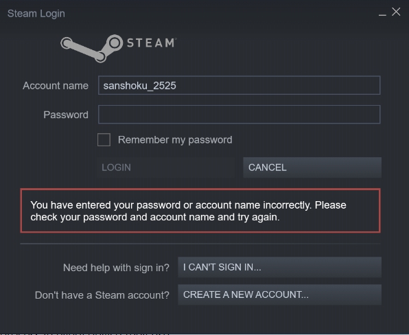
Norman use the term signifier to refer any mark or sound or perceivable indicator that letting user know what to do with an item. The width of the button makes it look more drop-down menu than a button to click on. The designers do use the CAPITALS to differentiate button and description text, but I think it could be more obvious to avoid misunderstanding. Despite the shape and color of the button, the term “I CAN’T SIGN IN” seems more difficult to understand than “CREATE A NEW ACCOUNT” since the users wouldn’t know what would happen before clicking the button. For the other function, the signifiers works nicely. The affordance is clear, which mean users could easily understand what can they do with an item. and the layout follow knowledge in the world. It do give out feedback of wrong combination but return the same page without telling the user what went wrong. This page also give out a nice constraint: the LOGIN button wouldn’t turn bright and clickable unless user fill both of the columns.
Possible Solution:
To avoid the feeling of unsure, I’d recommend to use “RETRIEVE MY PASSWORD/ACCOUNT” for the replacement of “I CAN’T SIGN IN…” For the shape of the button, if not changing the shape, my advice is align the text to the right to differentiate them from description text. Usually drop-down menu would not align to the right, so I assume that would be a more common mapping of buttons and could lower down confusion.
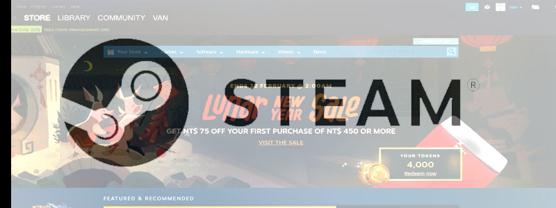
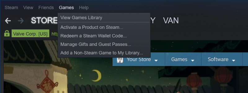
Critique 2 : Functions on Greeting page (Store page)
The greeting page of steam is a customized store page. Information of special sale event would be displayed on top of the screen.
At the first glance, the layout looks a little too complicated. There are three different control bars in the screen. The designers use a nice mapping technique to differentiate them. For the tool bar on top of everything is using the format of traditional application tool bar, which indicate it’s part of the application software but the page. The second tool bar is located on top of the URL column and align with backward and forward button, which indicate that it is a tool bar for tabs. The URL column, also function as a monitor to provide discoverability of the current state of the page, set constraint that it couldn’t edit by users if not using the action option the software provided. The third tool bar is the category bar for the store page itself. Moreover, the searching column clearly claim that it is used for search the store. These semantic constraints help users limited the possible function that the tool bar could offer so that they could find function easily.
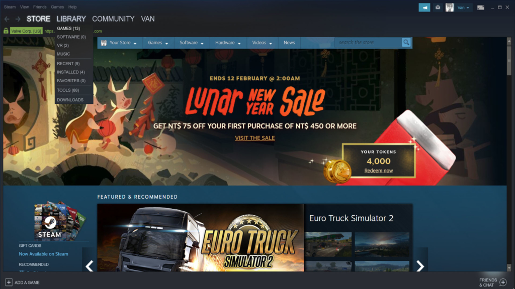
However, some of them have overlapped features. While it wouldn’t hurt to have various way to access essential function, some functions are not as findable as it could be. For example, the “games” button on the top tool bar gives users access their games library, just as the category “LIBRARY” in second tool bar allows them to, but the Games on the third tool bar only give links for users to explore and purchase new games. This inconsistency might mess up the knowledge in users’ head and make them get lost in the layout again and again.
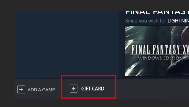
There is also a fixed foot allow user to add game, users could add a non-steam game to the library showing that they own it, or using code to activate a product on steam. Interestingly, there are not direct button for users to add physical steam gift card to steam.
Possible Solution:
To keep consistency, I don’t recommend using the same word for different functions even though the word might be descriptive for both the functions. The designers could try to use a different names. For example, using “game categories” for “games” in the store category bar. Or they could simply remove the link “View Games Library” and rename “Games” as “Manage my games” or “Action” because it could also link to user’s game list with “View.”
Also, I recommend them to add a direct link for adding gift card to account next to the “ADD A GAME” link.
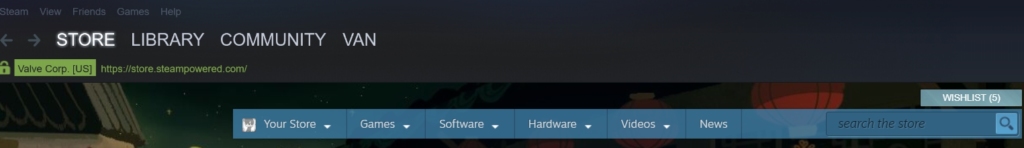
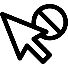
Critique 3 : Tabs and URL column
As mentioned, the second tool bar is located on top of the URL column and align with backward and forward button, which indicate that it is a tool bar for tabs. It follows the knowledge in the world, at least follows the rule that Google Chrome and Microsoft Edge follow.
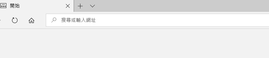
The upper one is a screenshot of Google Chrome, the another on is Microsoft Edge. Both of them are common Internet browsers. As seen, the tabs are beneath the URL column.
Also, they are both featuring as searching bar. For some users, they have been used to using the URL column to search and only use the URL column for the task. They might try to click the URL column and try to type on it, but no feedback would shown to tell them that the URL column is locked since there is already a little lock icon on the left of the URL column.
Possible Solution:
While the mouse cursor move upon the URL column, it would become a big “I”, which I think is a very misleading signifier that would indicate the URL column could be edited. Changing cursor from “I” to “Prohibition” could simply stop user from trying to edit the content of URL column by providing semanticconstraint as clue of affordances.