GOOD
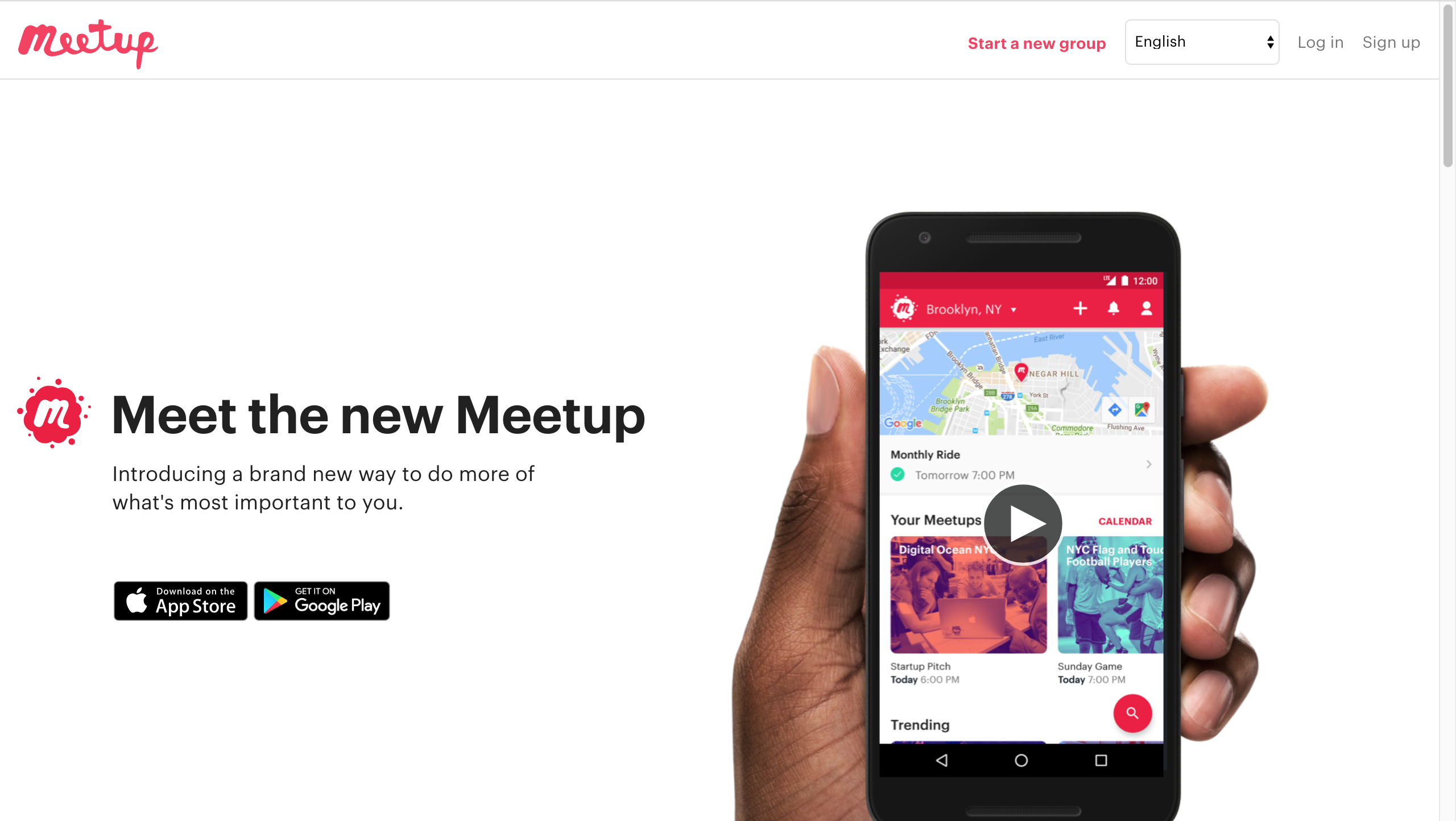
“Meet up” is good at interaction of UX and human needs. I download this app because I want to search some good events in New York City. This APP provides me multiple chooses. When I first register my account, they provide me several tags, for example, fashion, art, sports, etc. By knowing my interests, the app recommend the activities that I’m interested in. It’s a kind of effective.
Norman gives some essential principles to help us identify a “Good Design”, like human-center theory. Interaction principles like, affordance, signifiers, mapping, feedback, etc. Then he gives some concrete examples and details in the further description. For me, I think human-center design is always the first priority. Those principles are used to serve it. On the device, like iPad or phone. Our eyes points is the most directly contact activity. If the screen can’t show the clear information that we expect, we can define the app or web is chaotic design. The most essential achievement of Norman is he suggests the combination of technology and human sense. Both of them are complicated. However, if the designer can match up many of them, the good products can be created.
Critique & Recommendation 1
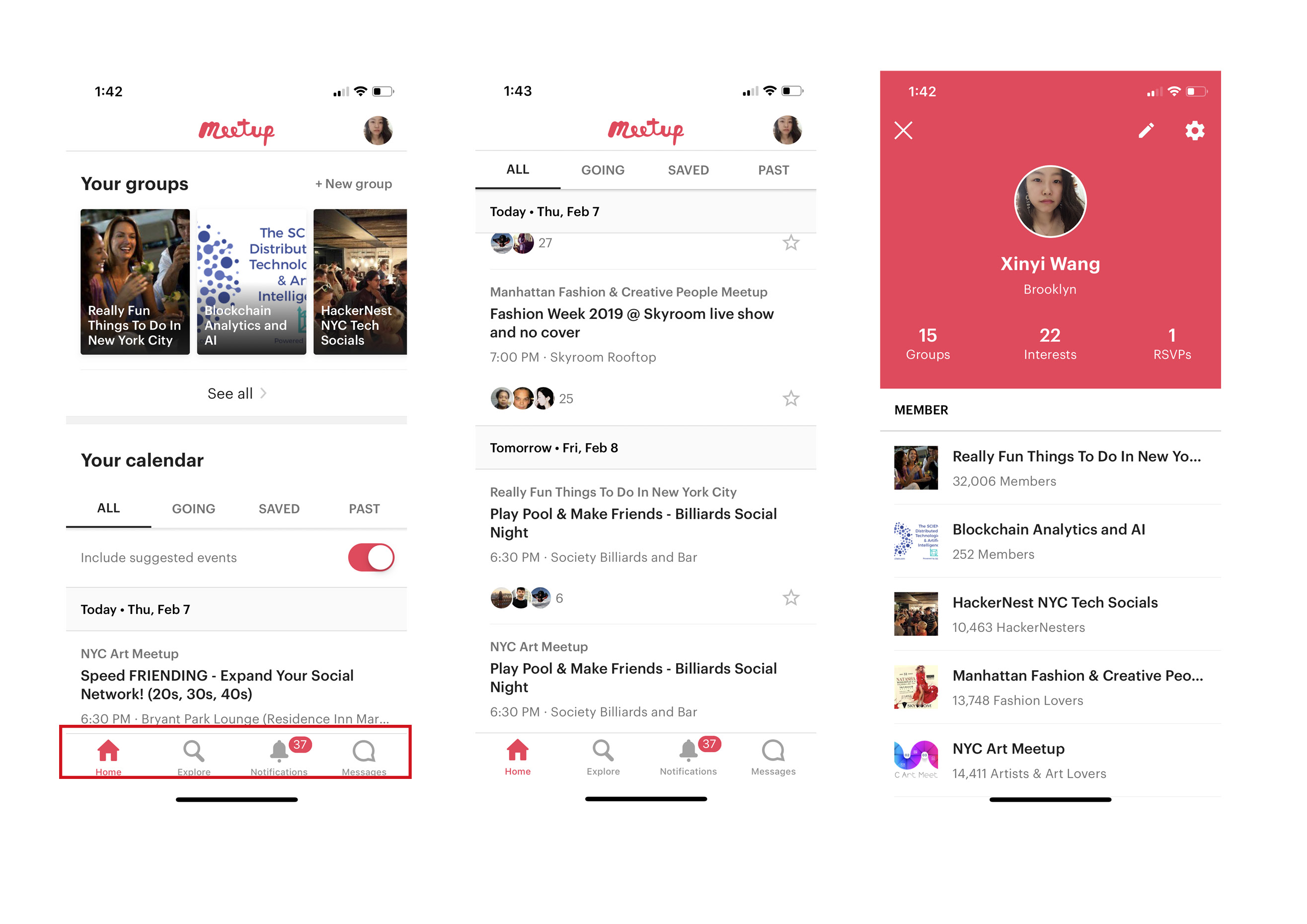
The idea of “meet up” is good. It has many useful and valuable information there, but the catalogue is too complicated which is Mapping and signifier. First, let’s look at the bottom menu. The background is white color, which is so invisible. The bottom menu is the most important guide because it leads the user to the main part of the products, like home, search and message. When I see the first screen of it, my eyes are tired and my mind is confused. There are too many titles on the same screen and none of them has visible signal design. It’s hard to tell which is important, which is not. By the center of user needs, meet up APP should be divided into two parts. Group activity suggestion and account information. The related part of them should be user find amazing activities and add them to their own activity calendar. The panel of activities post should be visible and attractive.
Critique & Recommendation 2
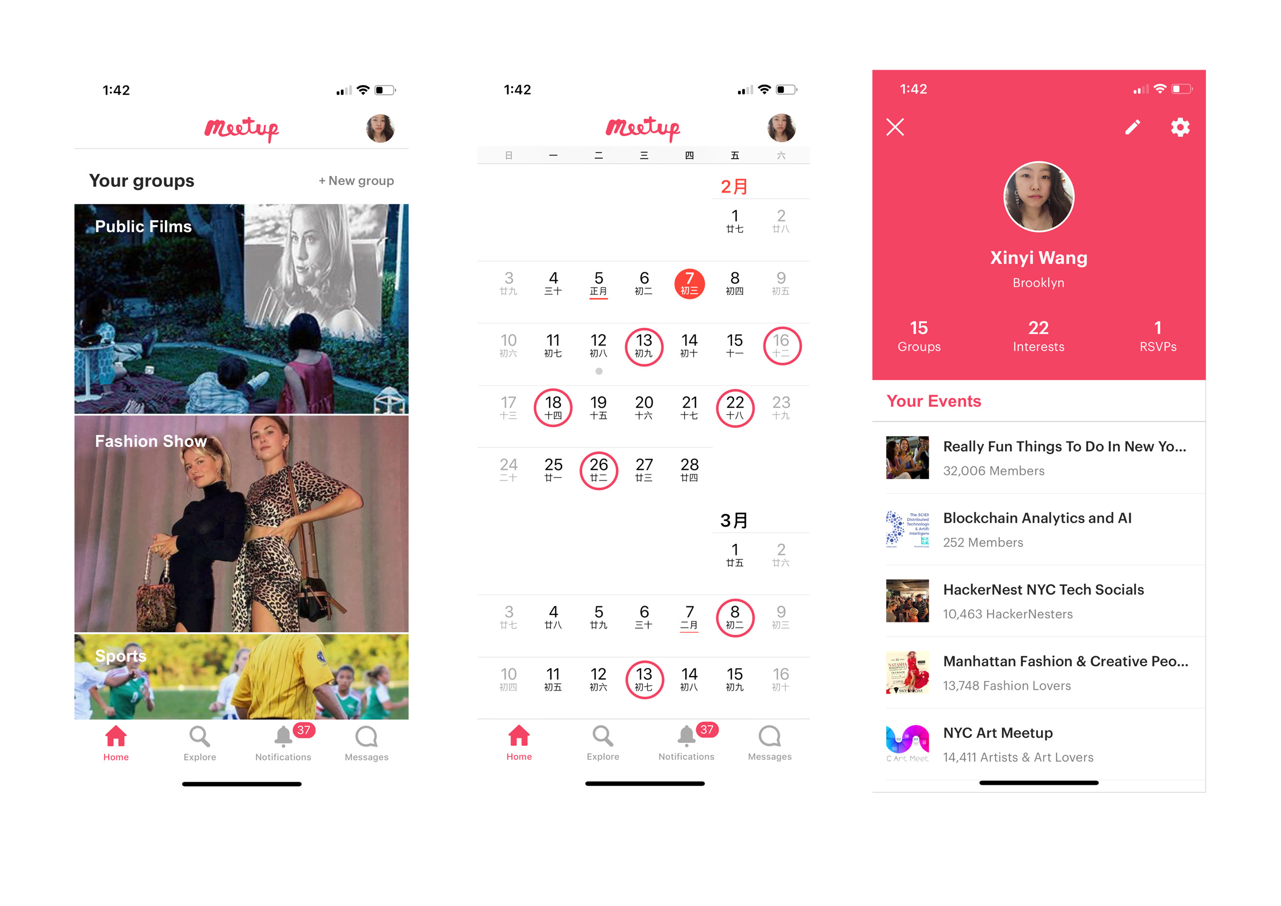
Back to the original design of this app, the pictures are too small and too many tags around it. It’s really hard for me to believe the activity they post in this app the compelling and reliable. There are no enough pictures to show in the introduction part and the information text is limited. I didn’t finish reading this activity poster, but the other activities shows immediately. I think designer didn’t really think deeply about people’s needs when they use this app. The definition of the app is also a social networking software. If they can’t make the user believe the event has good quality, users won’t participate in the events.
Critique & Recommendation 3
The database of events calendar is usable, “All, going, saved, past”. They are divided by the timeline. However, the problem is that which part is the most important for the users when they open the event calendar. They should consider it in advance, because “all” and “past” are useless in most situation. User have to think hard through those massive information to find useful events which makes UX really uncomfortable. In Norman’s word, the mapping is not clear, because it didn’t provide a clear way of remembering and understanding of mapping. “I have free time to join in this activity” is the premise of users who are using this app. If the app shows the calendar that points out the dates of events, users can easily filter out useless information.
To sum up, the Meet up APP provides many interesting events. If they can catalogue those information clearly, the user experience will be much better.