
With 4.5% of the global population experiencing color blindness, 4% suffering from low vision, and another 0.6% being blind, visual difficulties with using the web are more prevalent than you might appreciate. Women are less likely to have this disease when approximately every twelfth man is prone to it. Designing for color-blind people can be easily forgotten because most designers aren’t color-blind. This article will gather and summarize some of the principles to improve the color accessibility for the color-blind user in UX design.
What is color blindness?
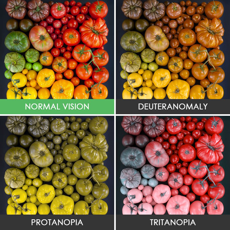
Color blindness is the inability to perceive differences between some of the colors that non-colored impaired users can distinguish (Wikipedia). Color blindness affects about five to eight percent of males (approximately 10.5 million) and less than one percent of females.

There are two types of color blindness. The most common is red/green color blindness which can be broken down into two types: Protan and Deutan. Those affected by Protan color blindness are less sensitive to red light, whilst sufferers of Deuteranopia have the same problem with green. There are also other kinds of color blindness. Blue-yellow color blindness, and the condition called Tritanopia or Tritanomaly.
As a designer, ensure your product is color accessible is important for people with visual impairment to interact with the digital product in the same way as non-visually-impaired people. For designers, the most challenge thing is it hard to know what color blind user see and the differences between then and the average user sees. Also, the difference between the different types of color blindness just adds an additional layer of complexity. In this way, several strategies can be used to enhance the accessibility for color blindness people in UX design.
Use both colors and symbols
Designers can’t only rely on color to convey a message. Certain types of color blindness might be difficult or impossible to see the red error messages. The color designation with a caption or an icon so that the user can understand its function no matter what happens with colors.For example, people with protanopia can be hard to see red color, in this way it can be difficult for designer uses only red to indicates the mistakes on the form. A caption or an icon can be a good solution to deal with this situation.

On Facebook’s form fields, the error messages are indicated with red color and icons.
Use patterns and textures to show the contrast
It’s common that color is used to signify different segments of a graph. However, only using color can be unfriendly to the color blindness user.

In this case, different patterns and texts can indicate the information to the color-blindness user.
Contrast is critical for readability.
Most color blindness people see a lower contrast than people who don’t suffer from color blindness. Using Contrast colors or colors on the opposite ends of the color spectrum work best for color-blind users. Also,to make sure about contrast, Web Content Accessibility Guidelines 2.0 level AA requires a contrast ratio of 4.5 for normal texts (14px — 18px).
In the palette below the 15 colors appear as 5-color tone progressions to those with color blindness which can be sufficient for most of the application’s design.

Some may argue about why a digital product should be designed with such a small population. Like David Kelly, the founder of IDEO said: “The main tenet of design thinking is empathy for the people you’re trying to design for.” UX designer should design for all audiences and empathy is the biggest asset for all UX designers. In the end, digital products aren’t just meant to look good but to be easy to use for everyone- including color blind people.
Refrences:
http://mkweb.bcgsc.ca/biovis2012/
https://www.usability.gov/get-involved/blog/2010/02/color-blindness.html
https://medium.theuxblog.com/how-to-design-for-color-blindness-a6f083b08e12
https://www.smashingmagazine.com/2016/06/improving-color-accessibility-for-color-blind-users/