Accessibility is one of the most fundamental elements in User Experience, and it is proven to develop a curated experience for broader user segments, especially users with disabilities.
So what is inclusive design and accessibility?
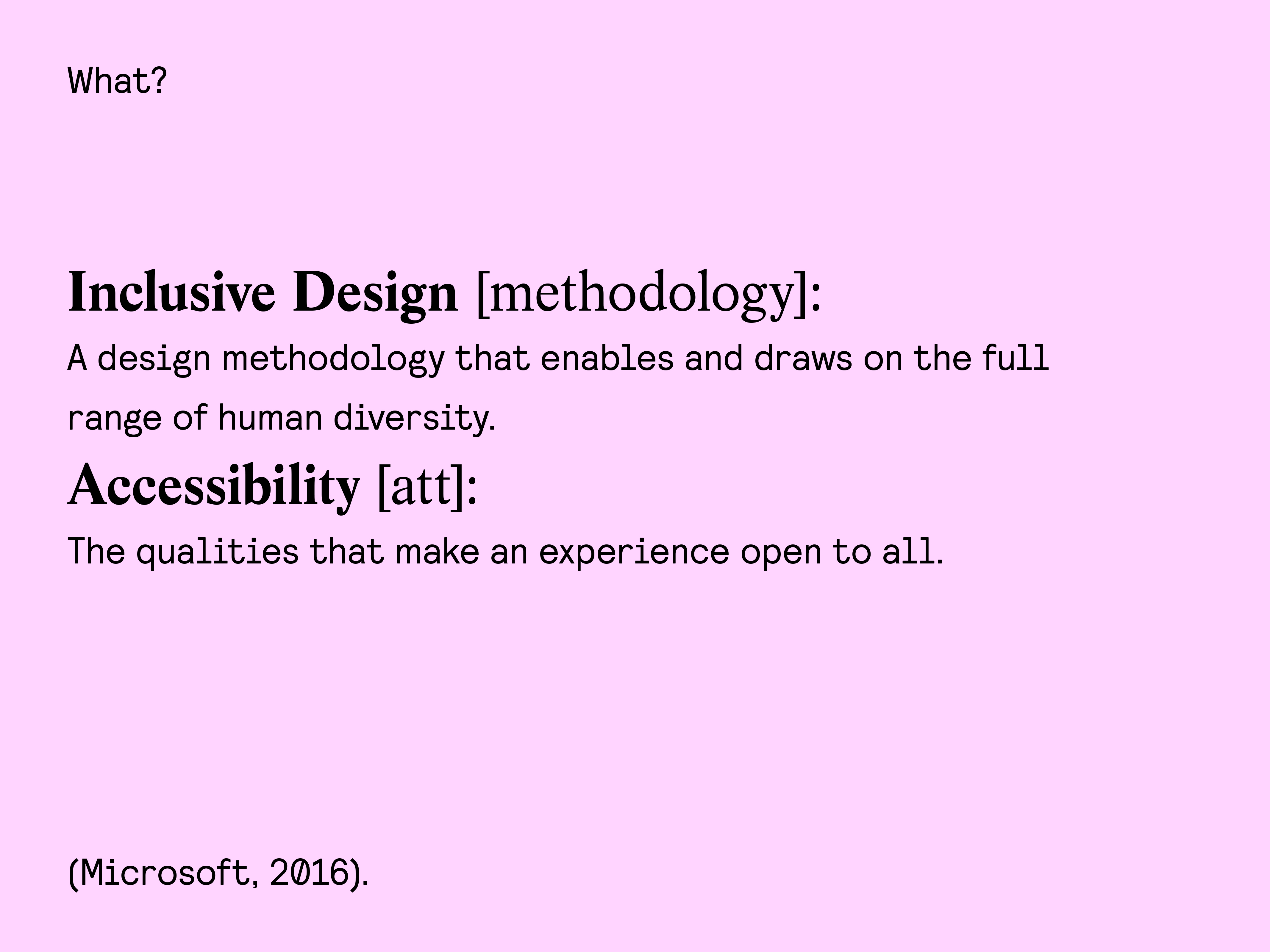
The inclusive design itself is a design methodology that enables and draws on the full range of human diversity. As we apply this design methodology, we would be able to provide accessibility to the interface, which is an attribute that makes an experience open to all for a wider range of users.
Why should we apply inclusive design to achieve accessibility?
Accessible design is not entirely intended for people with disabilities; instead, it extends to anyone with temporary and situational disadvantages. It can be someone who has just injured his/her arm, a mother holding her baby in one arm, or even a vlogger doing a makeup tutorial. To shed some light, inclusive design is not universal design. We are not creating one model that fits for all types of people in the world. Instead, we are creating design alternatives where other people with different ability can experience without feeling excluded.
However, this does not always happen in the world we are living in today. Firstly, It is mainly because “designing for disability is not cost effective” (Glinert and York, 2008). Secondly, most interfaces have and always been designed by and for people who are not disabled. Designing for accessibility can be effortless and cost-effective as long designers and coders understand standard guidelines for accessibility.
In looking at that, I would like to introduce a standard guideline created by W3C called WCAG (Web Content Accessibility Guidelines).
According to WCAG, there are 4 principles for a website to be accessible which are perceivable, operable, understandable and robust. I will list a few of the guidelines that are quite easy to be applied, especially by UX designers.
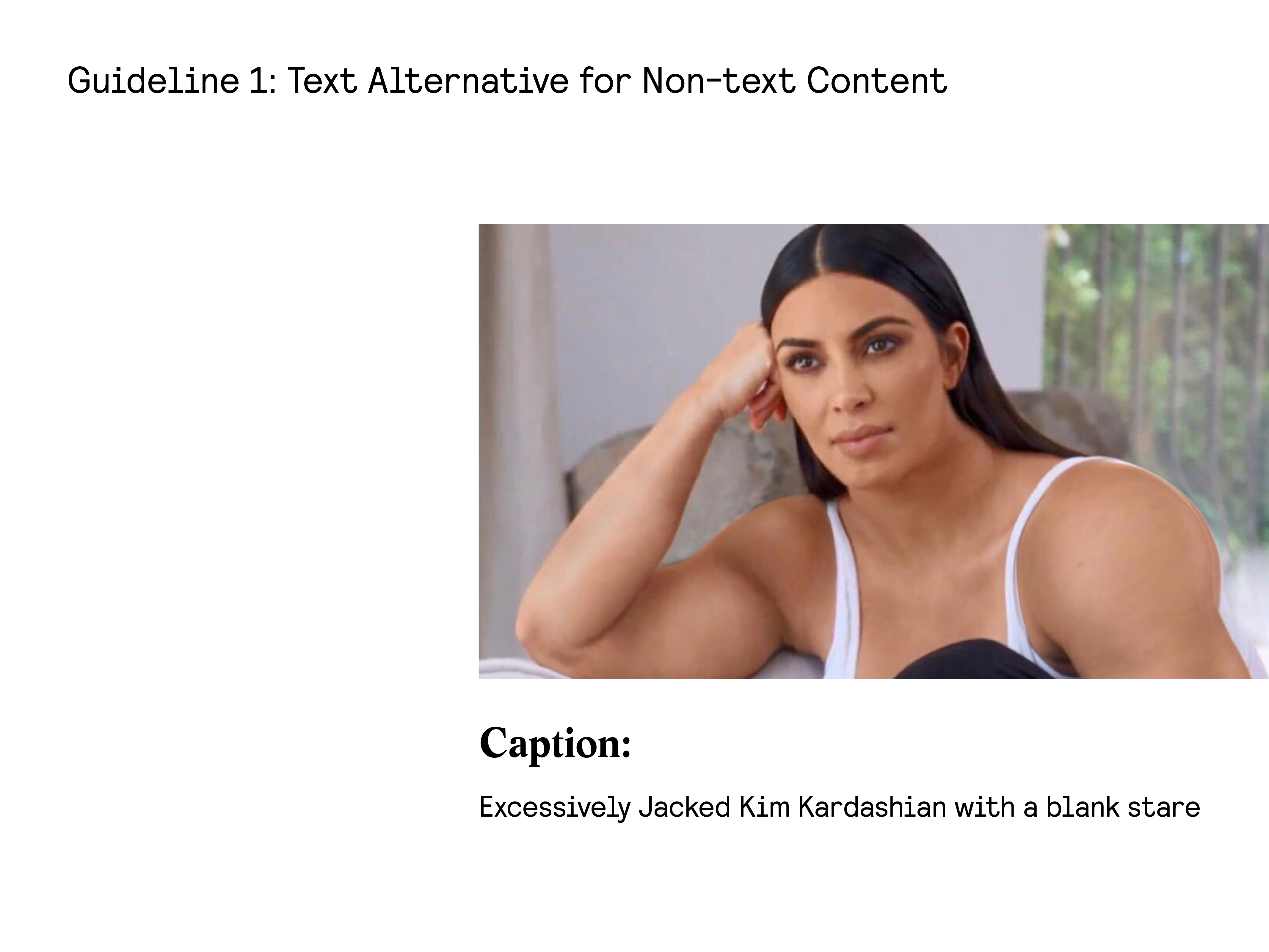
1. Provide Text Alternatives for Non-text Contents
People with blindness and low vision impairment often make use of screen readers. Therefore, designers should consider putting label and captions on non-text contents like images and videos. This will not only help people with vision disabilities but also users who have low internet speed that prohibit them from loading an image. Although there are upcoming programs like Google’s Conceptual Captions that help to describe non-text contents automatically, designers still have to anticipate this issue and provide label and caption manually.
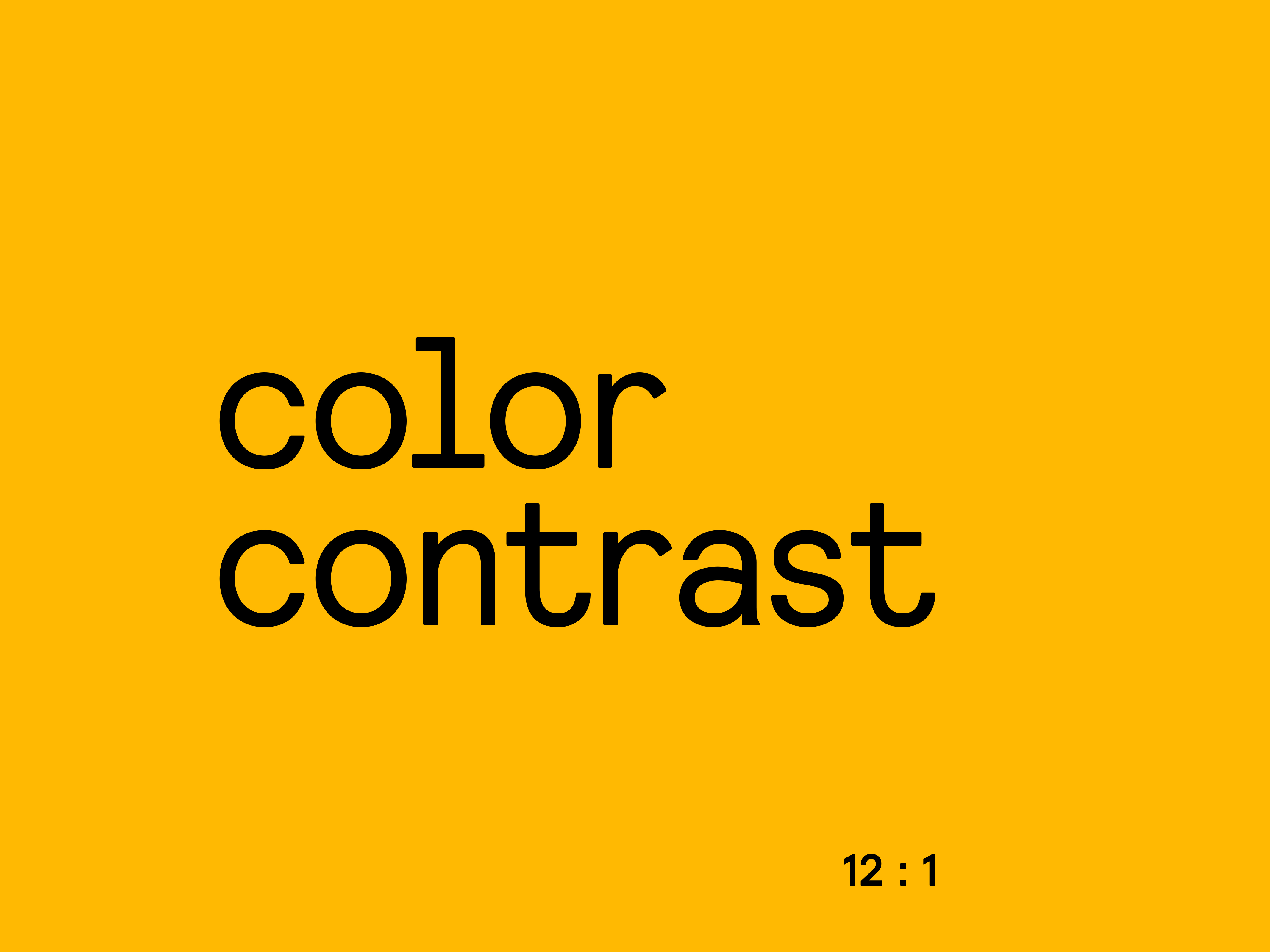
2. Color Contrast
Although the high-contrast protocol is made for people with vision impairments, it does benefit other users with different situation and scenario, e.g., for people to see the screen in bright sunlight. Based on the World Health Organization, around 217 million people have moderate to severe impairment; therefore, people who suffer vision impairment find it difficult to read text from a low-contrast background. It is essential for designers to understand the importance of color and contrast in designing an interface. According to WCAG and official government websites in the U.S.A, the standard contrast ratio between text and its background has to be at least 4.5 to 1. In looking at this, designers can instantly check contrast ratios using platforms like WebAim and Contrastchecker.com
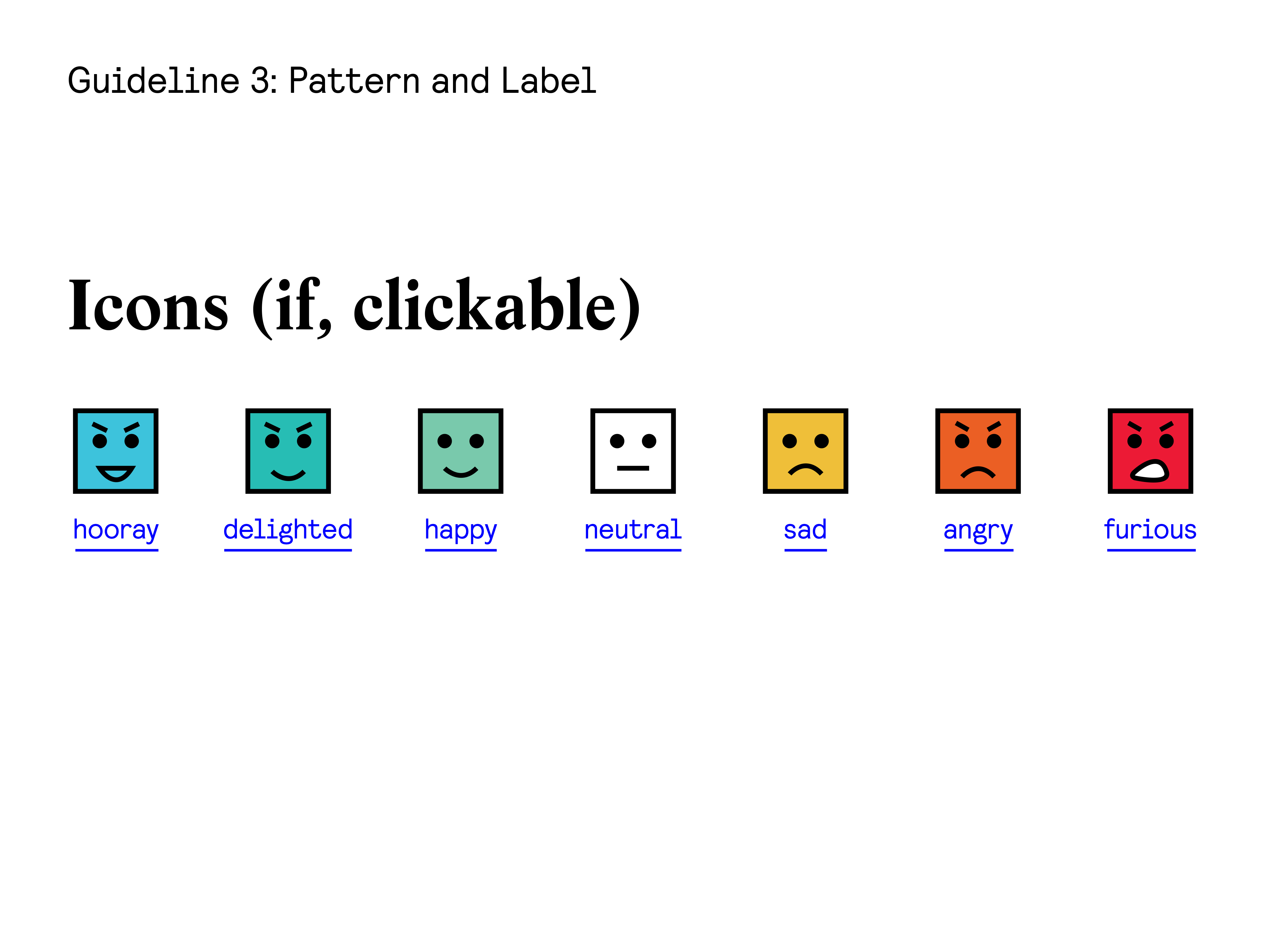
3. Pattern and Label
Pattern and label are used to emphasize critical contents when color differentiation is not sufficient. It is common that today’s modern website often just use a different color to signify hypertexts and buttons and people with color blindness find it hard to understand this. Firstly, Designers can consider using underlined text style for hypertexts. Secondly, graphs and charts should be distinguished with different pattern, shapes, labels, and icons to give clarity to users.
4. Keyboard Navigation
People with blindness often use a screen reader and keyboard navigation to go through a website. It is vital for UX designers to provide keyboard navigation and understand the importance of it. Keyboard navigation can also be useful for someone with a situational limitation like someone who just injured his arm or a mother holding her baby in one arm. In this scenario, users usually use the Tab button to navigate through interactive elements on a website like links and buttons. It is a designer’s job to make sure that the content of the site should be logical and follow the standard convention. The navigation system should start from left to right, top to bottom. The layout of the website should start with the header, navigation, content, input, and footer.
Conclusion
Designing for people is not an easy task, and when it comes to people, there is no such thing as “normal.” Therefore, I hope these few simple and easy-to-apply guidelines from WCAG and brief understanding about inclusive design will be able to help future designers and coders to view these as a collective responsibility to their design for them to create an accessible and understandable website for a wide range of users.
References:
Glinert, E. P. & York, B. W. Computers and People with Disabilities. ACM Transactions on Accessible Computing, 1(2). doi: http://doi.acm.org/10.1145/1408760.1408761
Shum, A., Holmes, K., Woolery, K., Price, M., Kim, D., Dvorkina, E., Muller D. D., Kile, N., Morris, S., Chou, J., Malekzadeh, S. (2016). Inclusive Microsoft Design.
Stanley, P. (2018, June 27). Designing for accessibility is not that hard [Blog Post]. Retrieved from https://uxdesign.cc/designing-for-accessibility-is-not-that-hard-c04cc4779d94