Mad-X consisted of myself, Mike, Agreya, and Xi (an acronym of our initials.) We worked together to redesign Seton Hall University’ Library website. The contents below provide some insight to our process:
User Research
User group: We are trying to identify user habits on their respective library websites. Our user group consisted of undergraduate, graduate students, recent alumni, and faculty. We are hoping to apply our insights in order to enhance the user experience of Seton Hall University’s Library website.
Methodology: We created an online survey that we distributed electronically, as well as conducted student interviews. Our online survey was created using Qualtrics and asked ten questions about participants opinions towards library services. Our participants ranged from students at Seton Hall University, to local New York City colleges, to foreign universities (n=46.) We visited Seton Hall University and interviewed several students about their thoughts and opinions about their library’s site.
Results: We found that a majority of our participants, around 40%, use their library a few times a week, and identify as ‘power-users’ of the library. However, the majority of our participants, mainly access their library’s website around midterms and finals when they are working through deadlines. From this insight we can gather that people are using the library’s site with a purpose.
- People mainly use their library’s website for help with research – this includes accessing databases, citation tools, and forming research questions.
- People use the library’s site to search for books.
- However, they seldom use the library’s site to borrow and reserve books.
- People desire to be self-sufficient by searching for information on their own in order to avoid asking the librarian questions, either in person or online.
From these insights, I was able to create a ‘purpose-based’ library goer. She goes to the library site with specific tasks in mind. She has several research questions in mind. However, is reluctant to ask for guidance from librarian staff.
Information Architecture
Card Sorting
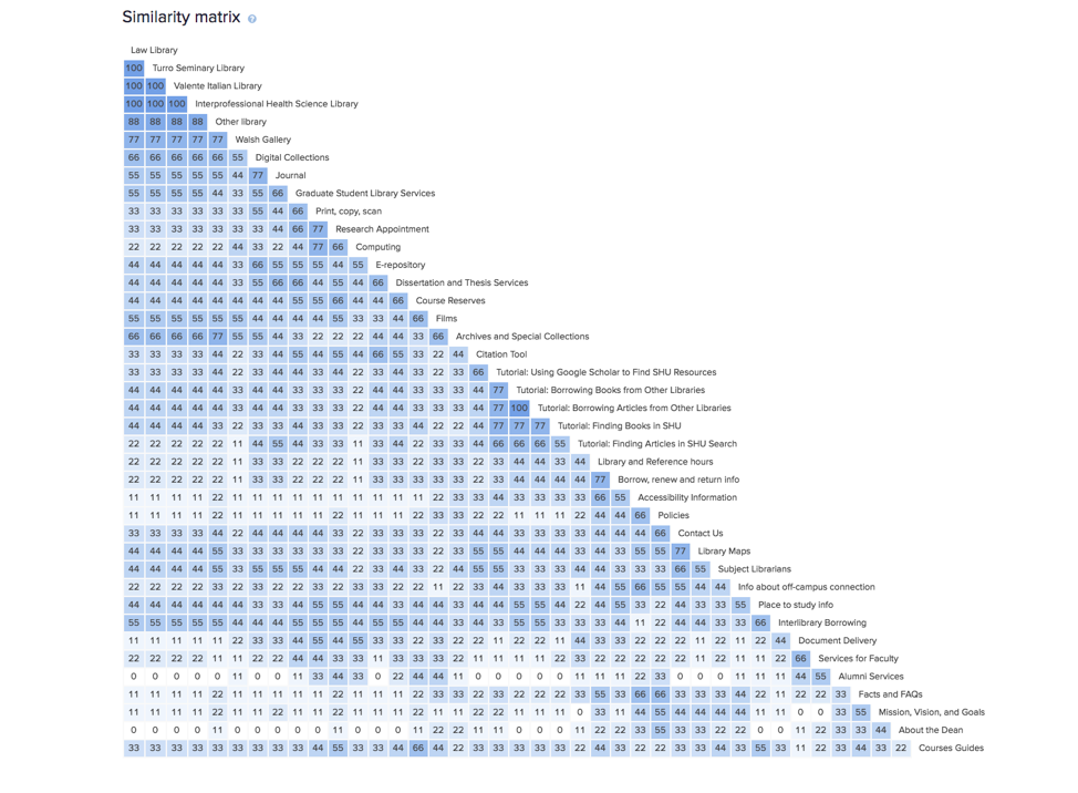
We created a card sort in order to get an understanding of how users navigate Seton Hall Library University (SHU) website. Our nine participants completed our online card sort in Optimal Workshop, some participants we observed while others completed the task privately. The items in the card sort were taken from SHU’s library website. The card sorting revealed ambiguous terminologies that were misinterpreted by the users. It gave us insight on how the users understood the services and how they are categorized.
Our participants primarily grouped the terms into three main categories: ‘Services’, ‘Libraries and Collections’, and ‘Library Information’. Our tree test showed us that these three drop-downs were successful. We took inspiration from NYU’s library website which had three main drop downs: ‘About’, ‘Libraries’, and ‘Services.’
Tree Testing
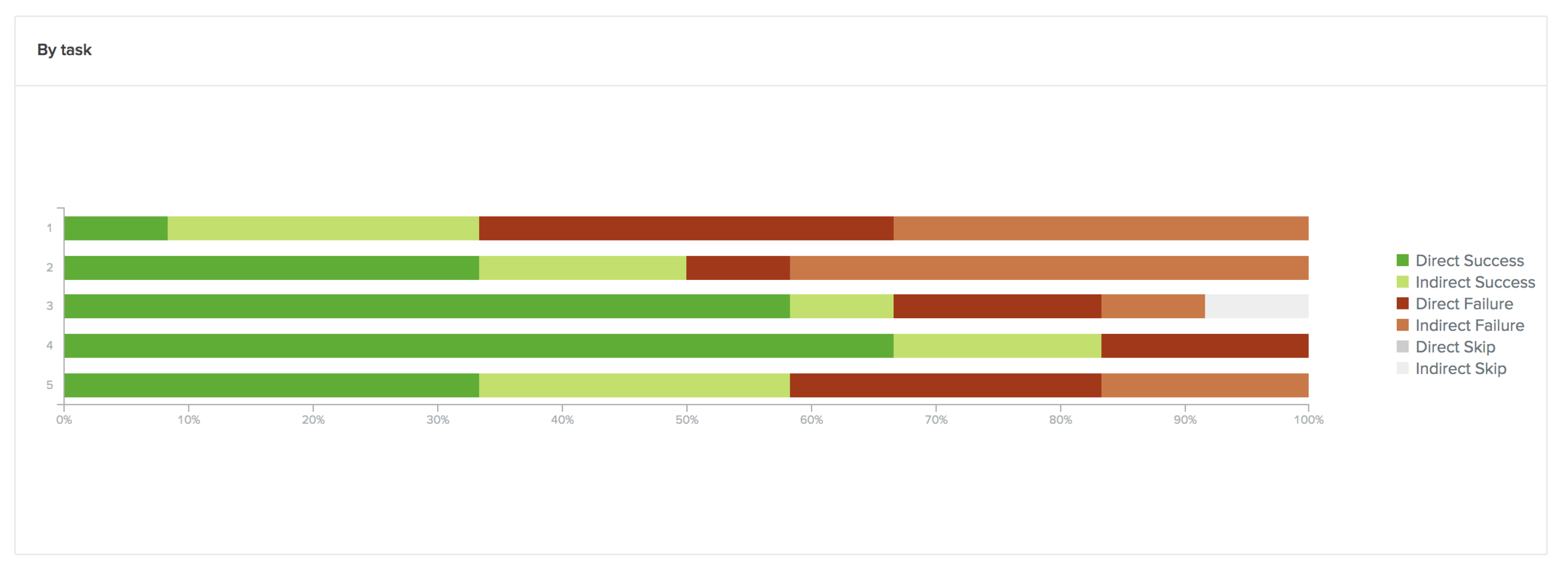
We took insights from the results of our card sort in order to create our tree test. The twelve participants of our tree test provided us with information of how users navigate the website while trying to complete a task. Early in our research about the users, we realized that our users are very ‘task-oriented.’ The user is not using the site for their own entertainment but rather to complete a task or take part in a service.
- Our participants primarily grouped the terms into three main categories: ‘Services’, ‘Libraries and Collections’, and ‘Library Information’.
- We found that participants were getting confused between ‘Library Collections’ and ‘Services.’ This insight leads us to explore changing ‘Library and Collections’ to ‘Our Libraries and Collections’ in order to demonstrate a physical space with books.
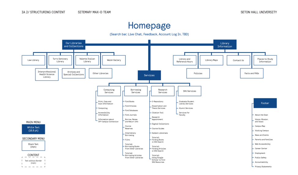
Site Map
From insights from our card sorting and tree test tasks, we were able to come up with the following site map:
Competitive Analysis
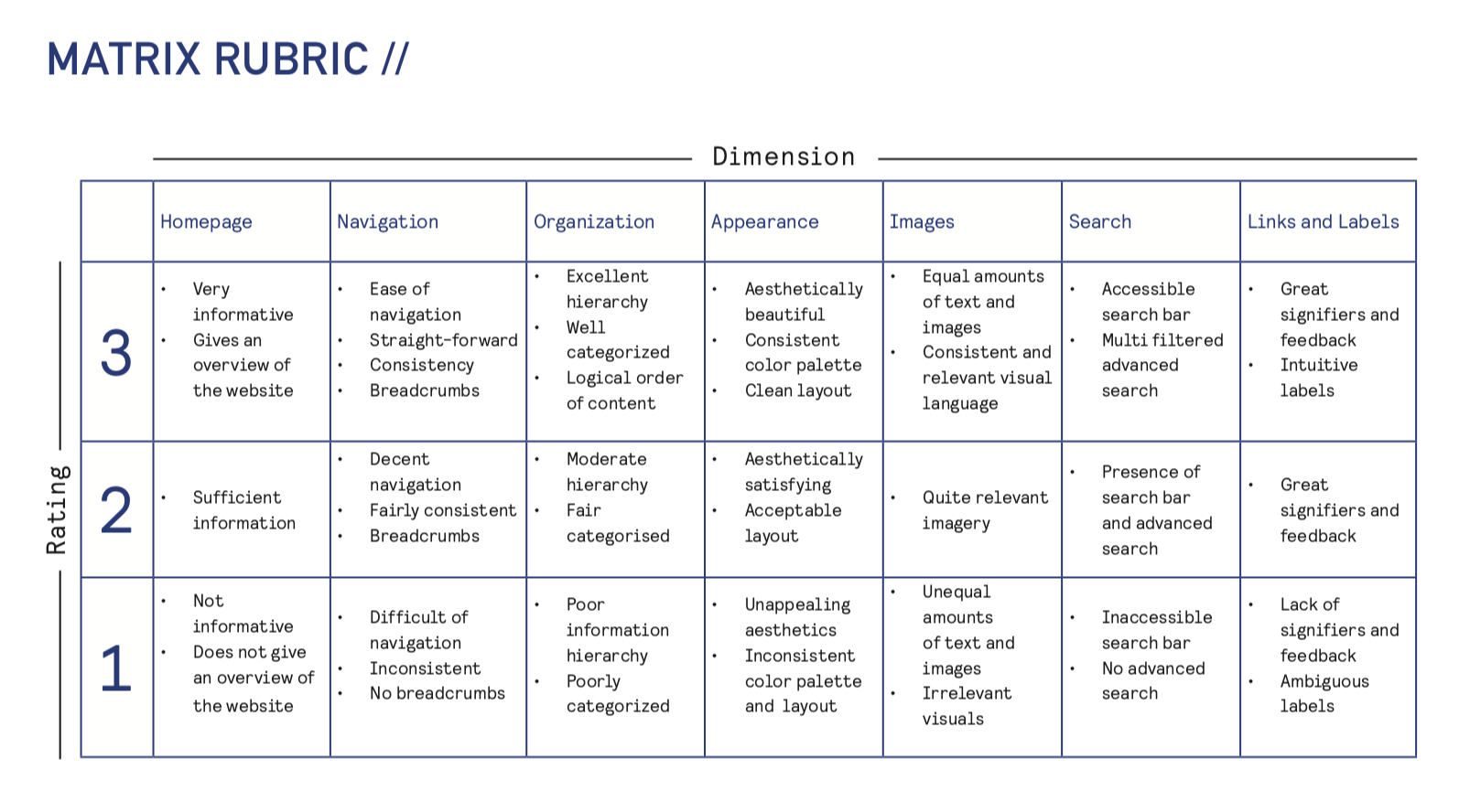
We used the following rubric to score five well-regarded library websites, so see which ones we wanted to pull inspiration from. We really liked the University of Texas Library’ homepage, as it was oriented towards the research-based student. We also found that multiple search bars confuse the student, as per NYU’s website. From these comparisons, we aimed for a simple, clean, research-oriented approach for our site.
Planning and Prototyping
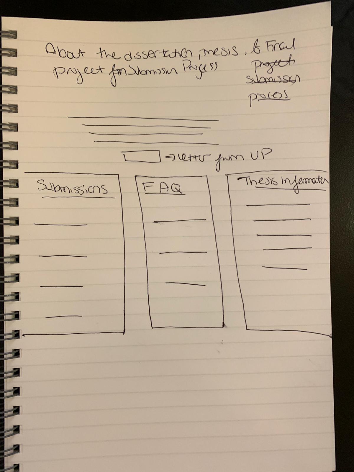
Shown to the right is one of the rough sketches that we used as inspiration for our prototype (thesis and dissertation page.) From our initial prototype sketches we decided that we needed to reorganize the top navigation menu. We felt that we needed to change the order of the top navigation menu, as users felt that ‘our services’ was the most accessed menu on the page. We decided to order the menu from most to least accessed.
We also found that we needed to distinguish different search bars. In our initial prototype, we found that users were having trouble distinguishing between two search bars. We made a point to distinguish them in our final prototype.
We also decided to place a title and breadcrumbs on every page. When users were completing tasks, they were having trouble navigating through different pages without bread crumbs and clear titles. We added those so they would navigate the page with ease.
Feedback and critique
The following bullet points include feedback that we received when presenting our prototype demonstration:
- Hierarchy of links: We should test out the practice of underlining important links, and the use of ‘underline’ as signifiers.
- Animation of ‘Find books, articles, journals, databases’: In the future we should conduct a user test if the animation of this bar is confusing, or misleading to users.
- Removing the emphasis from the ‘chat with a librarian’ widget: Bringing this widget towards the bottom off the page, from a floating widget, was appreciated. This helps the user navigate easily through the site, instead of constantly being asked if they need help.
- Repeating the ‘find books’ and ‘find articles’ as quick links: We offered those as quick links right underneath a search bar to find those. Those links could be switched to something else that is more helpful to the user.
- Lack of uniformity across desktop and mobile headers: The desktop header reads “University Libraries”, while the mobile header reads “Libraries.” This was an honest oversight, which means that we should have proofread the content once more.
Conclusion
I learned a lot about User Research. I learned just how important it is to go and speak to your user. For instance, I would have had no idea that SHU students are such ardent users of the ‘interlibrary’ borrowing tool, had I not had a chance to speak with them in person. I also learned about the practice of card sorting and tree testing, two tools which were entirely new to me. Card sorting allowed me to see how users would actually categorize labels, as opposed to how myself and my group would categorize them.
In the future, I would have aimed to have more time for the design aspect. I feel that had we had a few more weeks, we could have had a more fleshed out prototype. However, one likely ever feels that they are done designing something. It would have been nice to take more time to design service pages. I would have also liked to go back to SHU to see how students interact with the prototype and perform user testing on them.
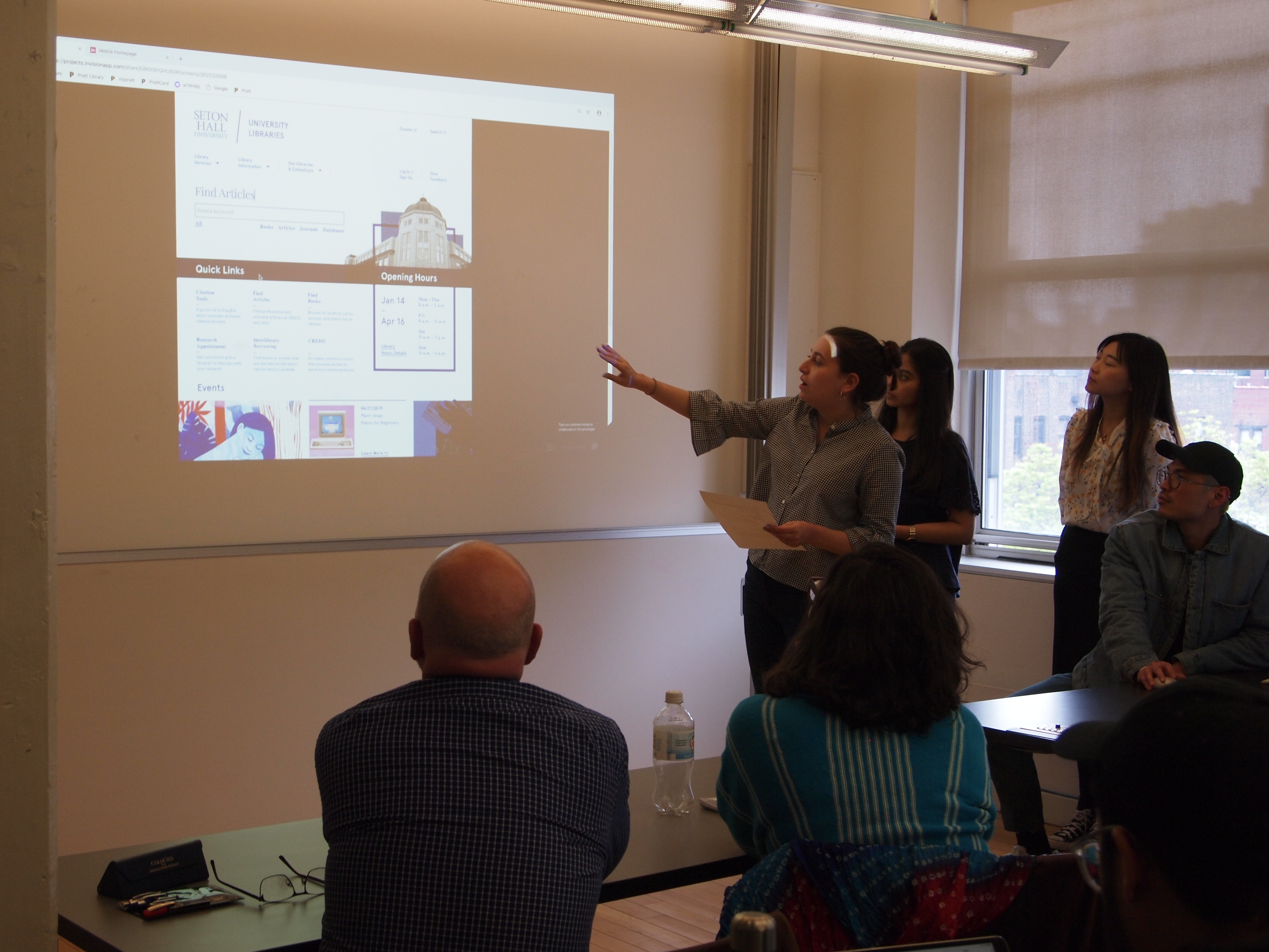
The links below contain our final prototypes:
Desktop prototype: https://invis.io/E8RXBFQHUB2#/362332698_Homepage
Mobile prototype: https://invis.io/6WRXBQN3XDF#/362332842_Mobile_Homepage