
Clue is a menstrual cycle tracking application, which not only lets you track your period but also your ovulation cycle and aids you to understand how your body works. Clue gives 10 million people each month insights into their reproductive health and collaborates with leading universities to advance female health research, and deliver essential education about health, menstruation, and sex
In an interview Don Norman once said, “Attractive things work better. When you wash and wax a car, it drives better, doesn’t it? Or at least feels like it does.”
Clue is functional, attractive and has a very clean interface. With the stigma-surrounding mensuration, the application is easy to use in a public place without any hesitation, but it often fails to perform some basic functionalities, as follows:
Period Tracking
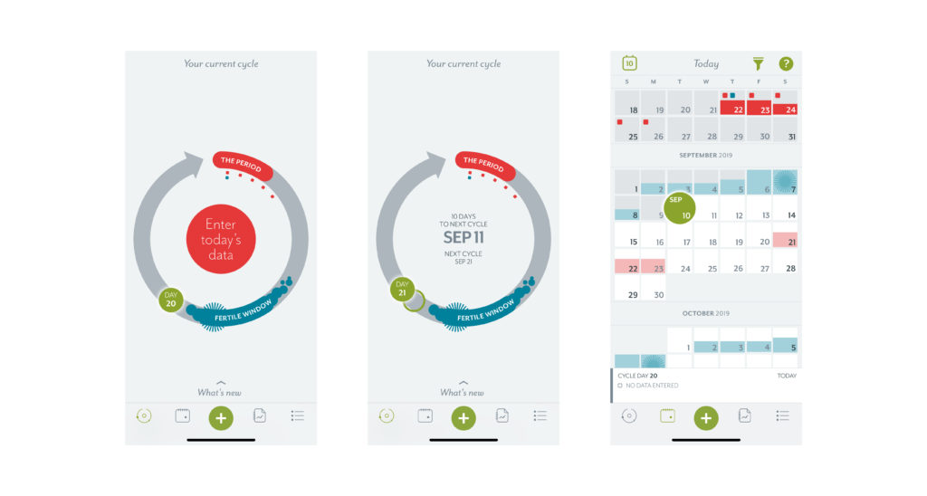
Clue is primarily used to track your cycle and check when its due. The due date of the period is not visible as soon as you open the application. You are either required to use the slider and slide to another date, or go into the calendar in the main navigation menu to find out the next due date. The application affords the details but it is a bad signifier and urges its users to look for the information. My solution to this problem is to make the next due date visible on the main screen as soon as the user opens the application.
Entering a New Cycle
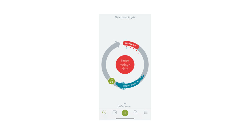
Entering a new cycle on the application can be done by clicking the red circle or the ” + “ button in the main navigation. This function is repetitive and the red circle with cycle looks redundant and is a bad signifier. It confuses the user, leaving them wondering if they are entering the data on the right screen.
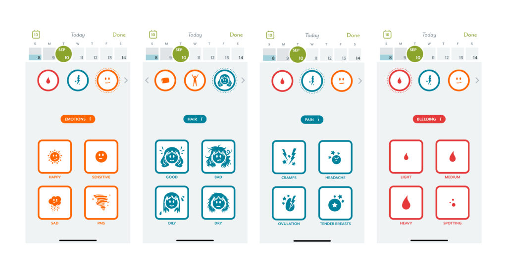
The application also gathers extensive data from the user about their period. This data is used by the application to understand the user better but doesn’t translate it into future predictions. If the user is spending their time giving the application their information, the application in turn should predict and warn them of the common symptoms they may face based on what they have felt previously. This outlines the mental model of the user.
Confusing Buttons
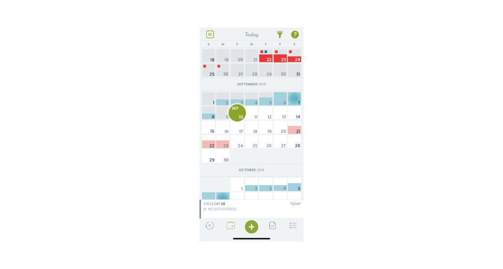
The icons on the top of the calendar screen are confusing and misleading. It is unclear as to why they are on the screen. The funnel icon gives the user a chance to manage their filters and the “?” gives the user information about the visuals used in the calendar. The icons defy understandability and give the user the information they don’t use.
Conclusion
Overall the application Clue is very user friendly and does a good job at helping millions of people keep a record and track of their menstrual cycle.