Design Critique: The Brooklyn Public Library (Website)
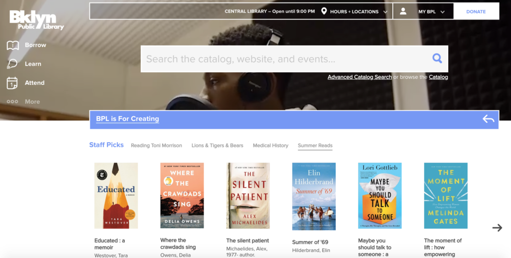
The Brooklyn Public Library ‘s website is a place where patrons can go to do research, borrow books and register to attend special events amongst many other resources. This evaluation will critique the Brooklyn Public Library’s website based on core usability factors.
Visibility: “More options”
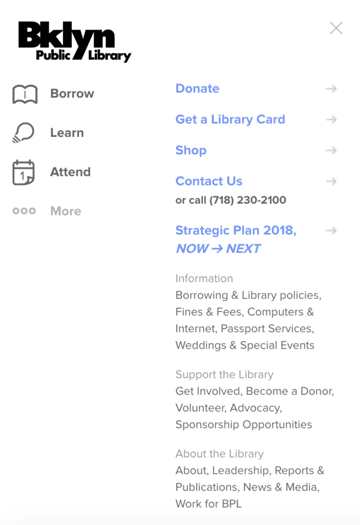
Navigating websites can be a daunting task when dealing with the conceptual model vs. the user’s conceptual model. Most websites do not come with customized system images to assist you with finding the specific item you are researching, as the mapping usually is straightforward and direct. Brooklyn Public Library (BPL) offers a variety of different resources to the public which is why their navigation bars are more inexplicit when it comes to page labels such as the ones seen in Figure 1.1. These particular titles are very broad and have a substantial amount of sub genres featured within them which can make the discoverability process longer than say a musician or bookstore’s website. The procedural knowledge patrons utilize when interacting with websites is far greater than the declarative knowledge being employed. It can be frustrating when ones’s effective knowledge deceives them in exchange for a designer’s conceptual model. This can lead to the idea of “human error”, which Don Norman refers to in his book “The Design of Everyday Things”. BPL has done a good job implementing signifiers to assist users in finding their destinations but the mapping could be stronger so that the process is more efficient and enjoyable.
Solving Visibility: “more options”
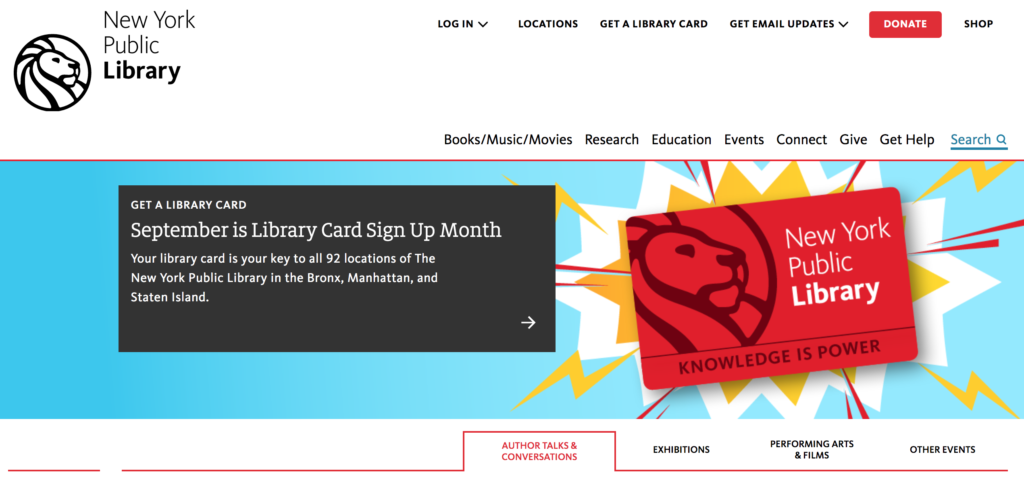
In Figure 1.2 the discoverability of the New York Public Library’s homepage is a lot more user friendly as it puts everything at the user’s fingertips–no need to navigate to a different section of the website and most importantly no need for deciphering semantics. The constraints and feedback on their homepage are more accommodating and seems to “strive to eliminate inappropriate interactions…” (Norman, 2013) For instance the “Research” feature’s mapping, discoverability and signifier are all very clear without the need of the “More Options”. Less is more would be a suggestion for BPL– the less people have to click and scroll through futile options the more favorable the experience. BPL should make the main resource labels less ambiguous and more explicit by using “Research” instead of “learn”, “Books/Music/Movies” instead of Borrow and lastly change “Attend” to “Events”. This will help simplify and settle some confusion around discoverability, mapping and signifiers.

Search inquiry
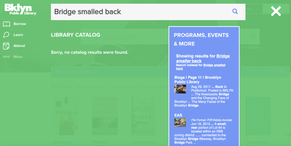
The “Search” function is very popular and highly useful but when it’s not intuitive or discoverable it can be very problematic. In (Figure 1.3) we can see that the discoverability of BPL’s search function is very visible as it is front and center on the website with clear signifiers and great feedback. The function immediately tells you when it cannot locate your item as seen in (Figure 1.4) but it also affords the possibilities of one’s search option as shown in (Figure 1.3).
There is one major set back that happens when you’ve incorrectly entered the wrong search phrase or misspelled a word–there is neither intuition nor sympathy for “human error”. In contrast, usually within a few strikes of typing in the google search engine it’s propagating suggestions regardless of mistakes.
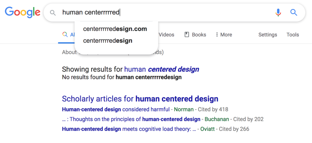
A.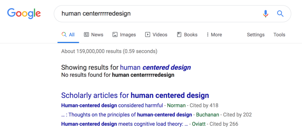
B.
Figure 1.5 (Googles search suggestions with voluntary ‘human error” to measure and evaluate outcomes.)
Solving Search inquiry Issues
The human-centered design process for BPL’s website search function should include “applied ethnography” in the understanding of how one browses and searches. By strengthening its constraints BPL would have the opportunity to make their website more accessible to a larger more diverse audience. A recommendation to fix this issue would be to program an autocomplete into the design so that users don’t have to compete with or rely on their STM or LTM alone. This could potentially increase the public’s independence and productivity by relying less on librarians for simple tasks and more on machine learning. By reducing the gulf of execution BPL could alleviate disruptions caused by their inconclusive dead ends or “road blocks” as Don Norman would say. BPL should prioritize the patrons needs and abilities so their users aren’t feeling defeated or discouraged when operating within their website. Figure 1.5 illustrates how google’s autocomplete function still intuits the suggestion one needs at getting closer to the desired outcome even when there are mistakes within the search inquiry.
Conclusion
Overall, the Brooklyn Public Library’s website has a lot to offer–it has various strengths with just a few opportunities to maximize user experience.