Bumble, a popular dating app, offers a traditional swipe/match platform but with a new concept that only women can make the first move to initiate a chat. Currently, Bumble has launched three features “Bumble Date”, “Bumble BFF” and “Bumble Bizz”. The entire philosophy behind Bumble was to create a place that leveled the dating field and empowered users to make connections. Although Bumble has three different features, I will focus on analyzing it’s dating feature.
Creating the user profile
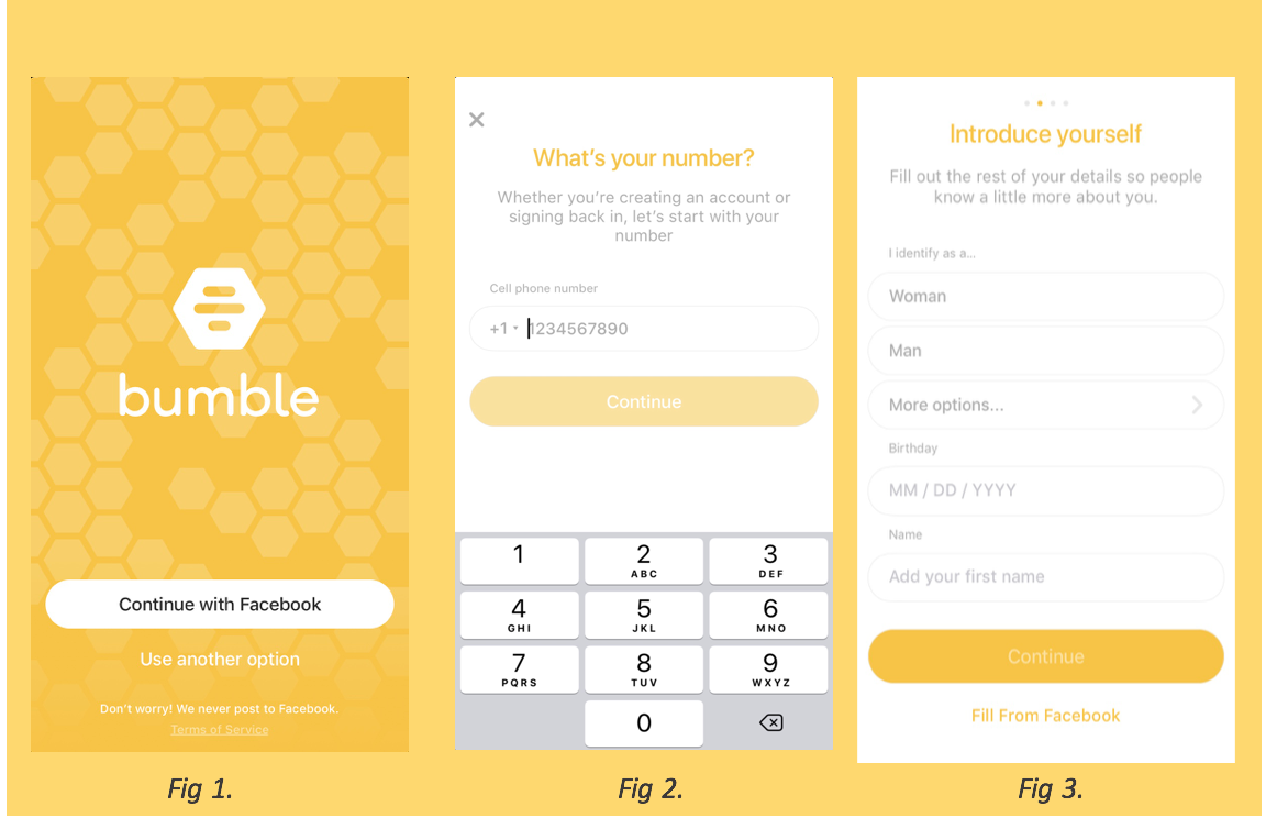
Bumble’s initial encounter with users, the login page, is very similar to other social apps. The login process applies the concept of knowledge in the world, which makes the whole register process effortlessly. First thing first, users can choose to either create a new account or login via Facebook(fig1 & fig2). After choosing one option to build up the user’s profile, the application provides several user prompts to help new users complete their profiles. One sweet thing which amazed me on Bumble is that instead of letting users choose their bio gender, they ask you what you identify yourself as (fig 3).
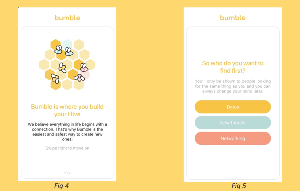
After done with all the basic information, Bumble will deliver the user a message regarding Bumble team’s main concept of creating this app (fig 4). It is always nice to know the intention behind an app since knowing the designer’s intension will help user bridge the gulfs of Execution and Evaluation. Then the user can choose which mode they would like to enter from the three features (fig 5), Bumble Date(Dates), Bumble BFF(New friends), and Bumble Bizz (Networking).
Swiping and Matching
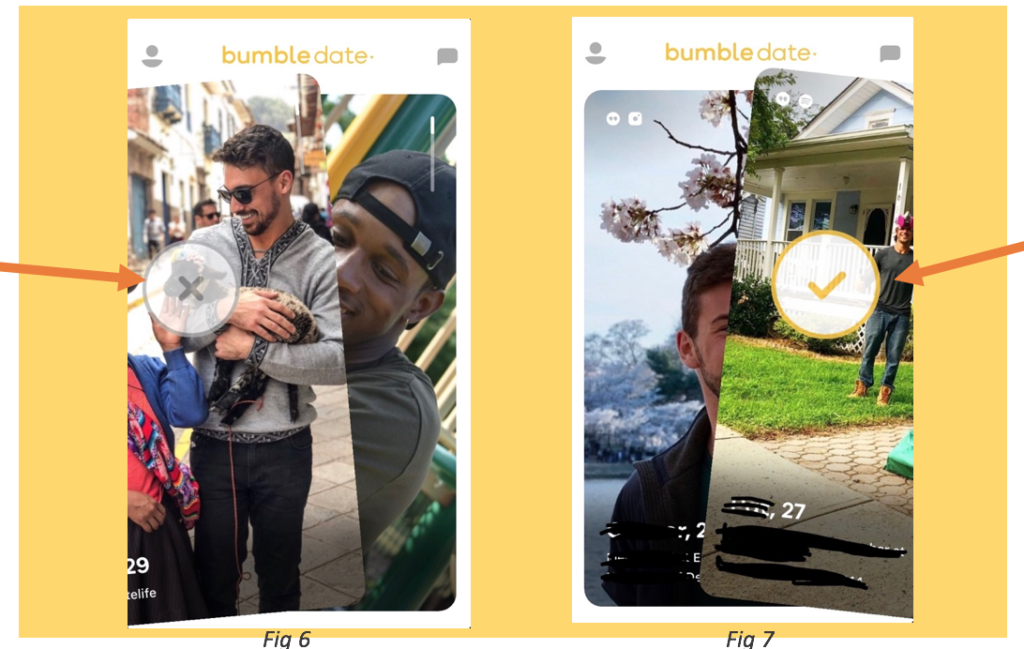
Once the user chose to enter either of the modes such as Bumble Dates. The user can swipe right and left to define whether they are interested in the person or not. On the usability front, several user prompts will pop out to assist the new user to navigate through the different features. Further, when the user either swipe right or left, there are two half-transparent sign shows up, a Cross (fig 6) and a Check (fig 7), which brings up the discoverability and affordance for the user to clearly realize their operation and decrease the possibility of swiping wrong.
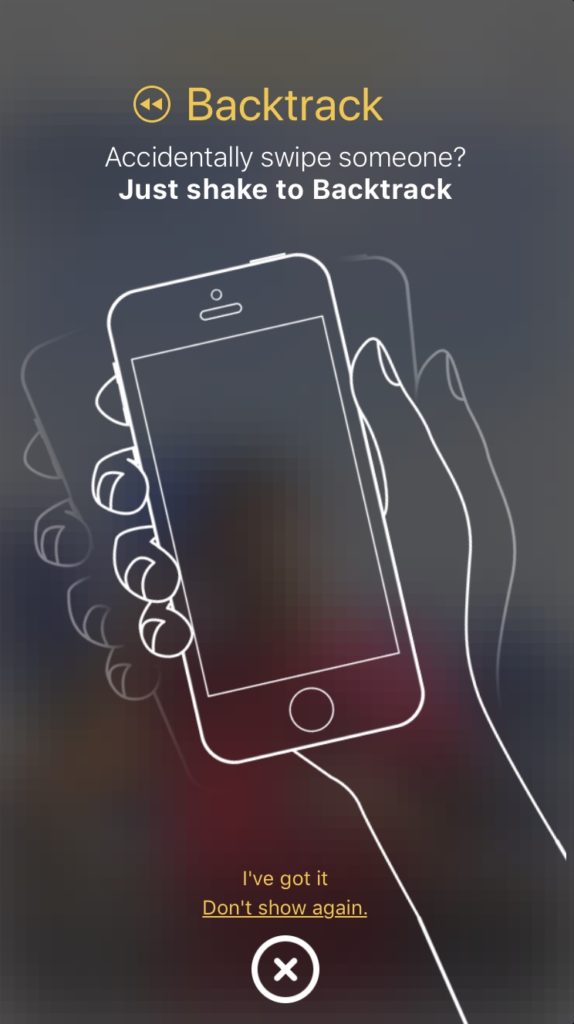
Even more, when the user first-time swipe left a person, the system will send you a message and tell you if you accidentally swipe the person left, you have the chance to shake it back. While the reminder is continuously popping up after every 10 times of left-swiping. The UI of the reminder has the mapping problem regarding the “Don’t show again” button is too close to the “cancel” button. The user can easily hit the wrong one which will cause them to see the annoying reminder once and once again. For solving this mapping problem, the “Don’t show again” can be bolded and enlarged a little bit so the user will have less chance to click the wrong one.
Viewing Profile
Like any other dating app, the users are the focal point. Therefore Bumble wisely dedicates roughly 90% of the screen real estate to photos of people from the user’s deck, with the other 10% allocated to their name and a brief bio. From the bar in the top right corner(fig 8), the user can tell that they can vertically scroll down for more photos and information. The bar signal is acting as a signifier/feedback of what is it indicating.
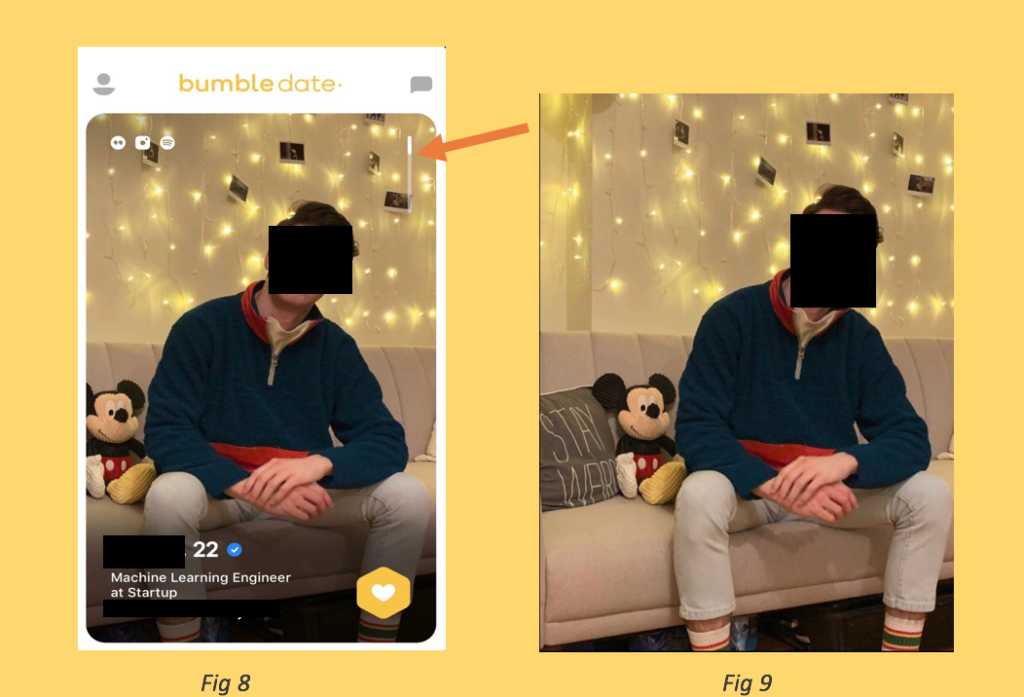
If the user is willing to see the whole picture, they can simply click the image (fig 9), and then the photo will be zoomed out to the size of the phone screen. However, if the user wants to view the rest of the pictures, they need to exit the full image mode back to the original page, then scroll down to see the rest. Bumble does not have the feature to swipe right for viewing other pictures in the full-screen mode. This violates the users’ knowledge in mind in a certain extent because the knowledge taught the user to expect that they can swipe right for viewing more. For solving this confusion, Bumble can simply add the feature for the user viewing more photos, but at the same time, they do not need to exit the full-screen mode.
Final Verdict
Overall, Bumble has a great conceptual model. Bumble’s user experience is mostly intuitive and flawless, and the UI design is modern and minimalist, but there is still some room for improvement. While the Bumble’s designers are pursuing a clean and minimalist interface, they neglect the legibility and the definition. Besides the overall design, Bumble can focus more on the details.