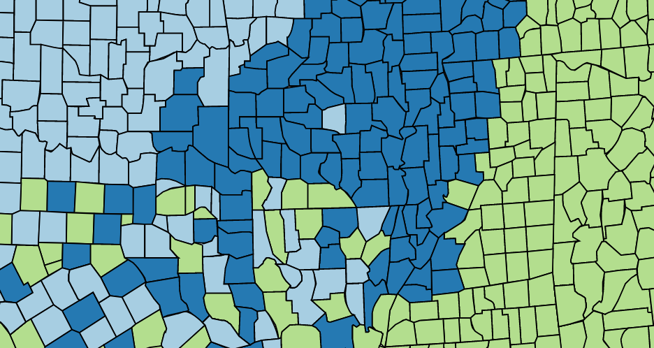
ColorBrewer 2.0 is a simple and effective webpage created by Cynthia Brewer, Mark Harrower, and The Pennsylvania State University. It is used as a diagnostic tool for evaluating and designing color schemes, particularly in the context of cartography. Its success is based in its limitations, with only 165 possible color schemes, users choose a variety of variables, both practical and aesthetic, to find a scheme best suited to their needs. These constraints of the underlying data in the software ensure readability and color differentiation. Within this article, I point out a few attributes of ColorBrewer that are the driving force behind its utility, as well as a few suggestions to further its development.
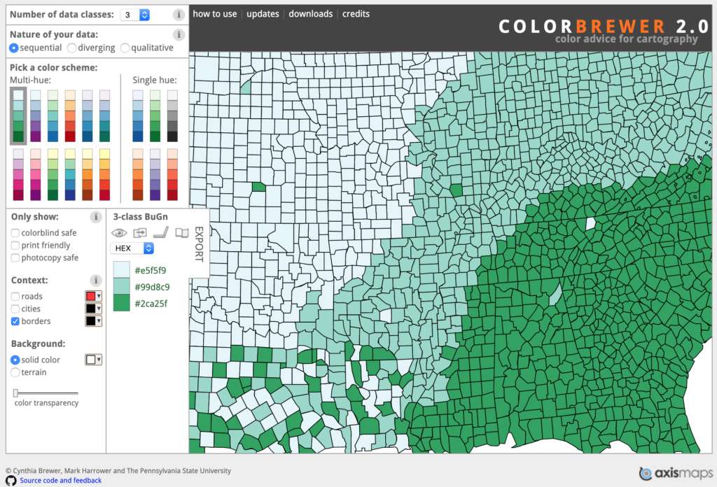
The site’s architecture is straightforward, with all options displayed on the homepage. This creates fewer visibility issues associated with more complex websites. Each option, for the most part, is displayed within its own “box” to minimize errors in the program’s conceptual model. However, I believe a different layout would be more appropriate, as it more aptly adheres to the typical train of thought when deciding on color scheme.
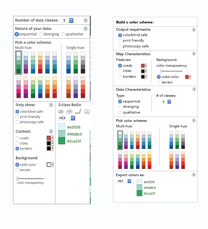
This proposed menu improves its design in a variety of ways. As mentioned, it employs attributes of human cognition, by leading the cartographer or designer in a more typical series of mental steps. Starting with the constraints of the output use case, followed by desired or needed map characteristics, then data types and category number, and culminating in color scheme choice. Since all of the variables affect color choices, it is better to establish them at the beginning of the selection. Also, the layout establishes a more consistent design language, mapping the user in a clear path from top to bottom. Previous to original layout, no “box” can be missed, as the path of the eye is led in a consistent direction, establishing a natural mapping.
Aspects that remain unchanged include menu, toggle, and button affordance. These are well established in original design, as users have previous knowledge in their head about how these attributes work. Furthermore, immediate feedback is given to the user, not only from the menu, toggle, and button itself, but from the adjacent map on the right side of the homepage. Also, the information icons remain within each category, each providing a more in-depth explanation of the options, or increasing the conceptual model, without complicating the interface with information many users have in their established knowledge. This increases the complexity of the website, however does not add to its confusion.
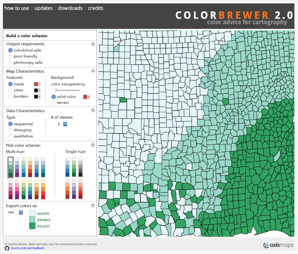
The overall layout of the website requires a few changes to maximize user benefits. First, the hierarchy of the site is established through three main tiers. The top banner introduces users to the site, provides details of use, site data downloads, and credits. The following body is the main structure of the site. With menu and map inline, they are mapped appropriately, signifying the user their connection. Finally, the footer reestablishes credit and copyright information, without being confused with the information in the body through a different delimitating background color.
The ColorBrewer 2.0 website is an extremely useful tool, and in many ways, is designed with the user in mind. However, with the above design alterations, its readability and utility will be further increased for user enjoyment.