A museum represents a window to the world, in which people can experience diverse cultures and artistic expressions. And, when it is not possible for people that live far away in time and location to get access to art collections, digital platforms become essential. Digital tools are important in the leadership role of museums of sharing and making art accessible.
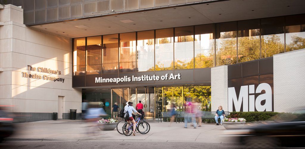
Mia has around 90,000 artworks from all over the world, including the Americas, Europe, and Asia. It brings diversity through art and culture to its many visitors. Following Don Norman’s principles in his book “The Design of Everyday Things,” I will be analyzing “Explore the Art,” an interface where people can explore the collection.
Description
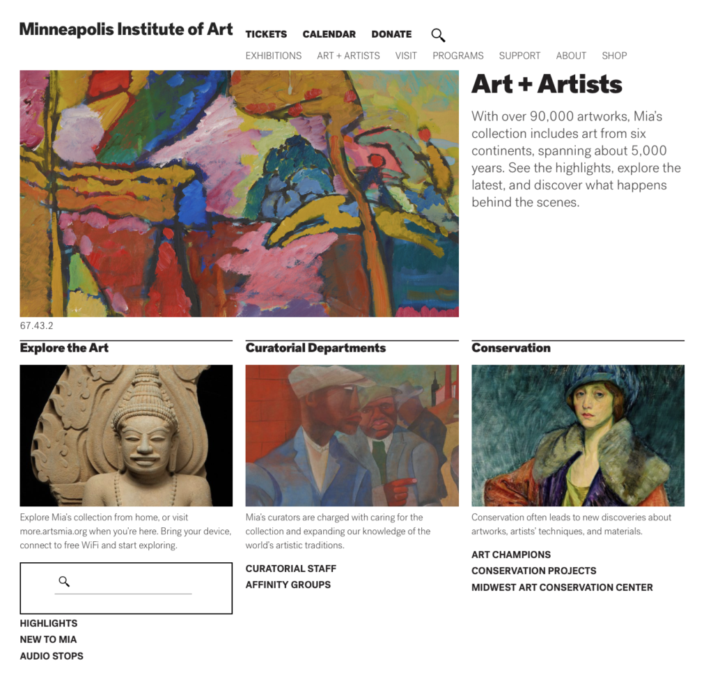
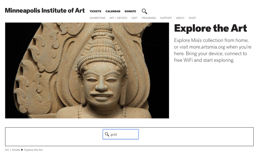
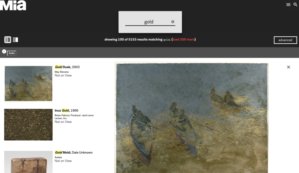
“Explore the Art” is part of Mia’s online collection. By entering words in the search box, it brings the opportunity to discover and explore the art in both ways, at home or the museum. Following the entered word, it displays the images and descriptive information of the artworks associated with the word. For this case, I started with the word “gold.”
observations
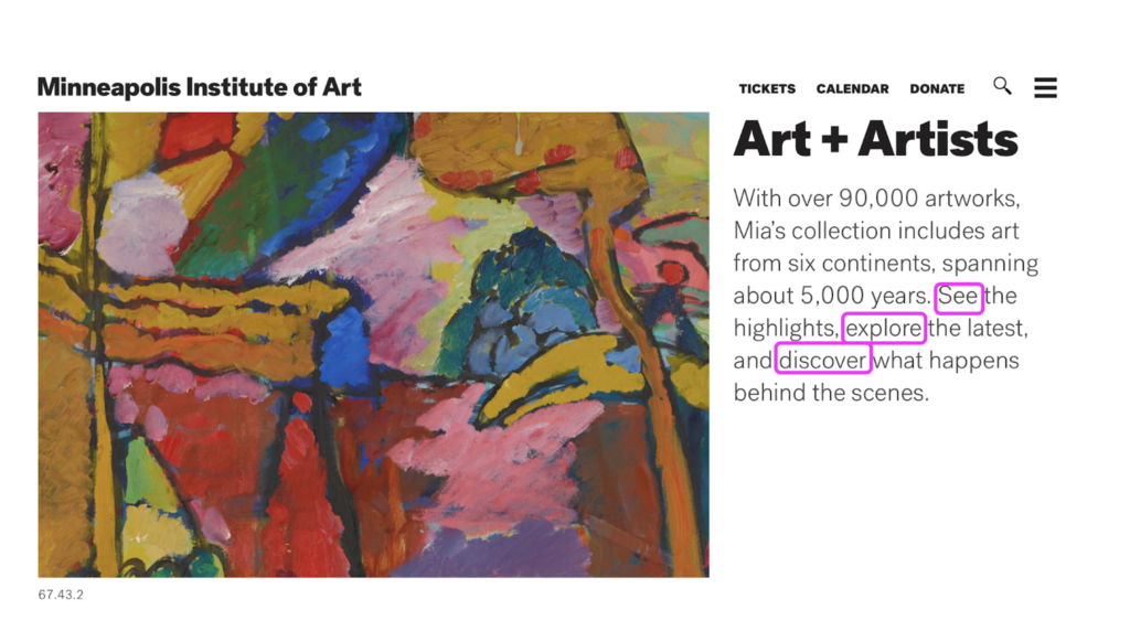
The interaction with this interface brings a positive experience because the user can access to valuable information about artworks related to the word the user has entered. However, the experience can be confusing and frustrating as well. To begin, the text that introduces the user is not providing links to the actions it mentions like see, explore, and discover. When I tried to click on those words, I expected to continue navigating, but nothing happened.
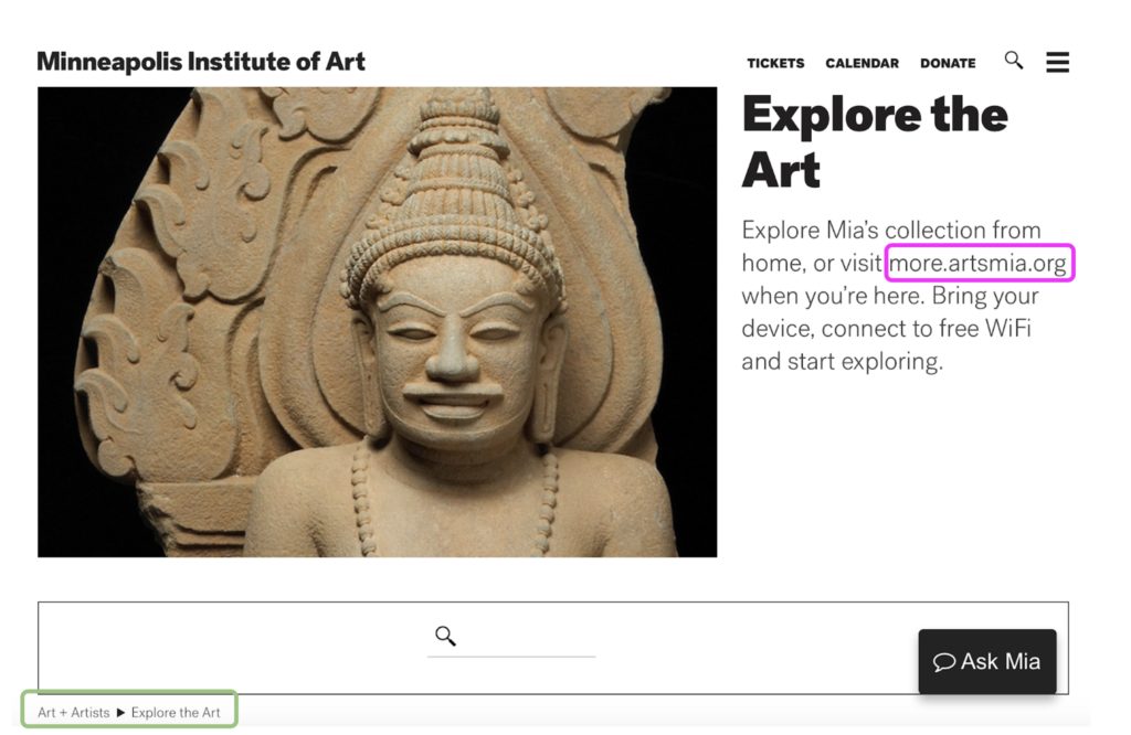
A similar situation happens in the next section “Explore the Art.” For instance, instead of clicking on “more. artsmia.org,” the user has to copy and paste it in a new tab.
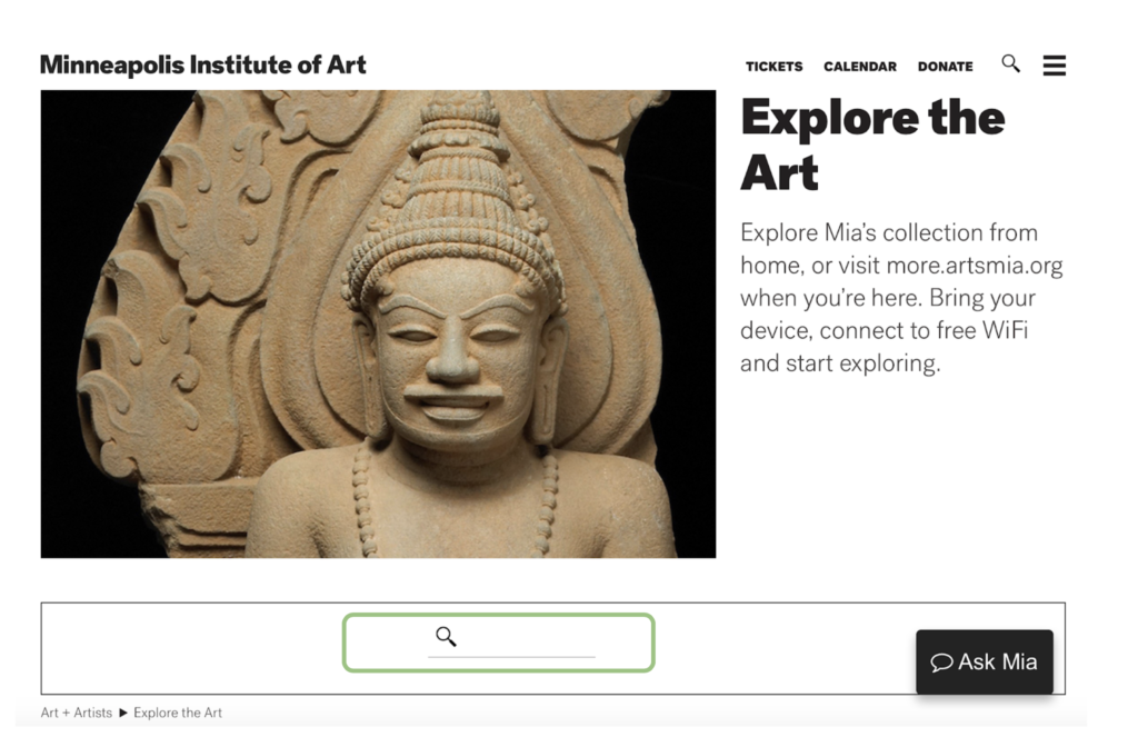
As the user continues advancing, the interface offers one search box. At this stage, the interface does not provide a sign to what to search for because it is free and open text. There, the user can enter any word. And, if the user is not familiar with art at all, the experience can be either challenging or frustrating.
Recommendations
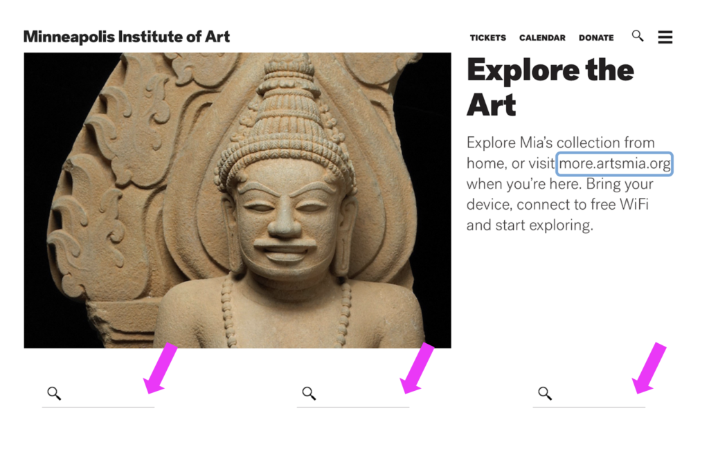
There are simple ways of enhancing the user experience, for example, adding a button with a link to the text “more. artsmia.org,” or including two more search boxes to offer different search levels like a beginner, intermediate, and advanced level, could be some of them.
TO SUM UP
The possible interactions with the interface are seeing, discovering, and exploring. However, the affordances, or the actions that are possible, are not complete. The signals, or signifiers that communicate where the actions should take place, are not perceivable. It can be useful to add buttons and links indicating clear actions such as “search” and “explore more.”
Gloriana Amador Agüero | Museums and Digital Culture | gamado14@pratt.edu