
Slack is a collaboration tool where you can work with your team to get things done together. With slack, you can communicate not only with one-on-one services but as well as with groups, across multiple platforms and devices. You can also freely share files and integrate other services and applications. The application is available on Playstore and Appstore on mobile, iPad and laptop. It also has a web version.
The Launch Screens
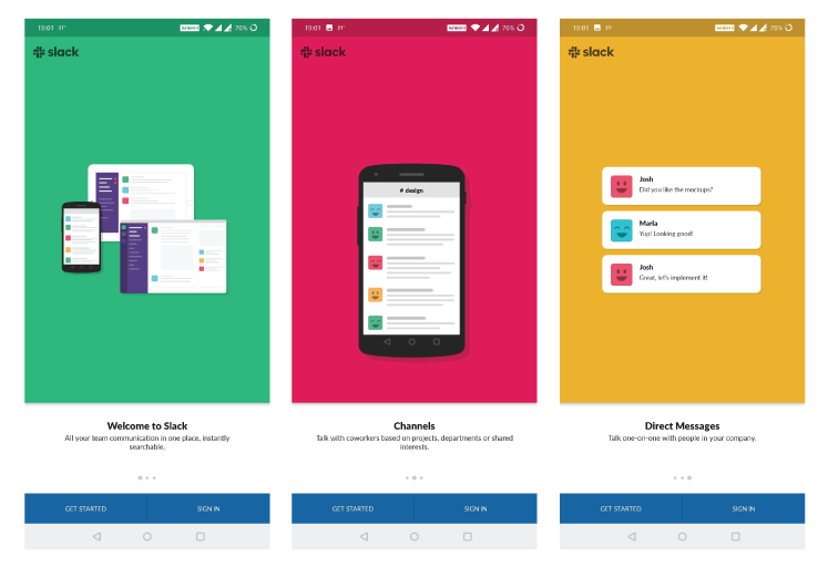
As Don Norman mentioned in the book “The Design of Everyday Things”, conceptual models improves both discoverability and outcomes assessment. They assist to understand, to predict how things function or act, to figure out what to do, and to feel controlled. Slack offers a brief introduction explaining the application, its usage, and characteristics that guide users for the first time and help them identify usage and objectives. (Figure 1)
Sign In Screens
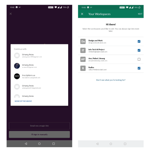
The login page gives users different sign-in options, the main one is that it allows users to select the email id linked to their slack workspace. This acts as signifiers and informs the user that the application will be able to sign in using any of the email ids. (Figure 2)
If the user decides to sign in using any of the email ids mentioned on the pop-up screen, the user will be given an option to select one or more workspaces associated with the email id selected. (Figure 2)
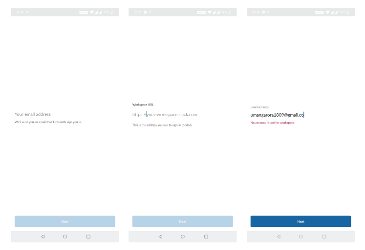
The app also allows the user to sign in by adding workspace URL to use any other email id apart from the list. If there is an error or action slip, for example, if the workspace is not connected to the email id, the user will receive feedback immediately. (Figure 3)
There is a constraint when a mistake happens while signing in the app, as there are no choices for restarting the process or going back. And even after the mistake happens, one can still press next but there is no feedback (Figure 3). The solution is to disable the next button until the individual corrects the error. They should also add a sign-up or back button to allow the individual to take an action.
Chat Screens
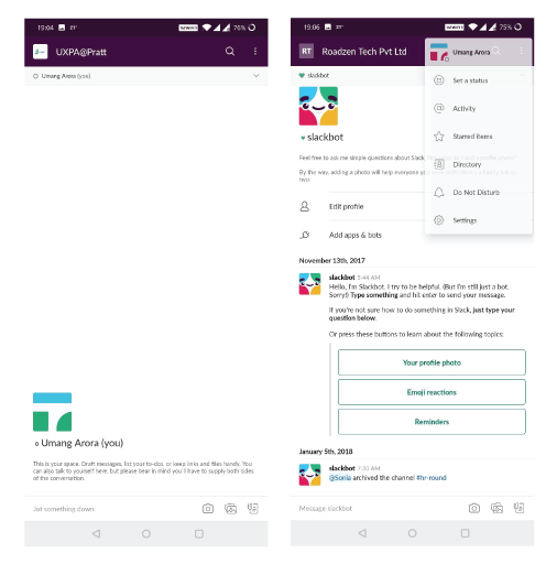
The design similarity to other messaging applications decreases the learning curve of the users and bridges the gulf of execution. The search icon is discoverable and understandable. It is also a widely acceptable icon which informs the user that it affords the search action. (Figure 4)
In the top right corner of the chat interface, the overflow menu (when clicked) displays natural mapping. It has spatial similarities making the structure clean and comprehensible. The icons used work as a signifier to assist get a better knowledge and have a conceptual or metaphorical similarity. For instance, Star icon for starred posts, the phonebook for the directory, etc. They also offer a clear concept of what happens when you click on the section, hence employing knowledge in the world. (Figure 4)
The Menu
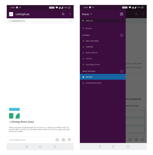
The menu icon used is a profile image that visually cleanses the design and works as a signifier of the user’s current workspace. But it makes the menu difficult to find which seems to be a paradox of technology as it complicates and leads to the gulf of execution owing to the disconnection between the conceptual models of the user and the designer. (Figure 5). This can be solved by adding the term ‘menu’ below the icon or adding a small hamburger menu icon with the profile image (similar to LinkedIn) reinforcing the task.
The menu has a framework that is evident and simple to use. The tasks can be readily discoverable. For example, if the user wants to add a channel he/she needs to click on the plus icon in front of the heading channels. The concepts of mapping and signifiers are used to give a better user experience. (Figure 5)
Similar to the menu icon, the icon used at the top right corner (inside the menu) for ‘workspaces’ is uncertain and creates confusion at the visceral stage which results in a rise in the user’s learning curve resulting in the gulf of execution. Adding the ‘workspace’ text to the icon would assist in addressing the issue and generate an ideal system image of the scheme. Or by enabling the user to alter the workspaces by clicking the name of the current workspace from the primary chat panel, a solution that can be tested. (Figure 5)
Conclusion
Slack is a universally used collaborative application that is understandable and enables users to interact readily with their team members. In some characteristics, it may have some issues such as constraints, signifiers, and the paradox of technology, but the application is intended to keep in mind the 3 levels of design appeal – visceral, behavioral, and reflective.