SoundCloud is an open music and podcast streaming platform that allows users to listen to songs from around the world as well as upload their own music. The platform is most popular for its original music from all types of independent artists and creators while offering users the opportunity to discover new underground music. This design critique will examine the ease and convenience new users are able to discover new music on the SoundCloud iOS app.
Signing Up for SoundCloud
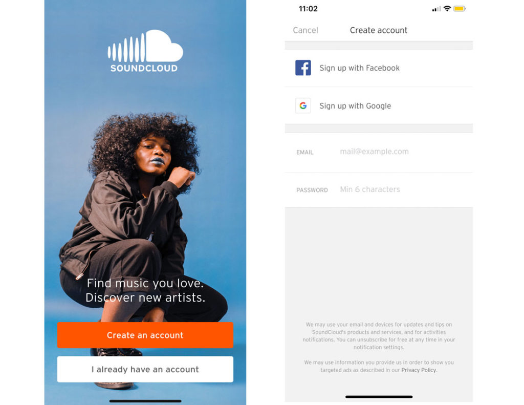
Users initial interaction with SoundCloud is a visually-appealing sign up page. Against the background of a blown-up photograph of an artist, the buttons at the bottom of the interface signify that there are only two options for entering into the app–either create an account or sign in to a preexisting one.
While the sign-up model is conventional for streaming platforms, this allows for little discoverability of what SoundCloud offers in terms of features and content. SoundCloud is unique from other music-streaming apps because it enables budding and underground artists to share and promote their work. For first time users who are not familiar with SoundCloud, at first glance, it is simply just another music-streaming app. To create an account, users are able to sign up with either Facebook or Google–which indicates that SoundCloud is an app for social network activity as well.
Discovering New Music
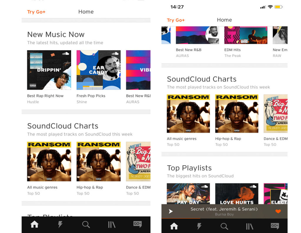
The home feed follows a simple, minimalistic card grid design. It displays different categories of music such as “New Music Now,” “SoundCloud Charts” and “Top Playlists.” Each category has a number of different playlists. But only two playlists from each category are fully displayed while the third playlist is shown half-way off the interface. This affords that there is more to look at or explore. Thus, the horizontal orientation or the mapping of the list prompts users to scroll towards the left to view more playlists or scroll down to discover more categories.
Viewing the Playlist
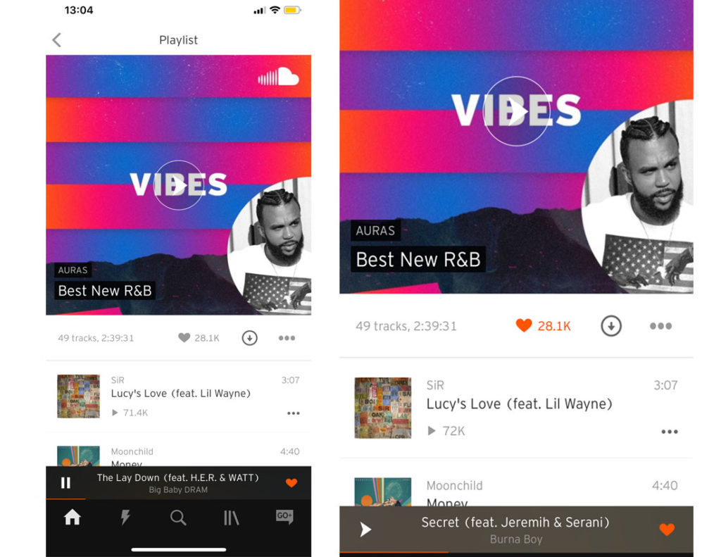
SoundCloud encourages users to like playlists which is indicated by the heart below the playlist feature image. The heart turns orange once a user taps on it, which provides visual feedback. The music player also appears at the bottom of the screen. The play button on the left of the music player signifies that a song is currently playing. An interesting aspect about the music player is that it has its own like button. When a user taps on the like button on the music player, he or she is liking the song not the actual playlist. For first time users, this may be confusing, but it is not so complex that it requires a high learning curve. In addition, the like buttons are mapped close to the feature it controls which will help users understand which feature they are liking.
Navigating through SoundCloud
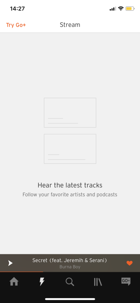
The navigation bar at the bottom of the interface leaves a lot up to the user to discover what the icons indicate. While, the home and search buttons fit the right conceptual model of their proper functions for users, the lightning bolt icon requires users to lean more heavily on knowledge in the world in order to learn what it indicates and its functions.
After a user taps on the lightning bolt, the interface does not allow for easy discoverability of what to do next–is it a list of liked tracks, do you have to follow accounts to stream music, is it free to stream music or do you have to sign up for SoundCloud Go+? (SoundCloud Go+ is their paid subscription service which gives users access to high quality audio, offline listening and no ads or previews.) There is little on the interface that helps direct users on how to stream the latest tracks, forcing users to find the correct signifiers to help them figure out what to do next. Upon closer inspection the Stream feature can only be used with SoundCloud Go+. To make the association clear for users, adding a pop-up that prompts users to subscribe to it in order to use the feature would be helpful.
SoundCloud is an app for music lovers and connoisseurs. Overall, its follows a simple, minimal design where the visual elements like the album art are highlighted against the white background. But for users who are unfamiliar with SoundCloud and its features, the app lacks clarity.