
Tumblr is a microblogging and social networking platform that allows users to post and share multimedia and other contents. In this article, I will critique Tumblr iOS app based on the design principles and concepts mentioned in Don Norman’s book The Design of Everyday Things.
Navigation
Once logged in, users are directed to the home screen where they will be able to scroll through the feed in a chronological order. The feed employs mapping, allowing users to move their fingers up or down to scroll through and see more feed that’s at the top or bottom of the screen. At the bottom navigation bar users will see the icons that signify the various functions of the app. The icons changes in color from its default grey to white when selected, providing a feedback to the user of the different type of screen that they are now looking at.
This helps the users form conceptual model of the app’s function and the various ways in which the users are capable of interacting with the app; they can browse through various feeds in the home page, look for new contents in the discover page, upload contents of their own on the post page, message other users, and manage their own feed in their profile page.
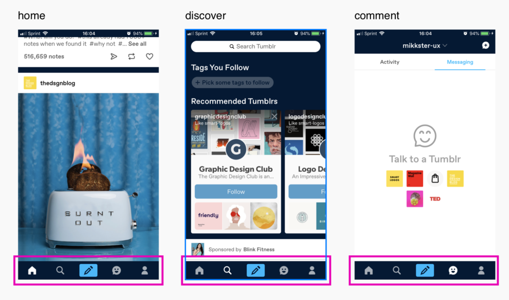
It is also evident that in the navigation bar (image 1), the post page signified by the pencil icon is given higher discoverability than other functions as it is placed on a vivid light blue background. By raising the discoverability of the post function, it helps users form a conceptual model that the post function is the most important function of the app.
However, the discoverability for the post function is increased at the cost of providing users with a clear feedback; the light blue background used to accentuate the post icon is more prominent than the feedback given when the users select a different tab. This can be seen in image 1 ; although 3 screens are completely different screens, at first glance they seem like they are all part of the same tab as the blue background for the post icon is more prominent than the subtle change in the color of the icons from grey to white, which acts as the feedback. This could create frustrating experience for the users as it conflicts with their knowledge of the world, that tabs are commonly highlighted whenever they are active.
Possible Solutions
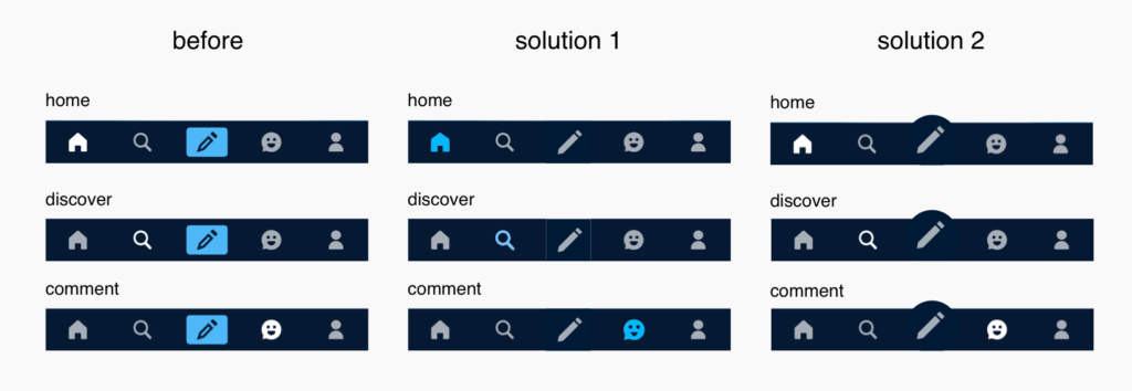
We can avoid the above problem by ensuring that the feedback given for the tab selection is not overpowered by the visual emphasis placed on the post icon. This can be done by simply removing the blue highlighted background (solution 1) and placing emphasis solely on the feedback of the selected icon, which will be easier to notice. Another solution is to retain the high discoverability for the post by using different visual treatment that emphasizes the post icon without distracting the attention from the active icon.
Posting Contents
Once tapping on the post icon in the bottom navigation bar, users are directed to a new screen that displays multiple signifiers for various forms of media which users are capable of posting through Tumblr (image 2, left).
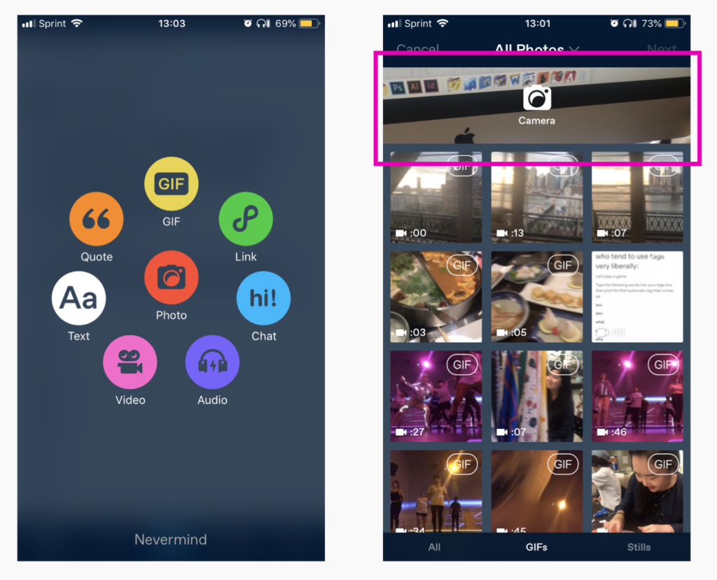
Once tapping on the GIF icon, users are directed to a screen that displays collections of videos from your phone that could be made into a GIF (image 2, right). At the top of the screen, there is a section for the camera, showing that the camera is activated; this signifies that the current screen affords taking videos. By showing both the collection of videos and the camera function, it helps users create conceptual model that they have the option to create a GIF from preexisting videos or take a new video to be made into gif, without using any prompts.

After the video is chosen, users are directed to a screen that allows them to choose 3 second clip from the video of their choice (image 3, left). If the user tries to crop and zoom the video by pinching the video, the prompt appears at the top reassuring the users that their intended action can be done in the next step (image 3, right).
This is an example of acknowledging the user’s need of wanting to crop and zoom the video and effectively bridging the gulf of execution by providing appropriate feedback. They are using the prompt to bridge the gap between the user’s knowledge of the world (pinch the image to crop or zoom when editing) and the system image (the users cannot crop or zoom the video in this screen) . This prompt also functions as a feedback for action-based slip of the users, if they were to unintentionally zoom or crop the video while trying to trim the video.
The app provides constraint on the type of action that users can execute in each screen, by allowing users to only trim the video in one screen and having them crop and zoom in the next screen. Through the use of constraint, the app effectively guides the users through the process of posting a GIF while preventing the users from experience cognitive overload.
Conclusion
Tumblr app provides appropriate signifiers, feedback, and constraints to help the users navigate through its complex functions. Although the signifiers can be improved in some areas, the app does a great job helping users interact with and post various forms of media with minimal confusion.