Launched in 2010, Untappd is an application for the craft beer community. Users can record and rate the beers they have tried, see what breweries have on tap, and keep up with events and releases surrounding craft brewing. Untappd also serves as a social platform, so that beer drinkers can communicate their thoughts to breweries or fellow craft fans.
Discovering the Best
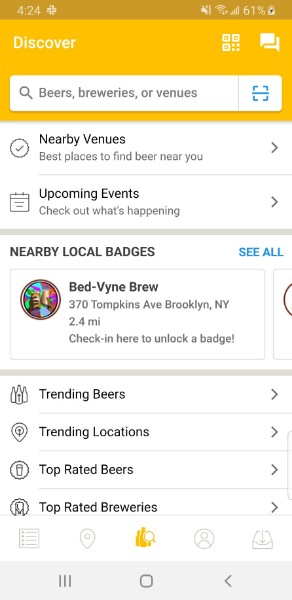
After the initial login, Untappd lands on the Discover screen. The primary purpose of this page is the search, clearly signified by a magnifying glass icon. The magnifying glass as a signifier works well: it maps the desired result (find) with what action is necessary to achieve it (search). See Figure 1.
The search itself is predictive, allowing a user to rely on knowledge in the world if they can’t remember the precise name of a beer, brewery, or venue. This aspect proves very useful, as it is often deemed unnecessary to remember these names when they are written down for us to look at. The predictive search accommodates the human tendency not to learn information that is readily available around us.
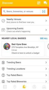
One drawback of this screen of the most-utilized functions of this application is not discoverable: to record a beer they have tried. In order to do this, they must search for a beer, select it, and then click “Check-In”. It is not known from looking at this landing screen that this is something Untappd offers their customers. A direct link to check in a beer, represented by an “Add” icon in the top right corner would solve this problem. See Figure 2.
Checking in a Beer
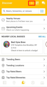
As mentioned above, Untappd is largely used to keep a record of beers that a user has tried. A beer can be rated from 1 to 5 with a sliding scale, but the increments on the scale are restricted to every 0.25 points. This semantic constraint makes it easier to rate and view other ratings, as the size of the screen relative to the average pointer finger don’t allow for too much granularity. This scale’s usability is also made better by its mapping. The numbers get higher as the marker is moved from left to right, reflecting how increasing numbers are usually represented. See Figure 3.
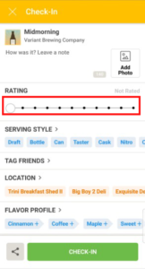
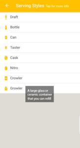
One of the other options is to choose the serving style of the beer. These options have no descriptors, making the choice difficult for those without knowledge in the mind of these styles. While one can clearly tell the difference between a can and a bottle, she may not know the difference between a draft and a nitro or a crowler and a growler. This could easily give rise to knowledge based mistakes. Untappd does provide small icons for each of these options, but the experience could be improved by adding text descriptions that specify the characterizing traits of each one. See Figure 4.
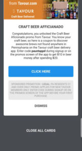
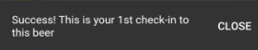
When one is finished inputting the desired information, they can click “check in”. The former screen disappears and gives way to an intermittent screen advertising nearby venues and showing new badges earned (Figure 5). It is not clear that the beer has been successfully checked in until the user dismisses these other messages and is taken back to the beer’s page. There, a small pop up informs them that this beer is, in fact, checked in (Figure 6). More immediate feedback is necessary here, with the same message appearing before the user is redirected.
Viewing Recent Activity
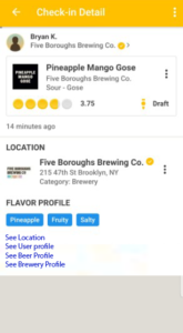
Untapped provides a feed of recent check-ins, showing the user what others are trying nearby. The feed is structured in card format, with each card carrying information about the user, the brewery, and the beer. An issue arises with the number of links provided in each card. One can choose to redirect to the profile of the user who checked in the beer; he could also choose to view information on the brewery, the location of the purchase, or even the check-in itself. This plethora of options is confusing, as the controls for choosing any of them (touching the screen at the appropriate place) are all nearly identical. This can lead to description-similarity slips, because of how alike these controls are. With enough of these slips, the visceral response of frustration is likely to occur. To avoid this undesirable outcome, links for each of these options can be separated clearly, where each redirect option only has one link. See Figure 7.
Locating Beer
The location function takes a user all the way through the 7 Stages of Action in an effort to find and try a specific beer.
- Goal: Go to a bar that serves the Super Shine Gose from Grimm Artisanal Ales
- Plan: Select the beer and choose “Find it” to see a list of locations that hold that beer. See Figure 8.
- Specify: Choose a location based on distance, rating and hours.
- Perform: Get directions or call an Uber to the location. See Figure 9.
- Perceive: Find the Super Shine Gose on the menu. See Figure 10.
- Interpret: The menu entry indicates that Super Shine is at this location
- Compare: Acknowledge that the goal has been achieved.
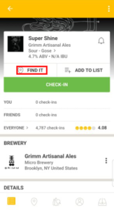
Fig 8. Untappd’s “Find it” option. 
Fig 9. Links to directions and Uber. 
Fig 10. The venue’s tap list.
The design of this function accommodates each stage in some way, allowing the users to cross the Bridges of Execution and Evaluation. The scope of this aspect has been very well addressed, and has proven helpful many times. In addition the “Find it” button, as well as the directions and Uber options are both easily discoverable, making this process much easier.