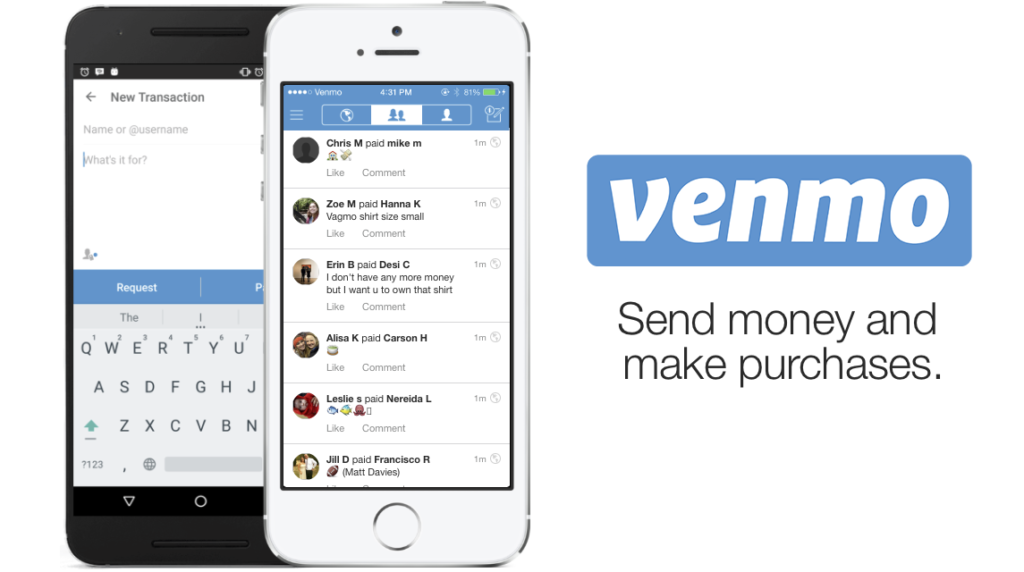
Venmo is a mobile payment app that allows users to easily send money to others with an account on the app. There is also a social component to the app that allows users to see transactions that others have made, including notes on what the transaction was for.
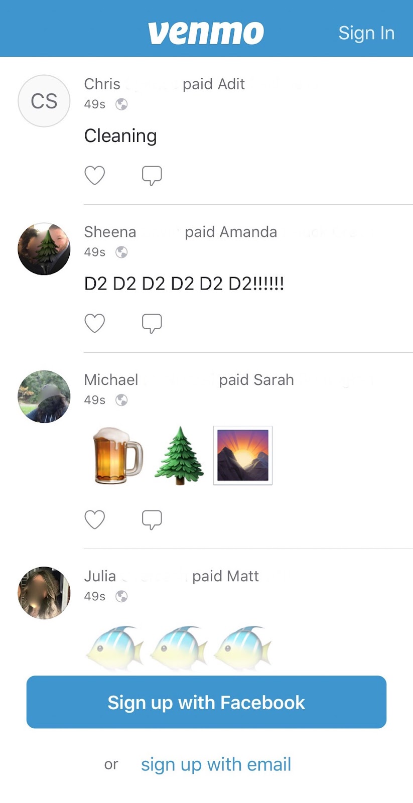
When a user first opens the app, Venmo presents the user with a snapshot of recently made public transactions. There is a login link in the top right corner and two sign up options at the bottom of the screen. For a first time user, the social feed impedes discoverability. What are all the possible options on this first page? It’s hard to know, when a user is confronted with all this irrelevant information.
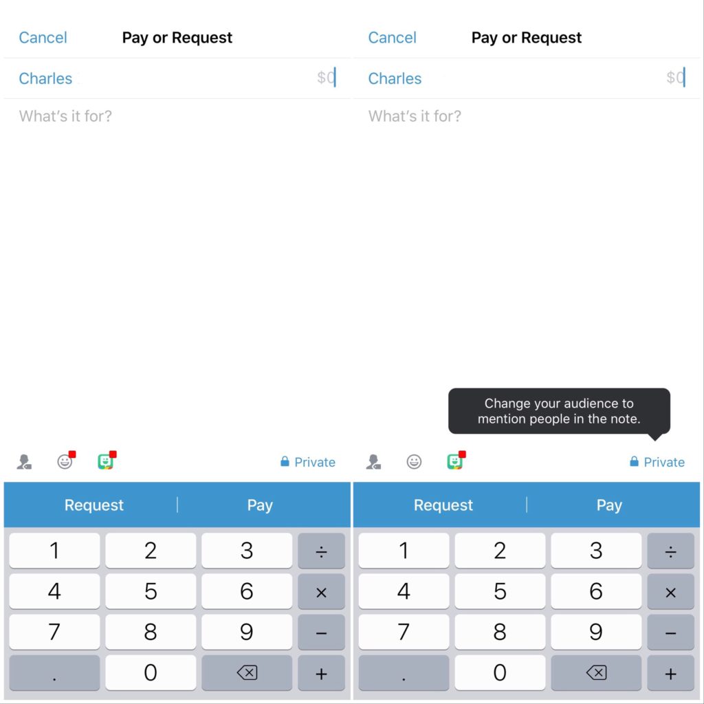
On the “Pay or Request” screen, where users can initiate transactions, I’d like to first focus on the icons above the “Request” and “Pay” buttons. The three icons from left to right afford the user the ability to respectively tag additional users in the note section of the transaction (they are not involved in the transaction, but just notified of the transaction), add a Venmo-app specific emoji, or link the Bitmoji app to add customized Bitmoji stickers to the note. None of these icons offer strong signifiers for their functions. In fact, when transactions are set to private, the user-tagging icon only prompts a tool-tip telling you to change your audience before proceeding. The privacy toggle itself has poor discoverability, since it is unclear that there are additional options that you can change by tapping on that status.
Since there is a lot of unused space on the screen, I would propose making the icons larger and more visible, which would especially help in the case of the user-tagging icon since it’s difficult to make out that the icon is meant to depict a person with a small tag attached. A small arrow or caret could be placed near the privacy status to indicate that there are more options in a menu.
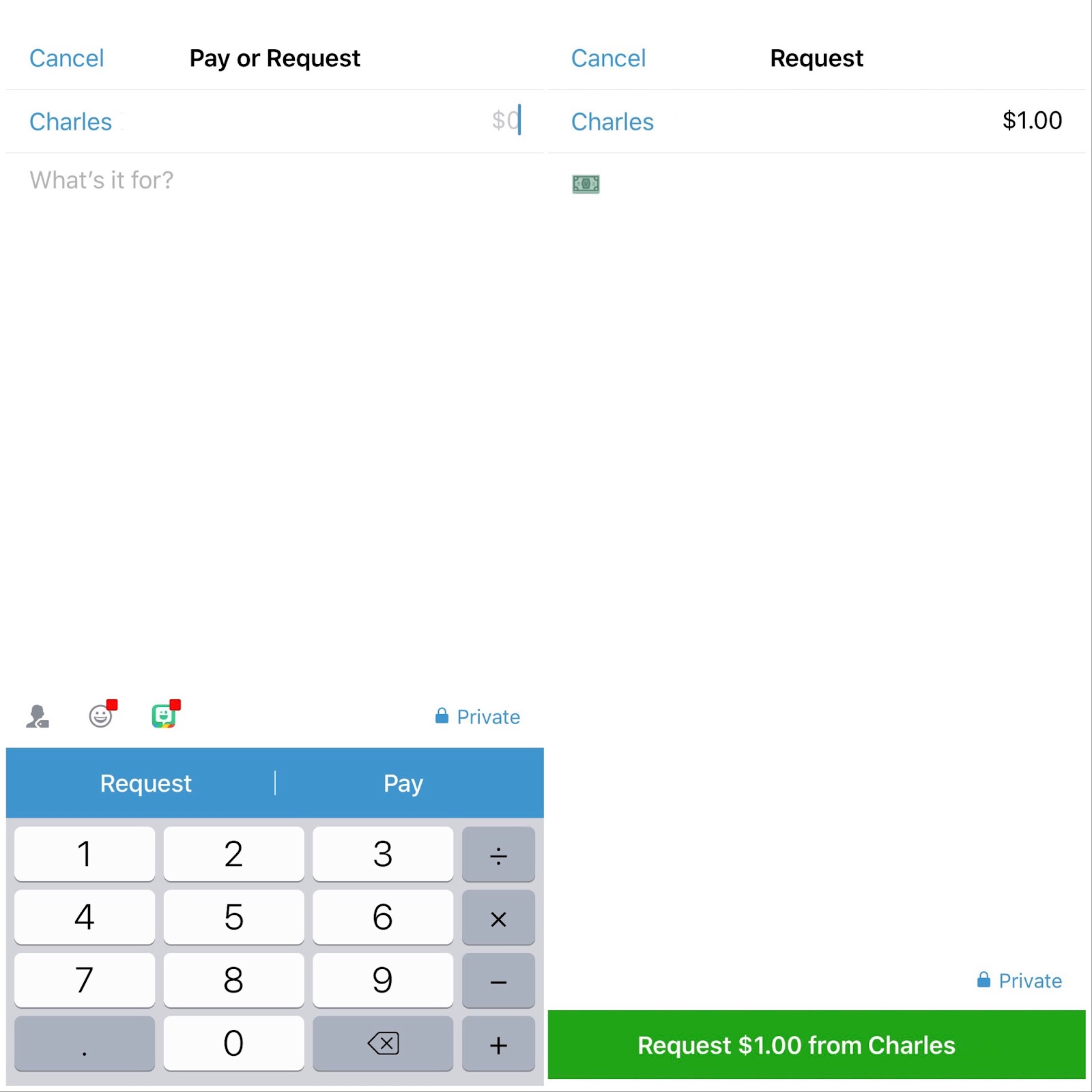
For completing transactions, the differentiation between the “Request” and “Pay” options is too minimal. The two options appear on the same bar, in the same blue-white color scheme, with only a minimal divider between them. (I should also point out that the top of the screen states “Pay or Request” but the order is reversed for the buttons.) Even though the user must confirm the action, both the “Request” and “Pay” options appear in a green bar on the next confirmation screen. It’s easy to imagine a user performing a description-similarity slip and paying a friend, when they meant to request money or vice versa. A solution to this would be to redesign the screen so the two options are two separate buttons and/or applying different colors and adding distinct icons to the two actions. It’s possible that with time, a user could adapt to the level of precision needed to distinguish the two actions, but it seems equally likely that an experienced user of the app would tap through the options without pausing to examine all the text.
Venmo could also change the style of the transaction confirmation. The app utilizes pop-up notifications for many other aspects of completing a transaction:
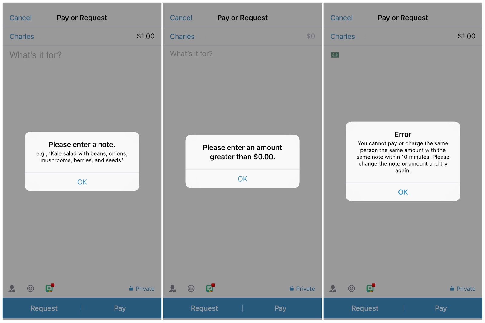
If the user has not entered a description for the transaction, an amount for the transaction, or the app believes the user might be mistakenly sending a duplicate payment, a pop-up dialog box with forcing function of locking the user in to fully completing the fields appears. A similar pop-up could be used to confirm the type of transaction with the user, rather than using the same simple green bar the app currently has for both actions.
At the same time, the overuse of these lock-ins can frustrate users. I personally find myself frustrated at being forced to enter a note when trying to complete an immediate transaction, where both parties are present and aware of exactly what the transaction is for.
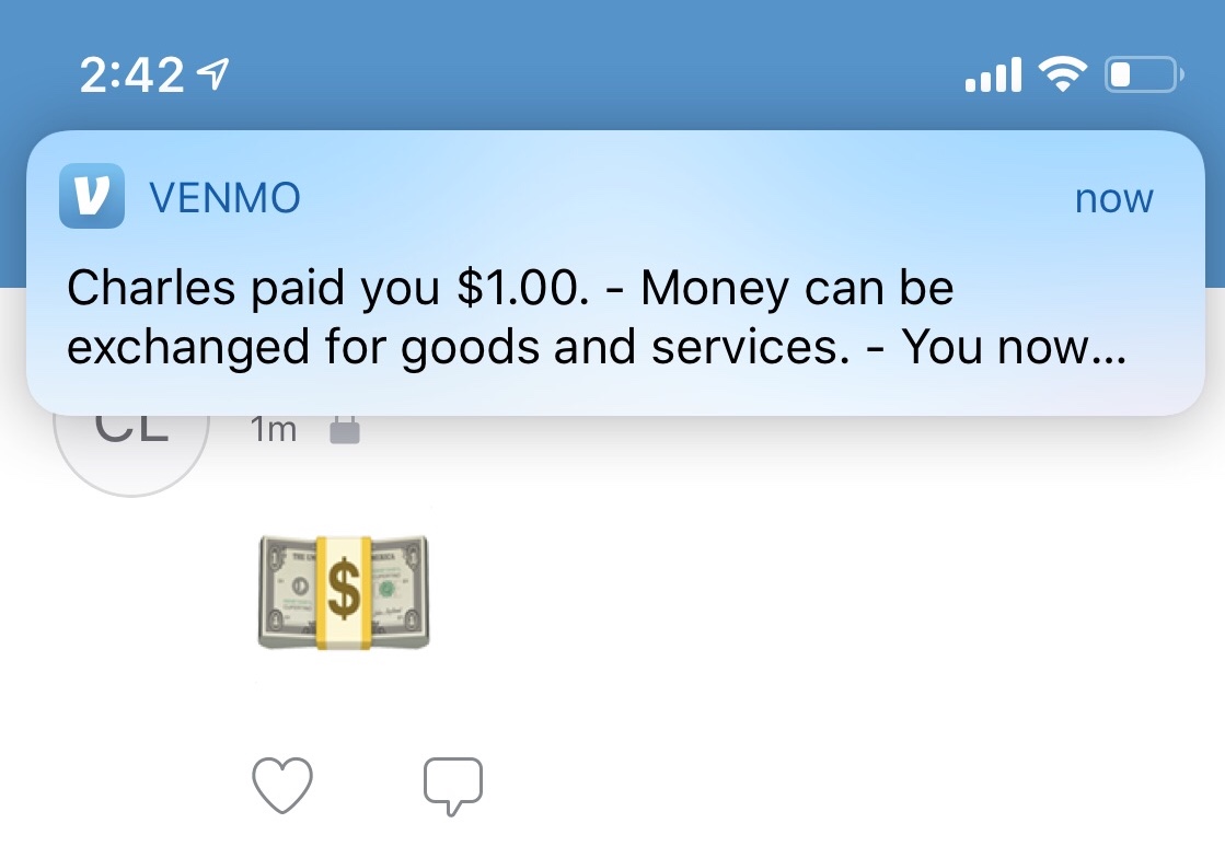
When receiving a payment, in addition to banner notification, Venmo also uses the notification tone of a cash register. While a user would need to have the cultural understanding to recognize the sound, it is also a unique audio notification that provides feedback for specific action and distinguishes it from other more common notifications, like a text or email alert.
Ultimately, while Venmo makes everyday financial transactions between friends more easily accessible by cutting out the steps needed for direct bank transfers, physical cash payments, or writing checks, the design choices create a learning curve to developing the knowledge-in-the-head necessary to efficiently use the app.