
Whatsapp Messenger is a cross-platform free messaging application owned by Facebook. It allows users to send text messages, make voice and video calls, and share images, documents, user locations, and other media. In this design critique assignment, I will be applying the concepts discussed by Don Norman in The Design of Everyday Things to evaluate the 3 main screens of Whatsapp Messenger.
Chats Screen:
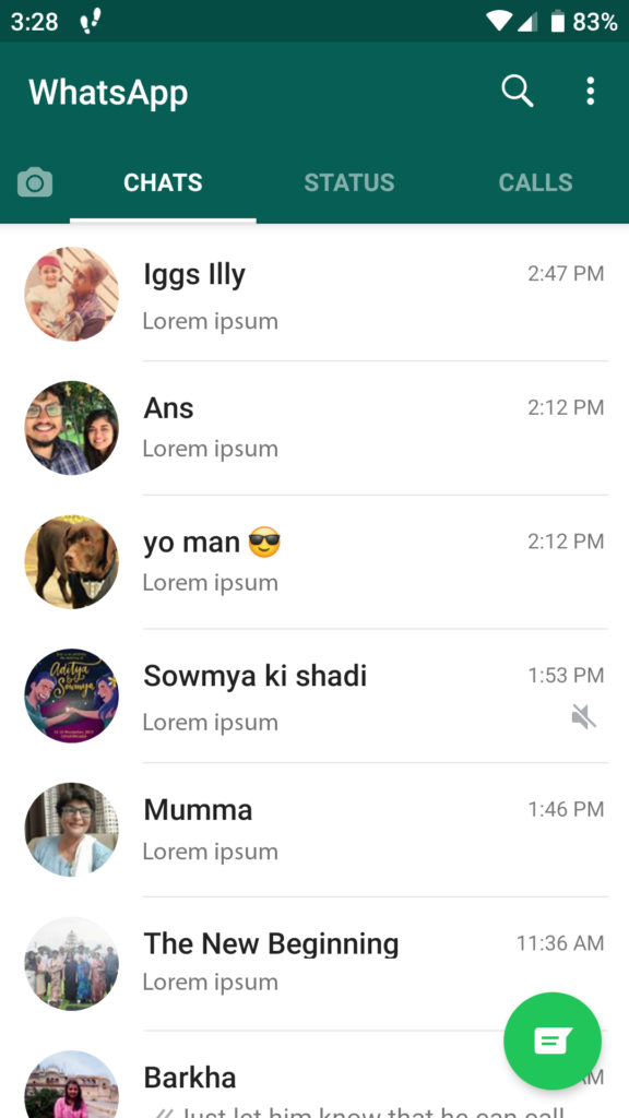
The chat section is simple and understandable. The design used is similar to all messaging apps which bridges the gulf of execution as it significantly reduces the user’s learning curve. The chats are clearly displayed, based on most recent chats first. All messages display the sender’s name and image, which is a great example of natural mapping, as it allows the user to immediately identify which message was sent by whom. As seen in Figure. 1. It also displays one line of the latest message and the time it was received.
Separate chats are easily distinguishable making it easy to access a single chat. They also indicate which chats are muted, which is an important feedback for the users. All messages are displayed together, regular and group chat, it provides no differentiation among the two types, which may get confusing for the users.
This section also displays a Floating Action Button at the bottom right corner of the screen is a signifier to start new chat, which guides users on a visceral level because of its placement and styling. The same design concept is followed by all Google Apps, Android Messenger, and Calling, Telegram, etc.
Status Screen:
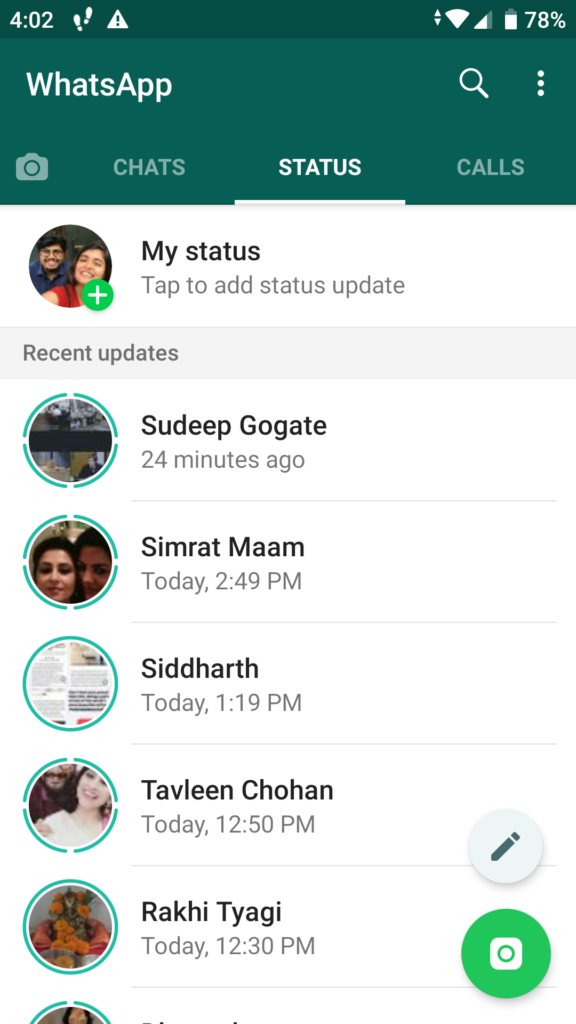
In the ‘Status’ screen the users can add either visual or written statuses, which are similar to ‘Stories’ displayed by other applications like, Instagram, Snapchat and Facebook. Their way of displaying the stories which are vertical is different from other applications where they are displayed horizontally.
There are many methods to add a new story, most of them which don’t abide by natural mapping and can be confusing to the users.
One method is a completely different section which comes either clicking on a ‘Camera’ icon which is placed at the leftmost side of the screen or by swiping right twice and passing the ‘Chats’ section. This method seems cumbersome and confusing to the user.
Another method is by clicking on the user’s display picture which is also present on the screen and has a green ‘add’ sign on it. Even though this method has good discoverability, it is not following consistently with the rest of the app and can be taken out as there is already an ‘add story’ button at the bottom of the page. But also the need to eliminate the other methods to add status arises because having so many methods can cause learned helplessness amongst the users.
Where this section breaks consistency is that there are two floating action buttons on the page, which both have very similar features, one being adding visual statuses and the other being to add only written statuses.
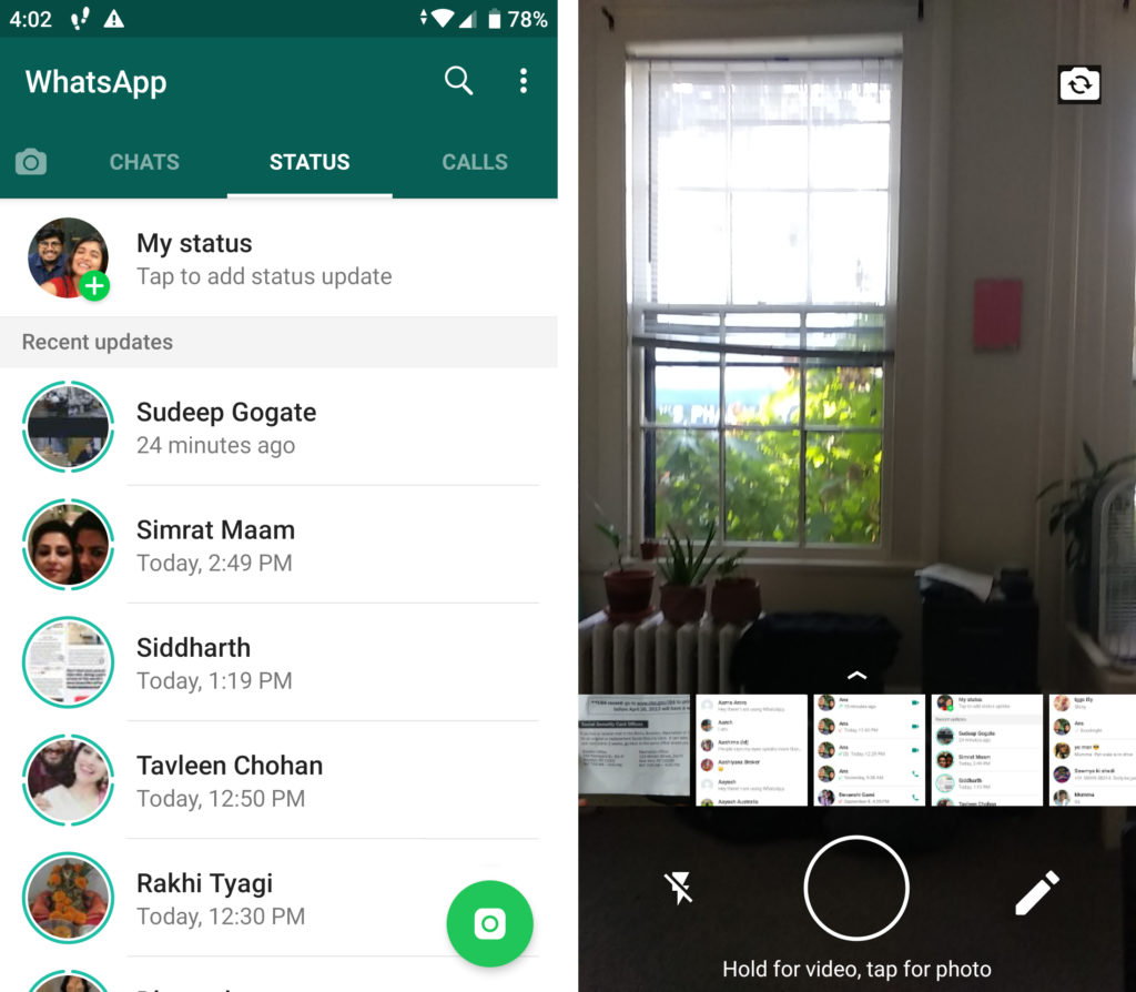
One recommendation would be to only use the main FAB and to include the ‘Written statuses’ feature inside the add story screen as displayed in figure .3.
Calls Screen:
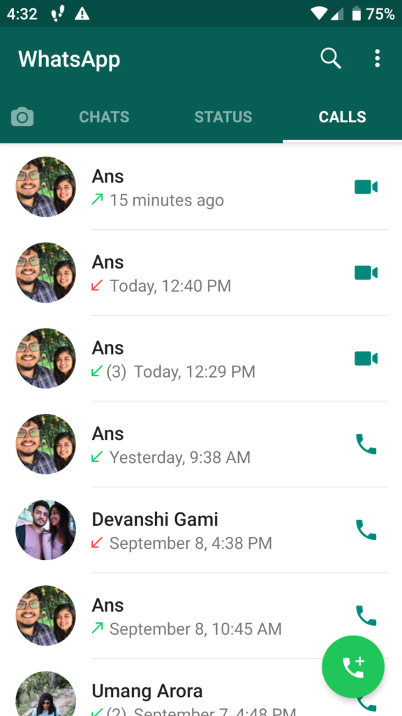
The ‘Calls’ screen follows a similar format as the ‘Chats’ screen, displaying the most recent calls first. There are also many elements in the call screen, that increase the user’s understandability of the nature of the calls. Every call displays arrows, either inward pointing or outward, which are universally used icons for ‘incoming’ and ‘outgoing’ calls respectively.
Each individual call also indicates whether it was a video call or a voice call by using icons as displayed in the figure. 4. They also afford the user to call back in the same format by clicking on the icons.
Conclusion:
Whatsapp is a very widely used messaging app as it follows the most basic characteristics of a good design which are Discoverability and Understanding. The app in all is quite easy to use even for a novice user and is also appealing on a visceral level. It may face problems like the paradox of technology with certain updates, but with such a widespread audience it is most likely to overcome those issues.