The World Bank is one of the foremost providers of global development data. Through its Open Data website, users can find, visualize, and download hundreds of datasets. This design critique will focus on this example page, since many users will land on a page like this without seeing the homepage (as I have in my own use of the site).
Discoverable and understandable features
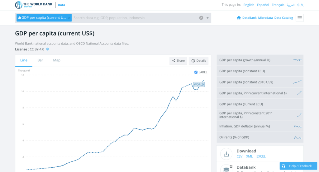
Here is the interface in a laptop sized window, with GDP per capita selected as an example dataset:

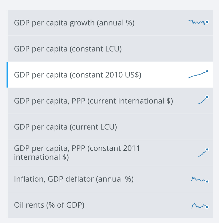
Users arriving at the site for the first time can see what actions are possible. The site’s most important affordances are made apparent by signifiers:
| Affordance | Signifiers |
| The ability to access many different datasets | The search bar help text, and the menu of similar datasets to the right of the chart |
| The ability to view data for different countries | The search bar help text, and the list of countries further down the page |
| The ability to visualize data, and customize the visualization | The chart, the line/bar/map toggle in the top left of the chart area, and the year slider below the chart |
| The ability to download data, and do so in multiple formats | The prominent “Download” section, visible when landing on the page, with buttons for different file formats |
Executing tasks
For most tasks, the gulf of execution and the gulf of evaluation are bridged without any major issues. A user arriving with the goal of comparing different measures of GDP can easily see that there are multiple GDP datasets available and how to select them (the hover effect provided on desktop devices also helps).
After the user clicks/taps a new dataset, there is a brief delay where there is no feedback indicating that the selection has been registered – the user cannot perceive that a change has occurred (the fifth stage of action). A loading animation would be helpful, but the transition happens quickly enough that it is not a large problem.
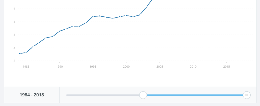
As another example, a user who wants to look at world GDP per capita over the past ten years can easily understand that the slider will control the years displayed on the chart, because the slider is a familiar control and runs intuitively from left to right, matching the axis it controls (natural mapping). The near-immediate change in the chart provides feedback that makes it easy to evaluate the effects of using the slider.
Additionally, throughout the site, care has been taken to reduce the chance of errors. Important data attributes such as the specific units of each dataset or the years selected are shown in large text, minimizing description-similarity slips where the user thinks they are viewing one measure of data but are really viewing another, for example.
Overall, the site includes a large number of features but still manages to be very usable – for the most part, it is complex without being confusing.
Confusion when selecting countries
An important feature of the site is the ability to add countries to the chart, but the way this is done is not completely understandable. From the top of the page, it is not immediately clear how to add countries:
In fact, this can be done with the search bar:
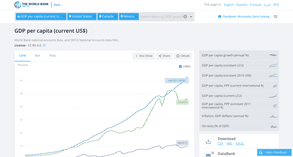
This was not clear to me because it did not fit my conceptual model of the search bar. I assumed I would use the search bar to find a page of interest and then end up on a separate page. In reality, it does this, but can also manipulate the current page (adding countries).
The other way to add countries is to scroll down to the table of countries below the chart, and click/tap the country name:
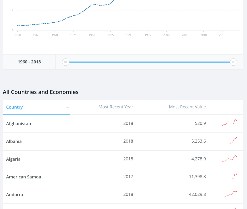
It is not immediately clear that the user can click/tap country names, and once that is understood, the user may not know if clicking/tapping will add them to the chart or navigate to a separate country page.
These issues could lead new users to make knowledge-based mistakes where they are hoping to go to a country page but end up adding a country to the chart, or hoping to add a country but make no selection because they assume they will be navigated to a different page. One positive aspect of the table design is that after selecting a country from the list, the user is scrolled back up to the chart where they can see their country added, bridging the gulf of evaluation.
One solution would be to separate the two functions of the search bar – selecting datasets and adding countries to the chart – and locate a menu for adding countries within the chart area:
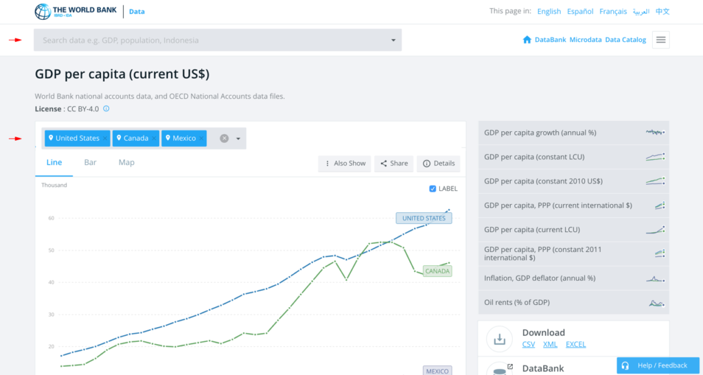
The top search bar, used for finding topic pages, is located outside the gray area of the selected topic; the country menu, used for adding countries to the chart, is located within the chart area. This utilizes natural mapping, specifically “best mapping” where “controls are mounted directly on the item to be controlled.”