Pinterest is an image-based social network that allows users to catalog, share and discover inspirations using images, GIFs, and videos, either uploaded from their computers or “pinned” from the web. The app requires registration and once logged in, users can start to explore the content.
Discovering content
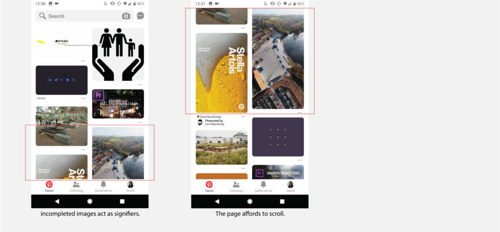
For most users who are familiar with the social network applications, they should have already established a conceptual model of how an infinite scrolling feeds app works. By moving the finger up or down, more content will appear in the bottom or on top, which uses the moving text model. Pinterest follows this convention, allows the behavioral level to take control when users scan through the page. However, for those who are unaware of this kind of operation, the incompleted images at the bottom of the screen also act as signifiers, indicating there are more to view underneath and it affords to scroll.
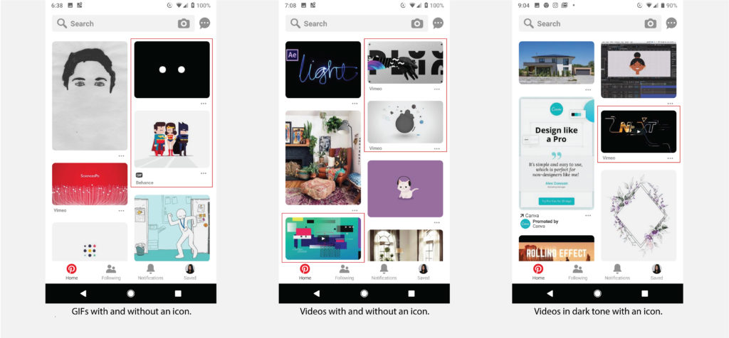
As I mentioned earlier, both images, GIFs, and videos may appear in the users’ feed. Pinterest places a play icon on the video post, which is the best mapping method, to states that it is a video. Similarly, for GIFs, the icon is placed right under the post, which is the second-best way of mapping. However, for some reason, the icons indicating the format of the content are shown only on some of the posts. What is more, the play icon is designed with a black background and therefore not discoverable on some videos in a dark tone. Since some of the built-in functions are not available for GIFs and videos, the lack of information may cause users to perform knowledge-based mistakes.
Recommendation:
Allow users to choose the format when they pin the images, GIFs or videos, and display the selected format information under/on each post. In addition, the play icon should be available with both black and white background, or in their signature red to increase discoverability.
Visual search
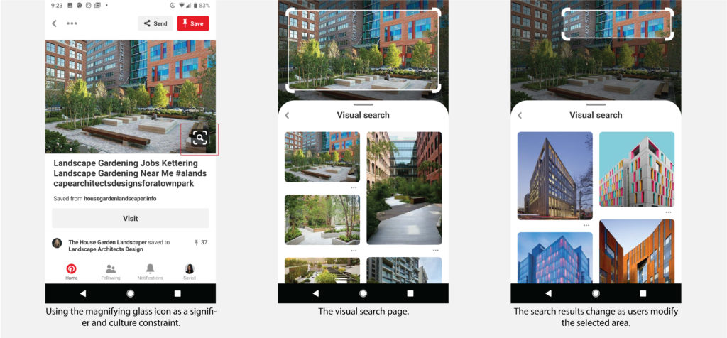
Users can perform a visual search on any part of a static pin. It is a novel function but the design of the icon follows some conventions. By using the magnifying glass icon as a culture constraint, the users match it with their knowledge in the head and immediately understand that the function of it is related to searching. Tapped the button and the users are directed to the visual search page. The white border of the rectangle and masked background signifies the area within is selected as a reference and affords to drag. It is mounted directly on the image and employed the best mapping. The border cannot exceed the image border, setting a physical constraint of the selected area. The search results change as users modify the selected area, providing feedback constantly. When users scrolling through the search results, the selected area remains on the image as a knowledge in the world, allowing users to go back and modify it again at any time. However, as both the image in the back and the border of the selected area are movable, action-based slips may occur when users want to shift the border but instead move the image.
Recommendation:
Fix the background image. Users can only shift the placement and size of the rectangle area to avoid slips and frustrations.
Managing Boards
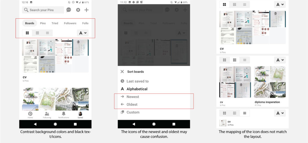
In the saved board page, Pinterest uses contrast background colors and black text/icons in the top navigation and display layout as signifiers, to indicate users these are buttons and help users locate themselves or their settings. Associated icons are used as knowledge in the world in sort to remind users of their current setting, though the icons of the newest and oldest may cause confusion in other cultures with different writing systems. And though it is very thoughtful for Pinterest to allow users to customize their display layout, the mapping of the icon does not match the layout and therefore cause confusion.
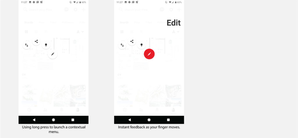
Pinterest allows users to edit, reorder, share board or search for related boards by a long press. However, it is a common android gesture to launch a contextual menu in an app and without that knowledge in the head, users have to perform the action with extra taps. But once you entered the menu, the feedback is well designed, as the icon enlarged as your finger move towards it and then changes to red to indicate it is selected.
Recommendation:
For the icons in sort, use vertical arrows instead of horizontal ones to represent the newest and oldest. For the display layout, the design of icon should illustrate the position of the boards rather than the size of the pins. Additionally, locate some of the most commonly used features such as edit and share/send as icons under each board to the right would help users perform desirable action easier.