TikTok is a social media app for creating and sharing videos for 500 million users around the world. TikTok users can utilize various video editing features to create videos such as filters or background soundtracks within a quick time. This Tik Tok (Android Version) design critique will be evaluated based on Norman (The Design of Everyday Things) terminology.

Principle 1: Visibility
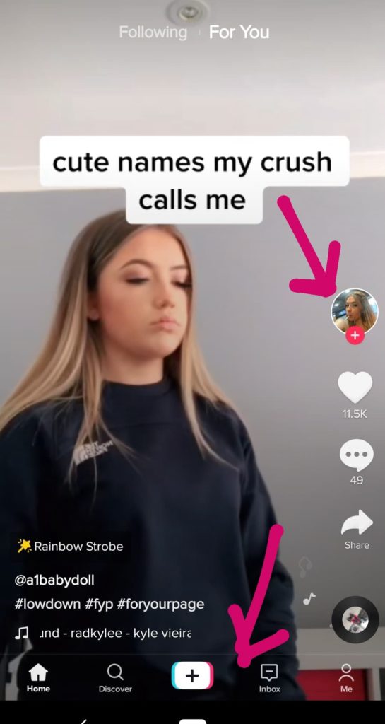
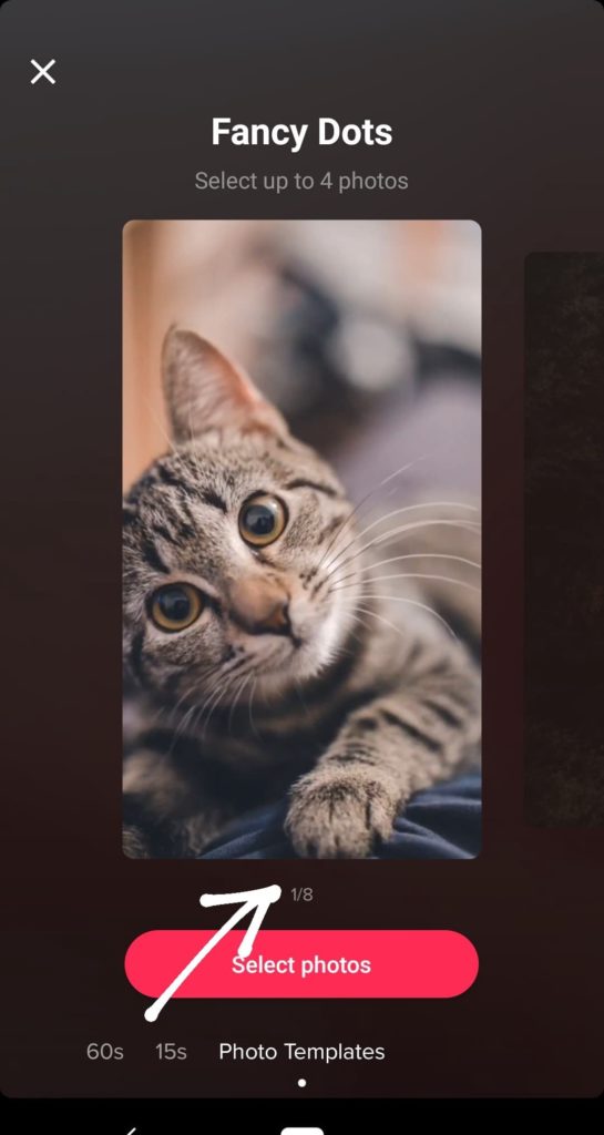
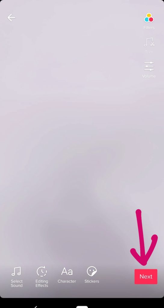
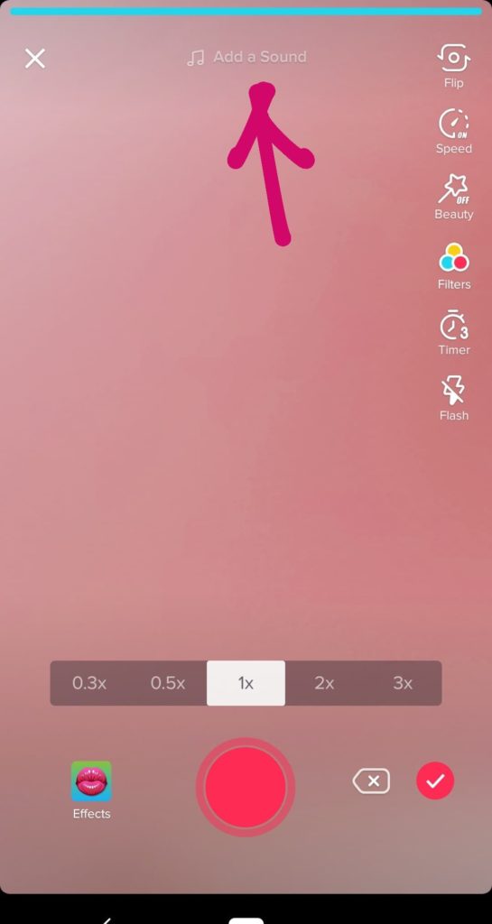
Editing videos is very efficient. The editing tools are in a visible area which is easy to reach (Image 1). There are six different editing features vertically on the right hands’ section which are easy to view, it also increases the visibility of recording videos on the bottom too. Therefore, the photo template shows another good visible design, when users flip the photo templates, there is a number on the bottom to remind users about selecting a certain number to create a photo animation (Image 2).
Principle 2: Feedback
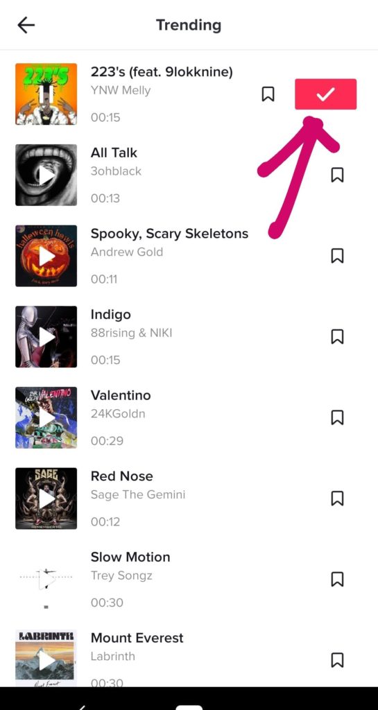
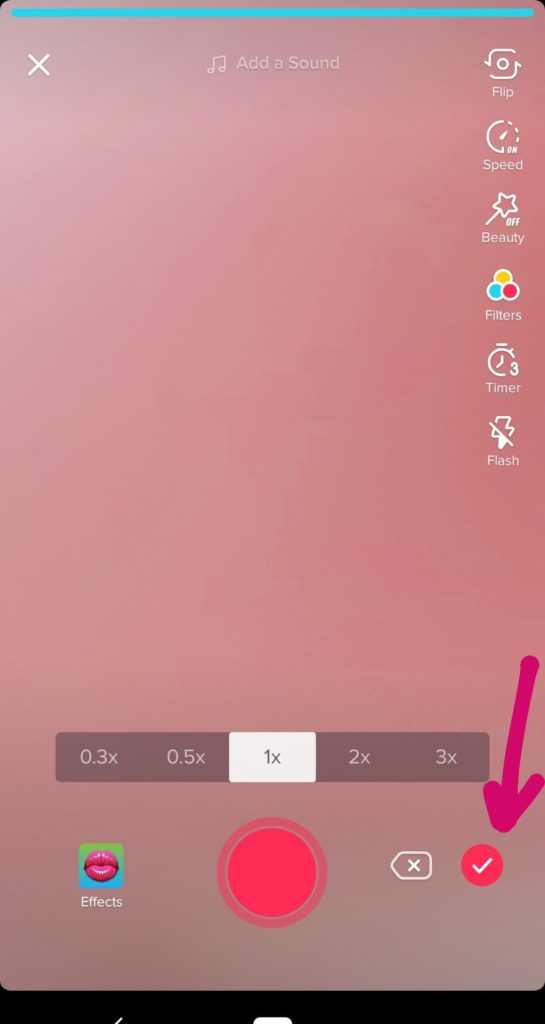
In term of discussing the principle of “feedback” : Sending back information about what action has been completed and what to go next. Tik Tok has several icons, which indicated the information about the action is completed such as the “tick” icon next to recoding bottom, pop uploading message, or save it a message (Image 3 & 4 & 5) These icons allow users to understand if their actions finish or not. For example, when users click on save music icon, there is a save it message on the top to double inform users about their music have been downloaded.
Principle 3: Map
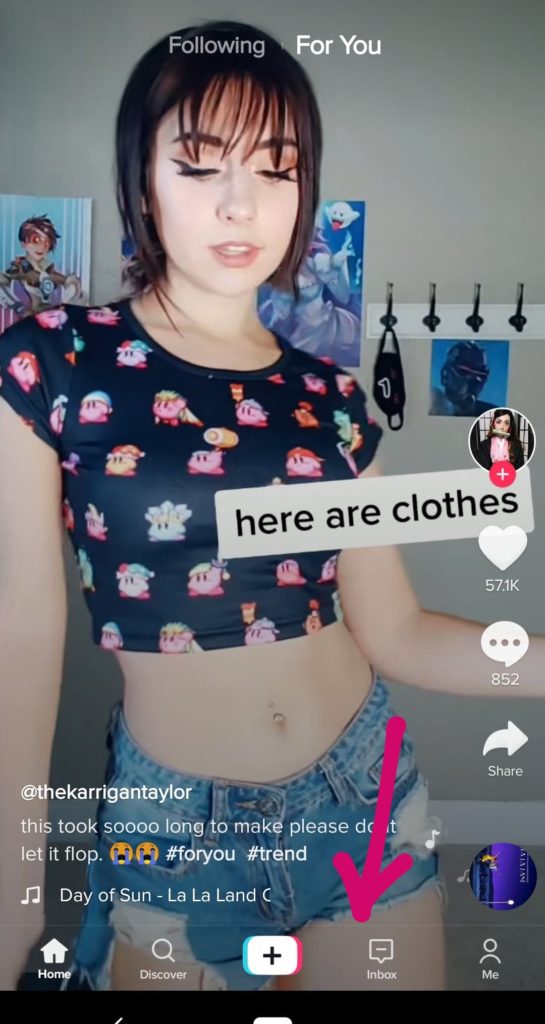
However, on the home page, there are no indications (Principle of the map: This refers to the relationship between controls and their effects in the world.) to show the relationship on each video. For example, users may not know to scroll down the page in order to view the next video. (Image 6)
Solution:
To inform users to scroll down, it can place an icon on the bottom area which helps users understand the relationships between each video and scroll down the page to view the next video.
Principle 4: Consistency
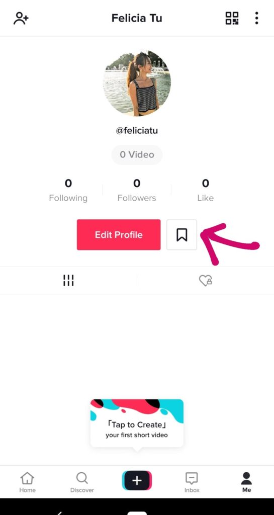
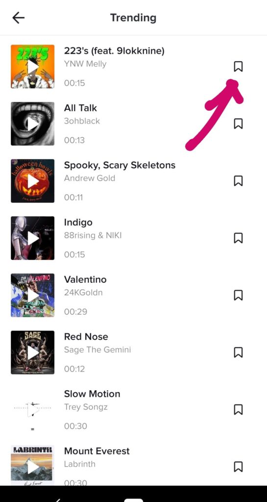
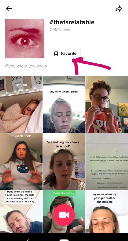
The save music icon shows the consistency of Tik Tok. It’s not only beside the song but also it can be found on the profile page(Image 7 & 8). However, when the users want to save the video, there is only a favorite button on the video page and mistakenly have a favorite label next to the save icon. (Image 9).
Solution:
If Tik Tok wants to achieve a higher goal of consistency. It should have the same save icons beside the videos as well as change the icon of a heart to the label of “favorite”.
Principle 5: Affordance
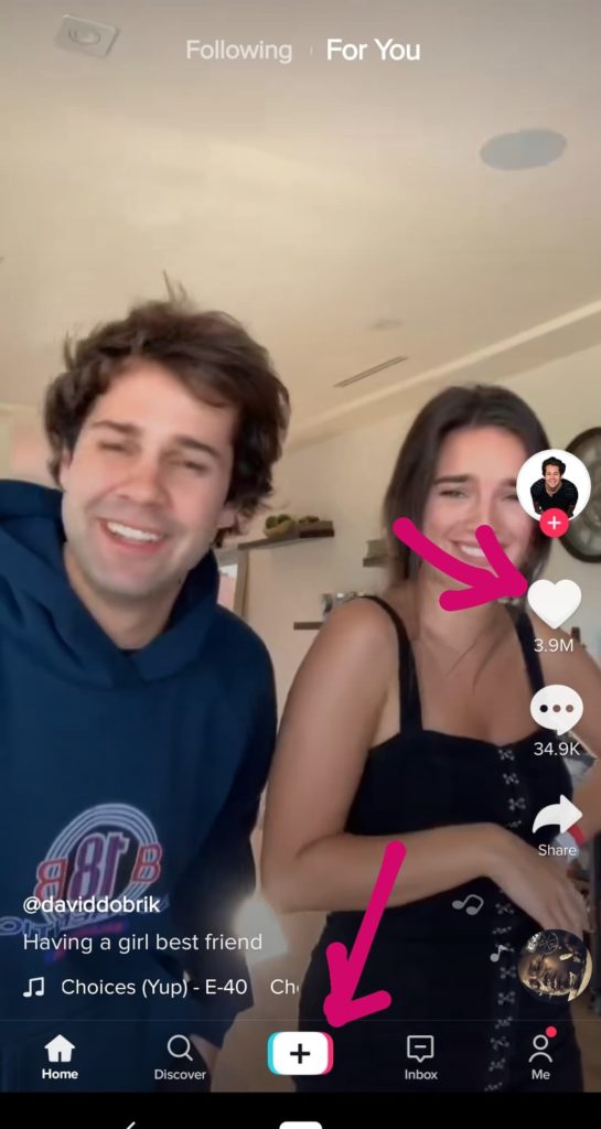
Tik Tok also affords an icon of “+” referring to the actions of “ add” on each page. Users click the large “+” on the button to add a video or to add friends on the profile page. (Image 10)
However, the add sound actions don’t have an icon “+” but it shows a message “add a sound” beside the music icon (Image 11). Although users can learn the function is “add” the sound by reading the message. It doesn’t meet the level of consistency.
Solution:
In order to show consistency and affordance, the music icon can combine with “+” icon and remove the sentence of “ add a sound” instead of a music icon and a message.