
Psychology is the study of human cognition and behavior. The following blog post explains the correlation between the human mind and its application in the field of user experience with Hicks, Millers, Fitts and Peak-end law being the main focus.
HICKS LAW
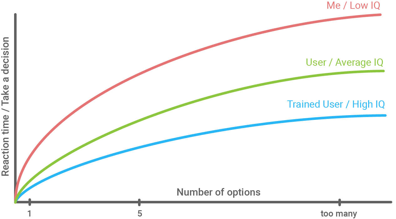
The time it takes to make a decision increases with the number and complexity of choices.
The Hicks Law is named after a pair of psychologists, William Edmund Hick, and Ray Hyman, the law goes to explain the relationship between the number of stimuli present and a person’s response time to the stimulus.
HICKS LAW AND UX
While using an interface, if the information provided is not concise or easy to find it would result in an increase in response time which would eventually lead to frustration in users. To avoid this it is recommended to apply Hicks law. Chunking information and reducing irrelevant content would simplify and quicken the user’s decision-making process.
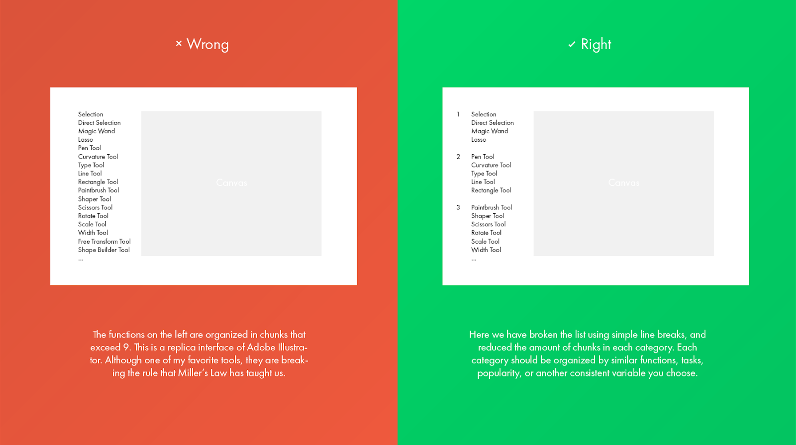
EXAMPLE 1: DROP-DOWN MENU
Fewer links in a drop-down menu would be easily understandable and easy to process by a user than multiple detailed links.
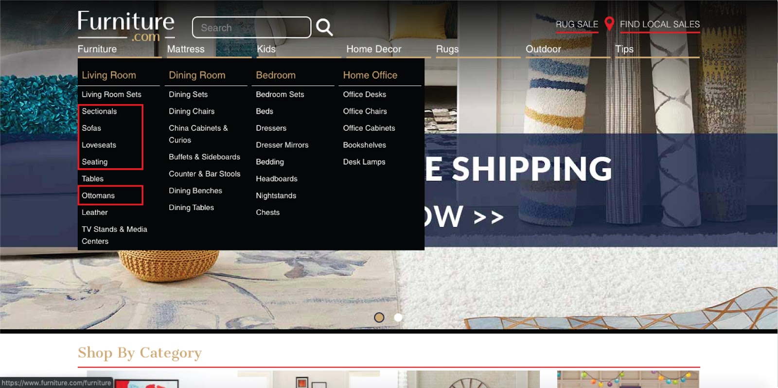
Recommendation:
Categorize seating, sofas, loveseats, sectionals, ottomans into one main category (Seatings).
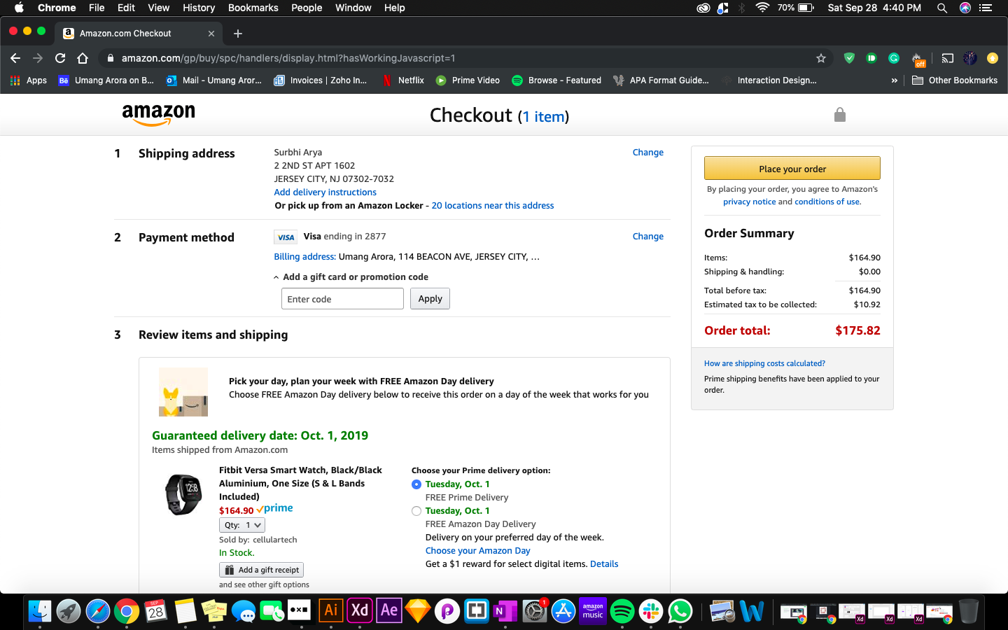
EXAMPLE 2: PAYMENT PROCESS
When information is spread across multiple stages, users find it less confusing making accomplishing the task easier and faster. Chunk relevant information together – Shipping address, payment method, and review items and shipping.
It is important to understand when and when not to apply Hick’s law. When there is a complex decision making involved, like choosing from multiple option it is suggested that the law shouldn’t be applied. For example, when a user is booking an Airbnb, there are many intricate details like the number of rooms, location, amenities, etc to be taken into account and cannot be neglected.
Overall, Hick’s law is a guideline that helps in categorizing choices and obscuring complexities if adapted in a design.
MILLERS LAW
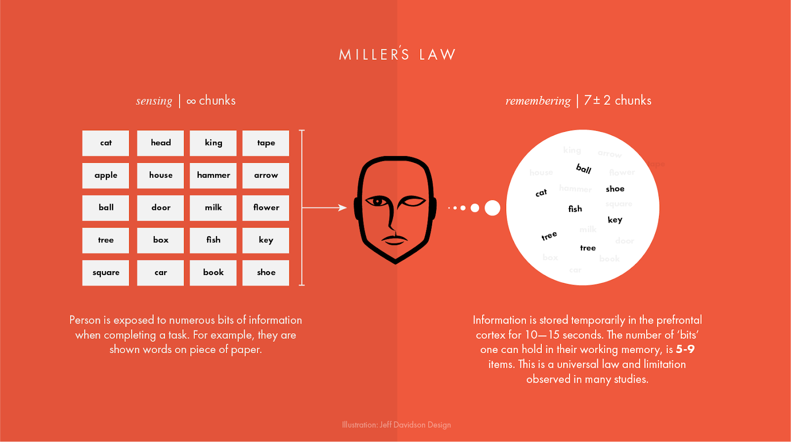
Miller's law states that an average person can only keep 7 (plus or minus 2) items in their working memory.
In 1956, a cognitive psychologist at Princeton University’s Psychology department, George A. Miller published a paper titled The Magical Number Seven, Plus or Minus Two. The paper explored the number of information chunks an average human’s memory (short term memory) can hold. The results of his study proved that the human mind can remember more or less 7 bits of information while completing a given task that requires cognitive effort and the performance of users was almost perfect when the presented stimuli were restricted to the magic number 7.
A human mind stores information based on its thoughts, feelings, and environment. As memory is suggestive, it is important to understand a user’s mental model and incorporate it into any design in order to improve the retention of information. The law suggests that users recall better when information is provided in clusters and there is logical grouping. It is recommended that lesser the chunks of information, more user-friendly an interface is, especially for novice users. Infrequent or novice users find it easier to accomplish a task when the information presented is concise, direct and well organized.

Miller’s law also suggests that users remember information presented at the start and end faster and tend to miss things in the middle. This is known as the serial position effect – coined by Hermann Ebbinghaus. For example, when a user is looking to buy something online, it is likely for him to remember the first and last few options in comparison to the ones between them.
Miller’s law is a perfect example of less is more. Users don’t have the luxury of time and hence tasks need to be quick, simple and easy to understand. It is necessary to remember that information overload can have a negative impact on the user’s performance. Organizing important elements of an interface at the beginning and end is helpful and creating experiences that rely on recognition rather than recall can improve the overall user experience.
Fitt’s Law
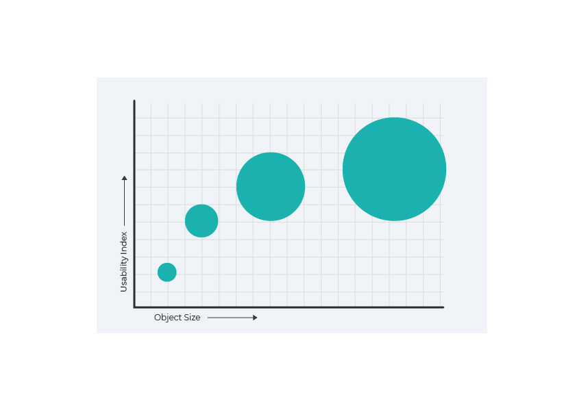
Fitts’s law is a predictive model for the speed of human movement, established by Paul Fitt’s in 1954 while examining the human motor system. The law explains, the time taken to select any target increases with the increase in distance and the decrease in size of the target.
The time to acquire a target is a function of the distance to and size of the target.
Fitt’s Law in UX
Fitt’s Law is commonly applied in UX design and aids designers in making educated decisions about their user interface. It improves the visual hierarchy and placement of designs, drawing attention to the elements on a webpage as intended by the designer.
The target object should be large enough that the user can find and select it without being exceedingly accurate. Likewise, the distance from the user’s expected cursor position or attention area should be kept as short as possible to the next related button.
Example 1: CTA Buttons
The CTA buttons on websites are often very large making it easier for the user to click on it and decreasing the level of accuracy needed to do the same. Interactive buttons like the ‘Join Free For a Month’ button for the Netflix home page are large and placed closer to the expected cursor position. Users can intuitively understand where to click.

Example 2: ‘Close’, ‘Start’, ‘Back’ buttons:
The corners of the computer screens are considered to have an ‘Infinite width’ as the cursor cannot go beyond that point. Vital commands like ‘Close’ ‘Start’ and ‘Back’ are usually placed in the corners making it easier for a user to select those buttons as they cannot go beyond them. The user just has to move the cursor in the general area where the button is situated for them to select it.


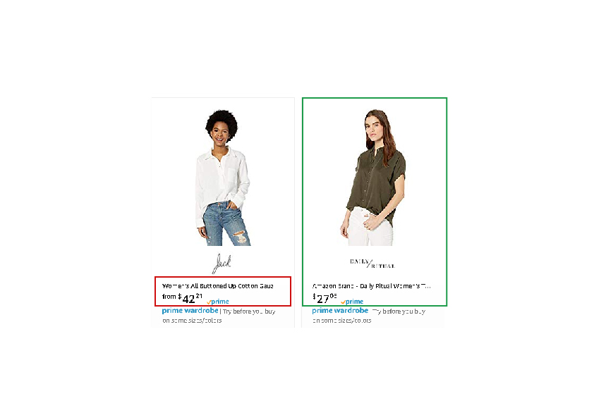
Example 3: Clickable Area
Online retail sites like Amazon make the entire product area including the image clickable and not just the link to reduce the amount of effort and accuracy required by the users.
PEAK-END RULE
People judge an experience largely based on how they felt at its peak and at its end, rather than the total sum or average of every moment of the experience.
In 1999, psychologist and economist Daniel Kahneman, who won the Nobel Prize, proved that people are judging an experience-based largely on two things: what we felt at its peak? And when something ends, how do we feel? “Memory was not designed to measure ongoing happiness or total suffering. For survival, you really don’t need to put a lot of weight on the duration of experiences. It is how bad they are and whether they end well, that is really the information you need as an organism.” he says.
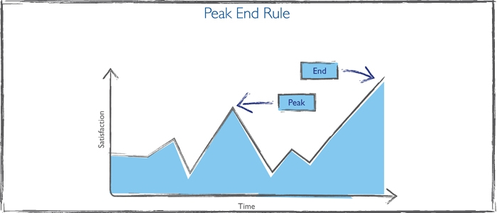
The peak-end theory’s psychology is based on cognition. Our brains are not computer operating systems because we have limits on how much we can process and remember. Our cognitive processing system creates methods to sort through incoming information, integration, processing, and decision making to be more efficient. The rule suggests that our memories are not extensive experiential pictures. We are limited in the amount of detail that will hold our memories. To make up for this, our tendency is to remember the highlights or peak experiences as well as the endings.
THE PEAK-END RULE IN UX
It’s about designing the moments of truth for the peak-end rule. Moments of truth are when users experience how poor or good your product really is, and hopefully how it helps them complete their tasks. At the end of an experience is a certain moment of truth, but there is more. Find and address the moments of truth of your product through user research. Highlight them.
Example 1: Positive Peak
Duolingo

Duolingo is an educational app that gamifies the language learning process. It’s fun and conversational strategy promotes users to enhance an already favorable feeling throughout their interactive classes. Elements that highlight moments of convenience, comfort, and even pleasure can turn an enjoyable experience into a memorable experience. At the end of a successful interaction, a bright color, an icon, or a vibrant illustration can solidify a healthy memory experience in your customers.
Duolingo strengthens the activity’s intrinsic pleasure by affirming those successes, enhancing the sense of accomplishment that comes with correctly answering questions.
Example 2: End Peak
Booking.com

While planning a vacation, sometimes searching for flights and places to stay may be a bit frustrating, booking.com has added friction to maintain the user excited for a little longer. For example, the website creates a travel guide, shows the user things to do in the area at the end of the reservation phase and encourages to explore the city.
Consider the most intense points of a typical user journey (the “peaks”) and the final moments (the “end”) when designing interfaces and experiences. Identify the moments when your product is most useful, valuable or entertaining, and design to improve those moments. Remember people are more vividly reminded of negative experiences than positive ones.
CONCLUSION
A design process is incomplete without psychological considerations. Psychology helps in creating a better and more user-friendly experience by enabling learnability, understandability, and efficiency. The laws discussed above provide helpful guidelines for any design process and if adapted will result in user satisfaction.
REFERENCES
https://jonyablonski.com/work/laws-of-ux/
https://uxdesign.cc/ux-psychology-go-hand-in-hand-introduction-to-human-attention-a70ffd2c4289
Blog Post by: Devanshi Gami | Pallavi Singh | Umang Arora