The Beginning
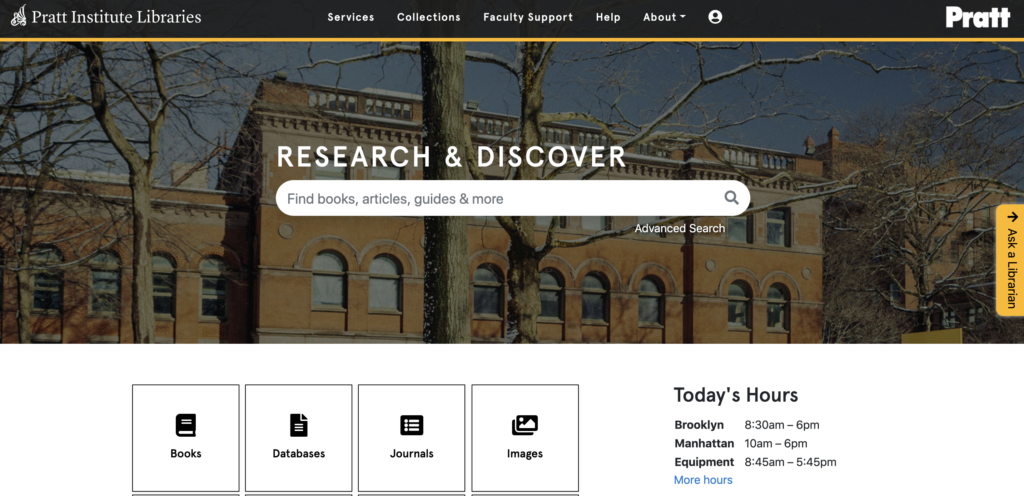
Working with our client Nicholas Dease from the Pratt Library was an absolute pleasure. From our first interaction to our last he always gave great constructive feedback. He knew exactly what he was looking for and was available whenever we needed feedback or had questions about specific details concerning our Usability Test. Nicholas had four main concerns about the redesign of the website. Firstly, he wanted us to address the funnel discovery and search bar layout architecture. He wanted us to devise a test that would require the user to conduct and independent search and take notes of where they began and where they ended. Were they able to accomplish the task they were set out to achieve and how they went about it? Secondly, Nicholas wanted us to observe the users interaction with the, “Ask a librarian” widget. He received feedback that the widget was too intrusive and wanted to understand how to improve the design so that it didn’t impede the user’s experience while conducting research on the website. Thirdly, Nicholas redesigned the, “Account Icon” and wanted to see if it was still discoverable. Lastly, there was a pretty outdated mapping feature to locate books that needed to be upgraded. Our team was able to create a task that prompted users to give us constructive criticism for an update.
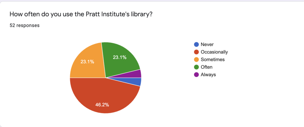
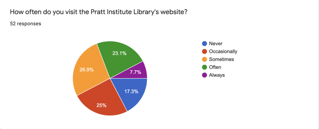
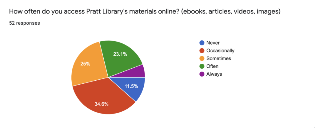
I really enjoyed working with my team, Gloriana and Nat both had very different skill sets that contributed greatly to our tests, presentation, report and just the overall experience. My biggest contribution was the content management part of the report. I was able to work with my strengths but also enjoyed improving on my opportunities. I was designated as the person who would look over the report to ensure there were no grammatical errors or typos. I had some hesitations in my capability to write the methodology section as I struggled so much with it in my previous reports but overall I think I did a nice job putting it together in a cohesive way. Taking the lead on creating the pre-questionnaire for the test was a great learning experience. I made one mistake when I originally sent the questionnaire out but I was able to catch it in time that it didn’t impact our team’s objective. I had seen the communicator messages in my inbox and always thought about who created the messages and for some reason the idea of having to write one, one day made me uneasy. Alas, it all worked out and no one got hurt, we actually received over 50 candidates. Below are some of the charts generated from this survey.
I’m thankful that I had the opportunity to practice this process as it was less complex than I imagined. I was focused on not making an error that would be sent out to every student at Pratt and that really overwhelmed me. We aren’t perfect, we’re humans and we make mistakes. If there was anytime to make an error then the time was now as being a student might be the greatest place to start as we tend to learn from our failures. While my teammates were finalizing different portions of the report I was able set up the original structure of the slides with place holders for them to input their magic. I’m pretty meticulous about things so I volunteered to tackle trimming the videos which would have been really nice if they worked. Again, it was a lesson learned–don’t rush in and set up your slides first. Kidding! Just ensure after people have set-up their presentations to always double check yours is still running correctly as they may have logged you out not knowing it would impact your presentation. Nat was incredible with the mock-ups and Gloriana really had some great suggestions on how to improve the website through the mock-ups. I contributed in this process by suggesting a change that I think made our position of reimagining a bright new future for the resource replacement cards even more compelling and that was the addition of “staff picks”. There’s something really special about adding a very human element to online resources as it has the potential to engage the users exponentially. Below you in (Figure 1.0) you will find the final and incredible mock-up that my colleague Nathaniel Quinn created after going over some options for books.
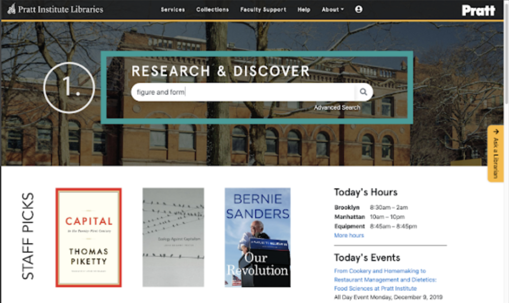
(Figure 1.0) Image by Nathaniel Quinn
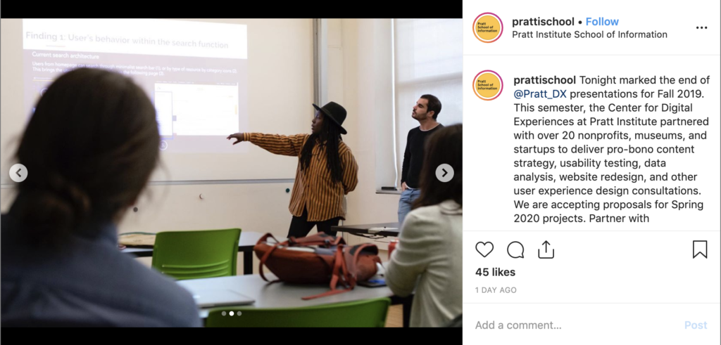
The presentation was also another exhilarating experience that I’m still learning the art of. Even though I perform live as a musician I still get nervous speaking in front of groups of people. We fortunately had a lot of presentations this semester so I learn a bit more how to turn my anxiety into productivity. This was my final presentation and I really wanted to conquer my fear–overall I think I definitely improved from my first presentation and I was completely happy with that. During my section of the presentation I talked about two key findings and recommendations that we observed during our tests which were, “User’s Behavior within the Search Function” and “Navigating the Account Icon”. (Figure 1.1a) and (Figure 1.1b)
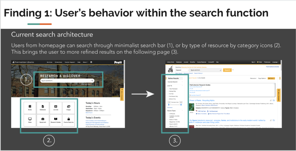
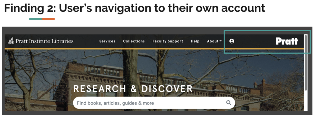
During the presentation I discussed what I described earlier in (Figure 1.1a) the homepage database cards, recommending the overall team thoughts on replacing the cards with staff picks so that the search started off on a good note rather than a frustrating one. Changing this aspect stood out as we found the database cards were confusing to discover initially for majority of users. Next, I explained why we enlarged the icon for the user account and took off the Pratt logo off the homepage. Users kept accidentally clicking on the Pratt logo while overlooking the “Account Icon” option.
During the user testing we met on the Brooklyn Campus, I was able to get there early to print out some of the necessary paperwork required for the UT. We utilized my computer for 5 out of 6 of the candidates as my computer was initially the only one with a working Quicktime player. I think it actually really worked out to our benefit as we were able to have two observers instead of just one or none at all. I believe it’s important in User Testing for there to be at least one neutral observer who can take notes in real time. There’s already so many things a moderator must control that taking notes would distract from the overall process.
Lastly, our debrief meeting with Nicholas was very productive he really appreciated the presentation and our overall feedback. He even said that he’d been thinking about the staff picks to make the site more engaging for awhile and now he felt like he’d actually do it. Our videos didn’t work during our presentation but we were able to show him in private which he explained was more ideal. Overall this project was important and I’m extremely satisfied with the way it turned out. I hope to work with my team members again and again on many more projects.