Port Authority Trans-Hudson (PATH) is a ‘rapid’ transit system in the Northeastern New Jersey cities of Newark,Harrison,Jersey City,Hoboken,Lower and Midtown Manhattan in New York city. This application provides the user real time countdown information, schedules, trip-planning, train routes and alerts – all in one convenient place.
Initial Screen/Page –
PathRide’s first encounter with the user is to understand the regular route the user takes and this is saved in the favourites section so that the user does not have to fill in the details again and again. ( Figure 1 )
The signifiers are undoubtedly great at the initial screen and does not mess with knowledge in users head or creates confusion.
In terms of discoverability the user can easily identify how do they advance with the application. However, the feedback isn’t great, after clicking the submit button the user is taken a new screen as seen in figure 2 which looks very clustered and the application shows the trains from destination to origin instead of showing results of trains from origin to destination( Figure 3 and 4 ) thus a gulf of evaluation arises among the users.
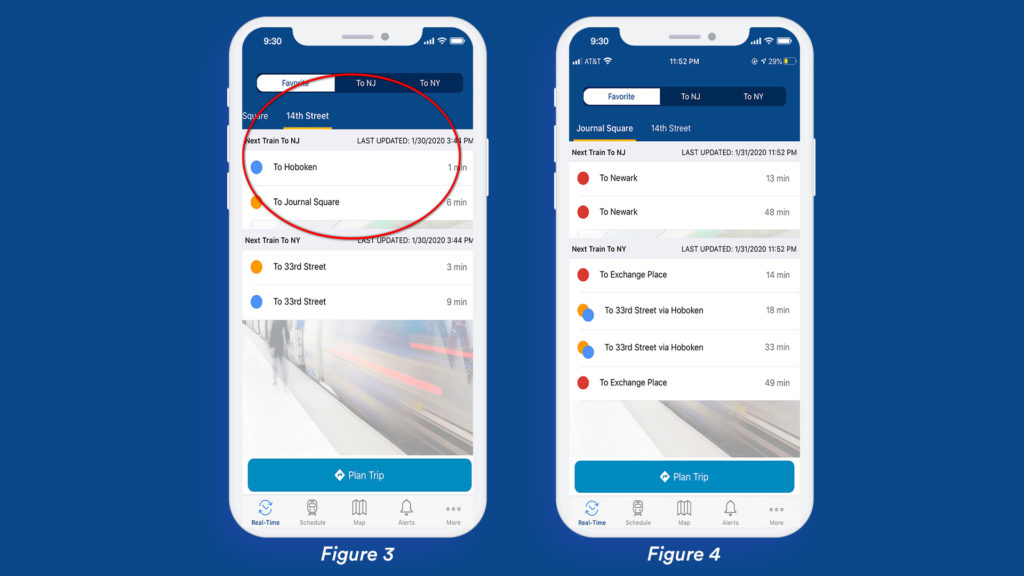
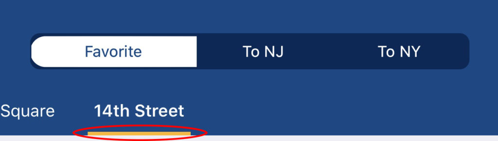
Empty spaces have a big impact on positive user interfaces because they set user’s focus on core elements and reduces the level of distraction but in this case the real time data of the train, station names, origin-destination have almost the same text sizes and this makes the discoverability hard for the user. The visibility of the origin station signifier is very poor and hardly discoverable.
However the bottom and top navigation bar uses natural mapping which gives the user a clear idea as to what the tabs would do when clicked. The feedback mechanism of the bar tells the users what part of the application they’re exploring, by highlighting the corresponding icon on the bar.
Planning a trip –
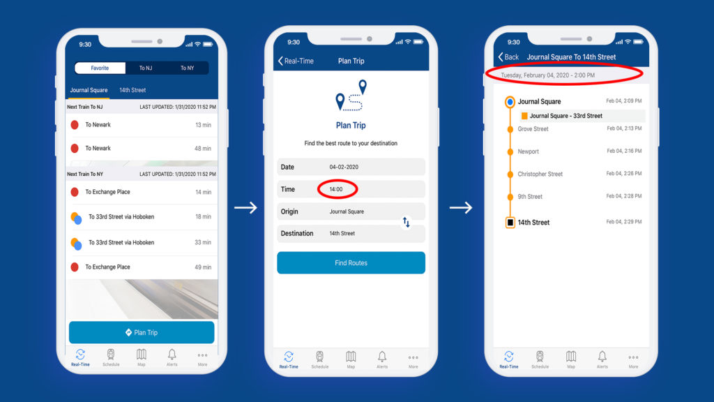
The main screen affords planning a trip, the Plan button acts as a signifier informing the user where to tap. The feedback shows a screen wherein the user enters the details which are easily discoverable.
However, if you notice the time is in 24hrs format and once you click the submit button the next screen shows the time in 12hrs format, this inconsistency could create confusion among users. If the user wants to check the train on a different date or time, he is supposed to go back and type in the details again, this acts as a constraint. Hence, a UI where the user could change the date/time in the same screen would be a lot better and would act as natural mapping.
Recommendation –
- The first thing would be showing the right data (Origin – Destination).
- In terms of design, the screen could have text hierarchy with different font styles (signifier) which would make it easier for the user to understand and focus on data.
- In the ‘planning a trip’ screen keep consistency in the date and time formats to avoid confusion.
- In the ‘planning a trip’ screen – a drop down menu which gives the user the option to check trains at different times and dates.
Here is a prototype of how the application could look like...
Conclusion –
As said by Donald Norman “Communication is key to design and to communicate, signifier is the key” and thus this app has a lot of scope in terms of the User Interface Design which could be a lot more user friendly as the application users could be of any age group.