
Background
Amazon Music is a music streaming platform and online music store operated by Amazon. It aims to provide users high-quality music everywhere and improve the music listening experience all the time.
Overall Feeling and Homepage
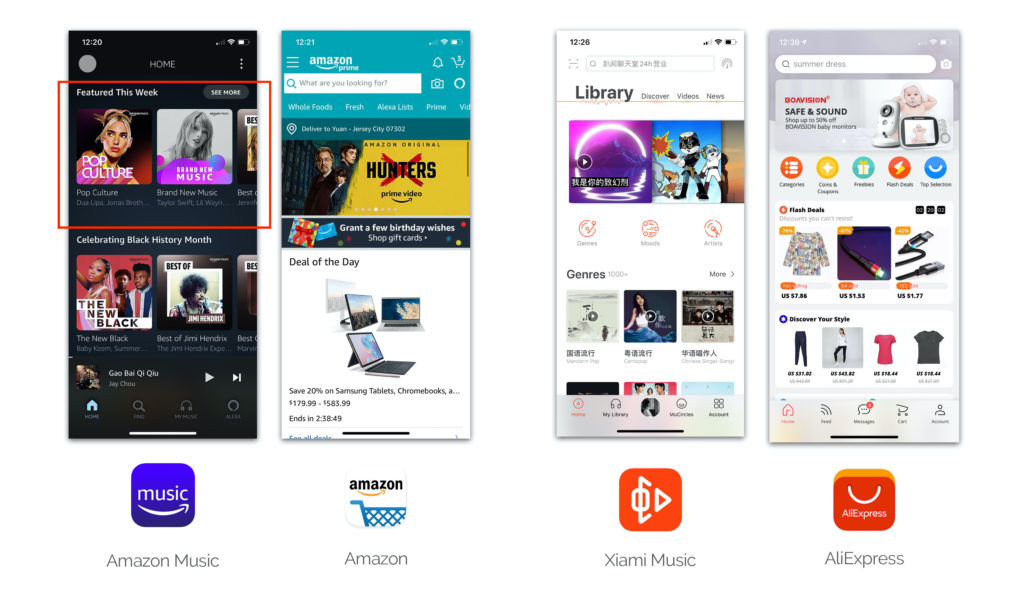
The overall design of Amazon Music is simple and modern. The album pictures on the homepage are attractive, and the group of the songs is very clear. Two and a half pictures per line are discoverable that can clearly tell the user it can be slide to the left. The bottom menu items meet the user’s high-frequency needs. Clicks have good feedback and the color change of the icon lets users know which page they are.
But Amazon music does not embody the brand identity perfectly. Although we know it belongs to Amazon from the name, icon and Alexa, its overall color, fonts, and even design logic are very different from Amazon. Comparing with Alibaba, a Chinese company whose products have similar business models, the brand images of AliExpress and Xiami Music are much more obvious and unified.
Music Playing Page
As the main page of the music app, Amazon Music is not perfect. Some problems in the design will be marked in the figure below and the improved prototype is on the right.
Summary of Improvement
– Buttons should be more discoverable
– Improve action mapping
– Enhance the efficiency of existing elements on the page and simplify the process
– Don’t put the frequently using button in a place where the fingers are difficult to operate
– Icon logic must be consistent with the general perception
Activity-centered Design
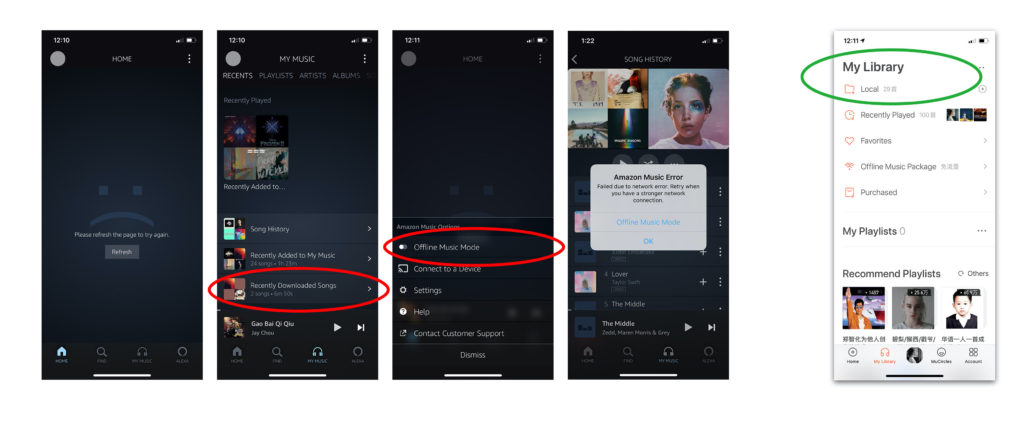
In addition to the basic design principle, Don Norman emphasized activity-centered design. When the user does the activity that uses the app to listen to music without the internet, problems existing.
Still compare with Xiami music, when you open amazon music without the internet, you will see the homepage without the internet connection and an unhappy face. However, without an internet connection, when you open Xiami music, the first page that pops up is ‘My Library’, and the top selection is ‘Local’, which is the download music folder.
Besides, Amazon Music ’s ‘Downloaded Songs’ folder is not obvious, which is difficult to find. Amazon Music also designed ‘Offline Music Mode’, which is a very good feature that can filter the result of downloaded songs in all playlist with one click. When the network suddenly terminates, clear feedbacks will pop up to tell the user what happened and provide ‘Offline Music Mode’ options. But when I open the software without the internet, the ‘Offline Music Mode’ button is off, and I need to work hard to find it and then open it.
In conclusion, Amazon Music The main functions can be smoothly implemented, and there are some good design features. However, the design details and the user experience under specific conditions can be further upgraded. Norman also mentioned that the fastest way to fix mistakes is undoing. We often make mistakes when adding music to the specific playlist, hoping that Amazon Music will further upgrade this in the future.