The Best Buy app is a mobile application usable on both ios and android devices as an alternate method for shopping at Best Buy. The app’s primary function is to help users/customers locate a specific electronic item that they need. Or you can browse the app using the “Product” tab and click on whatever catches your eye.
Search Bar in Home Page
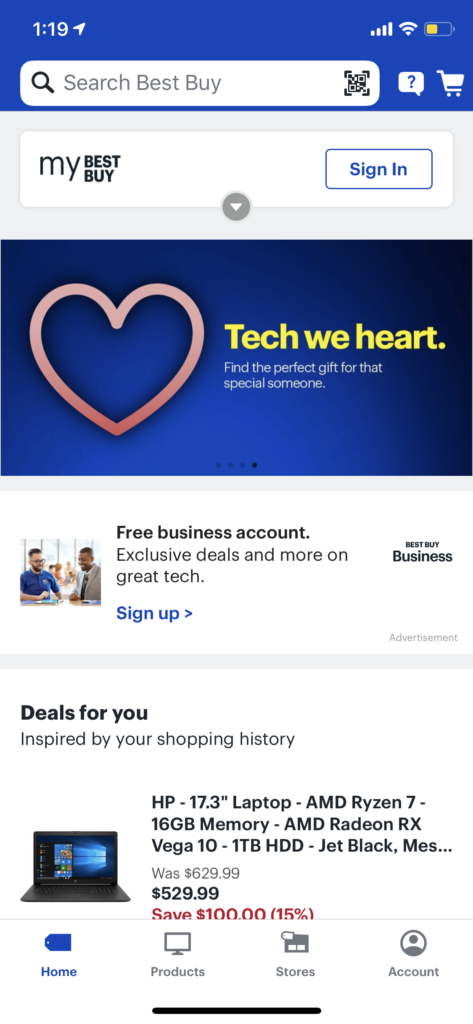
As you can see on the homepage, the search bar is immediately discoverable at the top of the screen. The search bar’s location at the top is typical among many shopping apps. Users who have any online shopping experience through mobile or desktop will know to look at the top. However, even if users have no online shopping experience, then other attributes contribute to discoverability. Signifiers such as the magnifying glass and the words “Search Best Buy” are showing the users where the search bar is. The words “Search Best Buy” also act as an affordance to users, literally letting them know you can search for products here. The mapping is done wonderfully as the search bar is a white text box on a blue background, and enclosed in the text box to the left are the signifiers. Not to mention on the right side of the text box, there is a visual of a QR/Barcode scanner, which lets users know that there is another method of searching beside the search bar.
Try typing in “Laptop” into the search bar
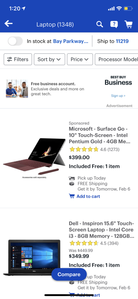
The feedback is immediate and leads you to exactly where you want to go. Once you search for a laptop, the next page brings up a list of laptops available at Best Buy. Again signifiers and mapping come into play as the laptop replaces the search bar, and right next to it is the number 1,348, which shows a user the number of devices with laptop in the title. Right below the search bar is where it lists the ways a user can filter and sort the results of “laptop.” Designers of the app figured that users read top to bottom, so having the option of filtering right above the search results is an excellent example of mapping.
Conceptual Model of Signing on to your Account
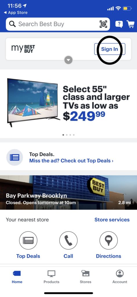
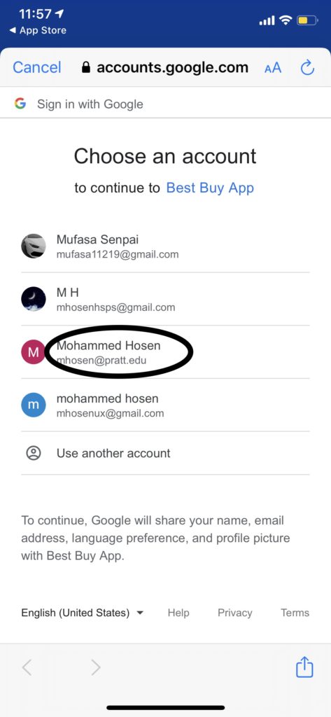
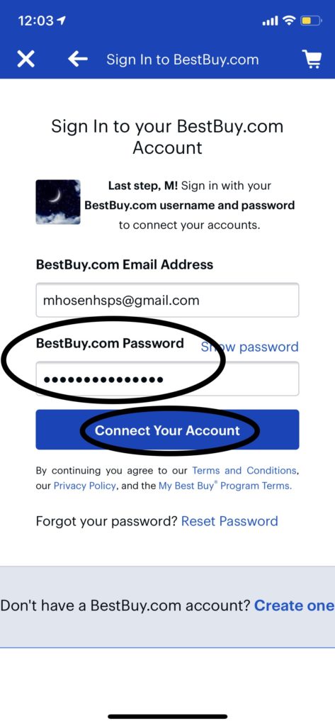
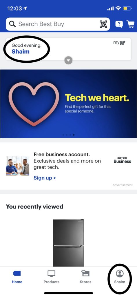
The conceptual model for signing into your account is as follows:
- Click “Sign in” Upper Right Corner.
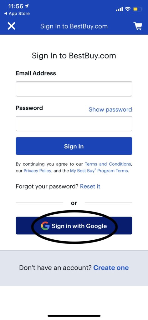
- Click “Sign in with Google” at the bottom center.
- Select the Google account you want to use.
- Enter your password.
- Click “Connect your Account” at the bottom center.
- The app welcomes you.
The conceptual model here is straightforward. The feedback after every action you take is immediate, and you also see visual progress being made to the eventual log in to the account. Each step in the conceptual model has its signifiers letting you know where to click: Ex., the “Sign In” button. One flaw in feedback is after you complete step 3. Once you select a Google account, you would expect to be logged in via google, but no, in reality, you have to make your own best buy password before successful sign in.
The seven stages of action, which include the gulf of execution and evaluation, tie into the process of signing into your account. I set myself as the user in this scenario. My goal was to access my account. The plan was to click on the “Sign In” button, which would take me to a page where I would input information resulting in me accessing my account. I performed the action, and eventually signed in through my Google account. After this, I went to the homepage to see visual confirmation of my account, on the upper left corner of the app it wrote “Good Evening, Shaim.” I interpreted this action as a successful sign in. And upon further evaluation, I concluded that I had reached my goal.
Try to scan a QR/Barcode that Best Buy doesn’t sell.

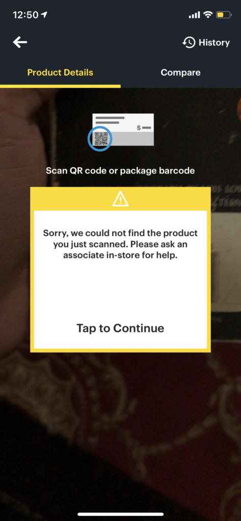
Going back to the homepage and clicking on the QR scan symbol, the feedback is that it gives the app access to your camera, which would scan the barcode. Now, if a user accesses this feature and tries to scan an item the store does not carry, then designers have a built-in error message as a constraint to stop users from performing the wrong actions.
Mistake when creating an account
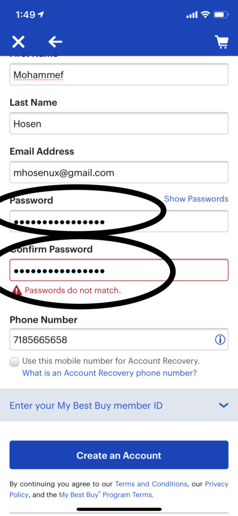
Consider a situation where a user is trying to create an account, and a memory lapse occurs. The user enters a different password, even if it’s off by one letter, into the confirm password box. The designer anticipated that and inserted another constraint, which is an error message saying the “Passwords do not match.”
Conclusion
The designers of the Best Buy app, make sure that users have a great shopping experience. The designers put a lot of thought into the features in the app. They added many signifiers, which made features easier to find and use. Not to mention, the layout and mapping of the controls in the app made sense. At the visceral level, the app isn’t too aesthetically pleasing, but it doesn’t need to be. The app uses the company’s color scheme very well. The designer made it intending to prioritize functionality and usability over aesthetics.