
Bumble is mobile application used by individuals to communicate in the social, networking and dating realm. It has tree main branches – Bumble Date, Bumble BFF and Bumble Bizz. It claims to have changed the way people find friends and date online by giving women the first opportunity to communicate.
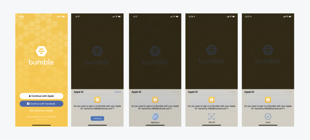
1. Login:
The homepage affords the signing up process. Consistent to most social media logins, bumble offers you the option to sign up with Facebook. Incase one chooses otherwise they can log in with their Apple ID or phone number. There’s optimum discoverability and visibility as the 3 options are clearly displayed and users have the understandability that they have to click on an option to proceed. The user is prompted with the registered Apple ID and is given constant feedback as they complete process.
The continue button is the signifier here. I feel the log in feature is efficient. It’s quick and straightforward which is very convenient for users. The integration with the iPhone’s Face ID feature reduces the effort of typing the password. Although, I feel like the log in could be as quirky and colorful as the rest of the interface. While the homepage looks zesty and inviting the log in experience is not consistent with it. The experience looks rather dull. Bright colors like yellow could be used with some animation to build excitement for the user. The placement of the animation could be in the center to capture attention and retain optimum engagement.
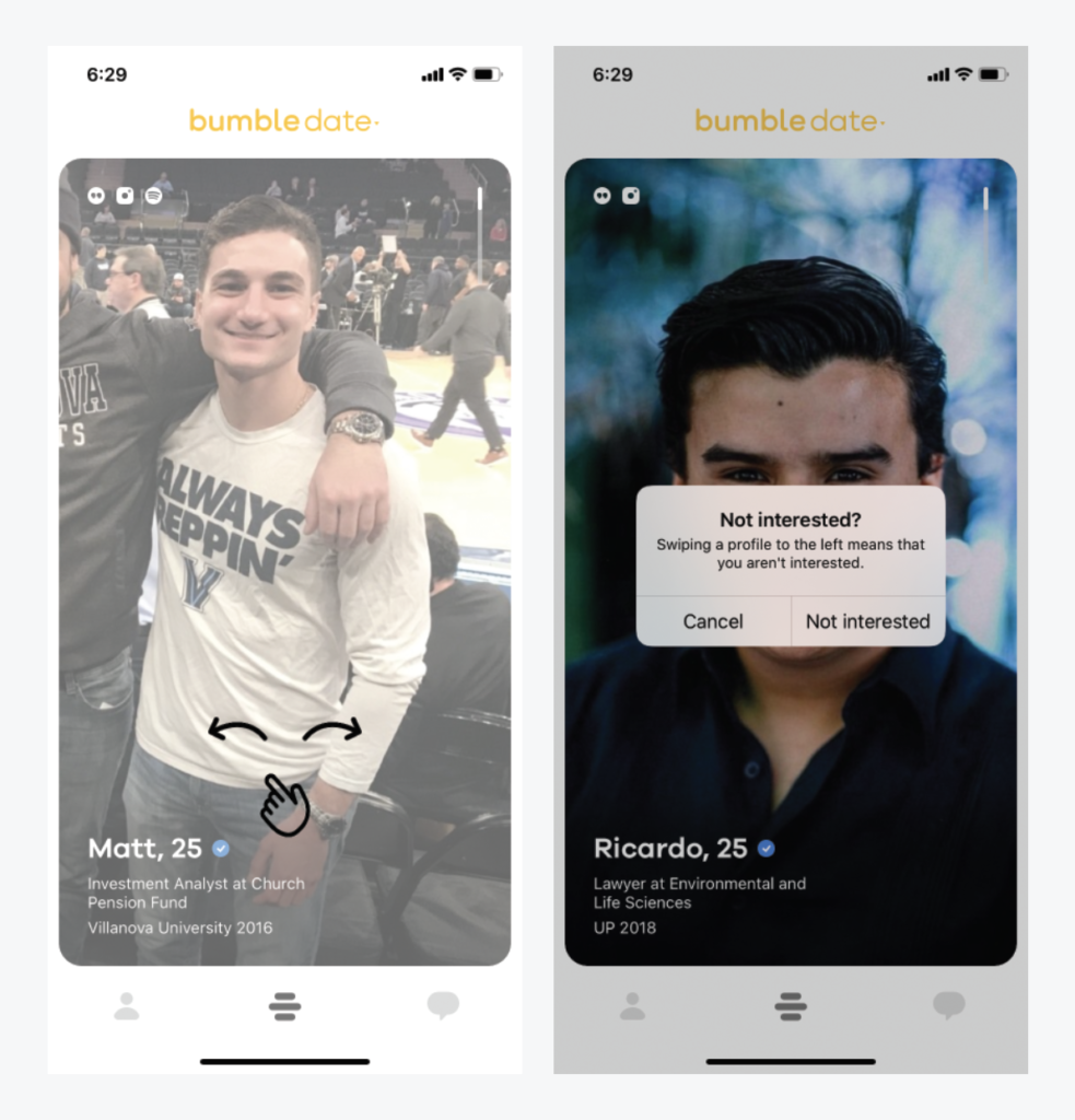
2. Swipe to make a match:
On Bumble Date, when we come across potential interest we swipe right and swipe left to get to the next profile. Users have arrows to guide them through the process but this is only for first swipe a new user makes. This function is very relevant for users wit imprecise knowledge regarding how one can browse through potential dating profiles . The little thumb with arrows are the signifiers here. The also form mappings which draws users to explore swiping. The swipe left is then followed by a feedback just to make sure the action wasn’t a slip. This ensures the understandability of the user and gives them an option to cancel of the wish to swipe right instead.
It was great to have a mapping to the swipe motion but it only shows up once. It leads to the swiping becoming the visceral response for the user along with bridging the gap between the gulf of evaluation and execution. It would be pleasurable for a new user to know their action of approving the profile matches his/her goal. It would be nice for this mapping to be around for every other swipe until the user is frequent (to have familiarity with the app environment). For returning users there could be a signifier guiding users to “skip initial assistance” option. Another way to give user feedback besides the pop up window could also be a certain kind of phone vibration when one swipes right- to confirm intentions of profile approval.
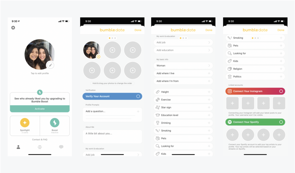
3. Edit Profile:
In order to edit your profile you have to click on the admin sign at the bottom left. Users would expect to see a general summary of their account when they see this icon. It has discoverability and understandability as its easy to spot and viewers anticipate that it would take you to their settings . After selecting the little pencil icon which acts as a signifier users can add/update their personal information. This scroll down menu allows you to write a description about you, add your work/education details, add you likes/dislike and connect to other social media accounts. This page affords the constant change/update of user information.
Although is a a very effective way of having all information on one page. It seems slightly cluttered and looks like long list. Information could have been split across multiple pages/tabs instead of all the categories being on one page. The could also be a drop down menu for each specific category so it would not seem vert list-like. “Connect two instagram and Spotify” could have been outside this page on the general summary page to attract more visible and encourage more media engagement.
To Conclude:
Overall, Bumble’s experience and interface seems integrated and continuous. All of the 3 attributes have visible affordances and signifiers, discoverability and immediacy of feedback. Although the usability seemed very efficient more additions can be made to improve the aesthetics, pleasure, and fun aspects of using the app.