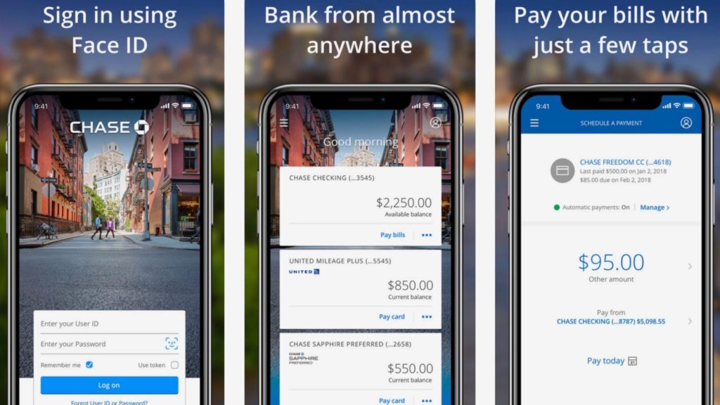

The Chase Mobile Banking App allows users to have a holistic view of their bank account and manage their money all in one place. Users are able to view balances, pay bills, transfer money and deposit checks, amongst other things. In this post, I will be focusing on three attributes of the Chase Mobile Banking App – Available Balance, Deposit a Check and Quickpay (Sending Money to People).
Available Balance
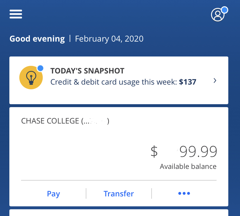
This screen is both the home screen and the screen where users can view their available balance. On this screen, multiple signifiers like the > next to “Today’s Snapshot” are introduced to signify to the user of all the different paths they can take. These signifiers come together to tell the user what the possibilities on this screen are (Affordances).
While the mapping of the most rational and used options are clear on this screen, the discoverability of the “Available balance” button is not well designed. At first, a user would not be able to tell that if they click on the available balance, in this case $99.99, they will be taken to a summary of their most recent transactions. This is not visible to users because this section does not look like a button. Instead, it just looks like information that blends in with other “un-clickable” text.
Recommendation: Change the font color of the “Available Balance/$99.99” to the same color as all other clickable options, like the pay and transfer. That way users can have a consistent experience and know what buttons are clickable on this section.
Deposit a Check
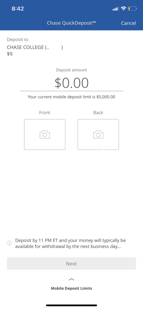
This screen allows users to deposit checks. By looking at the screen in its entirety, users will be able to tell what is possible on this screen (Affordances). I enjoy the design of this page because the signifiers are simple yet effective. There is a space for the amount on the check that a user will be depositing and signifiers that let the user know they need to take a picture of the front and the back of the screen.
Once the picture is taken it will show up on the screen providing feedback that the image has been successful. The mapping of the information presented on this screen is ordered in a sequential way that requires the user to fill out amount, then take photos in order to press “Next”, which changes color once all the other info has been recorded.
This screen does a good job with The Seven Stages of the Action Cycle that Norman discusses. We can infer that the users goal is to deposit a check. They plan the actions they are going to take, they then specify that the actions must start at the top of the screen since after each field is completed the next option becomes available. They then carry out the action, perceive what is going on, interpret if their action is working and compare the final result to their initial goal.. was my check deposited? Yes. Perfect.
Quickpay (Sending Money to People)
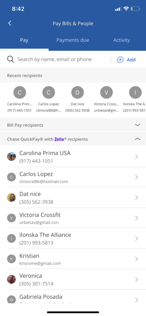
Quickpay via Zelle is an easy and efficient way to send money instantly to anyone at anytime.
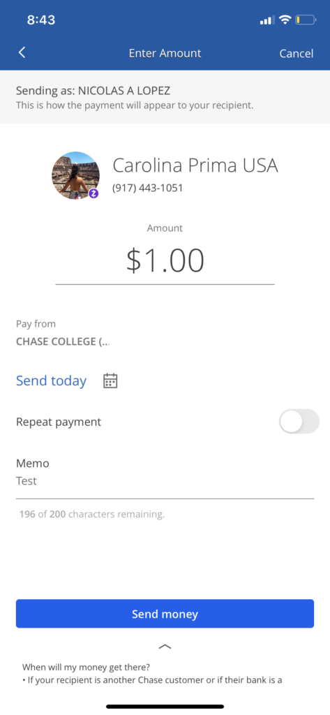
Both of these screens come together to allow for a user to find, select and send money to a person instantly. While the first screen has a lot of text and could be a bit distracting, the discoverability of key signifiers allows for the user to know what they can do on that screen (Affordances), which is to search and/or select a recipient.
Once a recipient has been selected, users will be directed to the next screen where they can add the amount they wish to send as well as a memo and date of delivery. The discoverability of the signifiers makes this a seamless experience. The consistency with other screens allows the user to know exactly where they have to input information. Overall, it is a screen with a design that signifies to users what they can achieve, is consistent and provides instant feedback after users have input information.
Conclusion
The Chase Mobile Banking app is, in my opinion, a very well though out app that allows for a pleasant user experience. The app does a very good job at presenting to users all the possible options on each screen (Affordances) so they can navigate and correctly find what they are looking for.