
The Deserve® Edu Mastercard is a solid student credit card for college students who don’t have a credit history — it offers rewards, no annual fee, and other student-friendly perks. Since an SSN isn’t needed to apply, it is the best option for an international student struggling to qualify for other credit cards in the USA.
LANDING PAGE: DISCOVERABILITY, AFFORDANCE, KNOWLEDGE IN THE WORLD
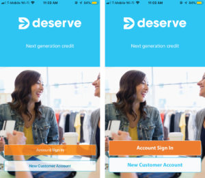
The application features an inviting image on the landing page [Figure 1 (left)] along with its logo and sign in and create new account transparent buttons that are discoverable and afford clicking. However, as per our knowledge in the world, we tend to give more importance to the visuals that are dominating; in this case the logo and the image. Hence, I propose that the hierarchy and the significance of the buttons can be further enhanced by a size increase and making the buttons opaque so as to not be distracted by the huge deserve logo and instantly be able to achieve the goal of logging in/creating an account [Figure 1 (right)].
HOME PAGE: SIGNIFIER, AFFORDANCE, GULF OF EXECUTION
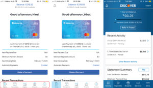
The home page is very welcoming with a greeting and clearly showing the user, the amount spent and the remaining credit. The page has bottom navigation that has low discoverability, good labeling though. The navigation lacks a good signifier that can direct to an affordance. For example, currently, the app highlights the home section by adding a dark grey color to the icon indicating that the user is on the home page now [Figure 2 (left)]. This is a very minor indication and can be neglected by the user causing the gulf of execution. A more highlighting blue signifier [Figure 2 (center)] will provide more discoverability and eventually bridge that gap. Also adding a notification symbol on the top left will be an easy way to access the latest alerts about the transactions [Figure 2 (center)] as referred from the discover app [Figure 2 (right)].
HOME PAGE: AFFORDANCE, FEEDBACK, GULF OF EVALUATION
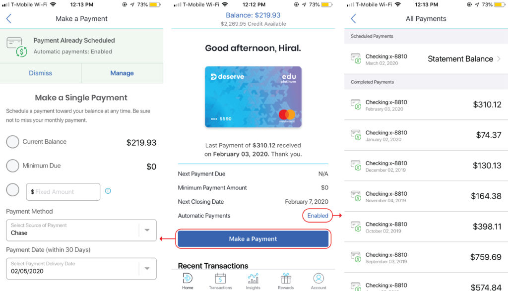
On the home page [Figure 3 (center)], the user can clearly identify the automatic payments tab which affords a click. However, on clicking it, the feedback is not what the user expects. Instead of showing the user an option to manage the auto-payments, it directly takes the user to the All Payments section [Figure 3 (right)]. The option to manage the auto-payments is however shown on clicking the Make a Payment button [Figure 3 (left)]. This causes a gulf of evaluation.
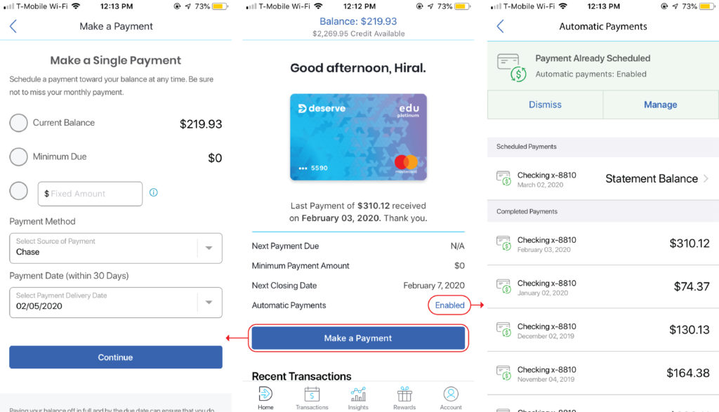
Hence, I propose the above design [Figure 4]. Getting rid of the manage the auto-payments option from the Make a Payment tab [Figure 4 (left)] and adding it to the Automatic Payments tab [Figure 4 (right)]. This bridges the gulf of evaluation because now the user gets what the tabs say and what he/she expects the tab to do.
TRANSACTIONS PAGE: MAPPING, GROUPING, PROXIMITY
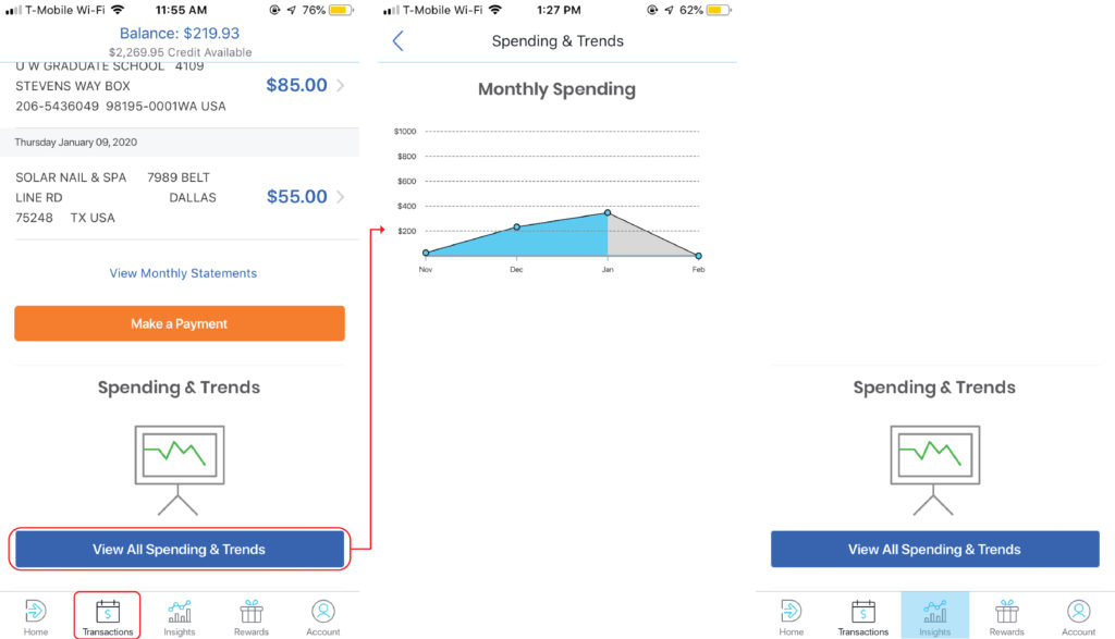
The transactions page includes a list of all the transactions but at the end also adds a View All Spending & Trends button [Figure 5(left)]. This button takes the user to a spending chart diagram [Figure 5(center)], which actually is an insight into the user’s sending trends. Mapping is ‘the relationship between the elements of two sets of things.’ It is an important concept in the design and layout of controls and displays.
‘Groupings and proximity are important principles from Gestalt psychology that can be used to map controls to function. ‘ Hence, I recommend that the Spending & Trends option be grouped with the Insights header [Figure5: (right)] to avoid the confusion in the gulf of execution & evaluation.
I believe that the app can become more succinct in its conceptual model.