Eventbrite.com is a website for event planning, management, and ticketing. Eventbrite provides users with multiple services. Users can browse events, buy tickets to participate in events and create their own events.
Home Page > Search Events
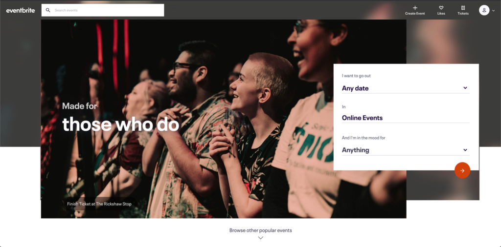
On top of the home page of Eventbrite.com, it is the navigation bar. The navigation bar has the affordances to support users to search for events, create events, manage liked events in different collections, check ticket status and edit profile information. The signifiers for these functions are explicit and straightforward since there are buttons constructed by descriptive text and icons. When a user hovers on any one of these buttons, the button changes its color to offer immediate feedback for the user.

Below the navigation bar, inside of the large image in the middle of the webpage, there is a false signifier. The rounded rectangular shape inside of the image looks like a button but it is unclickable. This piece of information should be shown in a regular text form similar to the title because it is actually the caption of the image. The recommendation for this problem is to take out the rounded rectangular shape and enlarge the text for clarity and proper visual hierarchy.
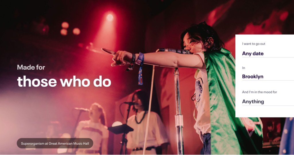
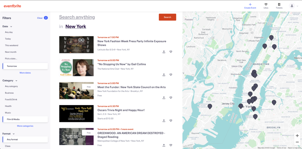
On the right-hand side, there is one more entry for searching for events. It is a search filter that clarifies dates, locations and event types allowing users to customize their results. The signifiers here are words from a sentence, they successfully communicate the affordances with users in a first-person statement format. I think it is an effective way to get users engaging with the website and build the correct conceptual model for Eventbrite.com.
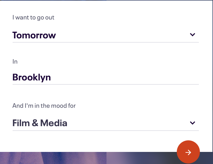
When a user clicks the red button with the arrow, the page transits to a search results page. It provides sufficient feedback by indicating search conditions in the left column, a list of events in the middle column and the location information shown on the map.
Home Page > Browse Events
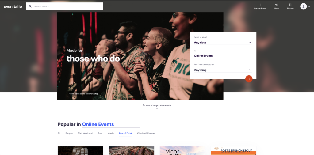
“Popular in______” looks like a repetitive search entry point for alternating event locations since it has a line for typing but it does not have the same function as the previous search filters. When a user types in a new location, the webpage would not rapidly change to the result page as the previous does. Instead, the new input location refreshes the contents accordingly at the bottom of the home page and they are supposed to be browsed by users.

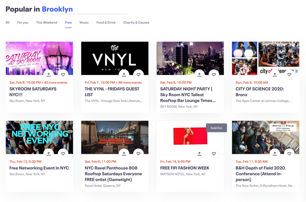
The categories under the location are clear signifiers highlighted in blue and play an important role as a second-layer filter. However, there are three entries for searching events on the home page and I think the design lacks constraints for novice users. The overall visual layout of these three entry points also cause mapping issues. The first two search queries will lead to a new page while the browsing affordance suggests users scroll up and down on the homepage in order to view events. My recommendation for the home page redesign is to only keep the first two search sections and push the browsing section down to eliminate confusion caused by the mappings. When a user wants to browse events, one can simply click on the “Browse other popular events” and proceed to the grid view of events with pictures and descriptions.