Expedia is an online travel agency and metasearch engine, which is designed to enhance its users’ travel experience. It is a platform where users are able to book flights, hotels, rental cars, cruise ships, activities, and bundle deals. In this article, I’m going to critique Expedia Android app following the design principles and concepts mentioned in Don Norman’s book The Design of Everyday Things, and I’m going to give my recommendations to improve the design.
1. Navigation
Placing the main navigation on the top of the screen gives strong discoverability to users to know the services Expedia offers [Fig 1 (a)]. In addition, the labeling uses texts and icons which are good signifiers. As a non-native speaker, I didn’t remember the meaning of “Cruises” when I first saw this label, which is not the knowledge in my head. However, I understood as soon as I saw the ship icon beside it since the ship icon is the knowledge in the world.
When I first saw the label “Things to Do”, I thought it meant the things I should do. And I couldn’t relate the icon to this label. However, it is actually the place for tourists to find short tours and buy tickets.
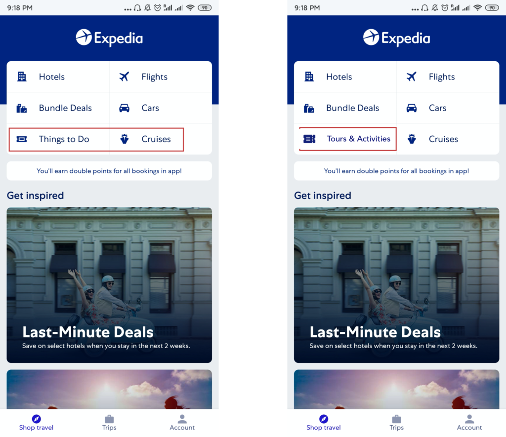
Fig 1: (a) Good and bad signifiers (b) Suggestion
Suggestions: The label “Thing to Do”, as well as its icon, can be changed to “Tours & Activities” with a clearer icon [Fig 1 (b)], which users are able to retrieve the knowledge in the world more quickly.
2. Booking Flights
The icons of “Flying from” and “Flying to” have good natural mapping [Fig 2 (a)], which prevents users from description-similarity slip. On the flights’ filter page, they give the option for users to choose flight duration.
But when I tried to limit it to 1 hour, I noticed that the button became unclickable, which is a constraint [Fig 2 (b)] for users to know what they can’t do. This is also the stage of evaluation where users want to evaluate what happened. However, users will not find the feedback quickly because it is placed at the bottom of the screen [Fig 2 (b)], which lacks discoverability.
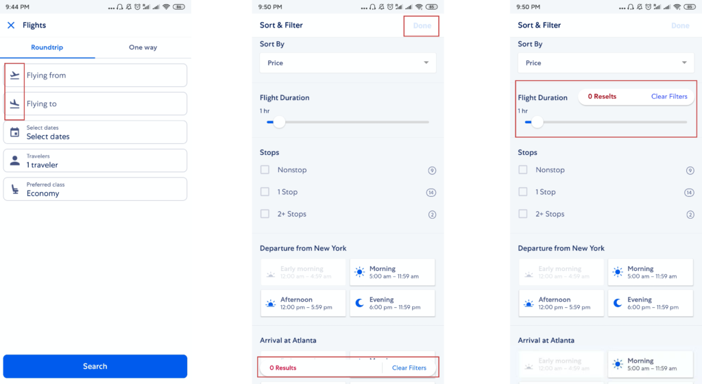
Fig 2: (a) Natural mapping (b) Constraint & Failed feedback (c) Suggestion
Suggestions: In order to let users get feedback as quickly as possible, the alert should be placed close to “Flight Duration” [Fig 2(c)] which is more visible.
3. Booking tours & activities
The activity page [Fig 3] gives users enough discoverability, in which users can easily find the essential information. The blue buttons are good signifiers that make users know they are clickable.
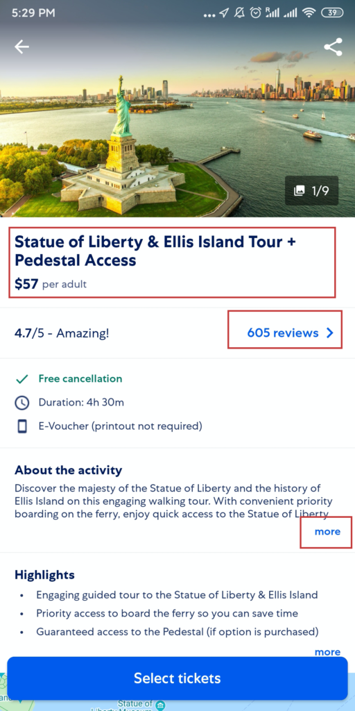
Fig 3: Discoverability & Signifiers
However, when I tried to look at the filter of activities, I found that I could only sort by popularity and Price [Fig 4 (a)]. And if I click price, the activities will order from low to high automatically. What if I want to find something expensive directly? This is not an appropriate system image of users, because we have got used to sort things by price in both directions. In addition, there is no feedback [Fig 4 (b)] after I do the sorting thing, which creates a gulf of evaluation. I have no idea which thing I sort by.
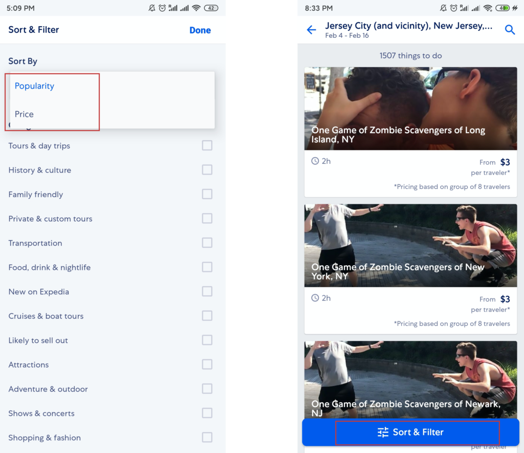
Fig 4: (a) Inappropriate system image (b) Failed feedback
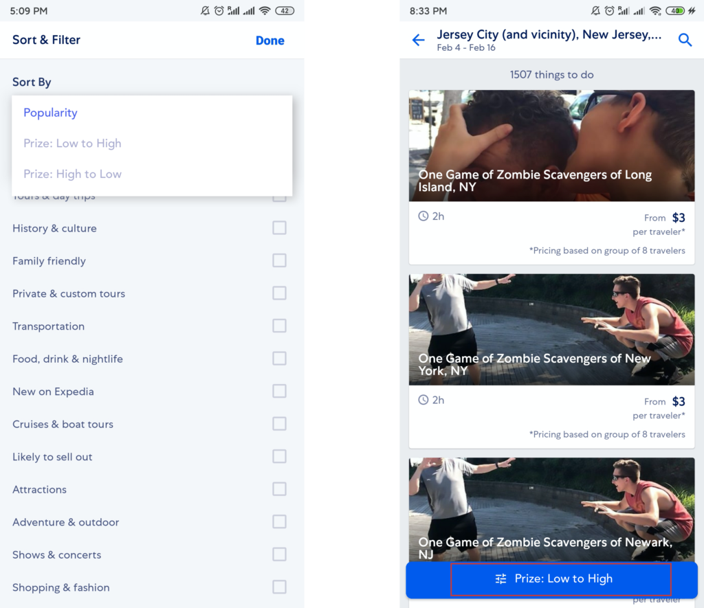
Fig 5: Suggestions
Suggestions: Give users options to sort by price from both directions, which relates to users’ system image. Add the filter label for the current status so that users can get feedback from what they have done. [Fig 5]
Conclusion:
Expedia makes good use of some of Norman’s design principles. However, there are a couple of issues that can be improved to deliver a smoother user experience.