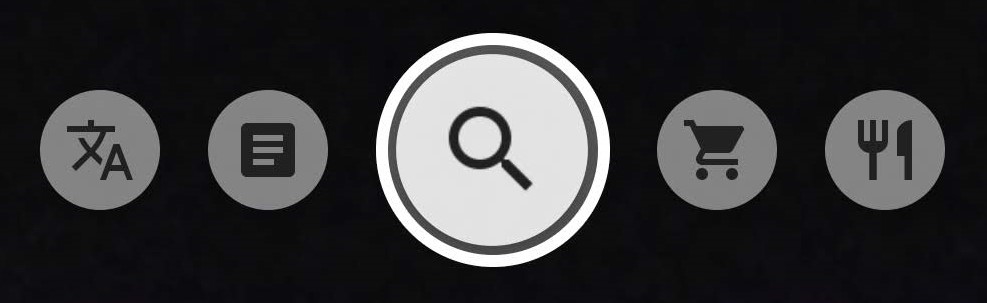
The app that I chose for this assignment is Google Lens. In this app there are five different functions,: a translate function, a text function, an auto/search function, a shopping function, and a dining function (image 1) that allow the user to search for specific images on Google. However, for this specific post, I will not be discussing the shopping or dining function of the app.
When looking at the main functions of the app there are:
Good Discoverability: It is clear what actions are possible the moment that the app is opened. Most of the icons that describe the functions make it clear to the user what the functions do (i.e. the shopping cart for shopping).
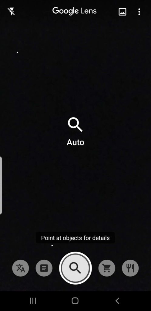
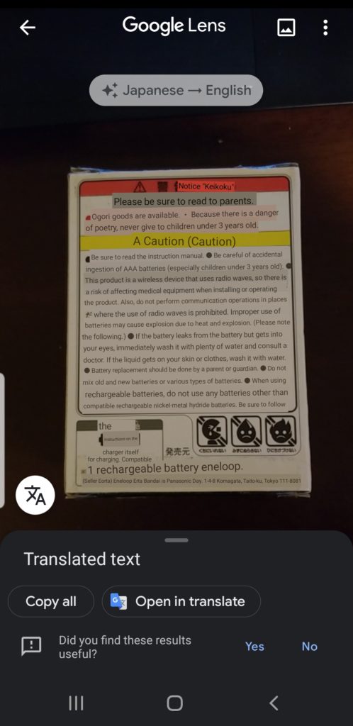
Good Feedback: White specs appear on the screen and move around to show that it’s responsive and ready to go. If the user points the camera at a blurry object it will say “point at objects for detail” so the user knows what to do (image 2). Once it is pointed at the object, the text and magnifying glass on the screen will disappear and focus on the item that is in front of the camera.
Auto/Search Function:
Used to search everyday object to get more details on them.
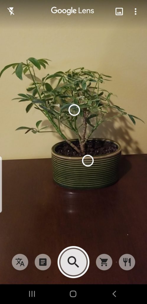
Good Feedback: Image 3 shows that the camera has picked up on the particular object that is in the camera by showing two bubbles on the screen.
Poor Signifiers: Nothing shows that the icon needs to be clicked on (as if to take a picture) to get results.
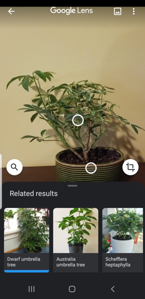
Poor Signifiers: There are no signifiers used to show that the user must scroll up to see the rest of the “Related results” (image 4).
Solution for Signifiers: The circle around the auto/search icon and the little bar at the top of the “related results” section could be flickering to show the user that an action must be performed in order to get results.
Translate:
Poor Discoverability: The icon shown in image 5 is not one that I would assume meant translate just from looking at it.
Solution: I would recommend making it look like the Google Translate symbol (image 6). That way if someone uses Google Translate they will already be familiar with the image and make the connection between them.
Poor Signifier: Unlike the auto/searching function, the button does not need to be pressed to start translating. In fact, if the user were to press the button, they would be sent to Google Translate itself and see a clump of untranslated text.
Solution: While the signifier for this specific function is not poorly done since it does state that the user has to point at the object, in relation to the other functions on the app it makes the user think they have to click on the button. Therefore, there should be some consistency established through the app.
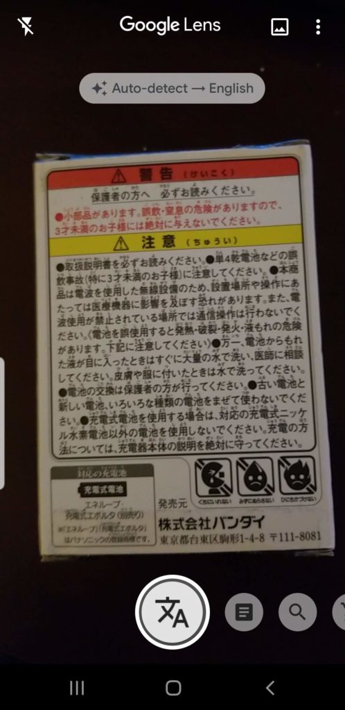
Good Feedback (but easily missed): If the user holds their camera over the object long enough, the translation will begin right before the user’s eyes (images 7 & 8).
Text:
Good Discoverability: The user would most likely know that the icon that looks like a piece of paper with words on it, will allow them to copy text (image 9).
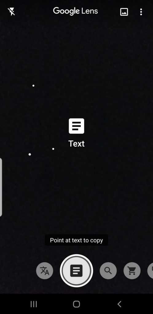
Poor Signifiers: There are no signifiers saying that the user should click on the icon to make it show results. Especially when the written signifier says, “point at text to copy” (image 9).
Solution: Make it clear that the button needs to be pressed to get results. Either make the flicker or have a better description. such as click for results.
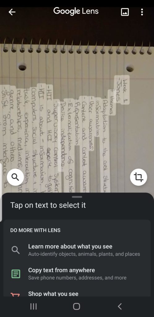
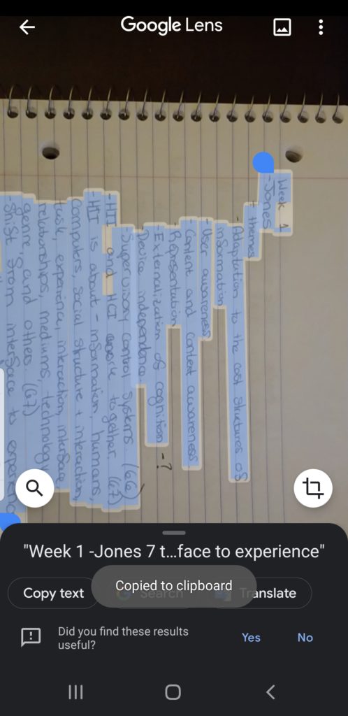
Poor Signifiers leading to Poor Results: The words on the page were outlined in white, which signifies to the user that this was the part of the image that was copied. It even said, “tap on text to select it” (image 10). When posted to the notes on a phone, the whole image was pasted in the notes, not just the highlighted text. Once this was discovered, I went back into the app and tried to highlight just the text to paste into the notes. This time, I received the signifier that it had been “copied to clipboard” (image 11). When I went to go paste it in my notes, the whole image pasted again, but this time the words were highlighted in blue.
Solution: Don’t show or allow the user to highlight just the words on a page. This tells the user that just the words will be copied, not the whole page.
Conclusion:
As a whole, I think the app provides good discoverability and feedback to the user. However, the biggest problem with the app is consistency. There were some functions that needed the user to click on the icon as if to take a picture of the object and there were others that just did it automatically. The main issue with this was that there were no signifiers that told the user that they needed to click on a certain icon or to just let it happen automatically. Every starting screen for each function all told the user to “point” at whatever was in front of the camera not to capture the image to get the results.