Google Maps Navigation is a navigation assistant that plots travel routes to a destination and then provides step-by-step instructions to the traveler on how to get there. The route planning can be done for travelling by foot, car, air or public transport. This critique considers Don Norman’s principles of good design to understand what makes the navigation so easy to adopt by novice users.
I’ve been interested in understanding what makes certain applications easy to learn for users who may otherwise not be savvy smart phone users. While I was trying to design an app for Mauqa Online’s helpers, I started talking to different people who belonged to this user segment. Out of all the applications these users were using, the navigation feature on Google Maps was perhaps the most complex app they had become accustomed. Something about the way the navigation was designed made it easy to learn even though the act of navigation itself can be quite complex in the real world.
In this critique, I evaluate two elements of the navigation that contribute to its success: the step-by-step directions provided by the navigation and the controls available to the user.
Would you rather talk to a human or ask Google Maps?
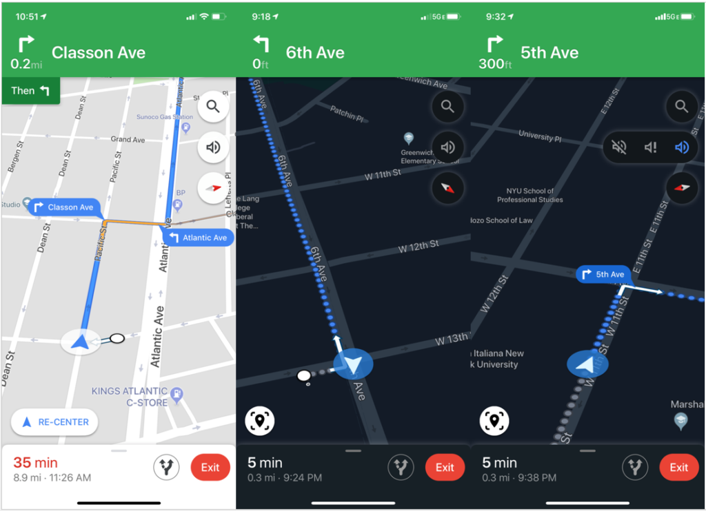
Turns out that the directions provided by Google Maps often match exactly how people give directions i.e. in the format of “go down this road, then take right, then take a left”. This means that the system image of the navigation matches really well with the user’s own conceptual model of how they expect to receive the directions.
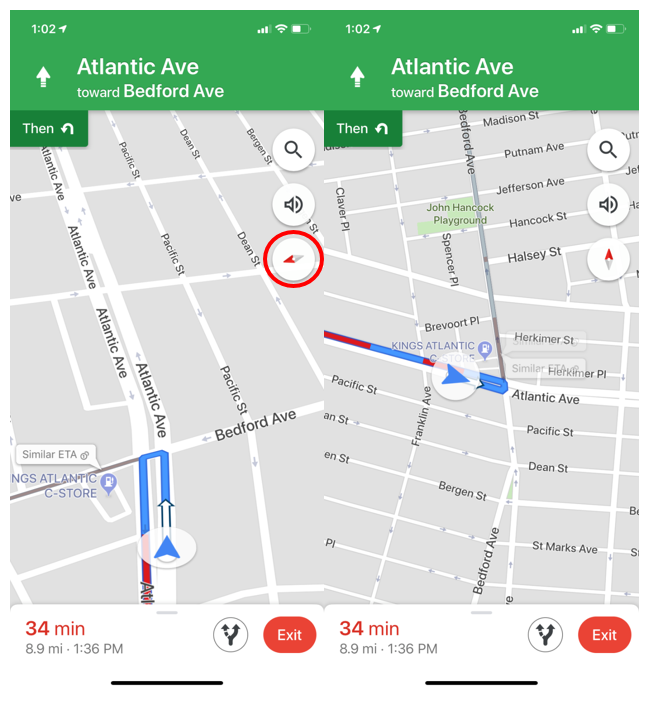
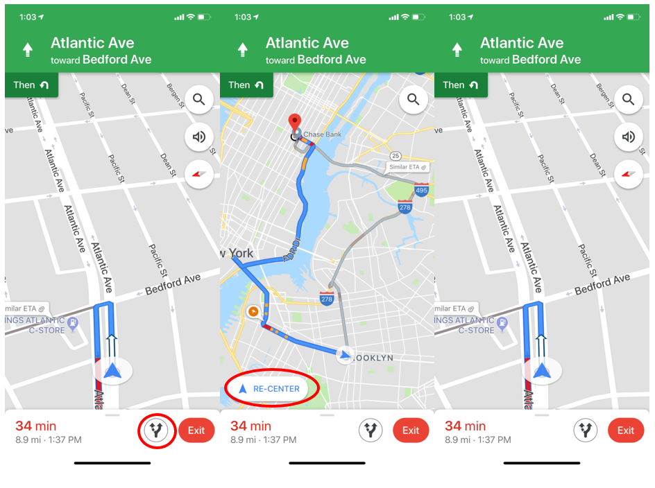
Moreover, once the user starts moving down the route, its updates in real time. As you move forward, the arrow representing the user moves in the same direction. This is an example of how this features maps the actions of the user to the result. The “Re-center” feature in particular contributes to this excellent mapping since it brings the user’s location to the center of the and points them in the direction they are facing.
Another excellent aspect of the navigation process is that as the user moves along the route they receive constant feedback through alerts that could be audio or notifcations.
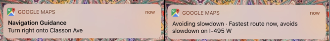
Despite these features, however, we have all been in situations where we feel lost while using the navigation. This can happen when you leave the subway and are not sure which direction you are facing. Or when you have to exit the highway and there are multiple exits in close proximity and you’re not sure which one you can take. Often times, the GPS itself is not functioning correctly which confuses the user. In a way, this experience is like the paradox of automation that Don Norman talks about. We are often so accustomed to the navigation getting us where we are going that when it stops working we get extremely frustrated and don’t know what to do next.
I suggest below some ways in which this problem can be addressed. One possible way is by adding signifiers which act as clues for users to help them orient themselves or the map.
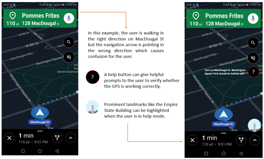
An example of making complex controls made understandable
Here I give examples of three controls that the user has over the setting of the navigation.
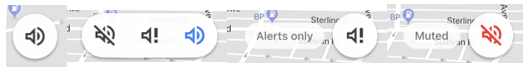
The first one is controlling the settings of the voice assistant. This option is easily discoverable for the user since its easily visible and looks like a button. What I particularly appreciate is the immediate feedback the user gets after they select a particular option. Perhaps the only element of confusion could be what do “alerts” mean in this context. Even though the user can assume that alerts might only be the most important messages they have to hear, they still might have to remember what exactly those messages are. This can be an example of the user having to keep knowledge in the head.
Another great example is compass function. This is again a good example of a good discoverability (the control is easily visible), mapping (the icon compass connects the action to the expected result of orienting the map in a north-south direction) and feedback (the user immediately sees the result of their action.
One issue that I would highlight is that the icon used for the “Preview” function is not a good enough signifier for what this function does which also makes it less discoverable. I’m sure seeing a preview of the trip is something users would want to have. But they might not know this option is available and how they can use it.
Overall the navigation provided by Google Maps is very easy to learn and useful tool and Don Norman’s principles of good design are a good way of understanding why it works so well for its users.