This article will be a review and critique of the Lifesum app by applying terms in The Design of Everyday Things — Don Norman. Besides, I will present the problems and provide suggestions to improve their app from a UX perspective.
About Lifesum
Lifesum helps you track your food and your exercise to live a healthier life and reach your fitness goals through better eating. You can add personal data, purpose, calorie intake, and set distribution between carbs, protein, and fat. You take control of your health in an easy, simple way, along with different options.
Analyzing principles based on 4 key attributes
Signifiers, Mapping, Constrains, Feedback, Discoverability, Complexity & Confusion
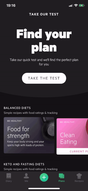
1. Find a diet you love and start a simplified meal plan
Good Design
- Two “TAKE THE TEXT” buttons on the top and bottom are visible signifiers. Good discoverability provides quick access to plan testing.
- Use real images as understandable mappings to give users a general sense of what plans will be like — for example, using avocado for Keto Diet, olive for the Mediterranean, salmon for Scandinavian, and dumbbell for Food for Strength.
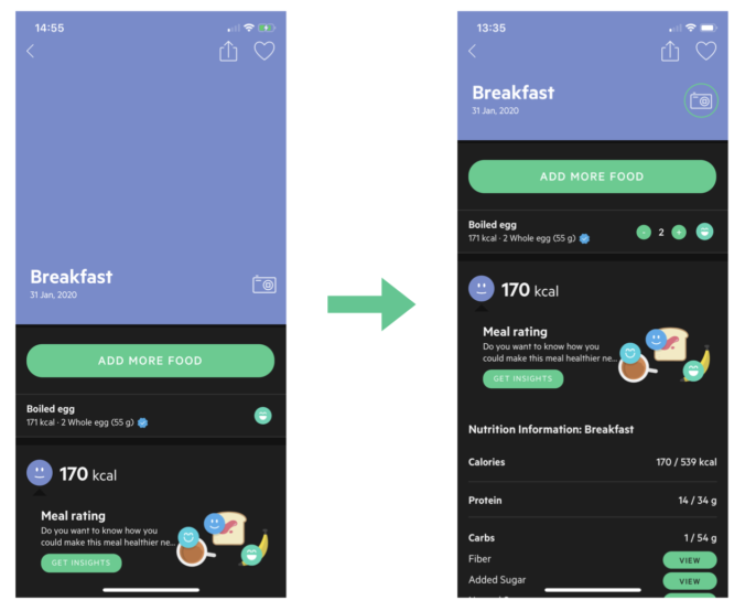
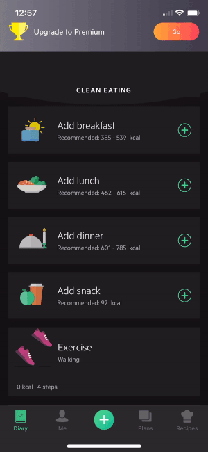
2. Track your meal in different ways
There are two ways of adding breakfast food for instance: clicking the breakfast card or the “+” button in the bottom navigation.
The using flow contains a lot of steps to add one kind of food, and a meal contains more than one thing, so this flow is repeated to finish the whole meal.
Bad Design
- The purple header takes up much space with no purpose, not a good conceptual model. The photo icon is lack of discoverability. It’s a nice to have feature but not necessary it’s taking up half of the screen.
Suggestion: reduce the space of photo for meals.
- Update amount: users need to go back to the meal in the app and update the grams or amount of the food. Too many clicks increase complexity.
Suggestion: add minus and plus buttons for each kind of food instead of entering it and edit the amount.
Good Design
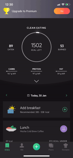
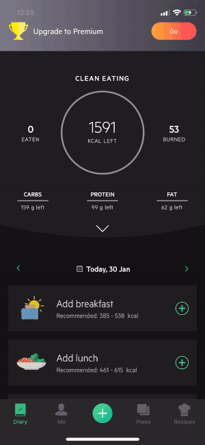
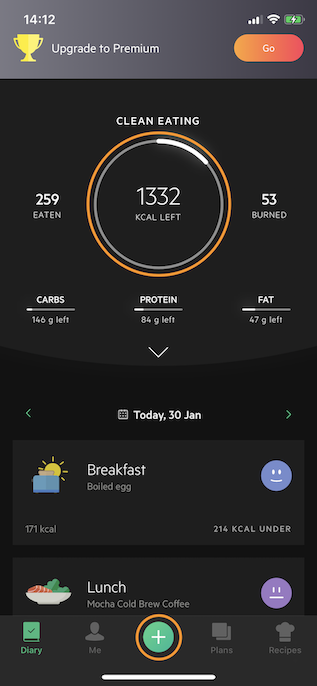
- Progress circle has good discoverability since it is an essential feature. Users can see how many calories left and whether hitting macros.
Bad Design
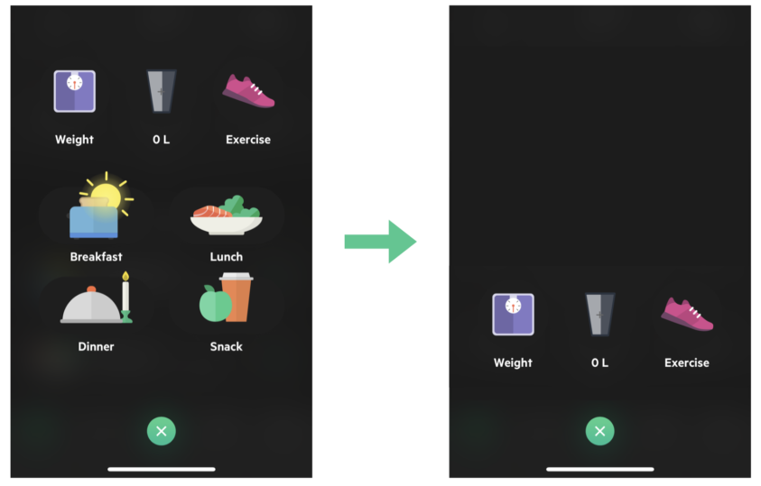
- “+” button is a good signifier, but there is no need to add meals through this button. The bottom navigation button is not a useful conceptual model. It’s not consistent with adding something by using the navigation bar. It also takes more time first to find breakfast and then click “+” than just click “+” on the breakfast card.
Suggestion: remove adding meals feature in “+” button’s, and only remain weight, water, and exercise information.
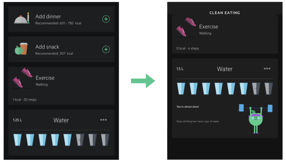
Bad Design
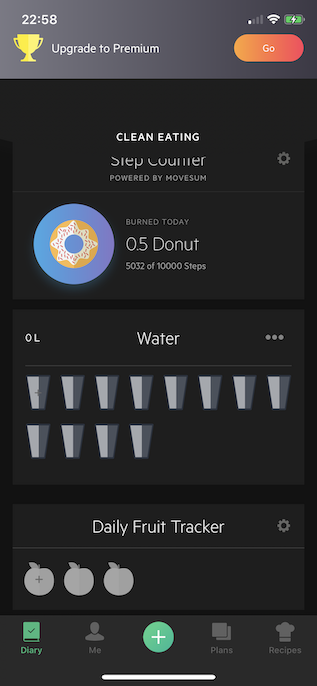
- The water tracker doesn’t give enough feedback. No tips or reminds when clicking.
Suggestion: add reminding sentence like, “You should drink two more cups of water.”
- Fruit tracker brings confusion because different fruits have different serving and nutrition. For example, one apple’s carbohydrate is much more than strawberry, and users may not notice this. So the tracker can not guide users well.
Suggestion: remove fruit tracker and just let users record fruit in meals.
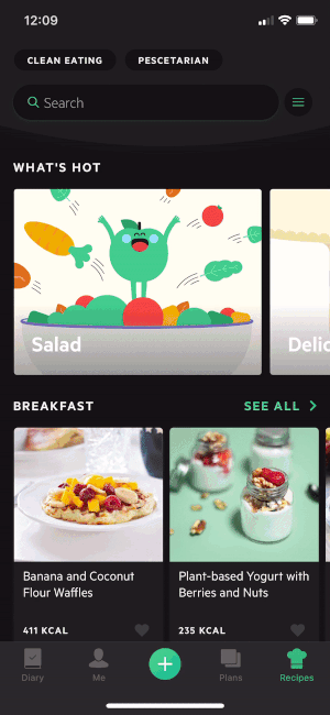
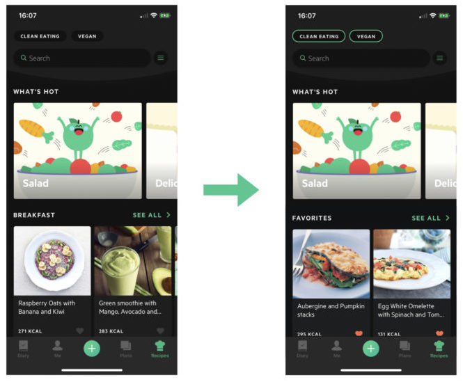
3. Enjoy hundreds of tasty and nutritious recipes
Bad Design
- Favorite recipes are lack of discoverability.
Suggestion: move favorite recipes to the top.
- The filter is not too complicated and confusing; users have no idea what it will include.
Suggestion: design drop downs for different categories.
- The dietary type is easy to find but hard to change. Have no feedback when clicking, and have to return to profile setting to change food preferences.
Suggestion: make tag clickable and changeable.
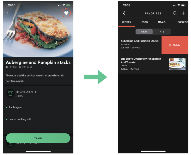
- Lack of discoverability for removing favorites. Steps to remove favorite is complex.
Suggestion: add interaction gesture that enables to slip right to delete favorites.
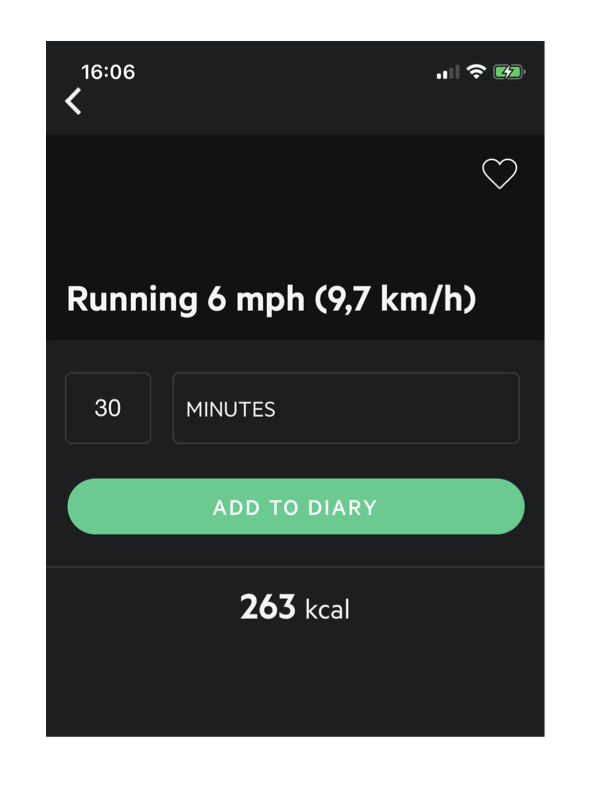
4. Track your exercise
Bad Design
- Users can add favorite food to the meal, but no feature that is to add favorite exercise, which is a poor mapping. Even there is no access to favorite an exercise, which harms the consistency.
Suggestion: add a “love” icon to exercise.
Good Design
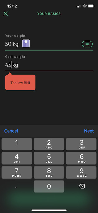
- Give BMI constraints to solve mental health problem.
People are easy to get distracted from the real world. Underweight situation is ubiquitous nowadays. While in Lifesum, if users set their BMI goals too low, their plans cannot work at all. This constraint somehow guarantees the safety of losing weight, and raise the awareness of self-care.
Considering 3 levels of human processing cognition and emotion
Overall, the Lifesum App is successful because its design have taken place at all levels.
Visceral level
Visceral responses are quickly and subconsciously, and are sensitive to only current state, without conscious awareness or control. For designers, the visceral response is about immediate perception.
Lifesum’s simplified user interface(appearance) uses aesthetic sensibilities to drive visceral responses. Green color gives users an immediate perception of healthy living. Those playful screens balance the allocation of buttons, icons, illustrations, animations, and texts.
Behavioral level
“It is important to be aware of my diet and to make a conscious effort in choosing healthier alternatives. I have been able to slowly build good eating habits by staying on track with my goals.”
For designers, the most critical aspect is that every action is associated with an expectation. The information in the feedback loop of evaluation confirms or disconfirms the expectations, resulting in satisfaction or frustration.
People often want to know about measurable achievements. Lifesum knows how to stimulate people to keep tracking nutrition in the App. Besides, it has a premium version, and the advertising approach is appropriate, reminds users when the advanced functions are most needed.
Reflective level
The reflective level is the home of conscious cognition, where deep understanding develops, where reasoning decision-making takes place. Highest standards of emotions come from here, where predictions of the future take place.
Users trust the widely accepted principle that absorbing fewer calories leads to weight loss, vice versa. This kind of cognition, reasoning, and understanding will contribute to the decision-making, which means users tend to continue using the app to achieve their goals. The further confident emotion towards their body and health will also contribute to user loyalty. Emotion and cognition are tightly intertwined.