About
Mint Mobile, formerly Mint SIM, is subsidiary of Ultra Mobile. It provides prepaid wireless service for youth market. Due to its inexpensive rates and simple user experience, Mint has gotten favorable feedback. Through its app, subscribers can buy packages of different months up front and other phone service including high speed data and international roaming credit.
Loading Page (Positive)
The loading page, as a feedback, informs the user the application is loading. In order to reduce the influence from discontinuity of the loading process, it uses an interesting short animation to replace the traditional loading icon, which effectively reduce the negative emotion of user and deepen user’s impression on the brand.

Function List (Positive)
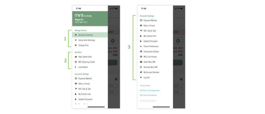
When user clicks the hamburger menu, a slide out showing function list appears. This function list uses an effective method to display the information, which is Modularization. It organize, modularize and divide these functions, each modules has a limited set of controls for different aspect of the task. According to Norman, one of the two deadly temptations for the designer is “Creeping Featurism” which means “the tendency to add to the number of features that a device can do, often extending the number beyond all reason”. It’s very hard for a program to remain usable and understandable when it has a large number of special-purpose features, but the modularization is a proper solution to conquer complexity.
Change Plan Page (Positive)
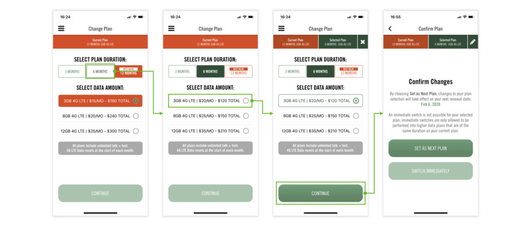
The Change Plan page gives user three discoverable types of plan duration. Each plan duration contains three levels data amount. When user completes these two steps, the top area presents both current plan and selected plan as the feedback of selecting service. Meanwhile, the “Continue” button at the bottom (a signifier of continue action) becomes available to click as a simultaneous feedback.
It is notable that the 12 months plan has a “BEST VALUE” tag and different visual style from other plan, which aims to attract user’s attention and promote the click rate.
Lack of Second Confirmation (Negative)
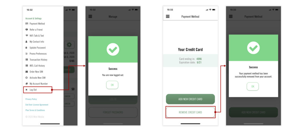
According to Norman, the best way to prevent errors is not let them happen in the first place. As the screenshot shows, “Remove Credit Card” and “Log Out” function both lacks confirmation popup constraint, which are more likely to cause mis-operation for users.
Suggestion: In order to prevent mis-operation, a popup window is needed to let the user choose confirm or cancel.
Lack of Return Function (Negative)
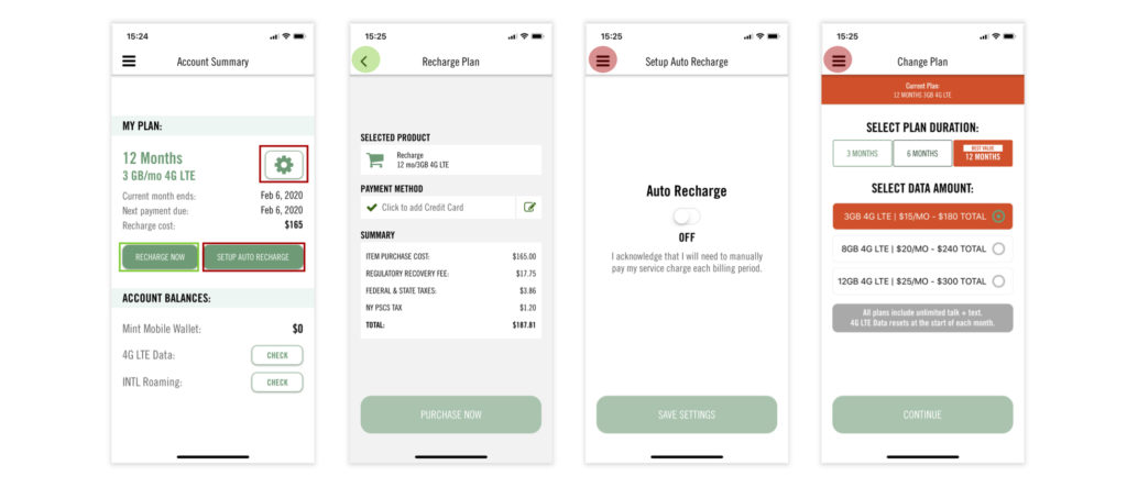
Generally speaking, in order to maintain the logic of operation process and align with user’s using habits, the sub-page needs to show an return icon to back to previous page when entering the sub-page from the main page. However, as the screenshot shows, “Setup Auto Recharge” page and “Change Plan” page both lack the return icon on the top left corner.
Suggestion: Change the hamburger menu to return icon, or add the return icon to the left of the hamburger menu (inspired by Amazon). Thus the information level of pages will become clearer, also creating more fluent operation experience.